|
| Group |
Round |
C/R |
Comment |
Date |
Image |
| 36 |
Jan 19 |
Comment |
Hello Michael
I'm just visiting from Group 67 and really enjoyed your comment about the mentally deficient people who visit Maine in February. I visited Maine last April for my first time and really enjoyed Acadia. I think this is a fine image of the Otter Cliffs. You have a nice sky that complements the colors of the cliffs and a pleasing composition that follows a beautifully curved line from the left corner and along the shoreline. You certainly had better weather than I did. If I were going to change anything I might suggest a polarizer to kill those highlights in the water and maybe bringing down the exposure just a bit to bring out the color in the rocks and the sky.
I am quite taken by your mentally deficient comment because I was there in mid April and was down on the coastal rock with, wind, rain and 27 degrees. Being a Florida resident I thought I was going to freeze solid. You must have been much worse than I. Since you shot is from Acadia you might be interested in looking at my image this month as it is from Acadia. You can see it by checking out Group 67.
Larry |
Jan 6th |
1 comment - 0 replies for Group 36
|
| 67 |
Jan 19 |
Reply |
All you have to add is the bellow of a bull gator in mating season! :-) |
Jan 21st |
| 67 |
Jan 19 |
Comment |
Cheryl
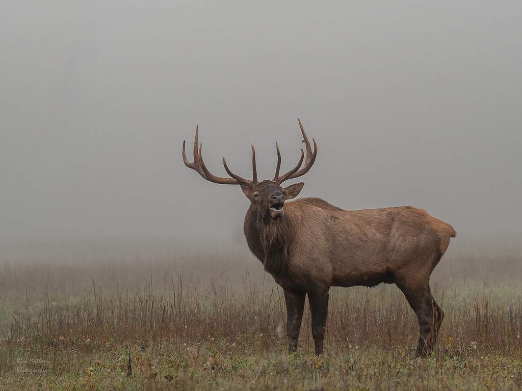
I am a background freak!! When I'm shooting wildlife I am constantly adjusting my angle to get the best background possible. Often I find that just getting lower solves a lot of the problems. But I always think of the background. I find that if the background is to cluttered I end up not liking the image. Thus I plan before I shoot,that is one reason why I like Richard's Elk that he submitted this month. Remember this discussion when you see my submission for next month. :-) |
Jan 21st |
| 67 |
Jan 19 |
Comment |
I agree. Nothing says wilderness like the call of a bull elk on a crisp chilly morning. That open mouth on the elk is one of the most appealing parts of the image.
|
Jan 21st |
| 67 |
Jan 19 |
Reply |
Thanks for your thoughts. I couldn't think of anything else to do with the water. Maybe a different shutter speed would change the looks. But because of the dark, I could not use a faster shutter.
I'm with you about the color image. I much prefer the color. In general, I am not a B&W fan for my work. I can appreciate a good B&W shot---like Ansel Adams, but I like the color. Thanks for commenting. |
Jan 20th |
| 67 |
Jan 19 |
Comment |
Hmmm... I never noticed the appearance of the clouds. There was no cloning done, I did enhance the golden glow near the "castle" just a bit. Didn't notice sensor dust, but there could easily have been some water spots as you rightly guessed that the water was really pounding. I remember wiping the mist off the lens between shots (I was using a lens hood as well) I didn't want this water to look like silk because I thought that might ruin the sense of violence.
As for the dragon----no respectable dragon would dare be out on a night light that!!! As for a damsel, well, my wife was waiting back at the hotel----which certainly was no castle! |
Jan 13th |
| 67 |
Jan 19 |
Comment |
You have a perfectly adorable image of mother and child. The pronghorn stands out nicely from the background and so i am not greatly upset by the bush near the pronghorn's head. That is unless you were going to completely remove the bush and have a clean, clear background. Reducing the fstop from 8 to 5.6 might help blur the background more than it already is. A quick fix that would help the image would be to crop in from the right and remove those little black branches that are intruding. I like the golden light which sets of the pronghorn's natural color quite nicely. I also like the angle of view as you have achieved a more eye to eye connection as you are not higher than the antelope. One thing that might draw more attention to the fawn would be if you shot from a lower angle as it would focus more attention on the fawn.
However, when all is said and done you really have a quite nice image and you should be well pleased. |
Jan 6th |
| 67 |
Jan 19 |
Comment |
This is an excellent portrait of a Carolina Wren. You have successfully separated the bird from its background and that helps to make the bird pop out in the image. The coloring of the bird and the post are a nice match which eliminates and extra colors helping to keep the image simple. The posture of the bird adds a bit of dynamics and makes the image more interesting. |
Jan 6th |
| 67 |
Jan 19 |
Reply |
I think that edit looks great. You did a nice job with it. |
Jan 5th |
| 67 |
Jan 19 |
Comment |
I do notice that the image submitted my Max is visually sharper than the original one submitted by Madhu. However, in the image submitted by Max I think the white areas on the shell appear more unnatural that in the original submission. Sometimes, I think when you over sharpen it gets a little on the shiny side. Just my opinion. |
Jan 4th |
| 67 |
Jan 19 |
Comment |
Richard
After reading your last comment I took your edited version and put it in Photoshop. Then, only using a simple selection tool, and edit>fill>content aware in 2 clicks I removed the tree. See how you like it this way. I know PSA would not be happy, but for general or personal editing ofa photo this works really pretty good. BTW, I'm using a older version of Photoshop not one that is on the cloud. |
Jan 4th |
 |
| 67 |
Jan 19 |
Comment |
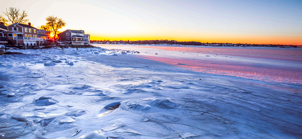
This is certainly an eye catching image and it was well worth a few numb fingers. I feel that the biggest part of the story is the ice and so I am offering a few suggestions. As you can see from the photo I've attached I started with a few crops. I reduced sky because it is just a large blank bright spot that I felt took attention away from the ice. (Remember the eye always goes to the bright spot) I cropped off the black hole in the lower left because I felt it was competing with sunrise and the ice. At first I liked the detail in the hole and when I read you comment about the size of the hole I was tempted to leave it in, but opted against doing so because unless you were standing next to me when I viewed the image I would not know about the size of the hole. Next I started by cropping off the little bump on the right edge of your original image. Then I added contrast to the ice and noticed the increase in drama. At that point I went back to the expanse of ice on the right and cropped of some more because I felt in forced more attention back onto the ice itself.
Please remember my edits are only my suggestions, and are presented here as topics for discussion. This is your image and it is a powerful one. You are the final judge as to what you want it to be. You may feel free to disregard any or all of my comments and you will still have an excellent image. |
Jan 4th |
 |
| 67 |
Jan 19 |
Reply |
I agree, in the B&W the house is hardly visible---as it was when I shot this image. For the record, in the B&W images I purposely lightened the house just a bit. :-) |
Jan 2nd |
| 67 |
Jan 19 |
Reply |
Thanks for the compliment on the B&W. Of the two, I personally like the dark one but I'm more partial to the color. I wish there was a greater tonal range to work with. |
Jan 2nd |
| 67 |
Jan 19 |
Comment |
I think the original image has some possibilities and maybe some continued playing around might discover some of these.
My first thought is to reduce some of the sky. I think if you crop somewhere between to highest white cloud and the lower cloud you would have a better balance.
I think flowers make an excellent compliment to the mountains but the treatment of them here looks a bit muddy. If you had kept the brightness of the original yellow flowers they may have been more stunning. You might also try removing the color with the adjustment brush from the brown area to the left of the flowers.
I'm sure your objective could be reached using masks in Photoshop, but I don't think Lightroom has the tools to do what you want.
I do think your composition idea is a good one and if you like that sort of B&W image with a single color added for punch it would be interesting. |
Jan 2nd |
| 67 |
Jan 19 |
Comment |
I'm a sucker for big game images, especially when the images shows the environment to set the scene. Thus when I first saw this image it gave me instant satisfaction. The foggy morning with the meadow grass fading into the fog is a powerful elk type scene. The grass tones compliment the tones of the elk and work quite well. My first suggestion is to change the crop and remove that hanging tree foliage in the upper left corner. It really serves no purpose and being completely detached in appearance almost looks like it is floating in space. You could make this a semi square composition and it would still look fine as the viewer would be forced to look only at the elk. When I checked out your camera setting I wondered about the shutter speed. Even when mounted on a tripod the 1/60 second seems slow for stopping big game. Your ISO is really quite low (500) and perhaps it could have been raised. If you compare this elk with your excellent image from last year this guy is a bit soft. It could be camera shake, elk movement, or a slightly missed focus. It is still a fine shot of the elk in the fog, I just wish it was a bit sharper.
On that note, I recently attended a presentation of Topaz and the presented noted that with Topaz you can a plugin called AI Clear which does a remarkable job of adding sharpness to an image. The presentation showed what it could do to a bird's feathers and it was impressive. I was thinking of taking advantage of the free trial, maybe it would serve as another tool in your processing bag of tricks. |
Jan 2nd |
| 67 |
Jan 19 |
Comment |
I have been enjoying your Macro efforts over the last few months. Last month was excellent but this my top it. One thing I most admire is your treatment of backgrounds. The solid black last time was striking, but this is, I think, even better. The near perfect cream green is a perfect compliment to your subject. The of the fern as it wraps around the snail makes an interesting frame that draws the eye. The fact that you captured the snail with its head out definitely make the image more appealing. Again your use of the diffused light keeps the hotspots away. I believe your crop is quite effective.
I have a Nikon 105, f2.8 macro lens but don't use it as much as I should. When I first saw this image I thought I've got to start using the lens more. You have given me some inspiration and I'll get busy trying to learn. I assume this was hand held, right??? How did you position the light. Last month you had someone hold it, what was the technique this time?
Anyway, this is a superb image. I think it is better that last month just because of the difficulty in creating this background, black is easier to obtain. Well done! |
Jan 2nd |
| 67 |
Jan 19 |
Reply |
Thanks for your input. Like you I feel for those poor folks. I bet they have great views of heavy seas crashing on those rock. The spray should be fantastic.
What I love most about your comment is when you say you can almost feel the cold wind and spray. That is exactly the emotion I was trying to convey. Most folks who view this make a similar comment so I guess I got something right.
I tried 4 different shutter speeds to try and get the best effect on the water. After that, the light was really gone. |
Jan 2nd |
| 67 |
Jan 19 |
Reply |
Before I posted this image I read the category guidelines carefully and they stated:
Images of animals, flowers, and other images from the natural world can show the "hand of man." Hybrid plants, animals at zoos and game farms, nature scenes with a fence, and other images not allowed in the Nature Division can be presented in this group.
I figured since the house was really small, and certainly not the subject it would be OK. And like I noted I didn't see it in the gloom until I was on my computer. I don't believe putting a church or barn in a field in a image would be right, but I thought this would be OK.
What attracted me to the image is the way the way receded as it rolled out so that it what I tried to work with in the composition. I noted you saw that part as well. I had not even thought of monochrome ( I rarely or never do Black and White) and rather liked the grey tones since that is what I saw. However, after reading your comment I decided to try it. I have attached two versions for your review. One is darker than the other, the only difference. These were hard because there is so little tonal difference. No matter what I did with the contrast it really didn't change much. I did a lot of painting with the Adjustment Brush in Lightroom.
As for the rule of thirds---I didn't even try. I think that there is a time to break the rules and this seemed like one. What I saw and worked on was the visual white line caused by the water moving from the right,into the rocks and then behind the little island ending by passing beneath the cliff with the house. I felt that that line moved the eye through the image and created interest with the textures in the water. When I saw the first image appear on my camera screen I thought it had the "WOW" factor and thus kept what I had and just changed shutter speeds for my additional shots. In the end I picked the one with the most detail in the white water.
Personally I feel the B&W images do not carry the same impact but I'm waiting to see what others say. I think there is a big learning curve with this image.
Thanks for all your observations.
|
Jan 2nd |
| 67 |
Jan 19 |
Reply |
Thanks for commenting. Be sure you go to Maine there are some great subjects for your camera including lighthouses, harbors and of course Acadia NP.
Yes it was sooooo cold. I was having trouble working my filters and camera controls and spent forever taking gloves on and off. Glad you liked the sky---I waited for the moving clouds to get that lone bright spot near the house to get some separation between the sky and the trees. The lack of tones was the hard part---You are right in noting that everything was just grey. For me, this image was really all about the swirling water and that is what I really worked on. |
Jan 2nd |
11 comments - 8 replies for Group 67
|
| 69 |
Jan 19 |
Comment |
Such beautiful detail accompanied with a striking pose. I really like the focused look on the bird's face as well. The rendering of the feathers is amazing. |
Jan 1st |
| 69 |
Jan 19 |
Comment |
WOW! You certainly found some lovely light in which to capture this sheep. |
Jan 1st |
2 comments - 0 replies for Group 69
|
14 comments - 8 replies Total
|


