|
| Group |
Round |
C/R |
Comment |
Date |
Image |
| 52 |
Dec 18 |
Comment |
Hi Mike. As a landscape photographer I find this image quite inter The diagonal lines of the mountains really draw my attention to the center of the image. The reflection in the water makes the foreground much more interesting.
While I really like the image, I wonder if a slight crop, such as I've attached might add something to the final product. I like the colors and the overall image but much of the upper sky is just blank---lacks clouds. I you cropped a little of the sky it might help direct the focus even more to the mountain and the reflection. As it is, just frame it! |
Dec 20th |
 |
| 52 |
Dec 18 |
Comment |
John
I really like the light coming through the wing of the right bird and the water drops caused by the take off. This is a great capture of a dramatic moment. I also like the way you managed to keep the background so dark and thus create such great contrast. |
Dec 20th |
2 comments - 0 replies for Group 52
|
| 67 |
Dec 18 |
Reply |
Just a note of caution. On another forum here on PSA I did exactly what you suggested and turned down some of the colors on HSL in Lightroom. The host (expert commentator) immediately fired back noting that when turning down all or portions of the HSL it leaves an unnatural looking appearance and should be avoided. This is particularly true with greens in Nature or Landscape type images. |
Dec 26th |
| 67 |
Dec 18 |
Comment |
Oh my. I am so sorry. I was just going through the months postings and noticed that my review of your image did not go through. I have no idea why. Please accept my apologies. I am pasting my review, I saved it on my computer below.
What a striking image! The white caterpiller on the black background, the study of contrasts, is just stunning. I am first impressed by the fact you you even saw this little creature while hiking. Better yet, that you had the presence of mind to figure out out to take this stunning shot. The use of the back light really made the image work. I think most would have tried to front light the caterpiller and in doing so would have ruined the image. How close was the light to the caterpiller and did you have to adjust the power of the flash? Also you state that you used a do-it-yourself diffuser. Was this something you created on the spur of the moment or something you had previously made and just brought along by chance? |
Dec 20th |
| 67 |
Dec 18 |
Comment |
Once you start photographing the MW you sorta get hooked. Now I seek out opportunities. I really appreciate your "Ted Talk" reference--never thought of it in that light.
Being in south Florida I do a great deal of bird photography. and I've seen the birds flying toward the light of the MW on some nights. It can be pretty amazing.
Glad you enjoyed the image. |
Dec 9th |
| 67 |
Dec 18 |
Reply |
Thanks. Maybe I'll post a Florida Milky Way shot another month. I have to fight the lights from Miami in order to see it but on some nights it works out. I use the App Photo Pills it lets you know everything about the sky. Not only the stars, and the MW, but sunrises and sunsets along with moonrises and moonsets. You can pre-plan the exact angle at which the sun will preform on any day in history. It is a really neat app and I use it a lot.
I think the images I like the most are the ones that require the most effort to take. I like the challenge. Thanks for commenting. |
Dec 9th |
| 67 |
Dec 18 |
Reply |
If you have a southern exposure or even a south southeast exposure you should be able to see the Milky Way come spring.
Those forest were so dense. No light gets in. But the forests made the scene seen almost cozy. (and they blocked the wind) |
Dec 9th |
| 67 |
Dec 18 |
Reply |
Mike. I assure you I am NOT a Bo Derek look alike. An Td I would not have wanted her there on the night I took this. She would have ruined my concentration completely. This was one of those nights that I frequently just sit and remember now when I see the image. Being there and seeing it was an extremely spiritual experience. More meaningful that any church I've ever been in.
However---you certainly dated both of us with that reference to Bo. that was really a long time ag.... Wonder how many others remember that scene. |
Dec 9th |
| 67 |
Dec 18 |
Comment |
The photo is most certainly eye catching and features some strong composition elements especially the location of the butterfly and the diagonal line. I feel the massive cropping and the high ISO work against you in this situation and cause a loss of sharpness. However, passing this image through Topaz and the use of the stylistic filters more than compensates and imparts to this image an artistic quality. In that I am not a Topaz user I have to ask if it is possible to tine down the halos that surround the leaves which seem to be exaggerated in the final version as compared to the original. Given the spur of the moment nature of the image and the high ISO value this really is a remarkable image. The glow of the butterfly created by the use of the radial filter you mention really worked out quite well. |
Dec 6th |
| 67 |
Dec 18 |
Reply |
Thank you Wayne for your thoughtful comment. I'll note that few of my landscapes are "grab" shots. I really try to slow down and work the scene. As for the GND filter I didn't dim any of the Milky Way, I only brought down the whites to dim the brightest of the stars in the water. My goal was to force the eye of the viewer up to the sky so I thought that by dimming the watery stars (which you will note are not pin points of light due to water movement over the long exposure)they water portion would act as a leading line to reach the sky. I really wanted the viewer's attention focused upward. I'll look and see if I have the version with the bright stars. |
Dec 5th |
| 67 |
Dec 18 |
Comment |
I'm going to be right up front with this---your knowledge of Macro photography is about 100 no make that 500 miles ahead of mine. Just reading about your process makes me dizzy. Reading about your shooting process was an education in itself.
There are two macro groups in the Digital Discussion group menu. I'll reach out to the people on those groups and ask if they would be willing to comment on your image this month.
From my view, and all I can comment on the general appearance of the image. I find the "critter" amazingly sharp. Guess that is what happens with 18 images stacked.
The wings look really great but I would like to ask if the head toward the snout (?) is a little soft. I also wonder if there is a bit of color contamination on its back as there seems to be some bleeding green. None of this is meant to be critical, I'm just admiring the image and trying to learn more from both it and you. You are the expert.
|
Dec 5th |
| 67 |
Dec 18 |
Comment |
This is a clever, well composed shot. The splashes of color caused by the goldfish add a bit of excitement to the image. I feel you used an optimum angle of view that provides enough over the top angle to let us see the fish and still makes the duck appear to be more or less on our eye level. I agree with you that a polarizer may have helped with the glare in the water. As a suggestion, did you try to adjust the luminosity slider? Sometimes that sort of acts like a polarizer. I would also suggest using the adjustment brush and sharpening the duck (maybe even increase the clarity) and these will help to sharpen up the duck feathers.
I do like the humorous aspect of the image. |
Dec 5th |
| 67 |
Dec 18 |
Comment |
I really love the painted buntings so automatically I like this image. Just a technique comment to start--with ever I am going into the field with my long lens over my shoulder I always have it zoomed out to its maximum length and focused on infinity---so it I see something, the gear is as ready as possible.
For the amount of cropping you have done you got a pretty good image. Cropping that much always degrades the image as I'm sure you can tell from the softness of the plummage. You certainly have captured some really nice light and even manages a catch light in the visible eye. Having at least one eye clear and sharp is a must for wildlife photography.
Just a question---do you know where your focus point was? I ask because the flower looks pretty sharp and so the the bird's eye. Steve Perry always suggests that you focus on the subject's eye (maybe in this case due to distance the point would have been the bird's head) While I like the composition, I would prefer of the sharp flowers on the far left were more blurred. Overall, I find it to be a beautiful environmental/ behavioral shot of the bunting. |
Dec 5th |
| 67 |
Dec 18 |
Comment |
It looks like you certainly made the most of your gear. I would like to make a gear suggestion and that would be to look into getting a 1.4 teleconverter. While it would add an f-stop to your exposure it would provide a bit more reach and with that gear combination it would hardly degrade the image.
I am impressed that you got such goo detail with so much cropping off the original. I feel like you got a very up close and personal portrait of the swan. In this case the preening pose bringing the bill on to its back and setting it off against the white, really made the image work. I think your cropped composition keeping that slight reflection in the water provides balance. Since you did so much work in post I would suggest that you use the adjustment brush in Lightroom to ever so slightly lighten the swans legs so as to match the tone in the bill. I also think you really did well saving the whites and highlights without blowing any of them. From looking at the original it appears you may have had a bit of overcast or clouds in the sky which certainly helped you save those white. But you did a great job.
Personally, I am not a fan of the Topaz treatment you applied in the final image. However it is still an eye catching image. I'm not well versed with Topaz but I do notice the white rim running along the swan's neck.
Overall, I feel you have done a fine job with this subject. |
Dec 5th |
7 comments - 5 replies for Group 67
|
| 69 |
Dec 18 |
Comment |
This is just a magical image. You found great light and the decision to make this an HDR is excellent. I think the relative high angle of view helps to display the various elements of the landscape to their best advantage and makes this a ore interesting composition. Very well done. |
Dec 20th |
1 comment - 0 replies for Group 69
|
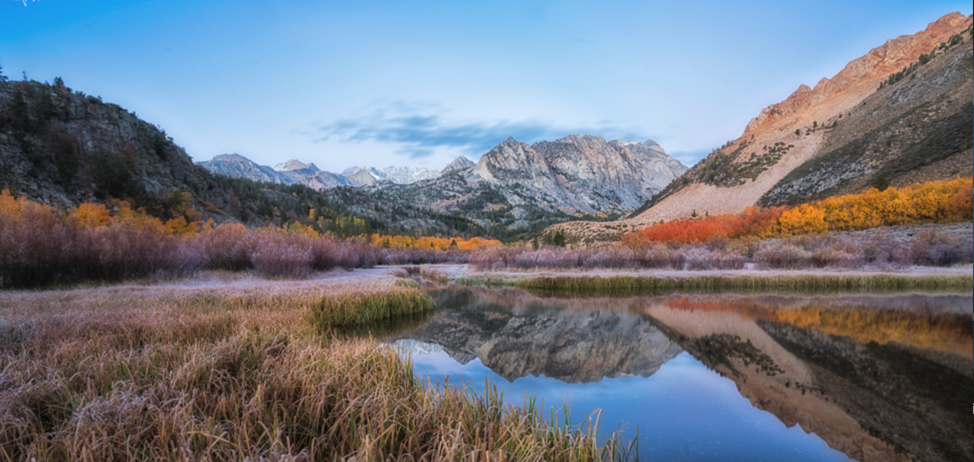
| 72 |
Dec 18 |
Comment |
I'm just visiting from group 67. What a stunning image. You could not have dreamed of better or more dramatic light. Your composition beautifully frames the mountains and its reflection. Your decision to underexpose the image really make the colors pop. The crowning cloud over the mountain helps to fill what could have been a blank sky and really completes the compositon. The clarity of the image only adds to the results. As others have noted, you might crop a little bit off the right edge. The repeating trees on the right side may not all be necessary.
Well done. |
Dec 20th |
1 comment - 0 replies for Group 72
|
| 75 |
Dec 18 |
Comment |
Hi. I'm just visiting from group 67. This is a beautiful compliment to your image from last month. Among other things it show that you really worked the scene from multiple angles. While I really like this image I wonder if you underexpose this a bit if it might bring out a greater richness in the colors. |
Dec 20th |
1 comment - 0 replies for Group 75
|
12 comments - 5 replies Total
|


