|
| Group |
Round |
C/R |
Comment |
Date |
Image |
| 45 |
May 17 |
Comment |
Of course, I imagined the redo would be on black... so, the fact that I put a thin gold stroke around it does not show. Oh, well. But try it. You might like it! |
May 9th |
| 45 |
May 17 |
Comment |
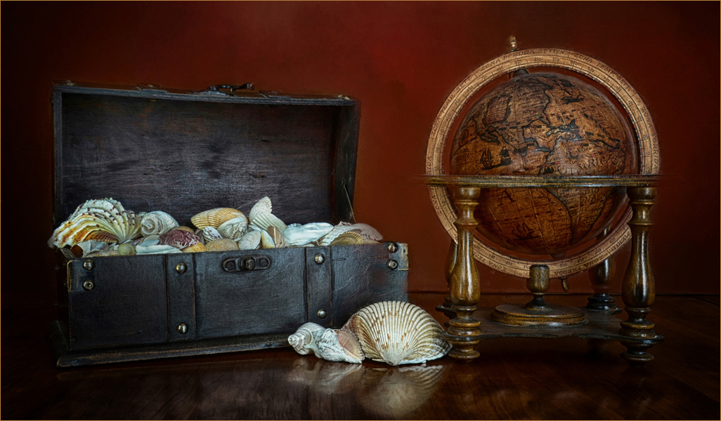
Oh, Cindy. Where do you find these things? Where do you get the ideas to do with them as you do? I find your choice of objects interesting. Maybe someone has traveled the globe to collect all those shells. Interesting story.
Personally, when showing an image on a black background such as this, I would like to see a light stroke... maybe a pixel or two, around the image so as to define its perimeter. Not white, but perhaps grabbing a bit of the reddish brown or some of the gold would just be enough to hold it together. |
May 9th |
 |
| 45 |
May 17 |
Comment |
You certainly improved this image by working with the background, cropping and adding contrast and brightening it up. I must say I cannot find what Cindy found, but then Cindy just sees things. She has helped me with some images, finding imperfections that I missed. Take her word for it. If Cindy sees it, it is there.
The image is much improved. Listen to Cindy and it will be perfect! |
May 9th |
| 45 |
May 17 |
Comment |
I think you did a good job here, fixing the composition and vignetting it. I would have liked a bit more contrast. |
May 9th |
| 45 |
May 17 |
Comment |
I like your crop a lot. The bottom of the image was not necessary. Your person is on a power point and emphasizes the fact that she is standing on a path, not in the middle of the flowers... I think. I like the image, the colors and the composition. Good tonality. Good job! |
May 9th |
| 45 |
May 17 |
Comment |
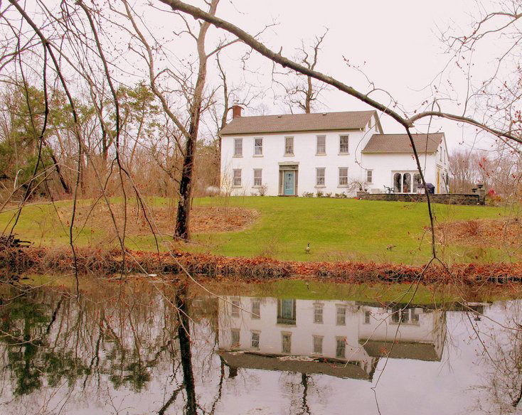
I have to agree with everything that Cindy has said, especially the contrast etc. That was the very first thing I noticed.
Regarding the crop. My first instinct was to remove some of the bottom of the image, to ground the house a little. The other way, it looks as if the house is on invisible stilts. I also cropped a bit off the right side so us to move the house even more out of the center spot. I think the new location of the house places it nearer to a power point. I did not change the contrast, though it could use it. I just worked on the composition. |
May 9th |
 |
6 comments - 0 replies for Group 45
|
6 comments - 0 replies Total
|