|
| Group |
Round |
C/R |
Comment |
Date |
Image |
| 45 |
Jan 17 |
Reply |
I am trying to branch out... but I will be back with more! |
Jan 22nd |
| 45 |
Jan 17 |
Comment |
I am not sure the difference shows up. But, I tried. |
Jan 11th |
| 45 |
Jan 17 |
Comment |
|
Jan 11th |
 |
| 45 |
Jan 17 |
Comment |
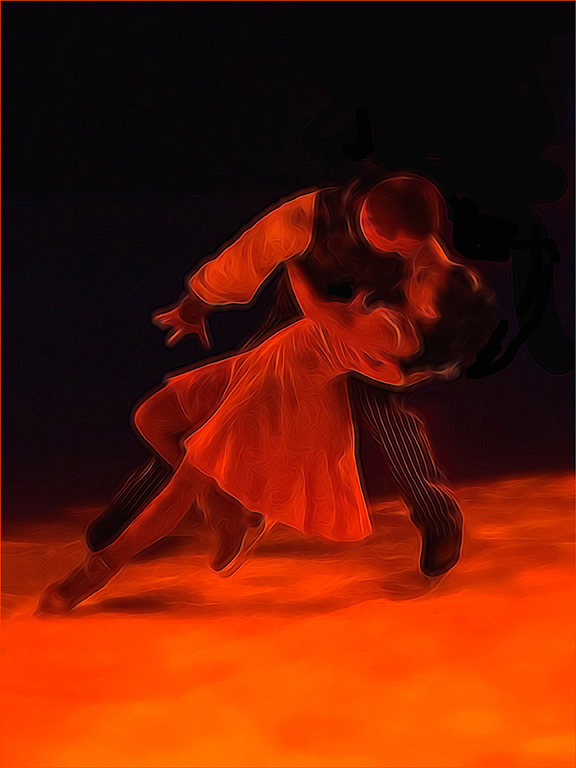
Good crop. The square format fits this image, and yes, it does make the image more powerful. I tried adding a little vibrance to make it pop just a little more. I think it helped a bit.
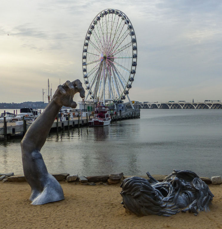
Interesting composition. Good to include the ferris wheel. Shows that not everything is a struggle, but that perhaps struggles are a bigger part of life than ferris wheels. |
Jan 11th |
| 45 |
Jan 17 |
Comment |
I feel like a broken record when I talk about how I love what you do to an eh! image to make it into a prize winner. But, what is, is!
You have an uncanny ability to see the possibilities of the world around you... you must have a finished product in mind as you take the shot.
I use and like Smart Photo Editor and gotten some interesting results. I never would have thought that is how you did this.
Thanks for making me think! Of course, I think as I look at your stuff, and then... I forget and go on with whatever. |
Jan 11th |
| 45 |
Jan 17 |
Comment |
Your image looks like it has been simplified in either OnOne or the other one... I cannot remember the name as I am brain dead... Much of the detail has been lost. Is there a way you could have corrected the color cast? I am sure there is, but again... my brain at the moment. You did a good job of cropping, though I think judges would definitely object to cutting off the legs. I think you have a fun image here for you and your friends to enjoy, but I am not sure this is an image for competition. So, go for it if you you wish, and then laugh at me! People often do, you know. I have never been to a rodeo... looks like fun. |
Jan 11th |
| 45 |
Jan 17 |
Comment |
|
Jan 11th |
 |
| 45 |
Jan 17 |
Comment |
An interesting point of view, that is sure. You did a fine job fixing the left side which was blown out, but i think the images needs more saturation and POP. And, when you finish with the POP, adding a vignette might add some interest. I know that centers of interest should not usually be centered, but I feel as if the image is a bit lopsided. I would clone some off from the right, even though that is the most appealing part of the image.
Actually, thinking out loud as I am writing this, I would split the image in two. I would duplicate the right side, open a new document double the size of the right section, place the right side on the new document, duplicate the right side and flip it horizontally, mesh them together. Then I would do whatever to made the image POP more. The left side is a drag on the image.
In my redo, I did just that and then I increased the vibrance and the saturation, sharpened and added a stroke, taking the color of the stroke from the image itself.
Just a little fun I had with your image. I hope you don't mind. |
Jan 11th |
| 45 |
Jan 17 |
Comment |
Ray, perhaps Richard can give you (and me) some Light Room hints. Not having seen the original (which I always wish you and the others would include), the crop looks good... right to the point. I think I would have cloned out the dark blue spot on the right hand side, and perhaps a bit more contrast would improve the impact of the image.
As I suggested to you privately, perhaps giving Photoshop Elements a chance... anyone have any other ideas? |
Jan 11th |
| 45 |
Jan 17 |
Comment |
Richard, I think you did a good job cropping the image and changing the tonality.
As you will see as you look at everyone's images this month, Ray is having a bit of difficulty getting used to Light Room. Perhaps if you would add some information about what you did in LR, it would help him along. |
Jan 11th |
| 45 |
Jan 17 |
Comment |
What an adorable little girl! |
Jan 11th |
10 comments - 1 reply for Group 45
|
10 comments - 1 reply Total
|