|
| Group |
Round |
C/R |
Comment |
Date |
Image |
| 35 |
May 25 |
Reply |
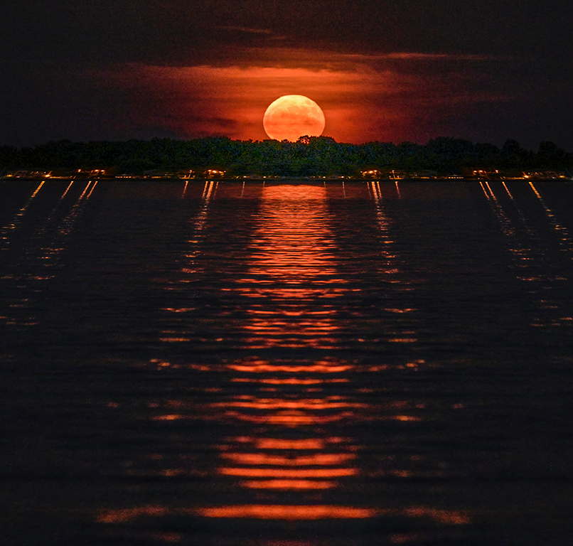
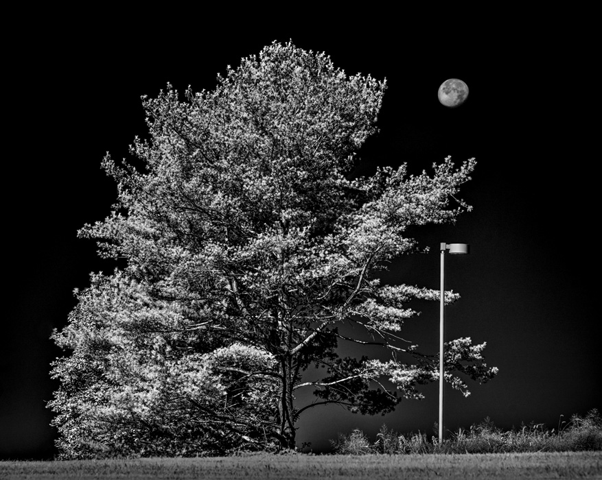
Hi Lauren, I have an all wavelength Sony conversion and use filters to get the effect I previsualize. While there is nothing wrong with your workflow, I suggest trying a filter on your lens that blocks all visible light (390 to 720 nm) and transmits only infrared (usually referred to as 720 nm and higher). The most common of these filters is the Hoya R72 with similar products by Kolari Vision 720 nm, Ice HB720, Urth R72, and Tiffen #87. Filters that start further in infrared include Ice HB760, Kolari Vision Pro Gen 3 780 nm, B&W 093 830 nm, and Kolari Vision 850 nm. The R72 and above filters will produce a much more dramatic dark sky. The attached image was taken in a parking lot on a clear, sunny day around 11 AM with a Nikon Z7 converted to 830 nm infrared. The moon was very, very faint to the naked eye but popped out dramatically in pure IR against the black sky. The camera captures reflected infrared. The moon's surface and healthy foliage reflect a lot of IR while space and cloudless sky reflect very little and appear black. Your camera is capable of a lot by using the appropriate filter on the lens. Try a 720 or 830 nm filter for dramatic clouds against dark sky. For visible color + infrared, I like the Kolari IR Chrome filter which sort of emulates the old Kodak Ektachrome Aero Infrared film with appropriate post processing. IR is a whole photography world that I love and include in the Fun Photography class that I teach at the University of Delaware. Have fun! Karl (Group 79) |
May 17th |
 |
| 35 |
May 25 |
Comment |
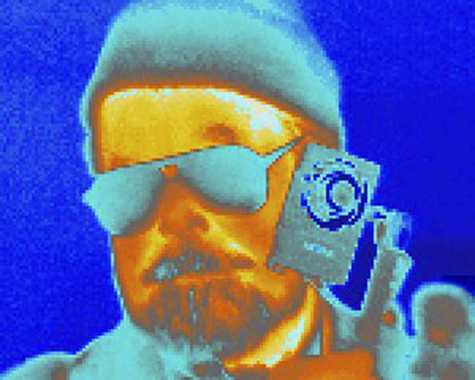
Hi Lauren, Can you provide more info on your IR camera: make/model and filter used? This image seems to lack the dark, contrasty sky expected when using a 720 nm (e.g. Hoya R72) or higher filter. It seems to still have a lot of visible wavelength light in it and lacks the impact of a pure IR image that the other 2 images in this Group have. Karl Leck from Group 79 |
May 10th |
1 comment - 1 reply for Group 35
|
| 79 |
May 25 |
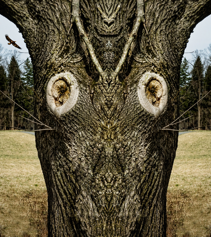
Reply |
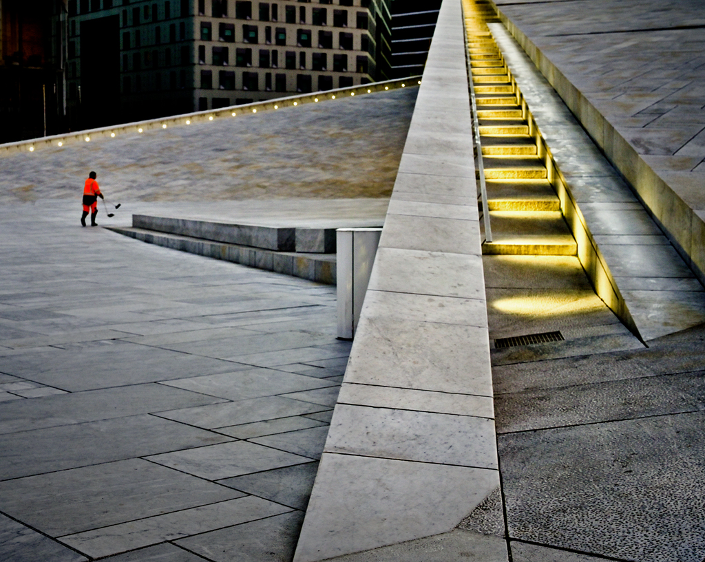
I did not notice the 'icicle' before. It is actually a repaired cut in the paving stones. I agree that taking it out would help. |
May 25th |
| 79 |
May 25 |
Reply |
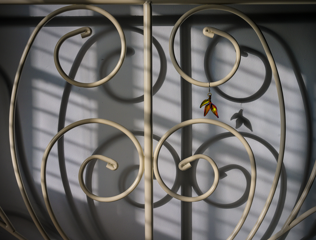
Thank you, Hanoch. I like fine detail (small shadows here) in many images because it inspires 'Slow Art'. The viewer can see a little more each time they view the picture. Karl |
May 17th |
| 79 |
May 25 |
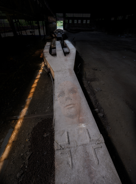
Reply |
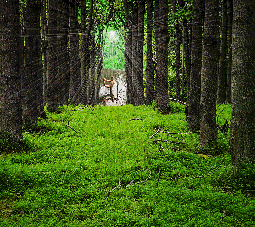
The idea of a wall doesn't come through to me. Of course, I wasn't there when the picture was made, so I don't have that knowledge. Instead, I see limitless space - infinity perhaps. The idea of contemplating 'something beyond here' may be applicable. |
May 12th |
| 79 |
May 25 |
Comment |
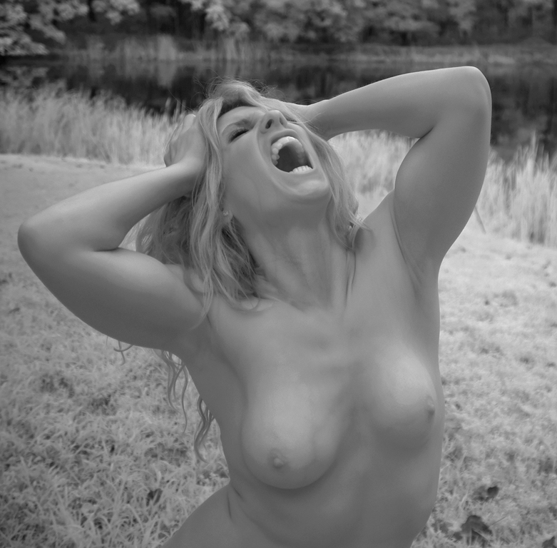
Hi Judith, Nicely done! You did several good photography moves that would make Ansel proud. You had a previsualization and made enough attempts with a trial-and-error technique to fulfill that visualization even with a distracting second tulip in the scene. You developed the image in post to really bring it to life and fulfill the visualization. The slight asymmetry provides a better composition by decentering the zoom point. The composition is also full of active triangles. Karl |
May 10th |
| 79 |
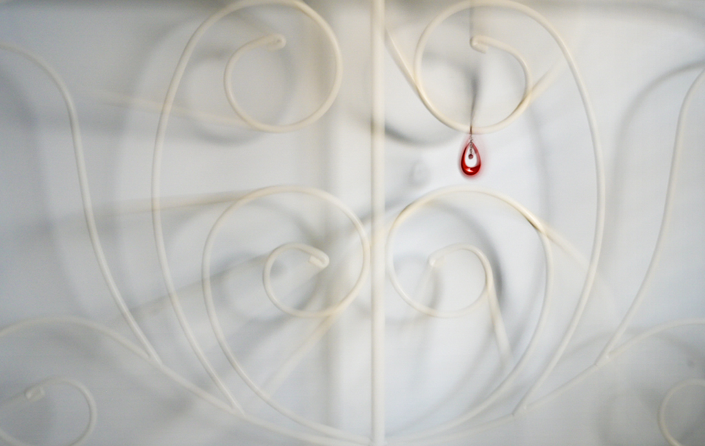
May 25 |
Comment |
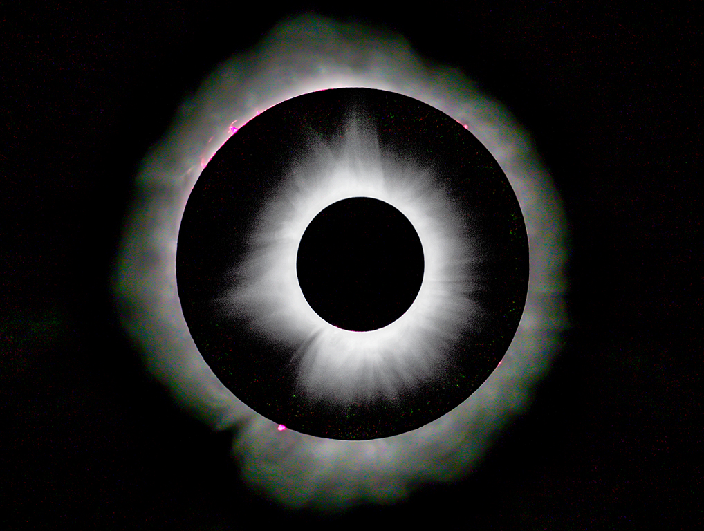
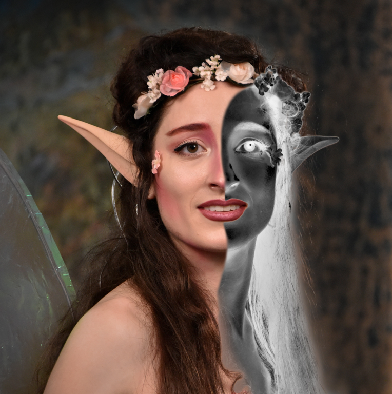
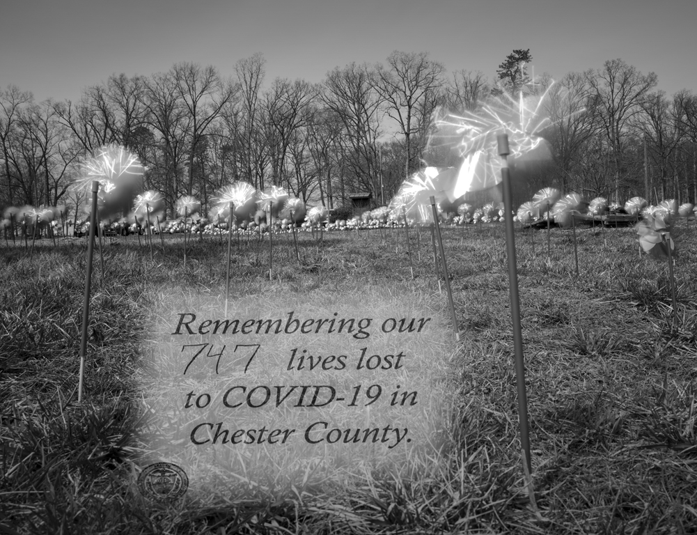
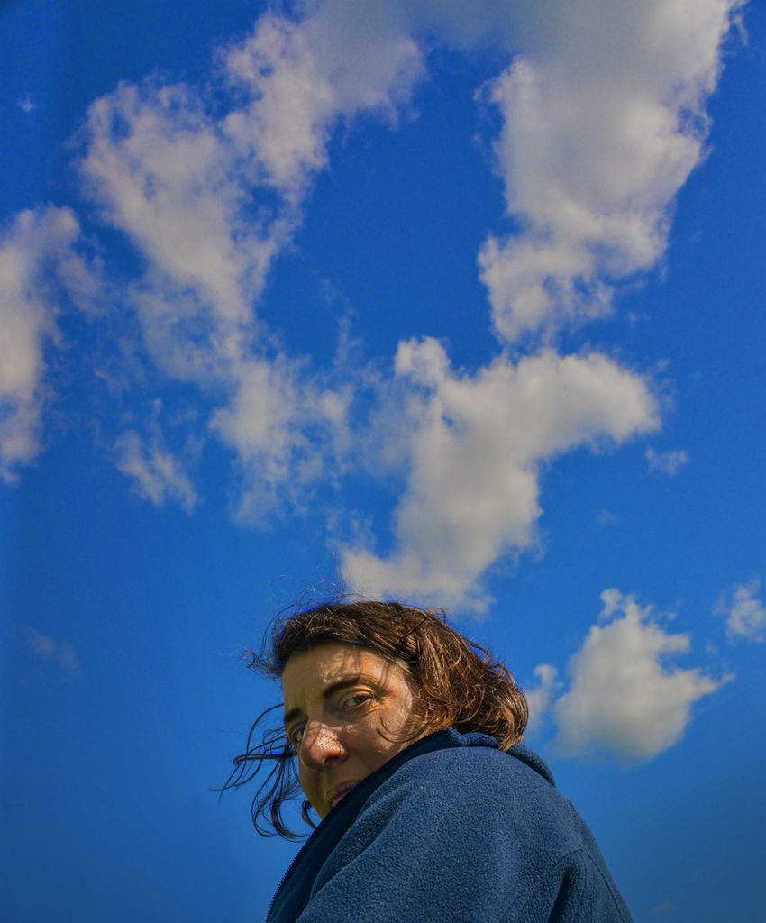
Hi Lauren, Pareidolia strikes again! Yes, it does look like an eye and the clouds really make the image effective. This image could stand out nicely in a competition full of routine slot canyon images. Karl |
May 10th |
| 79 |
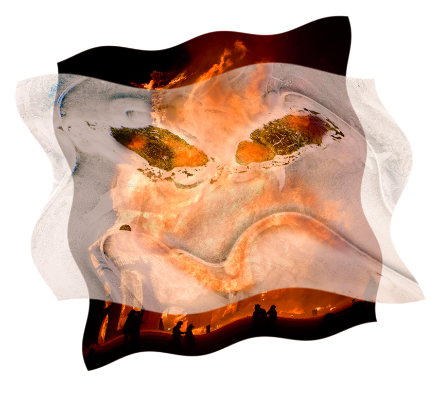
May 25 |
Comment |
Hi Hanoch, You have done a good job extracting the visitor from the original setting. The resulting high key image depends on how a viewer sees the remaining elements: ceiling, nearly centered person from behind, and floor. For me, the ceiling acts as containment of the person. Without it they could contemplate timeless infinity. Removing the museum items makes the image abstract, perhaps oversimplified to the point where a lot of possible meaning is lost. Since we see the figure from behind, can we assume they are looking at nothing or perhaps something beyond human senses? I'm having trouble finding meaning. Karl |
May 10th |
| 79 |
May 25 |
Comment |
Hi Peter, Post processing can help 'develop' an image to its best potential. Sometimes applying a tool to the overall image leaves artifacts in some areas. In this case, sharpening the bee works very well and makes it stand out nicely, but sharpening on the yellow area and bottom petals looks overdone. Partial masking of these areas would reduce or eliminate the oversharpening artifact look. Focus and exposure are fine. Post processing can help a lot, but needs to be carefully controlled to avoid a fake look. Karl |
May 8th |
| 79 |
May 25 |
Comment |
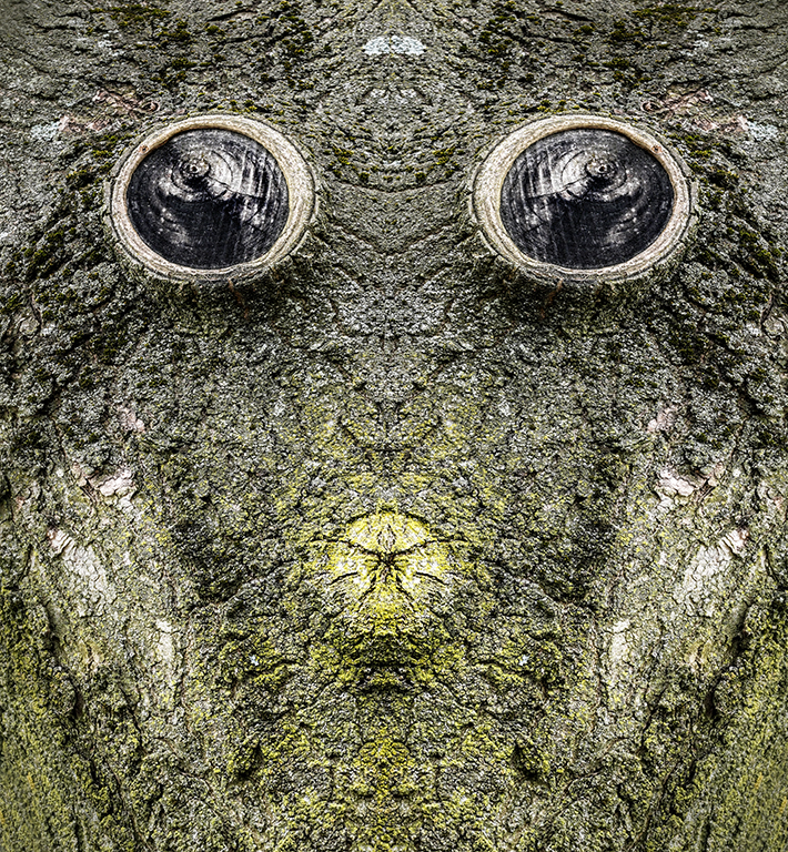
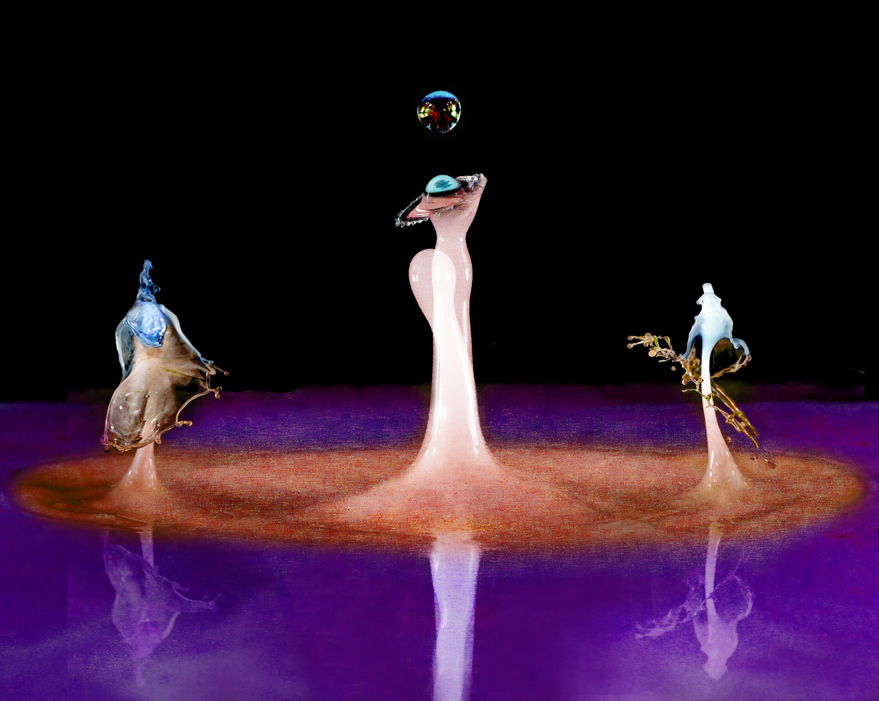
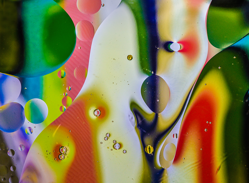
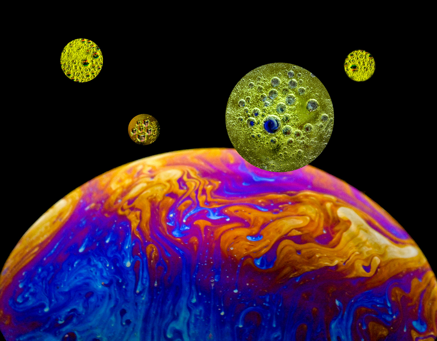
Hi Freddie, This abstract reflection is loaded with variation in shape, color, and sharpness/blur. The S-curve composition is pleasing. Looking at the image for a while brings out a sidewards glancing eye near the center. After noticing the eye, it becomes a subject reference point for exploring the image further. Like many abstracts, it can be turned in any direction to become a visually different image. Very interesting. Karl |
May 8th |
5 comments - 3 replies for Group 79
|
6 comments - 4 replies Total
|