|
| Group |
Round |
C/R |
Comment |
Date |
Image |
| 79 |
Feb 24 |
Reply |
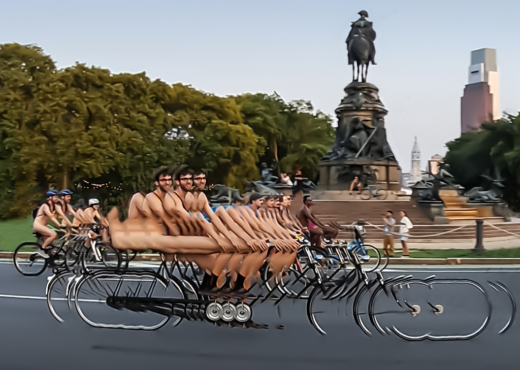
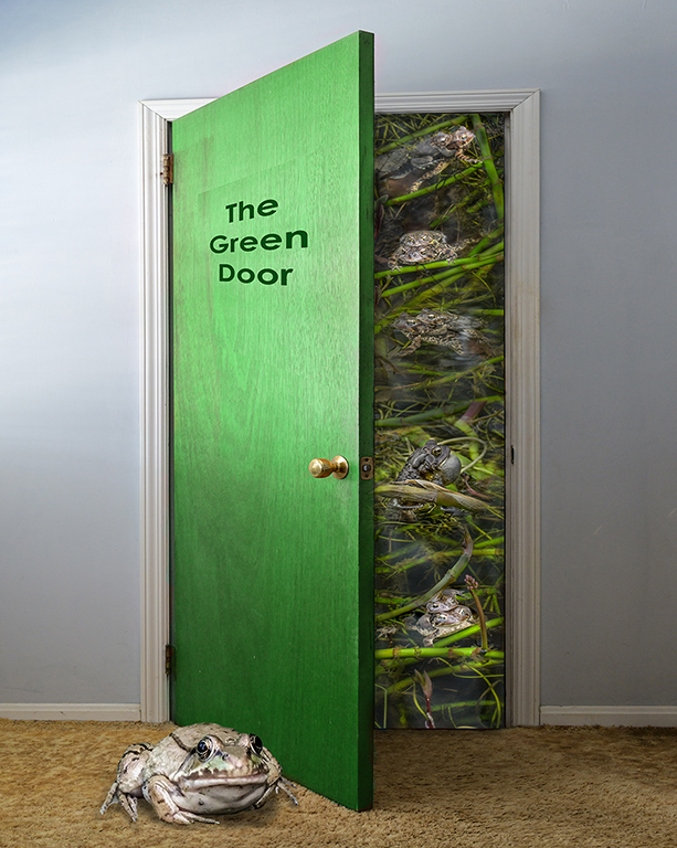
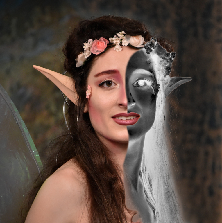
Judith, What an imagination you have! I thought Vitruvian Man was a long-legged insect. Karl |
Feb 18th |
| 79 |
Feb 24 |
Reply |
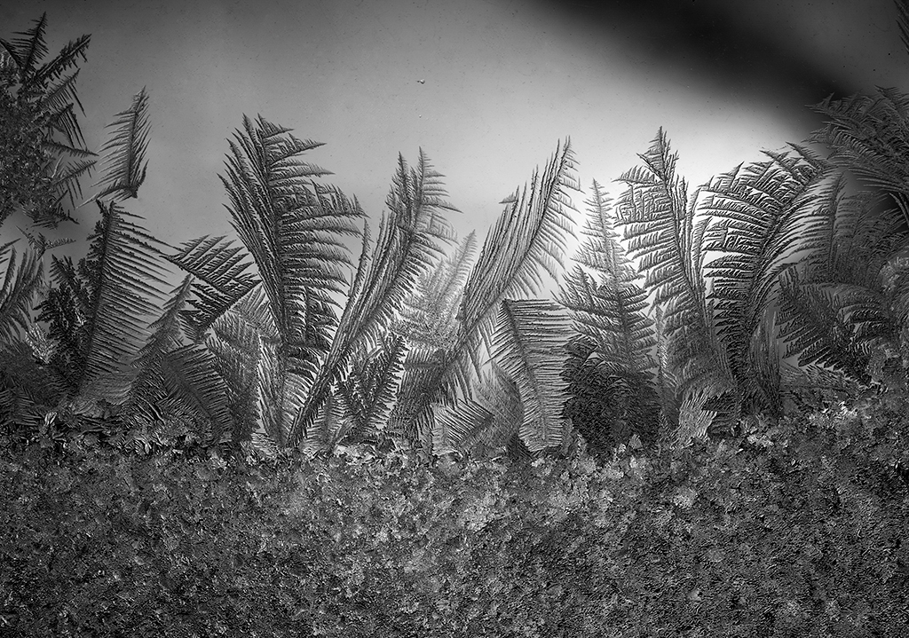
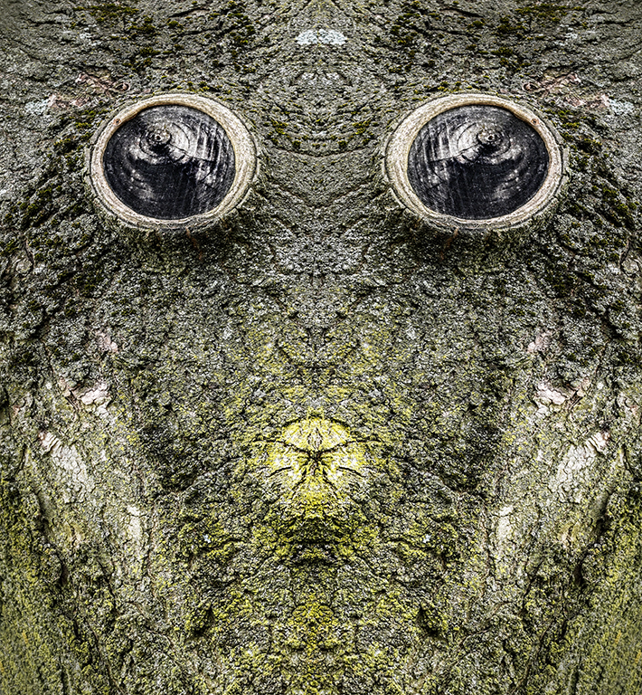
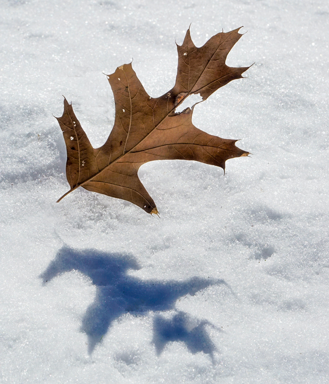
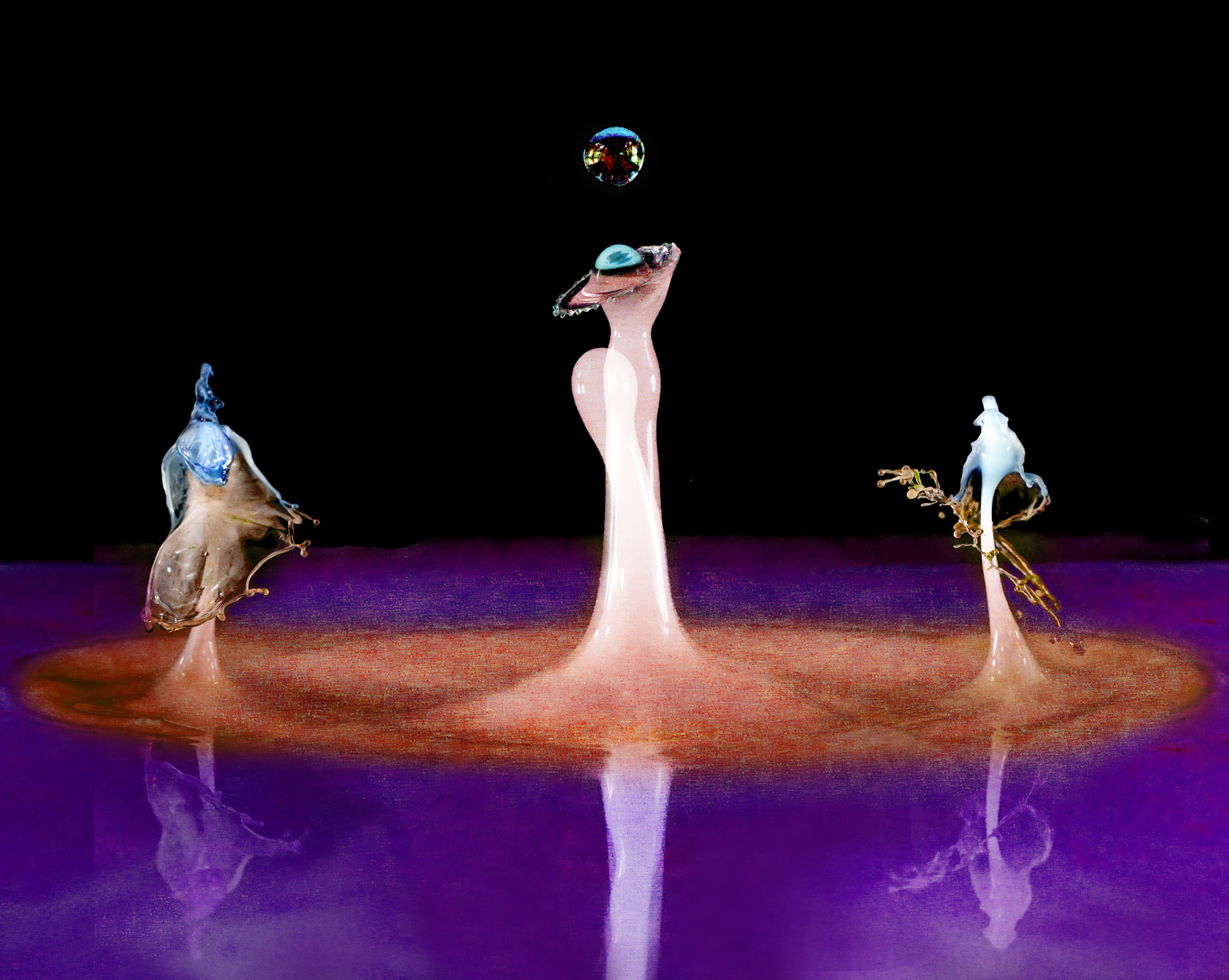
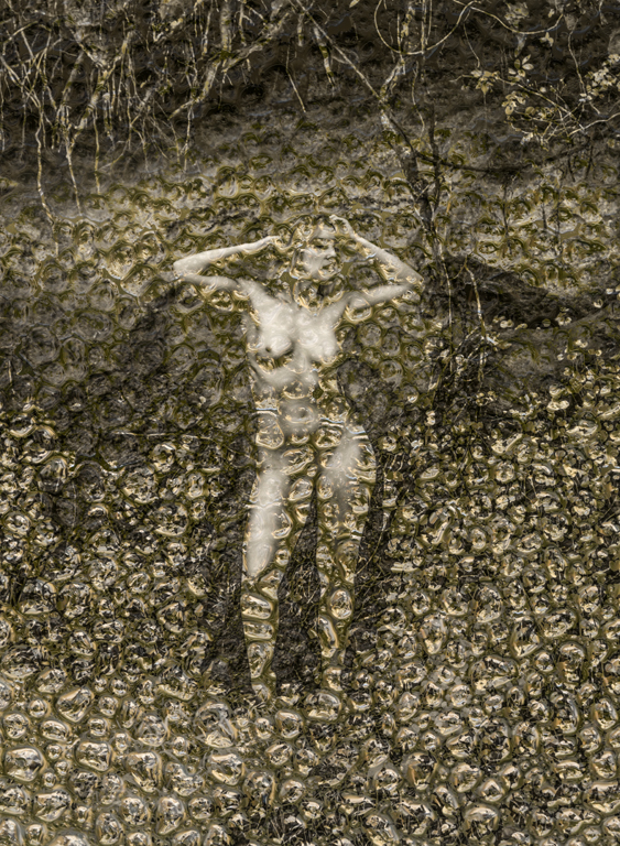
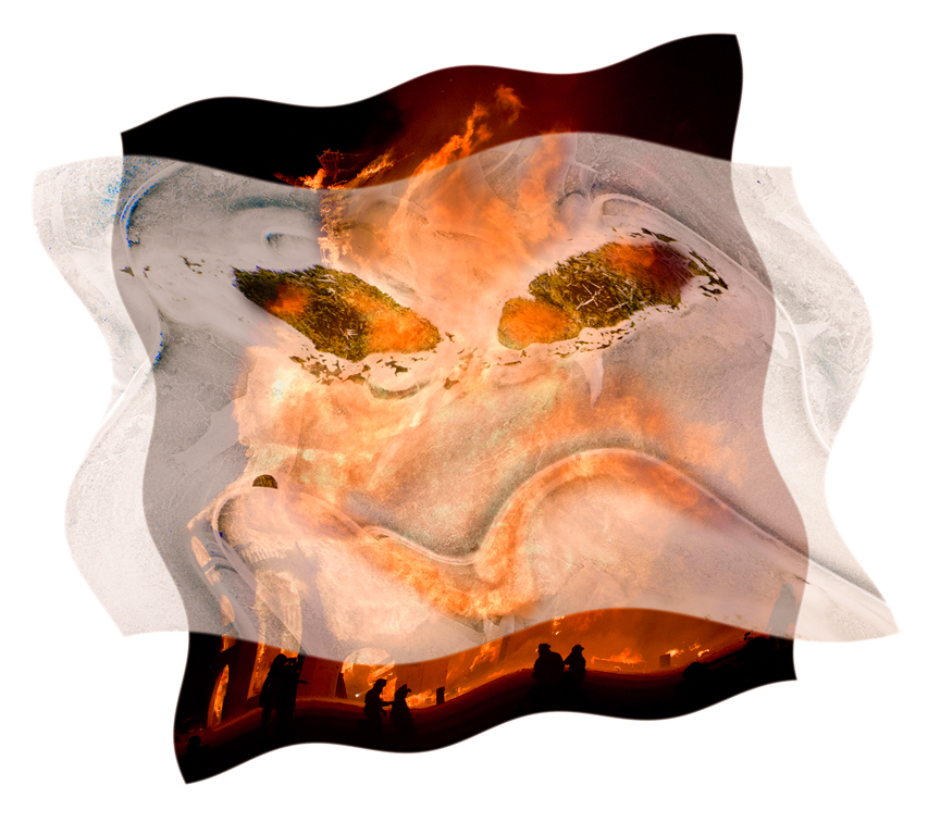
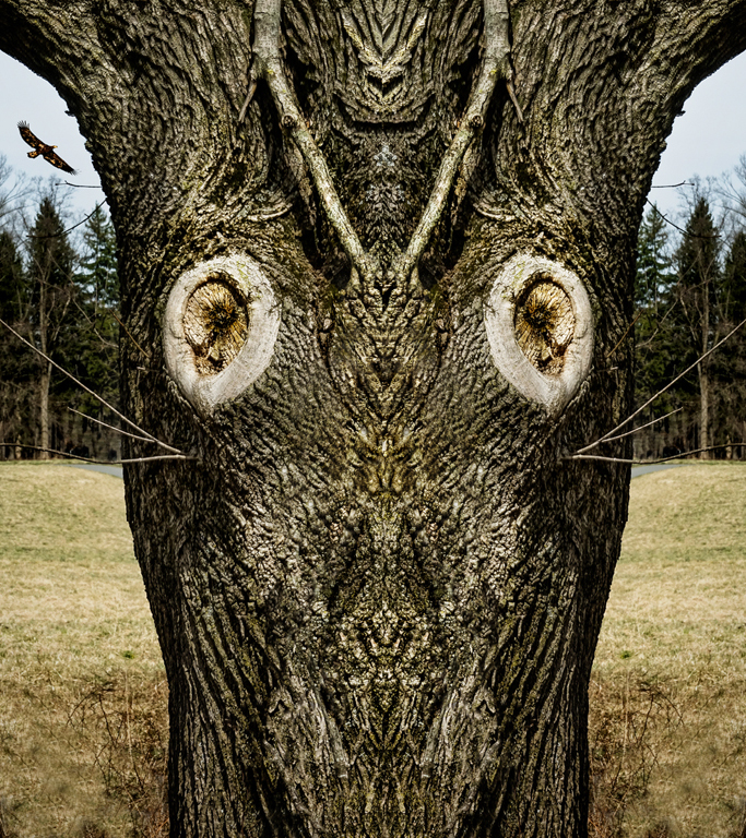
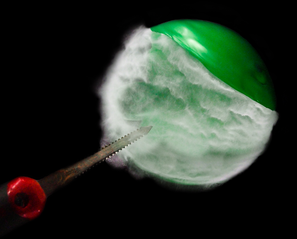
The flipping is not necessary in that this is already interesting for the reasons you cite. The flipping added some new aspects such as the horned face with tongue out at the center holding a cracked ball. There are also more subtle, smaller faces on the centerline at the top and bottom. Or at least that's what I perceived in what is just tree bark. Karl |
Feb 12th |
| 79 |
Feb 24 |
Comment |
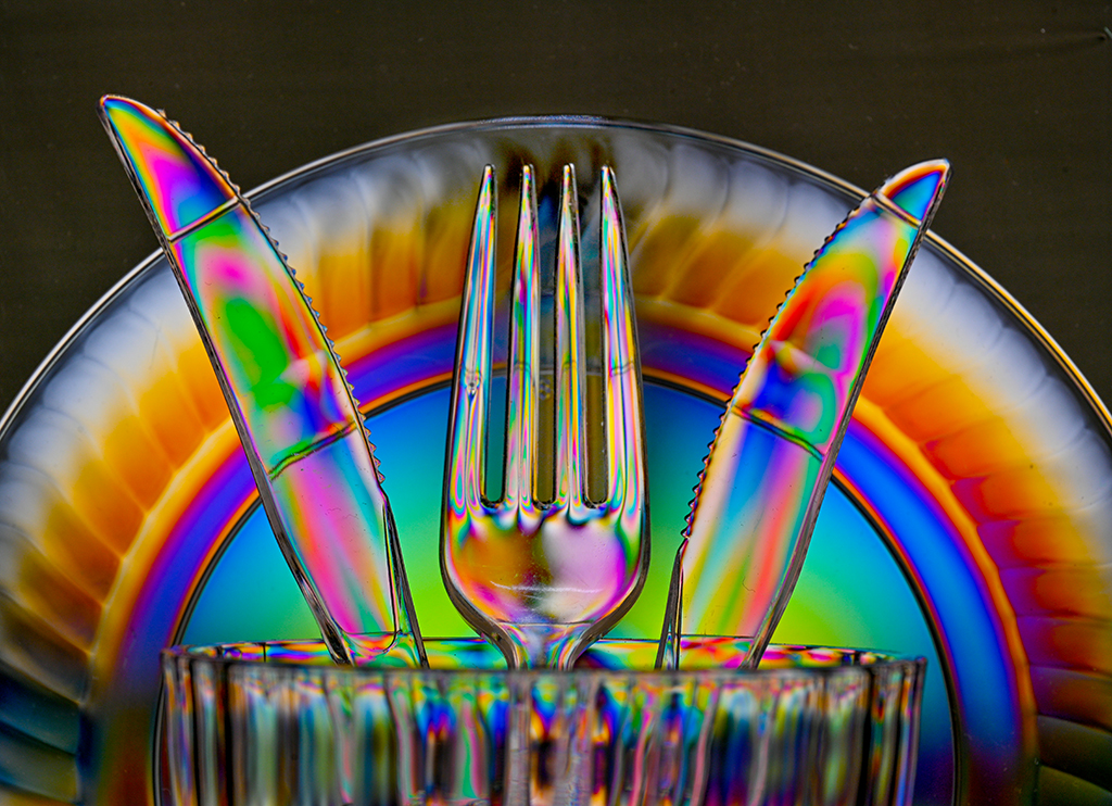
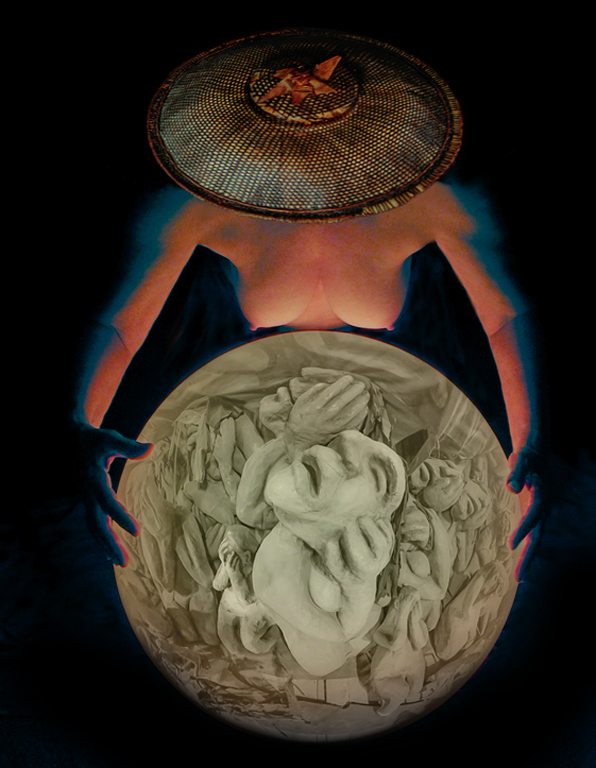
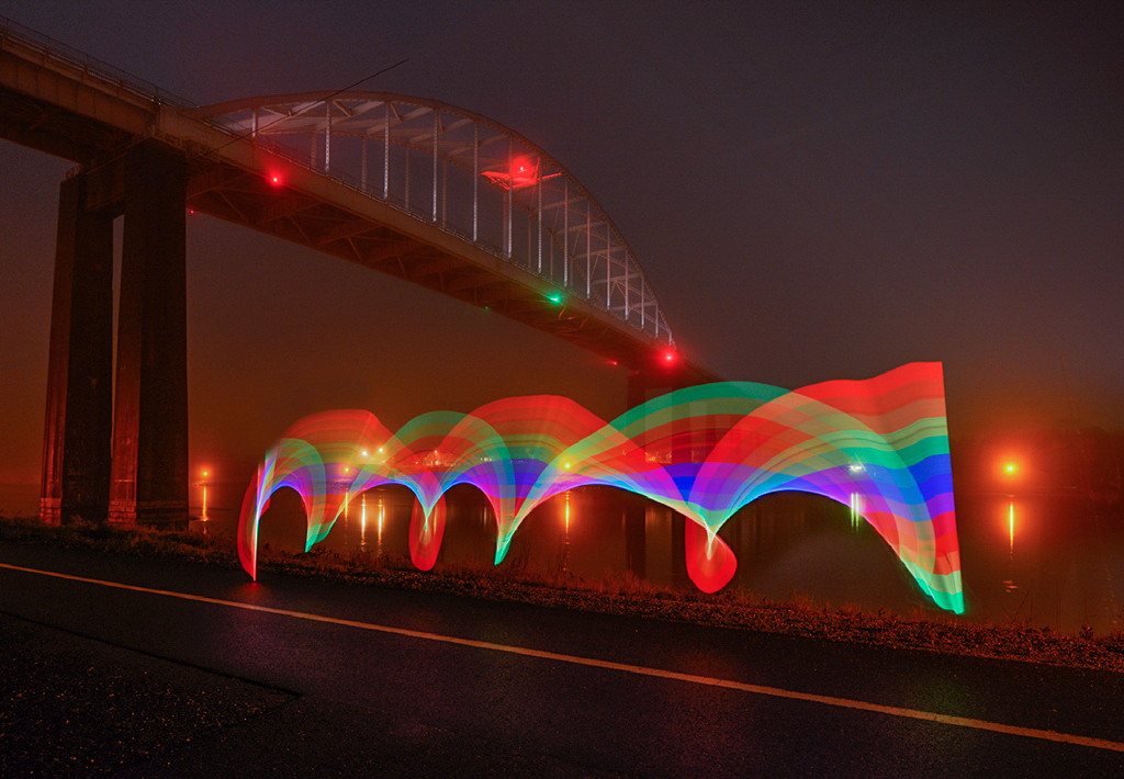
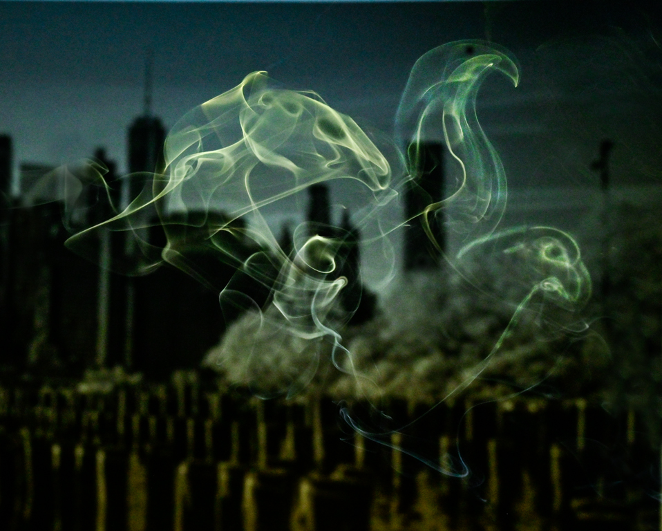
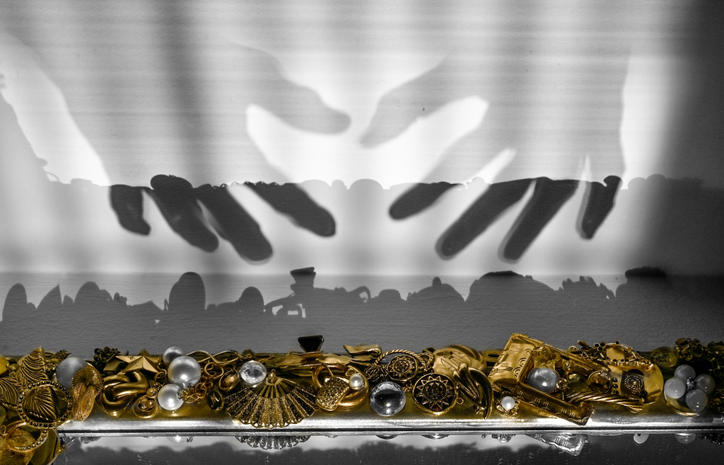
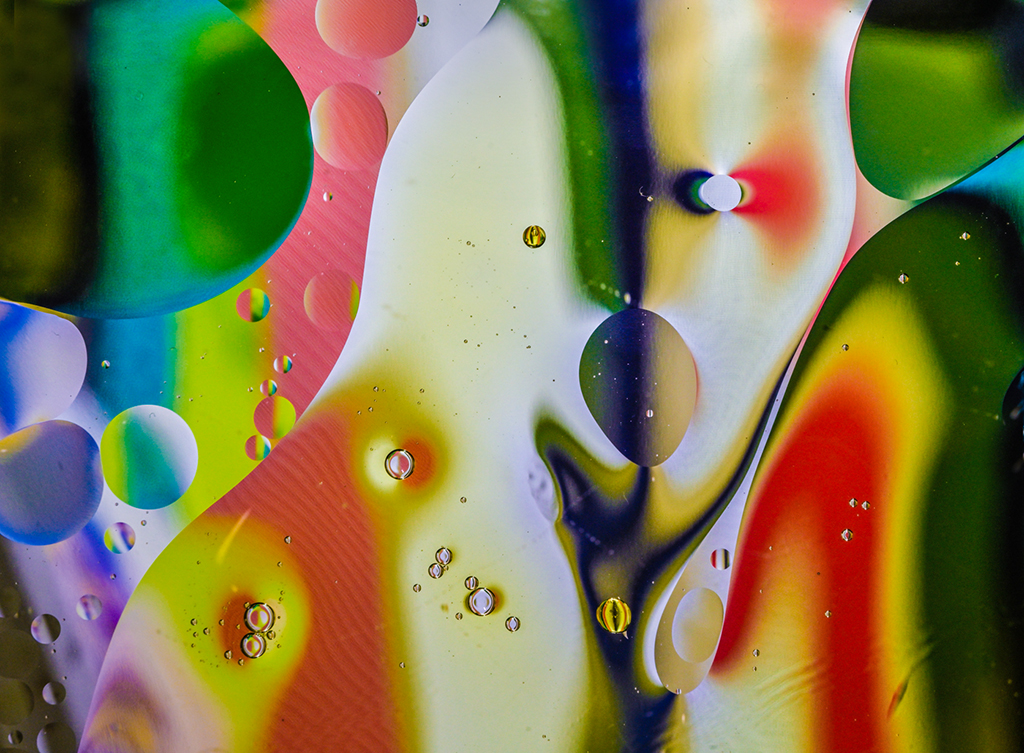
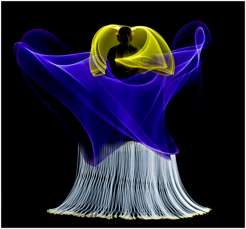
Hi Lauren, Very good technique. The focus stacking resulted in an image where the varying closeness of sharp lines, not focus, gave the feeling of depth. Is this the hidden construct of the universe complete with black holes? It looks like an amazing piece of art to photograph. I think there is a difference between a person's artistic vision and interpretation in materials, and something synthesized by algorithms from a library of manmade items. Karl |
Feb 7th |
| 79 |
Feb 24 |
Comment |
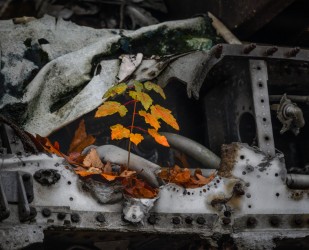
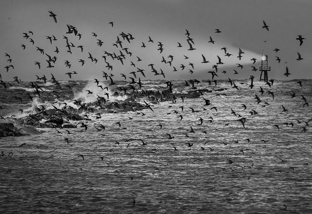
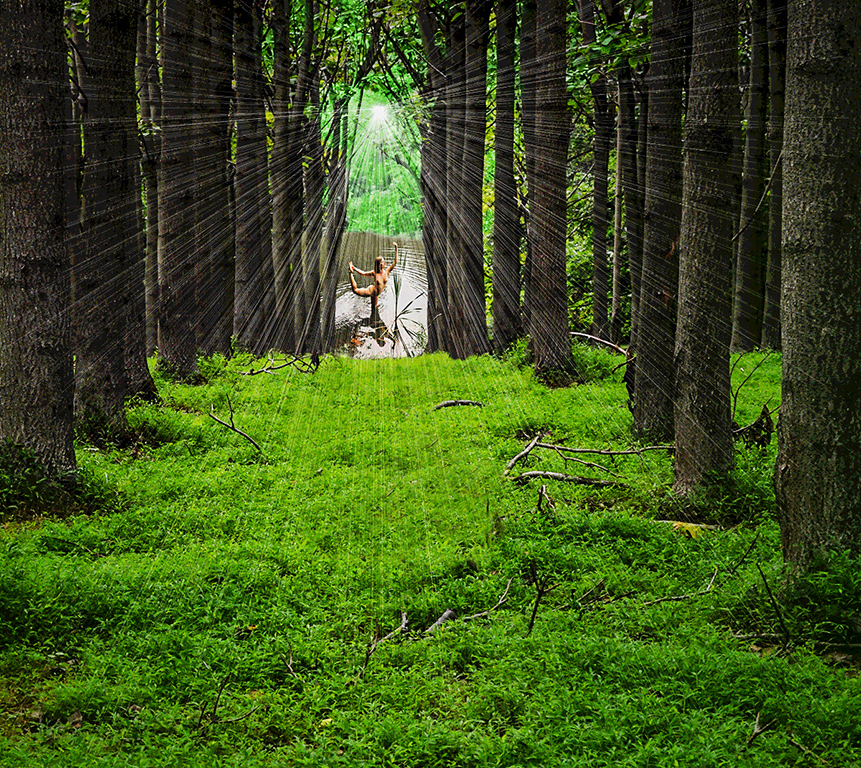
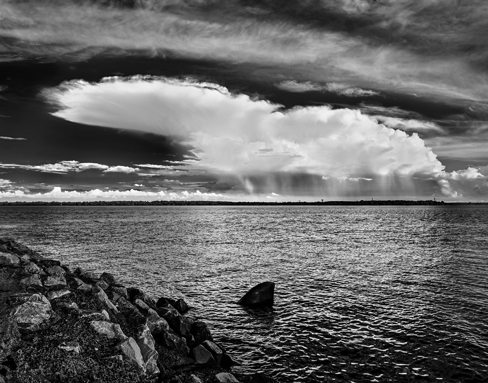
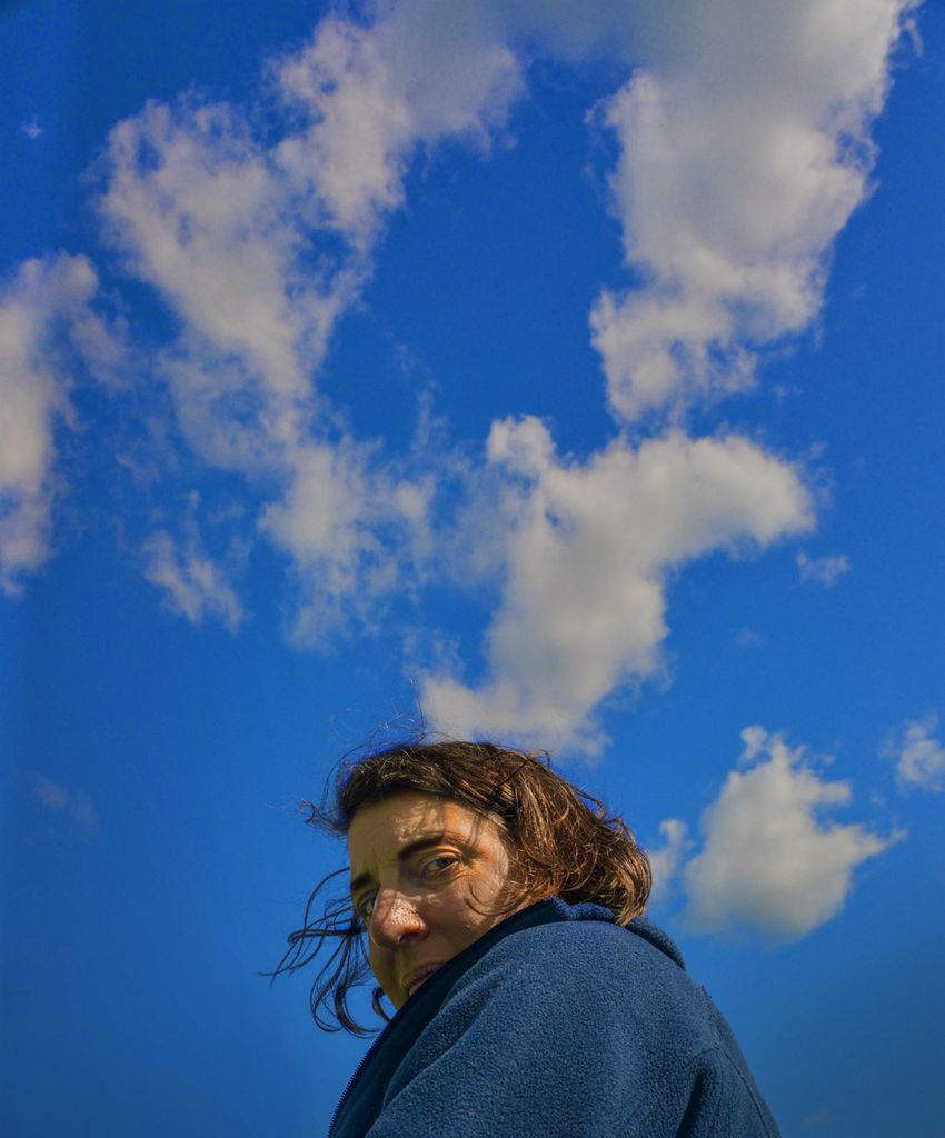
Hi Mariann, I agree that the rocks at lower left are distracting and should be cloned or 'healed' out. The cropping is great! You found a good composition in this scene. I think your interpretation of the water and clouds is very good. I wouldn't change them as they are just the background for the lines, post and bird subjects. The image has the feeling of a seaside overcast day.
Karl |
Feb 7th |
| 79 |
Feb 24 |
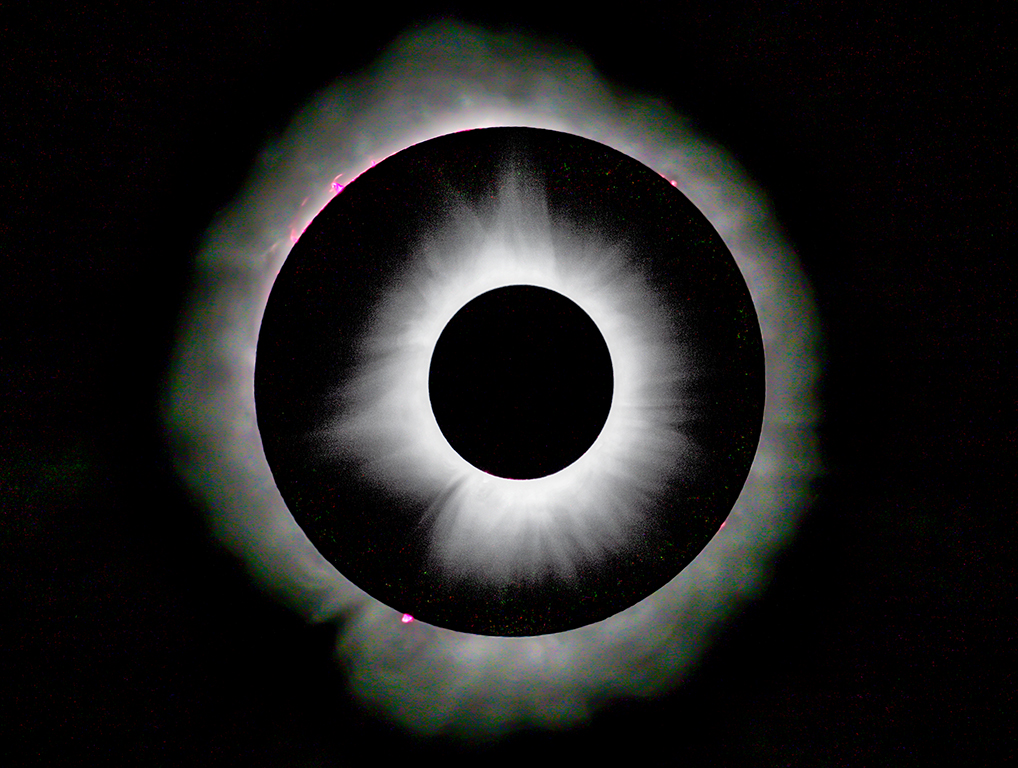
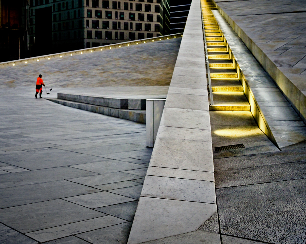
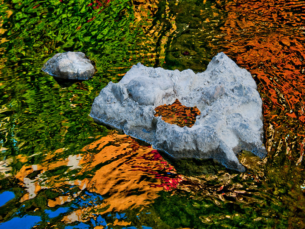
Comment |
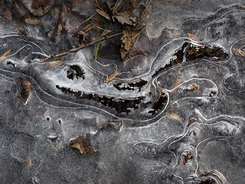
Hi Gerard, This is certainly one of the planet's more interesting pieces of pavement. While tour guides may add water to bring out the image, increasing contrast in post processing made it more dramatic. About 10-15% could be cropped off the right side. How about flipping it left to right? I know that wasn't how it is on the pavement, but the image is already modified by water and post processing. I think the composition reads better in a flipped image.
Karl |
Feb 7th |
| 79 |
Feb 24 |
Comment |
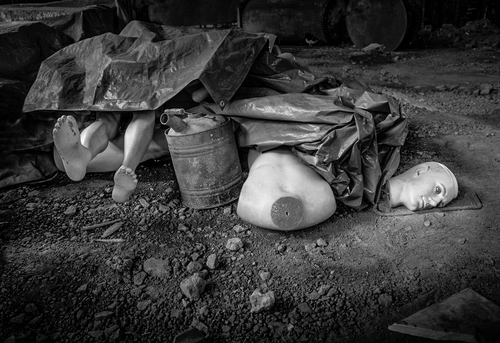
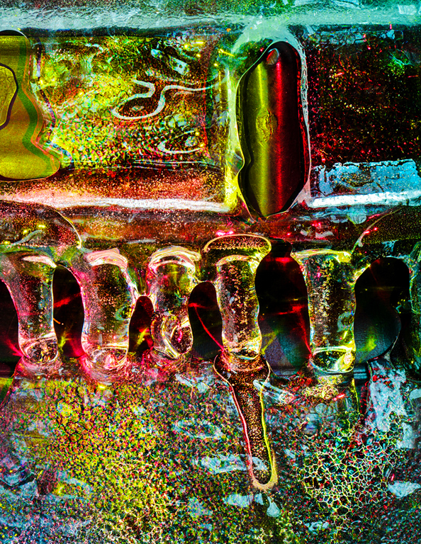
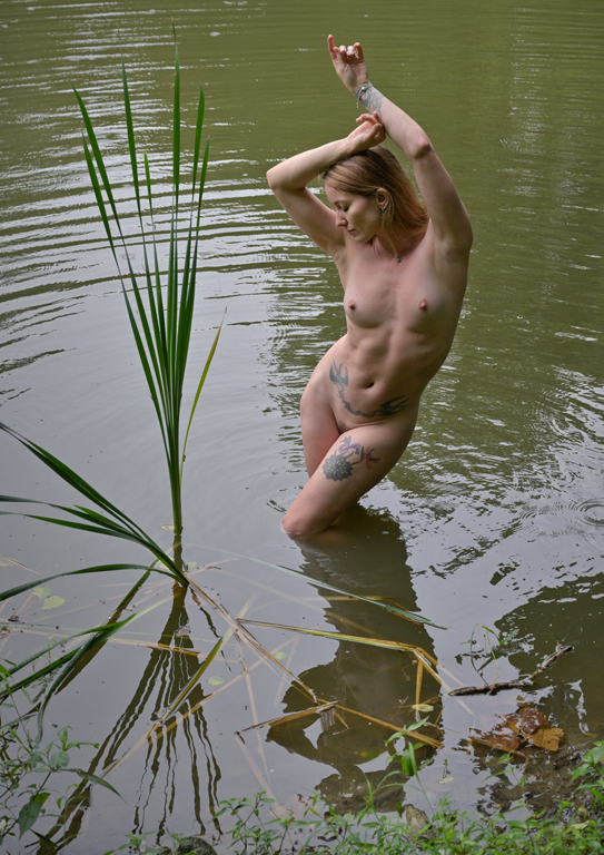
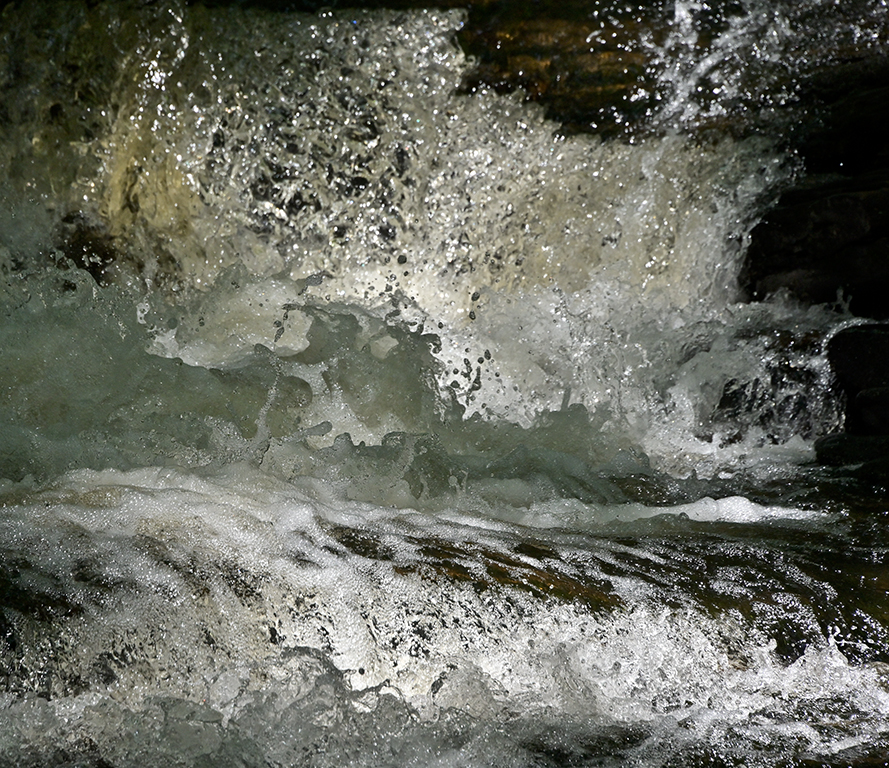
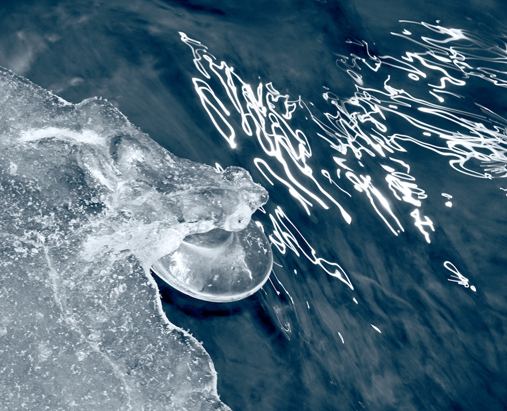
Hi Peter, I'm glad you survived the rocks. I've fallen a few times and lost or dunked cameras. We need to be extra cautious sometimes.
The image has been taken out of the realm of continuous tone photography in post processing. The rock texture is exaggerated and has reduced tonal range. Borders have white halos. My aesthetic places this in the realm of artistic illustration. Was that the intention? If so, the image succeeds. If not, it looks over processed.
The long exposure water smoothing works well here.
Karl |
Feb 7th |
| 79 |
Feb 24 |
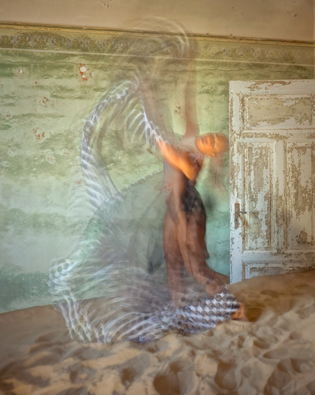
Comment |
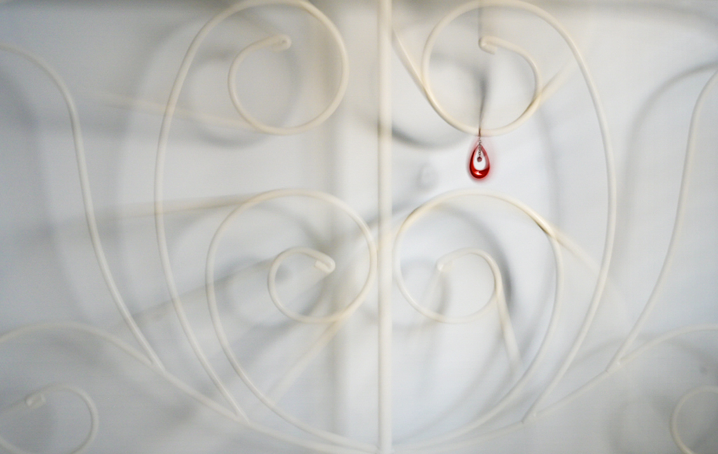
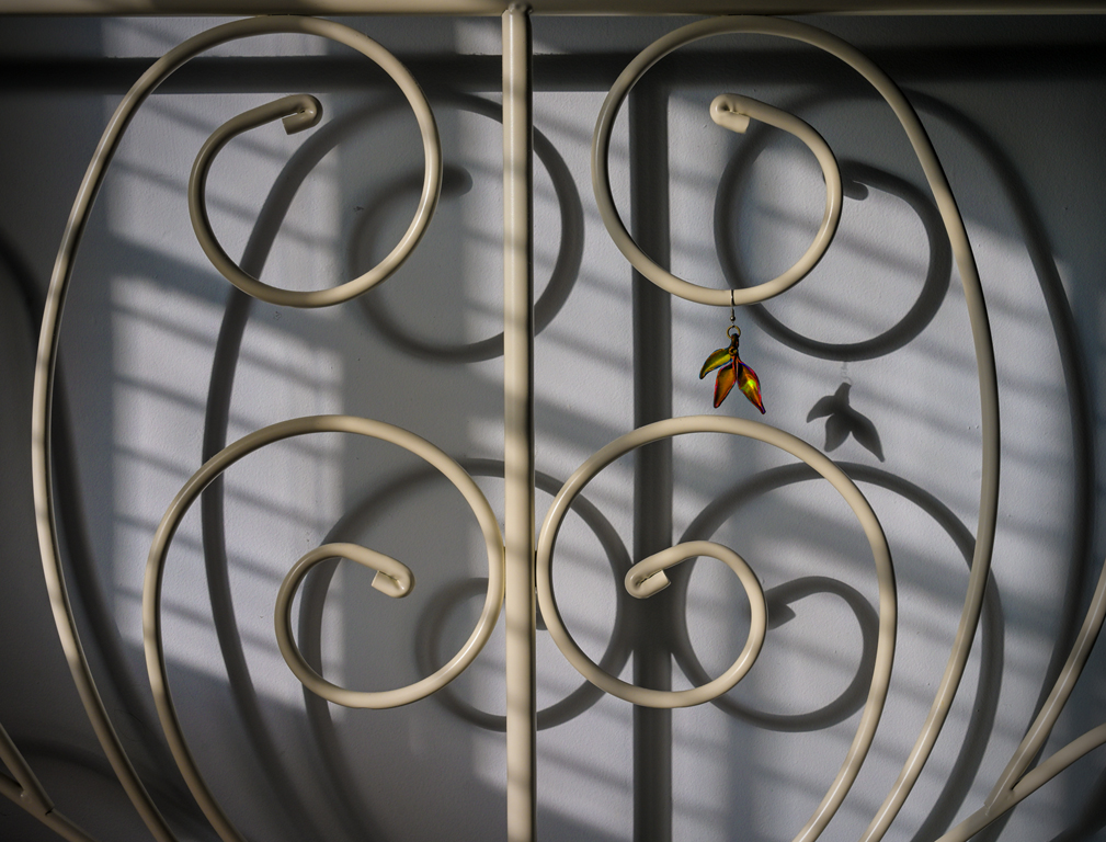
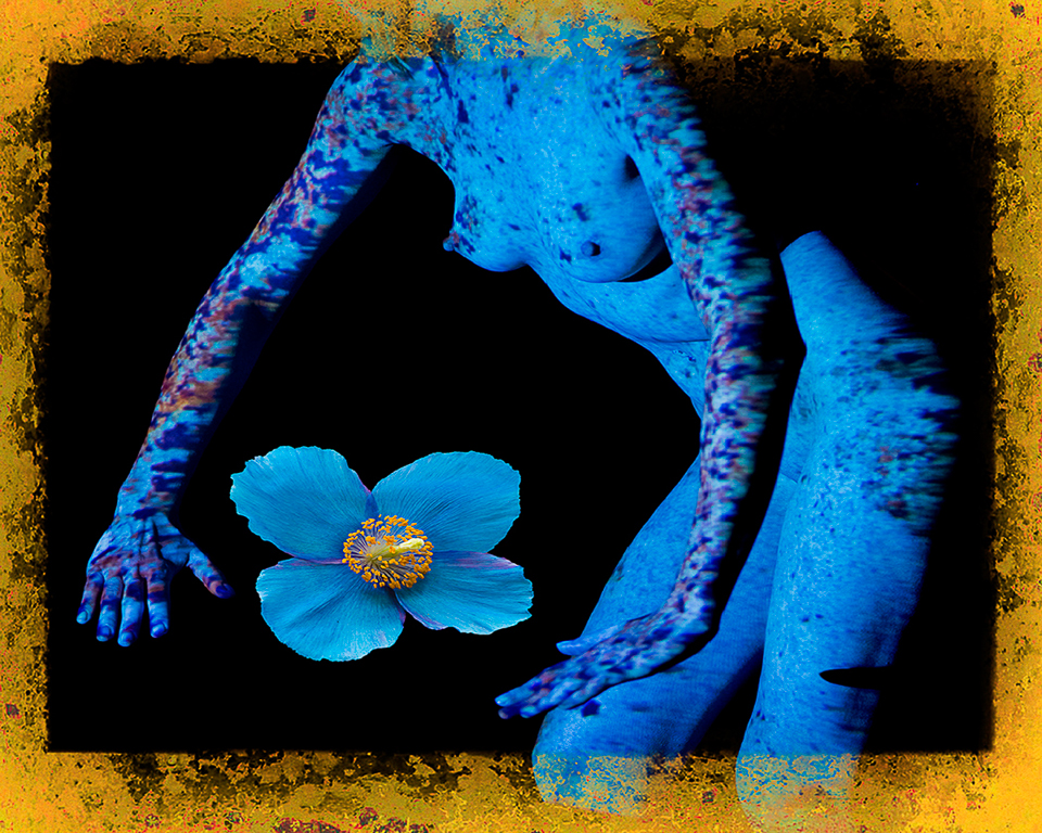
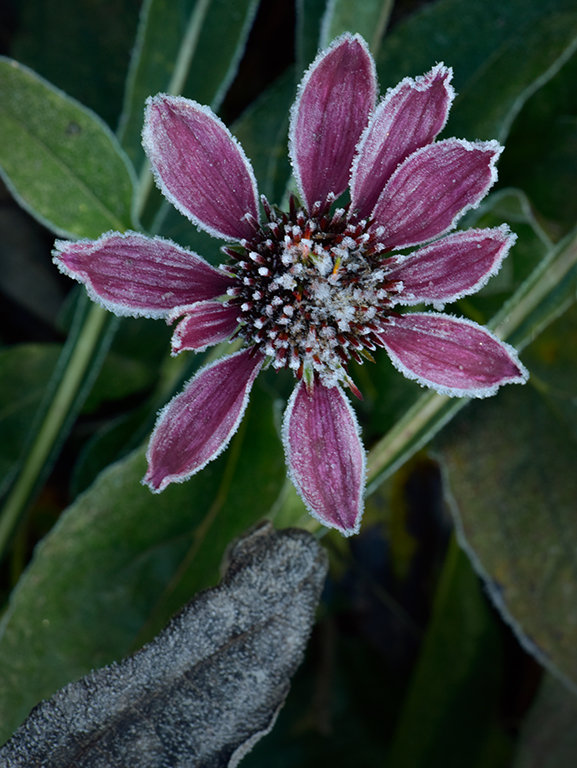
Hi Judith, Your interpretation is reminiscent of the Kodalith process used by Wellington Lee and others in PSA print exhibitions in the mid-20th century. The results are high contrast, little or no gray scale, and simplistic composition. I'm not sure a minimalist artist would paint the pods hanging horizontally as if in the wind although that is an interesting, new interpretation. For my eyes, I'd prefer the pods hanging down. The handmade border fits the image well. The left side (or bottom if re-oriented) has a bit too much negative space. Thank you for bringing back high contrast monochrome. Karl |
Feb 7th |
5 comments - 2 replies for Group 79
|
5 comments - 2 replies Total
|