|
| Group |
Round |
C/R |
Comment |
Date |
Image |
| 79 |
Jul 23 |
Reply |
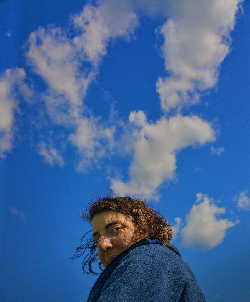
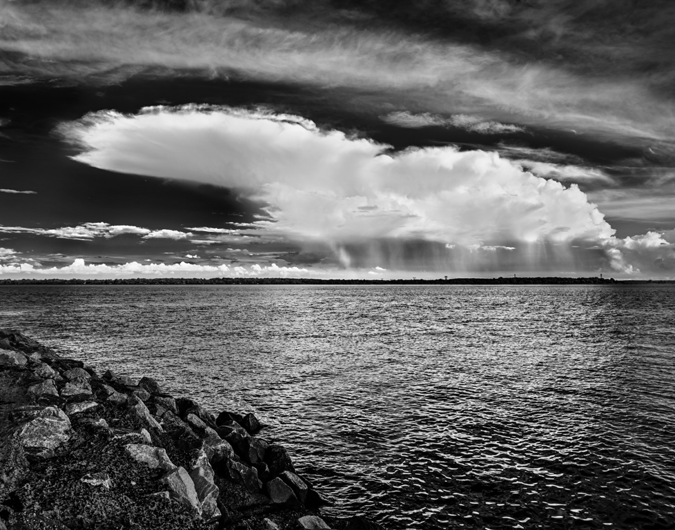
Hi Gerard, I like the idea of additional brightness near the horizon. It helps emphasize the cloud. The angled strip doesn't fit my style. I would prefer gradient darkening of the lower right corner to create a more triangular composition. Thank you for the great suggestions. It's really nice to have thoughtful viewers. Karl |
Jul 15th |
| 79 |
Jul 23 |
Reply |
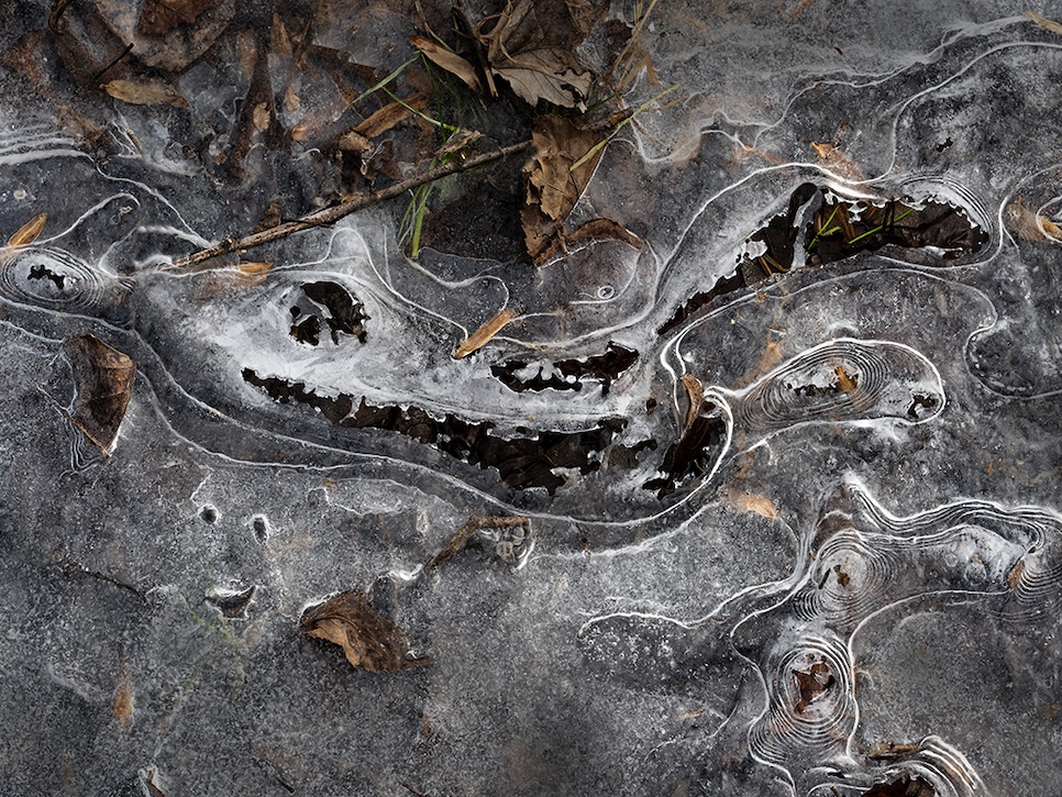
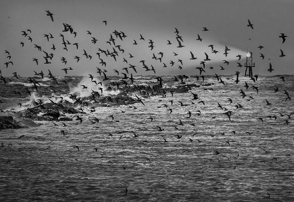
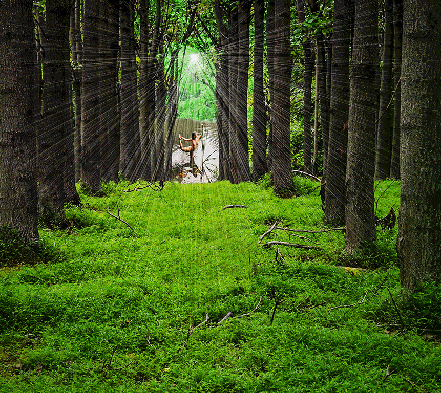
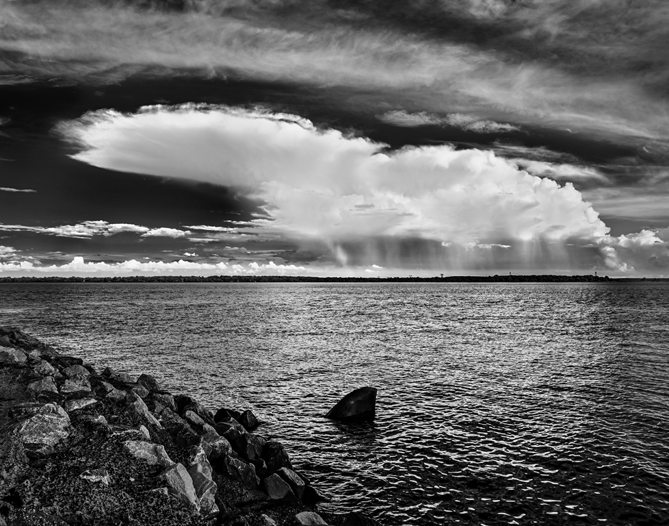
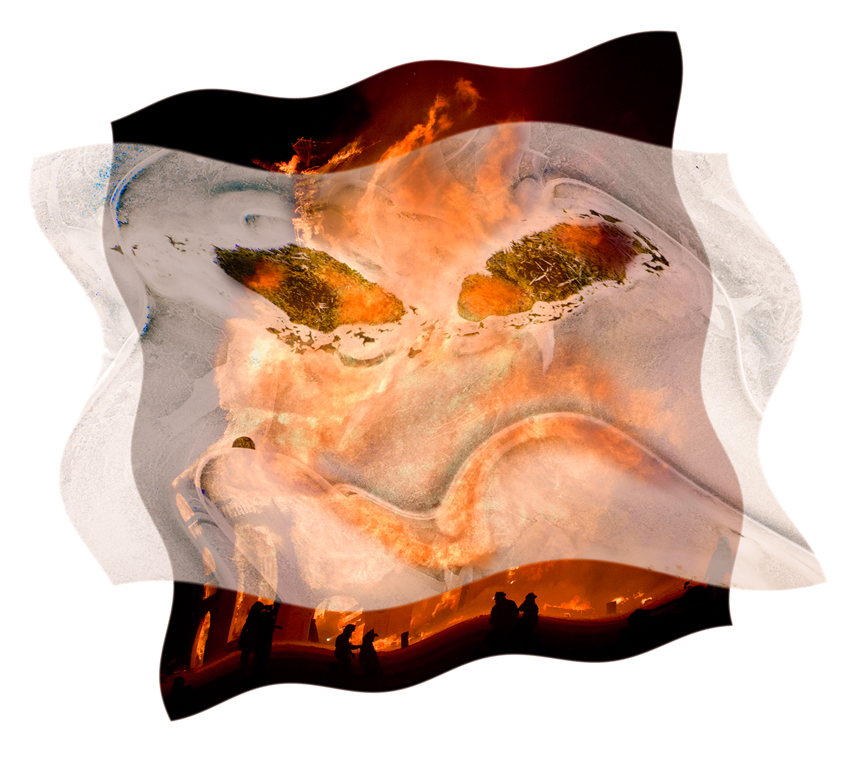
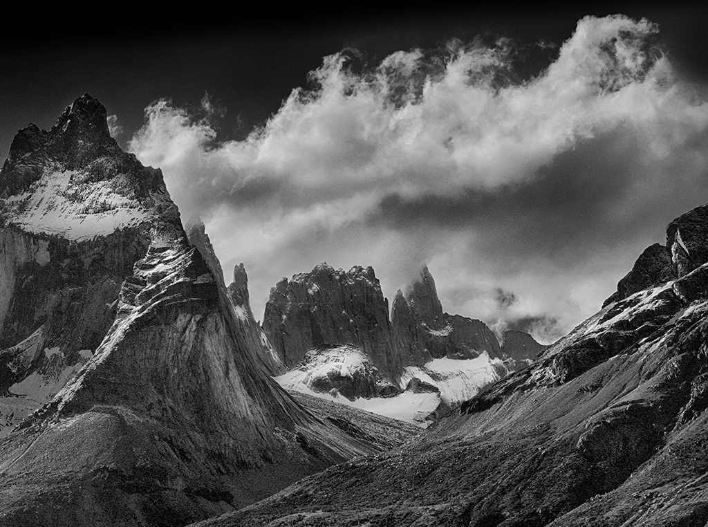
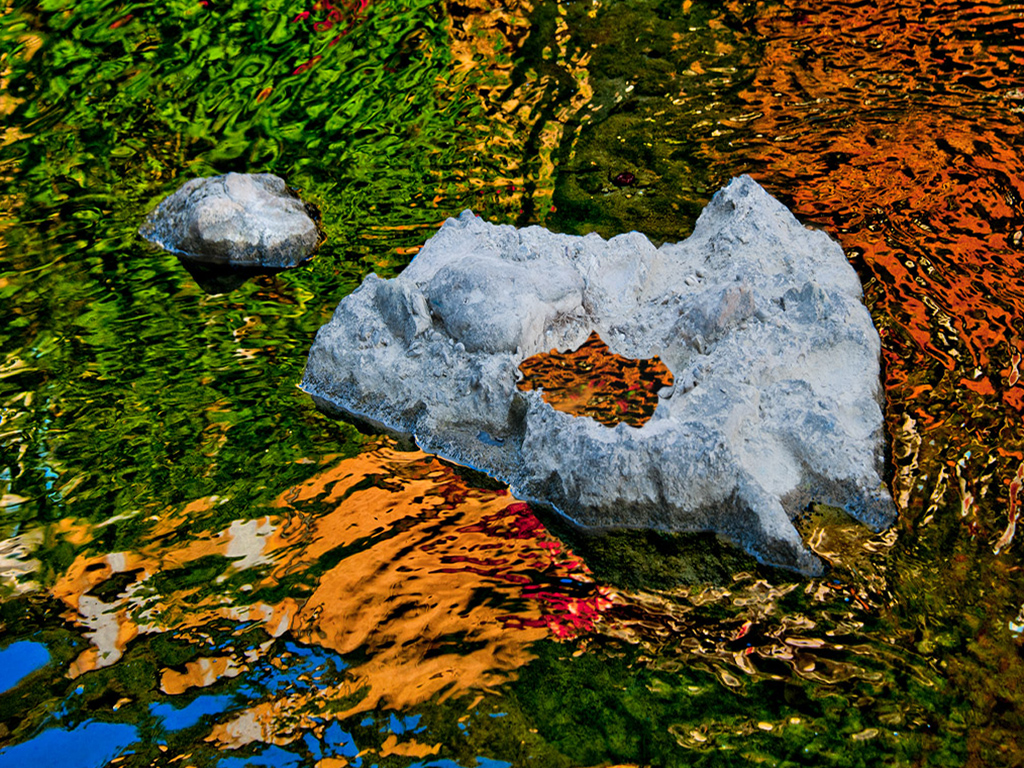
Cropping off the bottom third to make a pano would certainly emphasize the cloud better and produce a cleaner image. I tend to have questionable details (e.g. the object in the water) in some of my images just to see if the viewer notices and possibly to disturb them even though it will confuse judges. I enjoy ambiguity. Karl |
Jul 14th |
| 79 |
Jul 23 |
Reply |
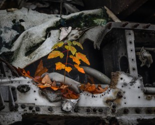
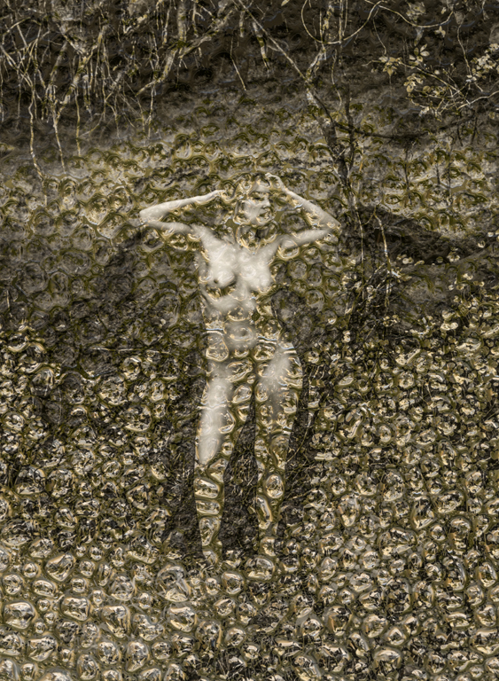
Here is the finless version. The exhibit is at the Kennett Area Senior Center in Kennett Square. It's a collection of weather images by members of the Center's Photo Group and includes rain, snow, lightning, and rainbows. No one had tornado pictures. |
Jul 10th |
 |
| 79 |
Jul 23 |
Comment |
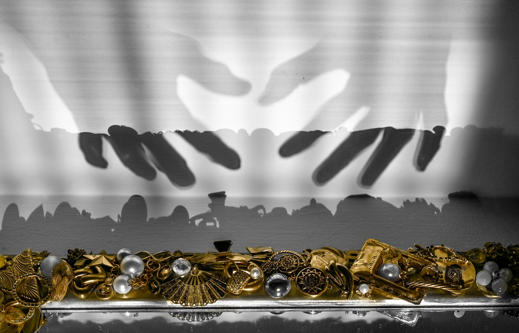
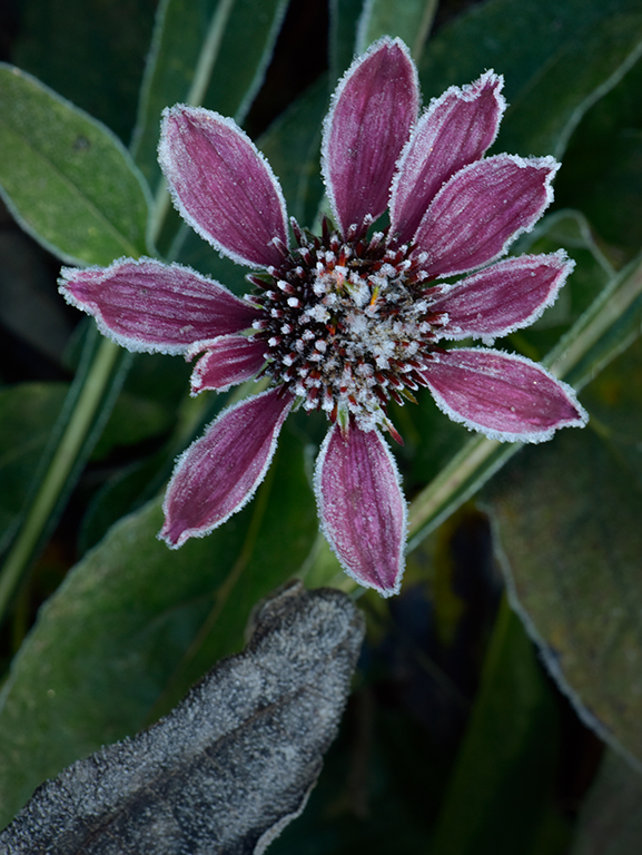
Hi Lauren, I sense some noise artifacts in the image. Correcting it is tricky because you don't want obvious clumps, loss of detail, or contrast lines. This image is pushing toward those things. You didn't specify the camera sensor resolution or the noise reduction that may have been used. On my screen, the greens seem a bit over saturated. This is a subtly shaded scene. Preserving realistic color and shading in the current world of extremes will produce images that gain appreciation over time instead of the current fadish results. Sorry for the soapbox talk.
After all that, I decided on a monochrome conversion in Elements with a bit of gradient at the top and bottom left corner. For me, the tones of the scene are better served without color. Karl |
Jul 8th |
 |
| 79 |
Jul 23 |
Comment |
Hi Freddie, Great interpretation of warm/cool tones. TheIt has a dimensional feeling that I want to rub my hand over. I like the result as-is, but also note as Peter did, that there can be infinite variations. As far as printing goes, I would have it done on gloss aluminum. Karl |
Jul 8th |
| 79 |
Jul 23 |
Comment |
Hi Liz, The monochrome conversion is well made resulting in excellent tonality. I echo Lauren's comments on perspective and cropping from the top a bit. Nicely composed with good texture everywhere. Karl |
Jul 8th |
| 79 |
Jul 23 |
Comment |
I like the original concept of a sharp center and blurred petals which takes it out of the 'record' shot category. The more asymmetric crop of Peter's version is more pleasing. Great discussion! Karl |
Jul 8th |
| 79 |
Jul 23 |
Comment |
Hi Peter, An excellent derivation! The angle gives character to the chicks. Creating an all black background makes them stand out like glass sculpture in a museum. I agree with Lauren that the image has a very transparent/translucent look. I like the colors. Very original. Karl |
Jul 8th |
| 79 |
Jul 23 |
Comment |
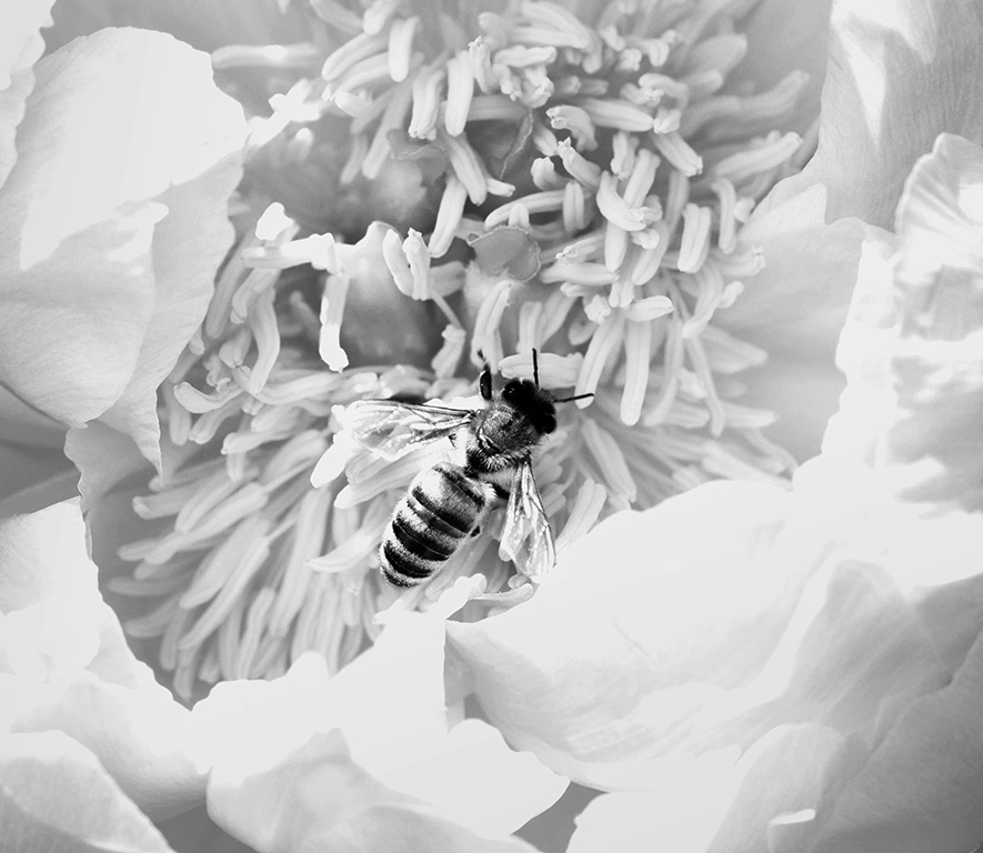
Hi Judith, I like the idea of going to monochrome here to emphasize the texture. I gave it a go and concentrated on cloning the right wing to the left side since it is difficult to see the left wing. The image was converted to B&W in Elements using 'landscape' style, then decreasing red and increasing green (for the yellow). In Levels I decreased background contrast and eliminated pure black there. In a brightness/contrast layer masked just for the bee, I increased contrast. The idea was to slightly increase the bee's prominence. Finally, I cropped it about the same as you did. Karl |
Jul 8th |
 |
| 79 |
Jul 23 |
Reply |
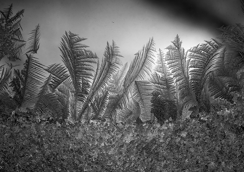
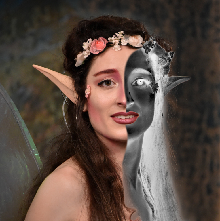
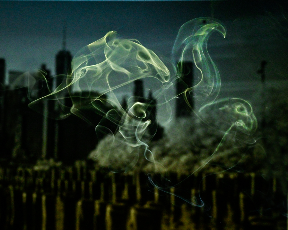
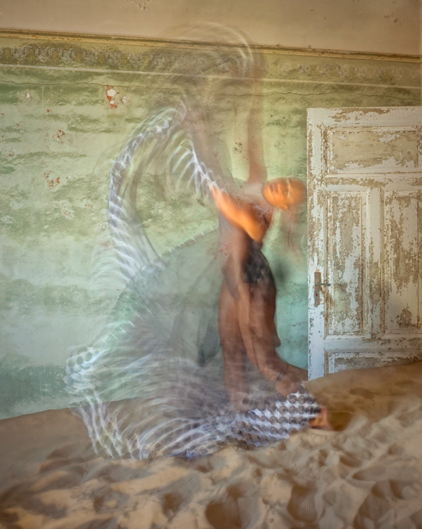
Hi Lauren, I like IR for black & white tonality. I have a camera that has all filtration removed so I can do color + IR. I've done some but the results seem graphic, not photographic. I would be happy in a monochrome group. The object in the water is a strainer on a storm water effluent. I liked its shape, but it is a visual distraction. I removed it in another version that is now in an exhibit about 'Weather'. Karl |
Jul 8th |
6 comments - 5 replies for Group 79
|
6 comments - 5 replies Total
|