|
| Group |
Round |
C/R |
Comment |
Date |
Image |
| 79 |
Jun 23 |
Reply |
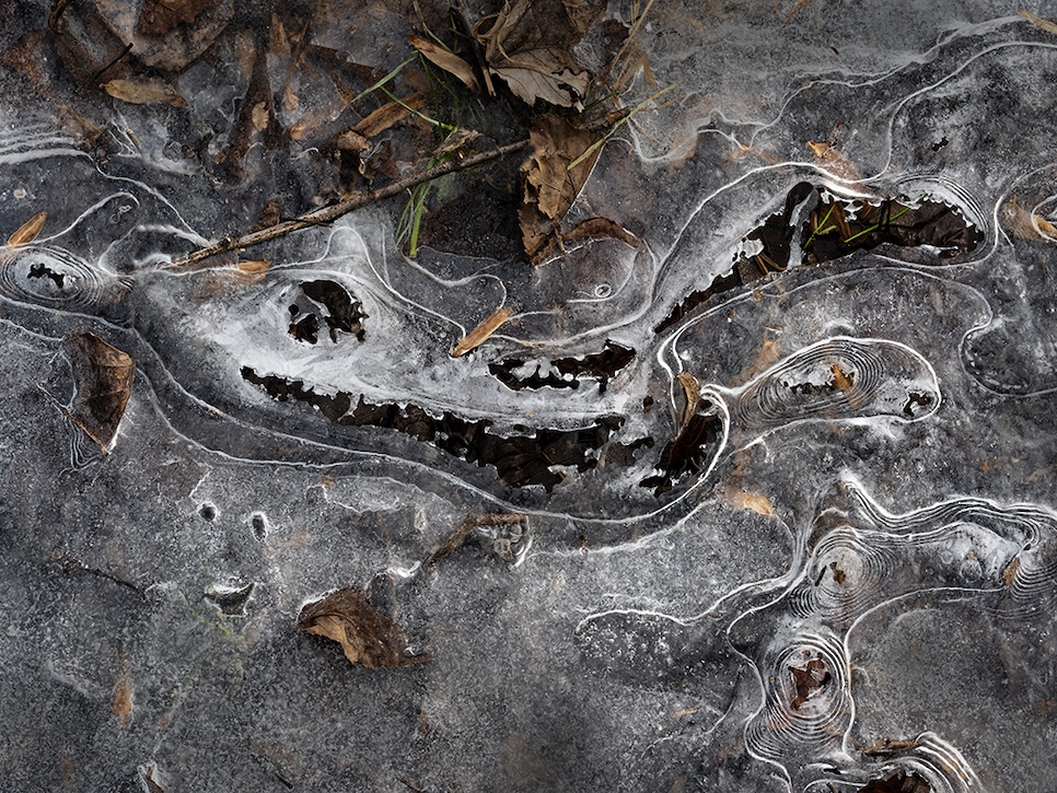
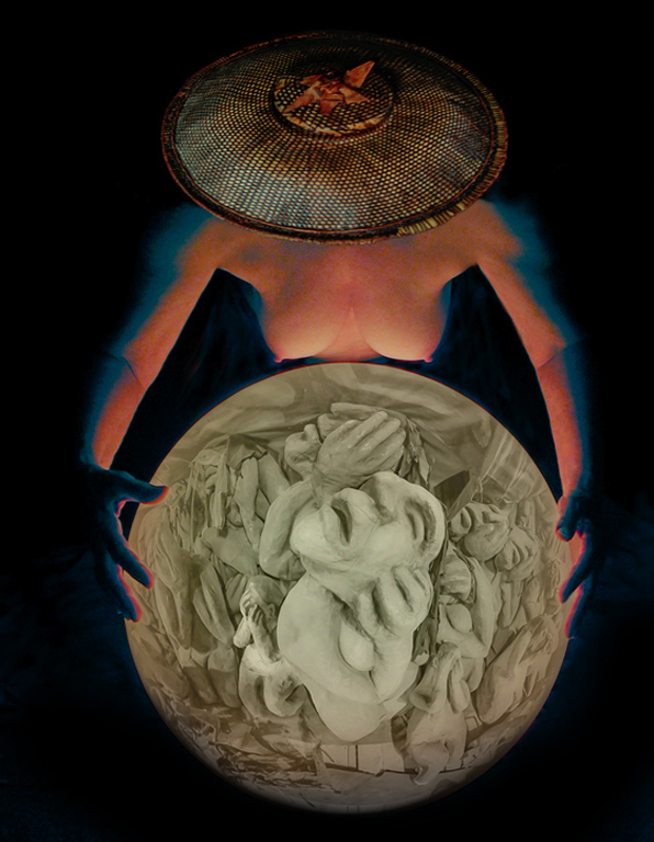
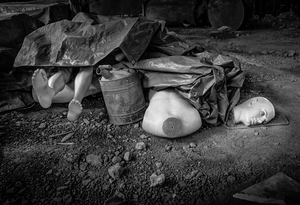
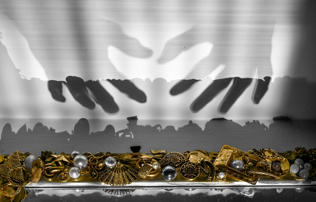
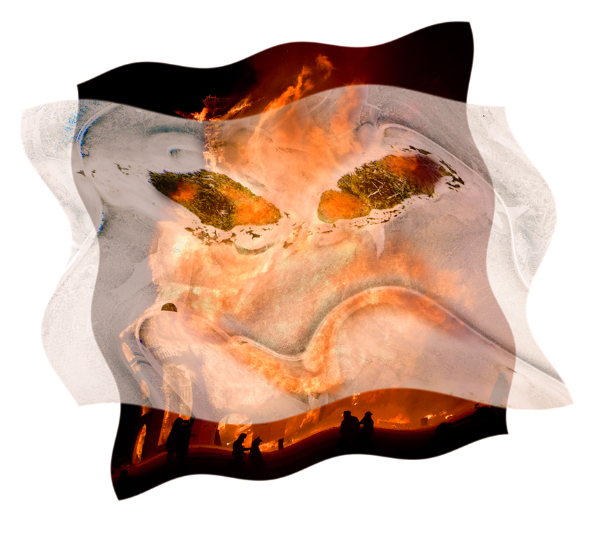
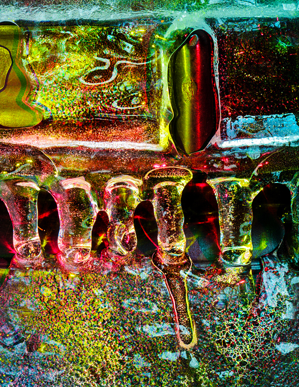
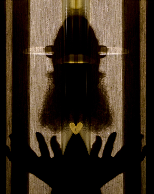
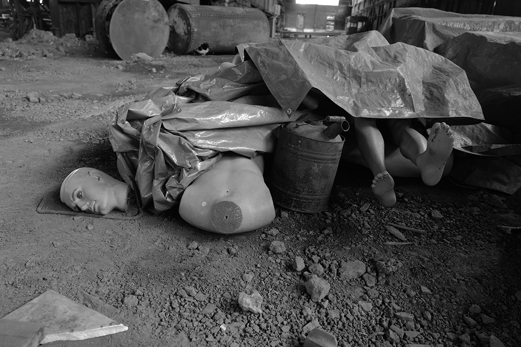
I now realize that I should not have mentioned 911. The venue was so saturated with the feeling of the event that it stuck in my head. The articles in the image may have had little or nothing to do with 911 although they were sitting close to pieces of the Towers in a huge shed.
As far as shock value goes, I sometimes wander off the track of beautiful pictorial imagery. I'll point out that an important part of the PSA permanent collection are the prints of William Mortensen whose 'Monsters and Madonnas' is one of my favorite books on creative photography. Karl |
Jun 25th |
| 79 |
Jun 23 |
Reply |
You are correct about the 911 title distracting from a viewer's own interpretation of the scene which is as I found it. I should have used a more generic title like 'Discard Pile' or some such. I personally favor not pushing midtone contrast too far because an image can get cartoonish quickly, but the image could perhaps benefit from a little more local Clarity on the manikin parts. Thank you for the well considered comments. Karl |
Jun 23rd |
| 79 |
Jun 23 |
Reply |
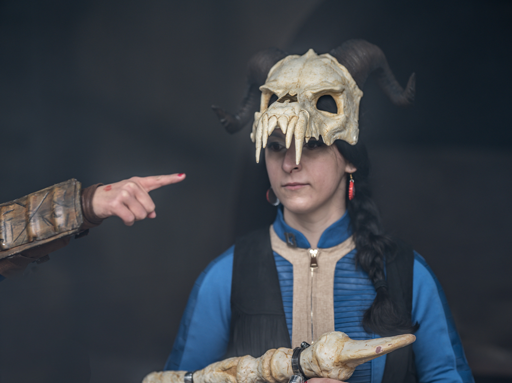
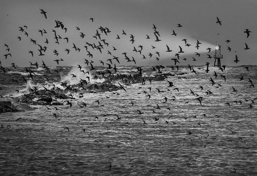
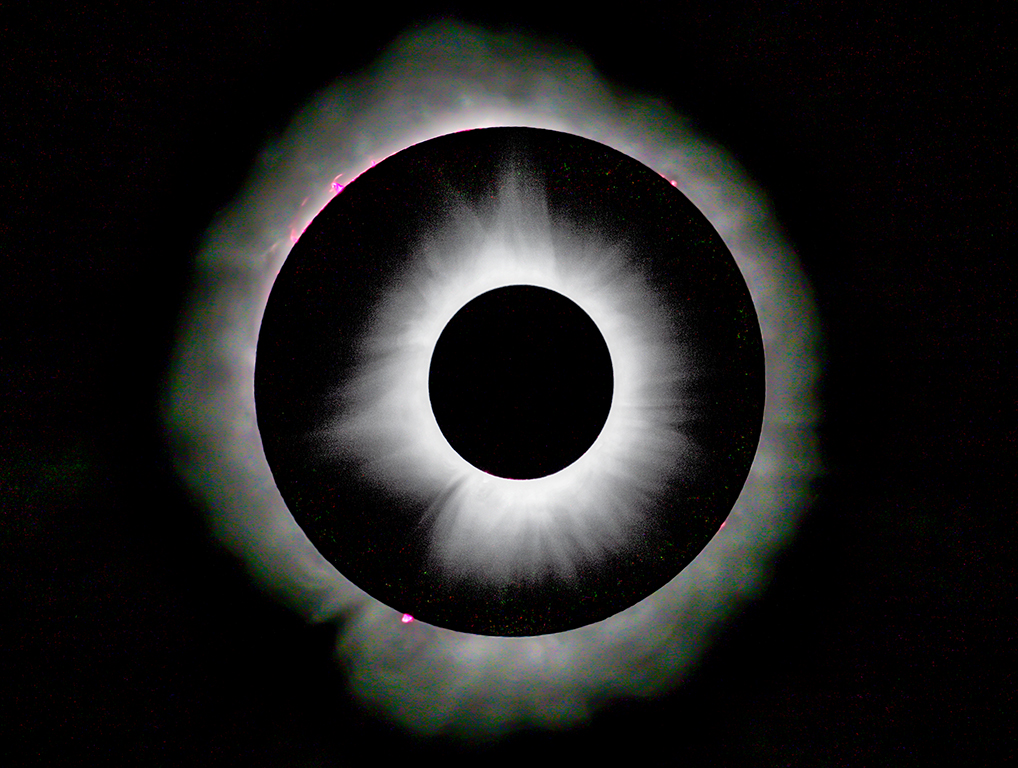
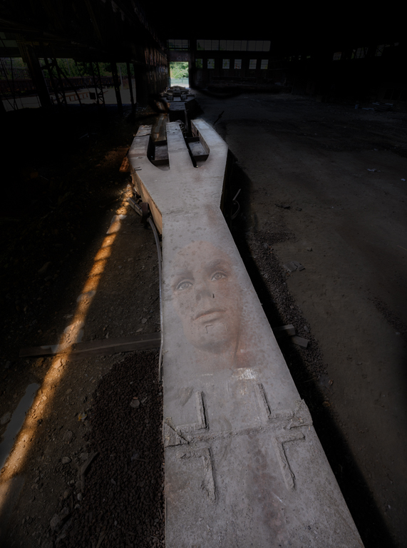
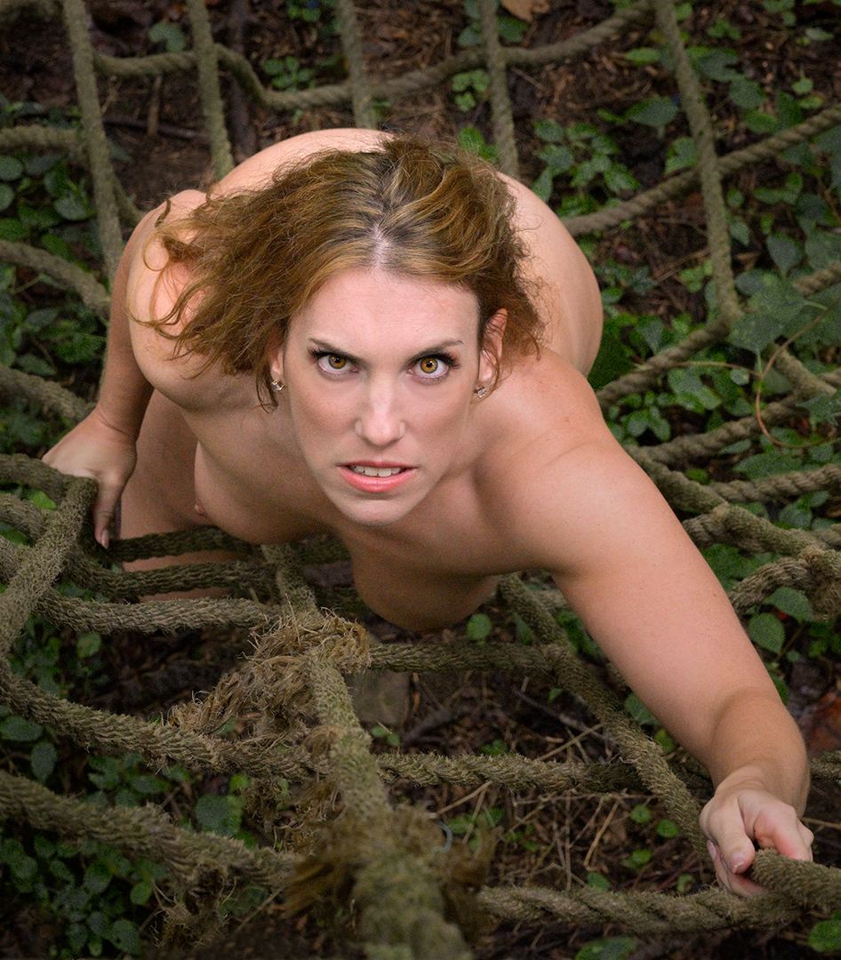
Hi Judith, The Leica Q2 Monochrome was made without the color lenses of the Bayer filter over the sensor. So far only Leica ($$) and Phase One ($$$$) make a monochrome although MaxMax will convert a camera to monochrome but some features may be lost. In a 'normal' digital camera, 4 photosites (red, blue and 2 green filtered sites) make a color pixel. In monochrome each photosite is a pixel, so very high resolution, especially when coupled with a super sharp lens specifically designed for the camera, is the result. Why Canon, Nikon, Sony, Olympus haven't done it is a mystery to me. It's difficult to appreciate the sharpness, detail, and dynamic range in a 1024x768 image here. The original image is attached in reduced size. The manikin's eyes were incredibly piercing. Karl |
Jun 23rd |
 |
| 79 |
Jun 23 |
Comment |
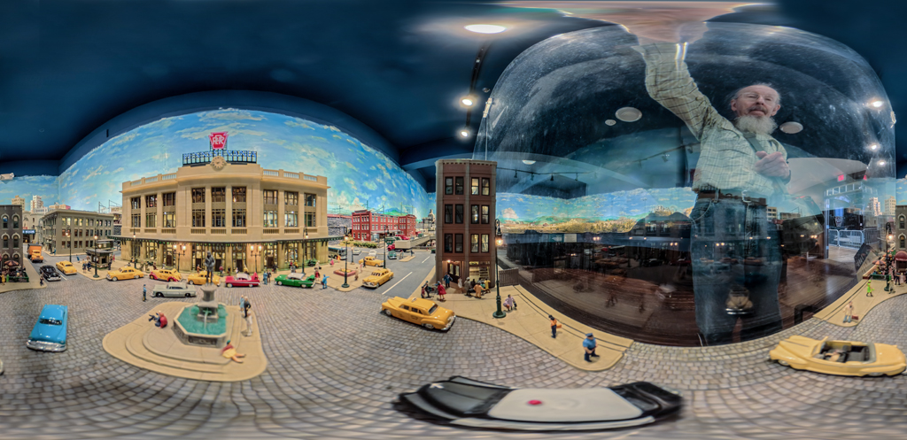
Hi Lauren, Beautiful hi-key. When something looks this simple, the knowledgeable viewer must respect the talent of the artist in producing it. I applaud your labor in post processing. I would have deleted the original image immediately in camera and gone to work on better lighting. The image should print very well on textured fine art paper. I would try it on Moab's Moenkopi Washi Unryu 55 or Moenkopi Washi Kozo 110 paper. Karl |
Jun 23rd |
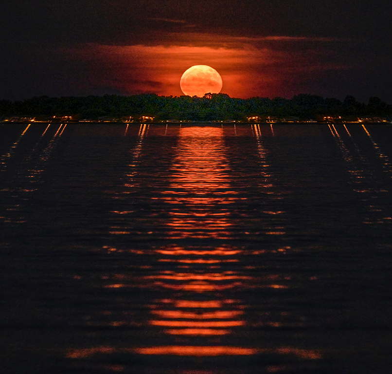
| 79 |
Jun 23 |
Comment |
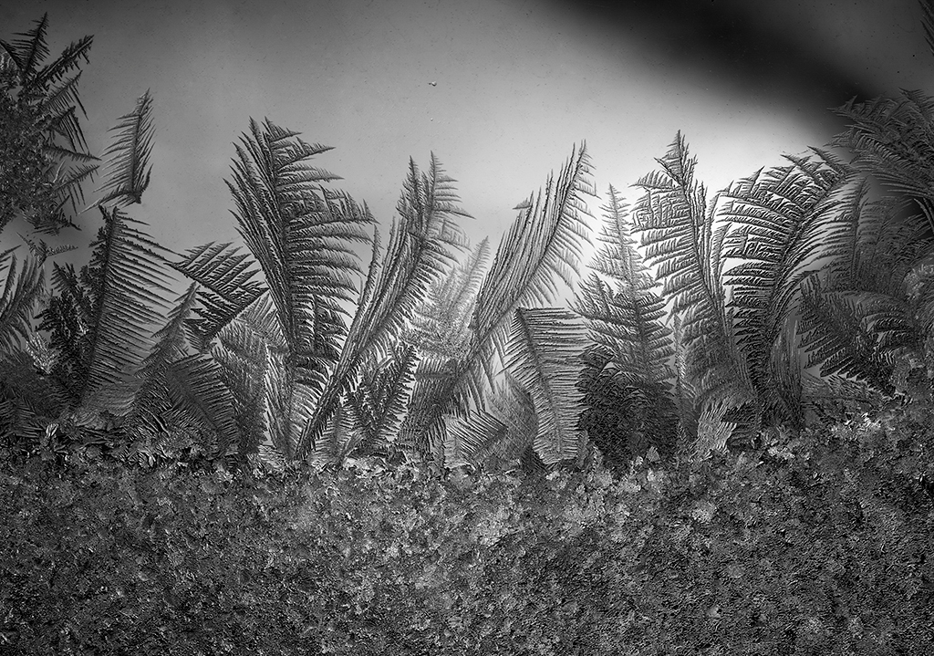
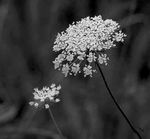
Hi Liz, I agree with others that more contrast would help. Going back to the color original, avoid the simple IR conversion because that will lighten the greens. Instead use a conversion that has sliders to modify red, green, and blue.
Available in Photoshop Elements under Enhance/Convert to B&W/Scenic Landscape and adjust the contrast. The result is white flowers standing out against a darker background in the attached photo. I like the squarish composition. The 'child' could be a bit sharper. Karl |
Jun 23rd |
 |
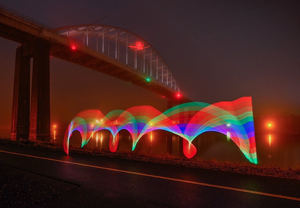
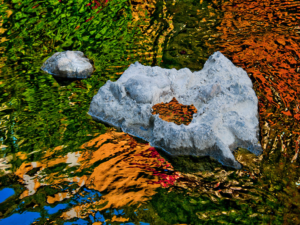
| 79 |
Jun 23 |
Comment |
Hi Gerard, The colored skeins appear to be the prime subject but my eye is distracted by the bright area at the top. Perhaps moving a bit to the right, if it were possible, would get away from the bright area. Having both the beautifully grained chair and floor in focus along with the contrasty post processing has given the appearance of two merged surfaces done in a flat cartoon illustration style. Perhaps having a more limited depth of field to separate chair from background would give a more dimensional quality. The overall brown tone contrasted to the wool colors is very good. Karl |
Jun 23rd |
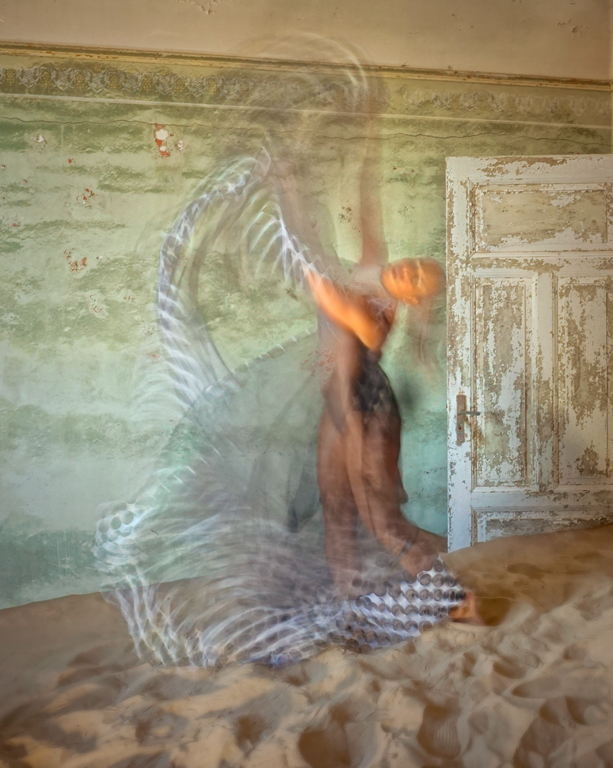
| 79 |
Jun 23 |
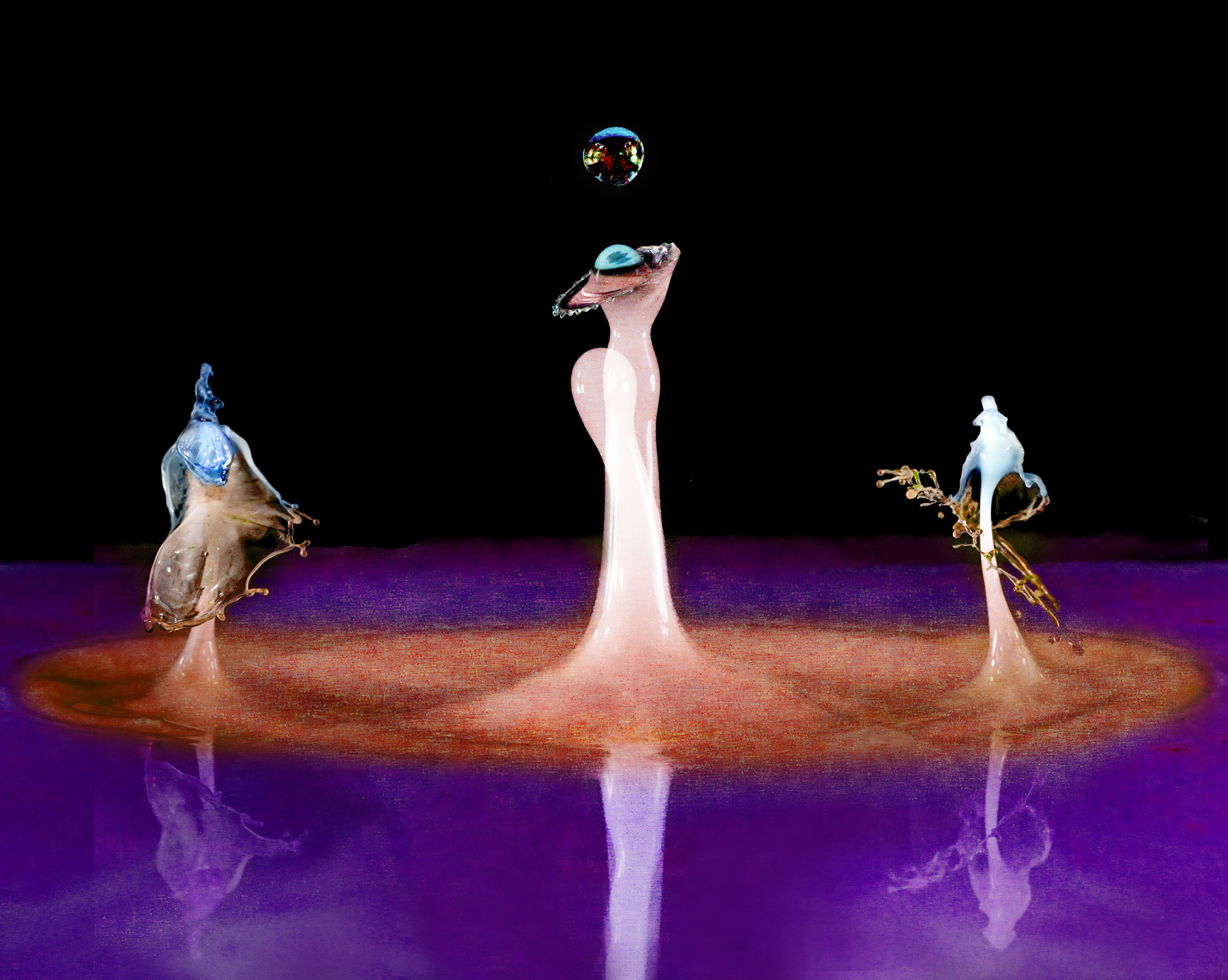
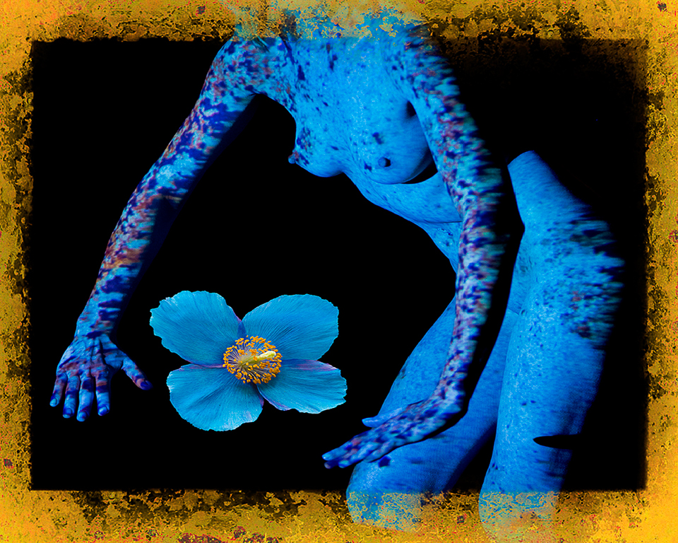
Comment |
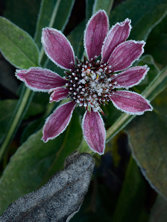
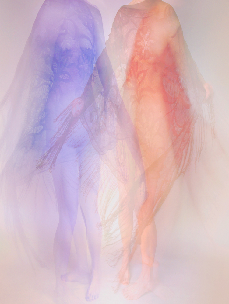
Hi Peter, At first view, I saw a multiple exposure. I like the result from Painter which gave it an painted look. If you like the large negative space, perhaps flipping the image horizontally would lead the eye from left to the subject flower. I wouldn't crop the flower any tighter. I get claustrophobic when I see very tight crops or slightly trimmed petals. It's like having a finger tip cut off. The flower interpretation is great. The blue/purple color highlights the color scheme. The cropping and layout are negotiable. Karl |
Jun 23rd |
| 79 |
Jun 23 |
Comment |
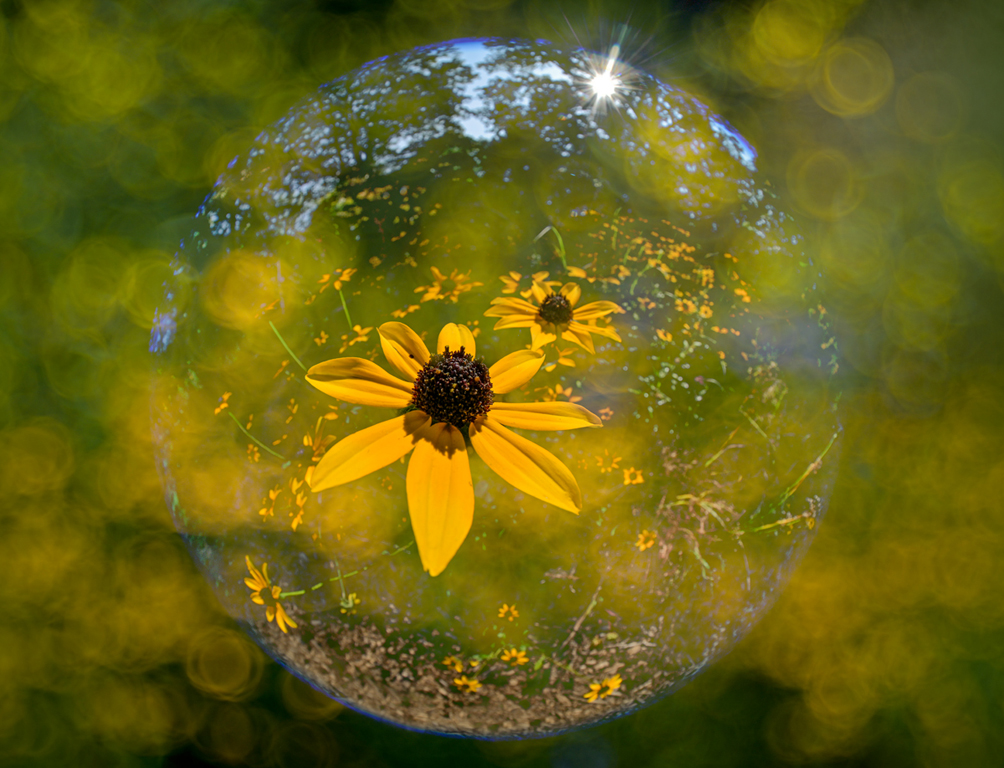
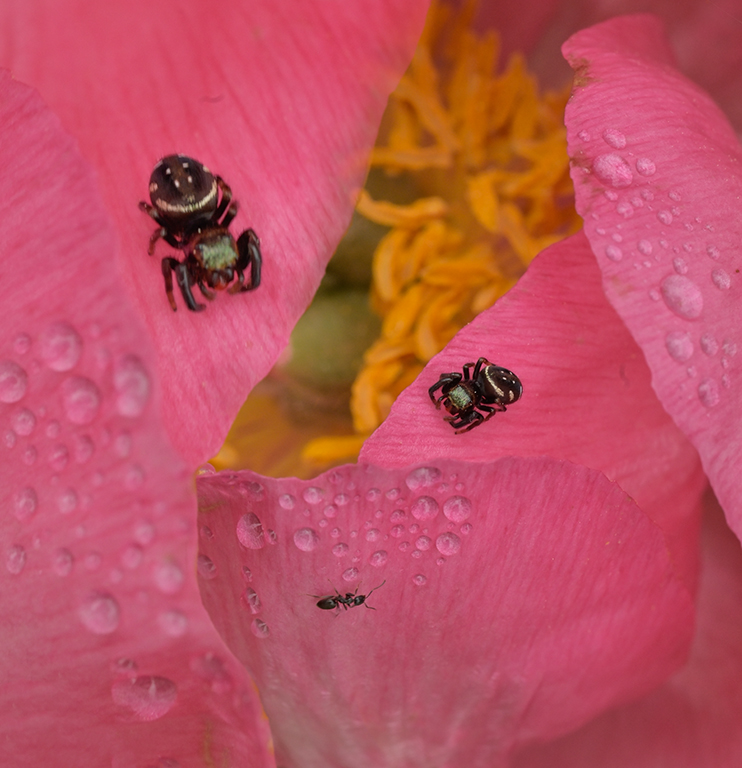
Hi Judith, I hate to say that I love a cellphone image, but this one has a wonderful feel with the limited depth of field flowing off like fabric. I assume that the phone's light illuminated the flower like a camera ringlight and allowed the background to get very dark which helps simplify the image. I think it's quite successful as presented. Karl |
Jun 23rd |
5 comments - 3 replies for Group 79
|
5 comments - 3 replies Total
|