|
| Group |
Round |
C/R |
Comment |
Date |
Image |
| 79 |
Mar 23 |
Comment |
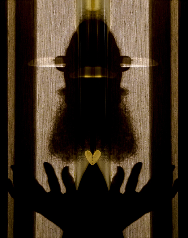
Hi Lauren, What a great idea of a photo exhibit of old stuff for a senior venue! I'm going to 'steal' that idea for the senior center where I'm on the Board.
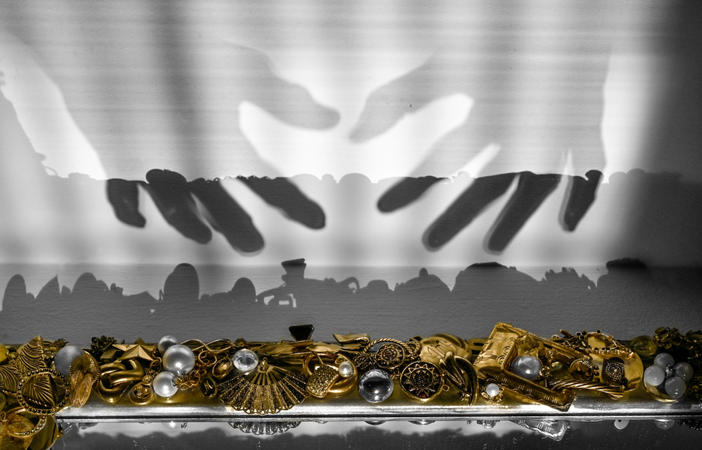
I agree with Judith that the image needs to be wider with less of the table below. Remember that the carriage section moves horizontally so we need to see space for it to 'move' into on the right and left. Another, possibly dreamy, interpretation would be to use a portrait lens like Lensbaby Velvet for this series. The typewriter could also be imaged at a wide aperture (f/2 or f/2.8) focused on the keys or the Underwood name on the front panel to give the impression of seeing through the not so sharp eyes (like mine) of old age. Maybe add a 10-25% sepia/brown color via Hue/Saturation-Colorize.
Great idea for a series. I can't wait to see more. Karl |
Mar 10th |
| 79 |
Mar 23 |
Comment |
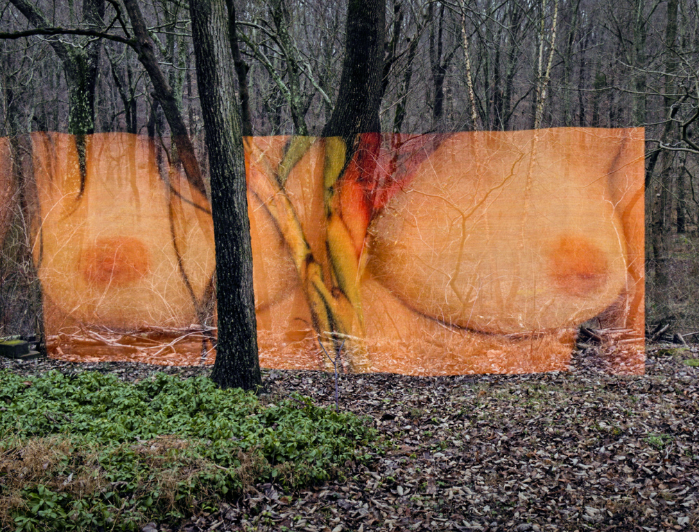
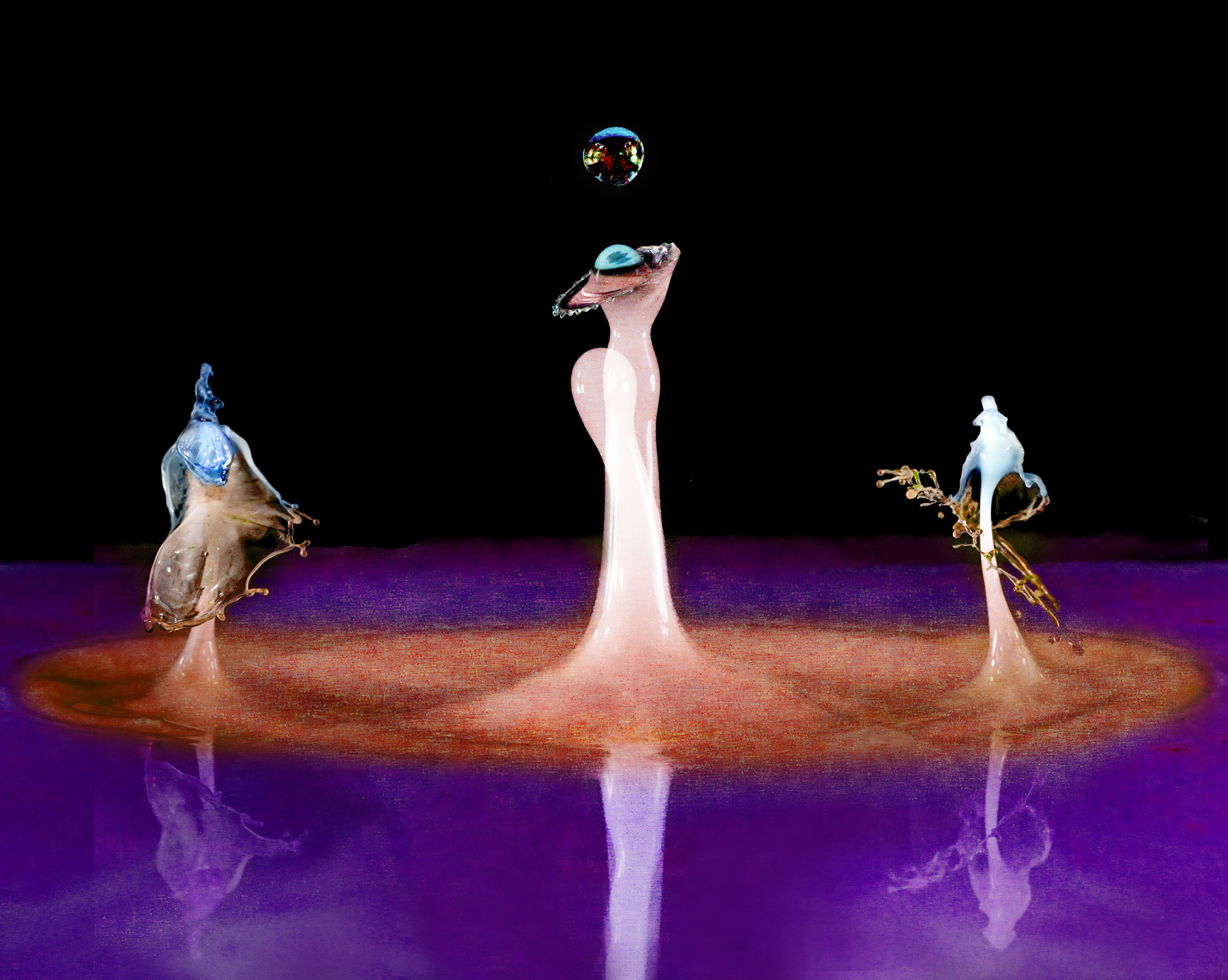
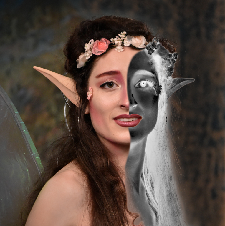
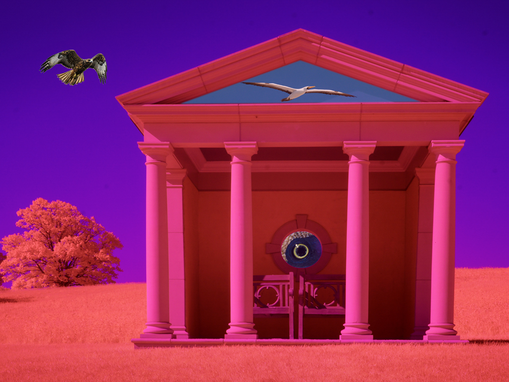
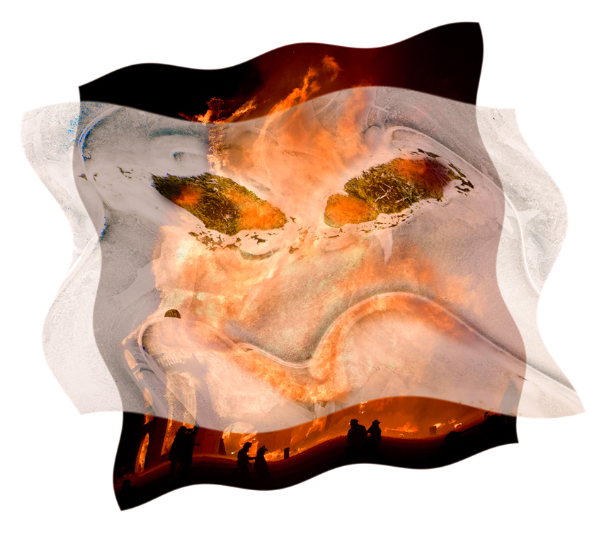
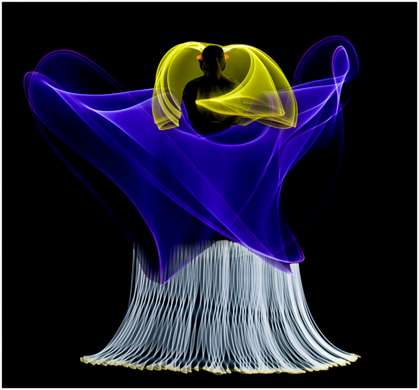
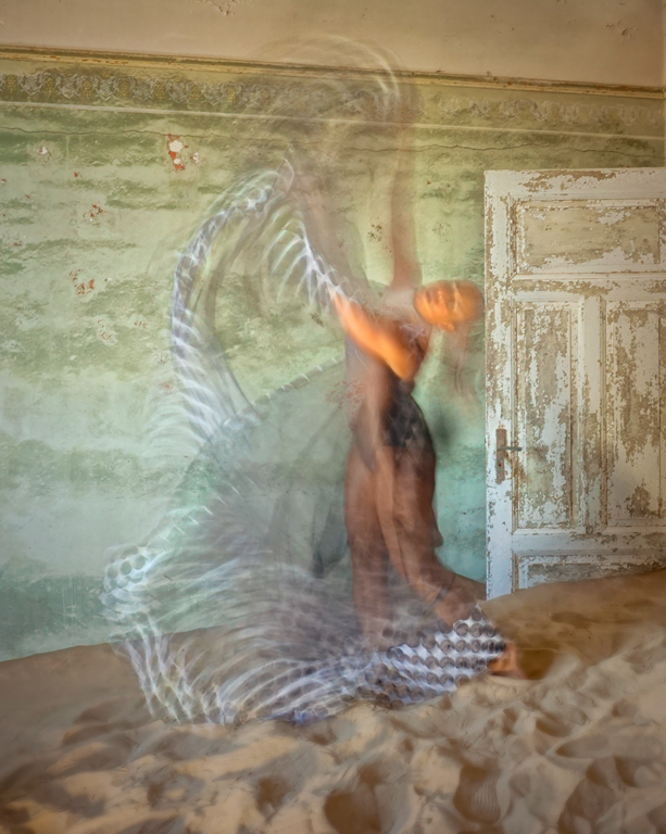
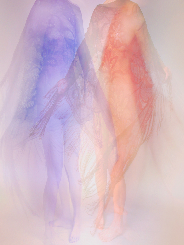
Hi Freddie, I also see the angel but admit that I live in a house full of them from my late mother's collection. The colours are a strong theme in this abstract. I like the 'legs' at the bottom but would crop 25% off the top to visually raise the 'figures' in the image. Abstracts are always open to interpretation. This image has feeling. One aspect that confused my mind was the sharper outlines of the two 'figures'. They help to define the figures but seem a bit out of place in the softness of the image. Interesting. Karl |
Mar 10th |
| 79 |
Mar 23 |
Comment |
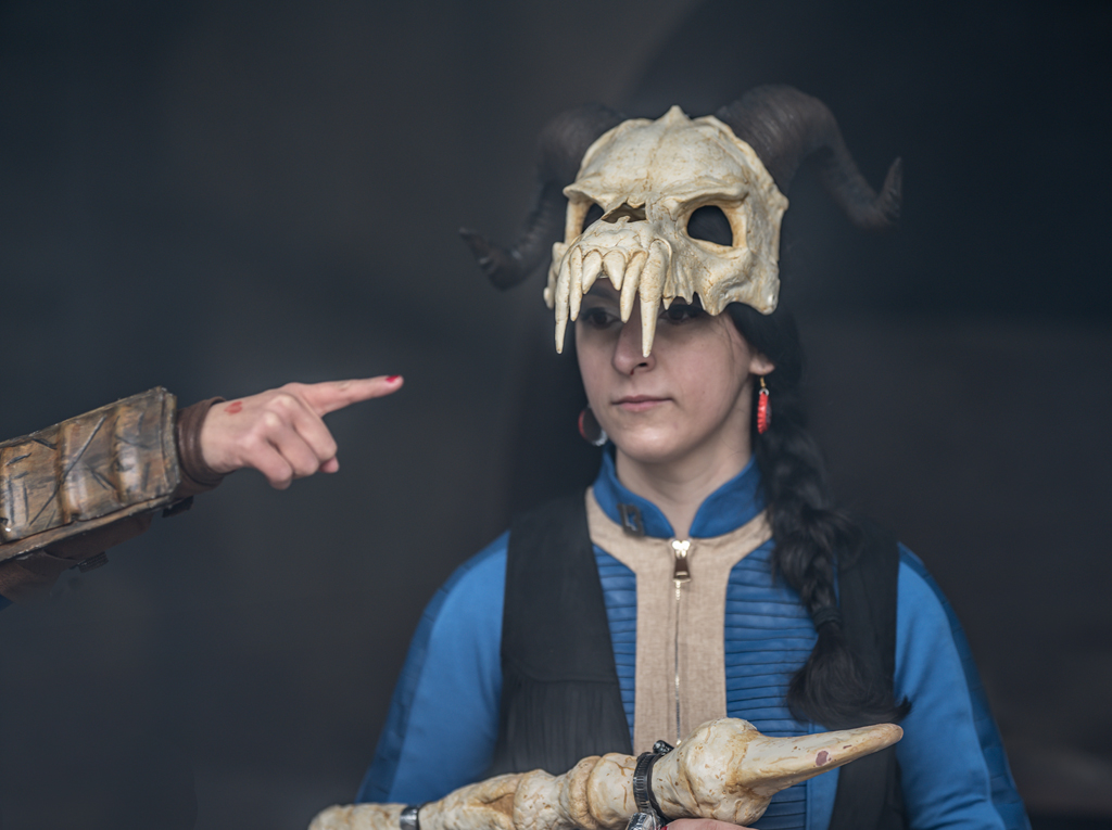
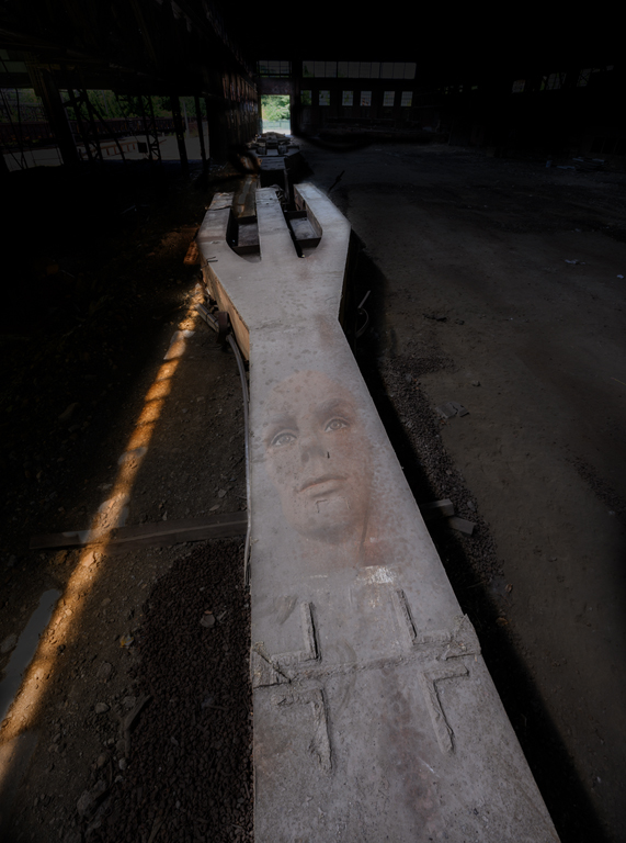
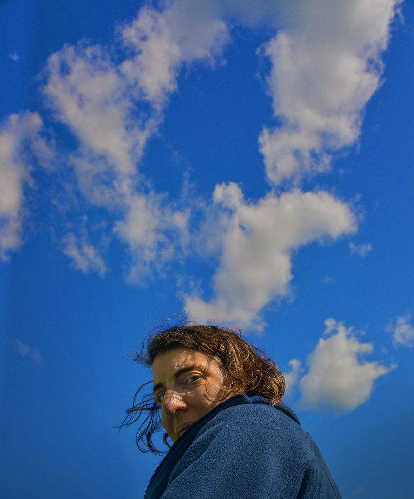
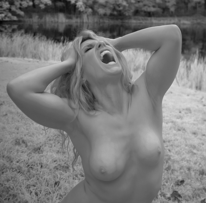
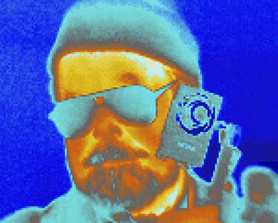
Hi Gerard, A very strong portrait with good lighting. The Crisp Sharpness makes the image far sharper than a painter could and, along with Character, is the chief attribute of the image. The light is nicely balanced. Shadows add a dimensional quality to a 2-D photograph. Well done. Perhaps a LARGE print for the wall? Karl |
Mar 10th |
| 79 |
Mar 23 |
Comment |
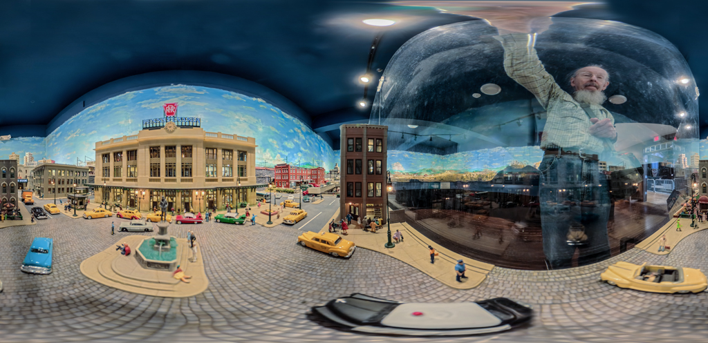
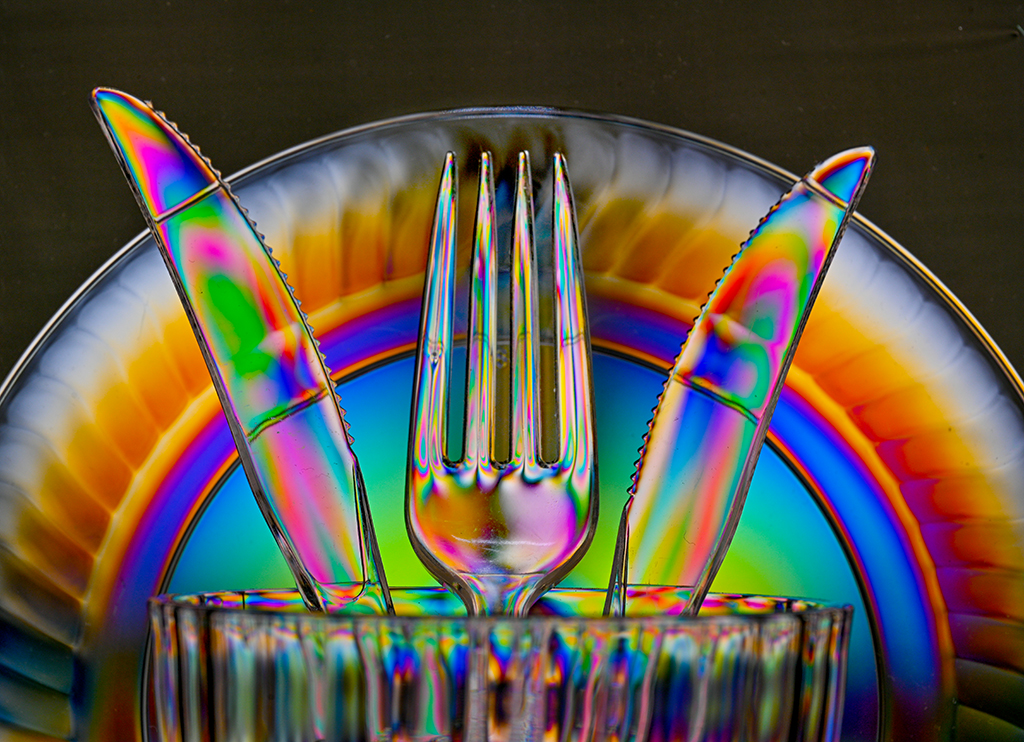
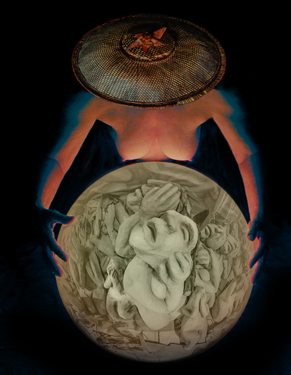
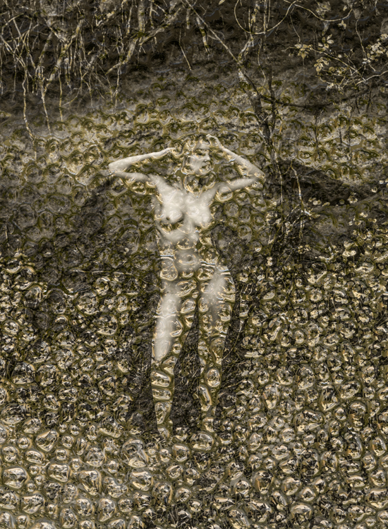
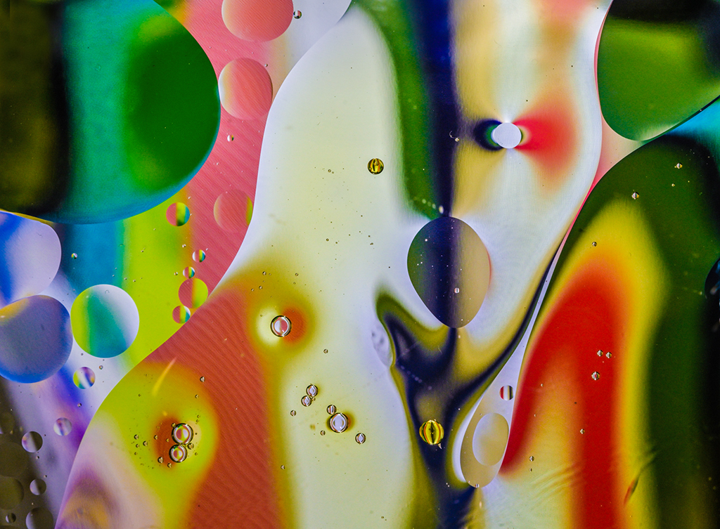
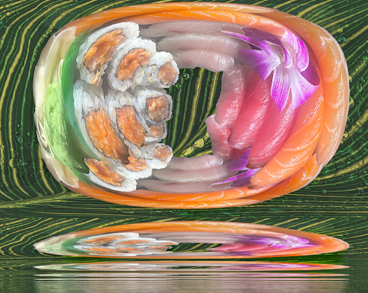
Hi Peter, A wonderful interpretation of the sushi dish. I like the application of polar coordinates and multiple reflections. I suggest making the image more dimensional by increasing Clarity (midtone contrast) of the sushi and slightly desaturating and softening the leaf background which, by the way, was a brilliant addition. Karl |
Mar 10th |
 |
| 79 |
Mar 23 |
Comment |
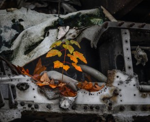
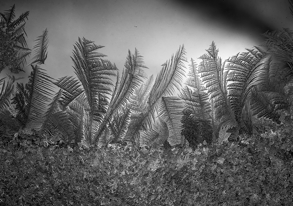
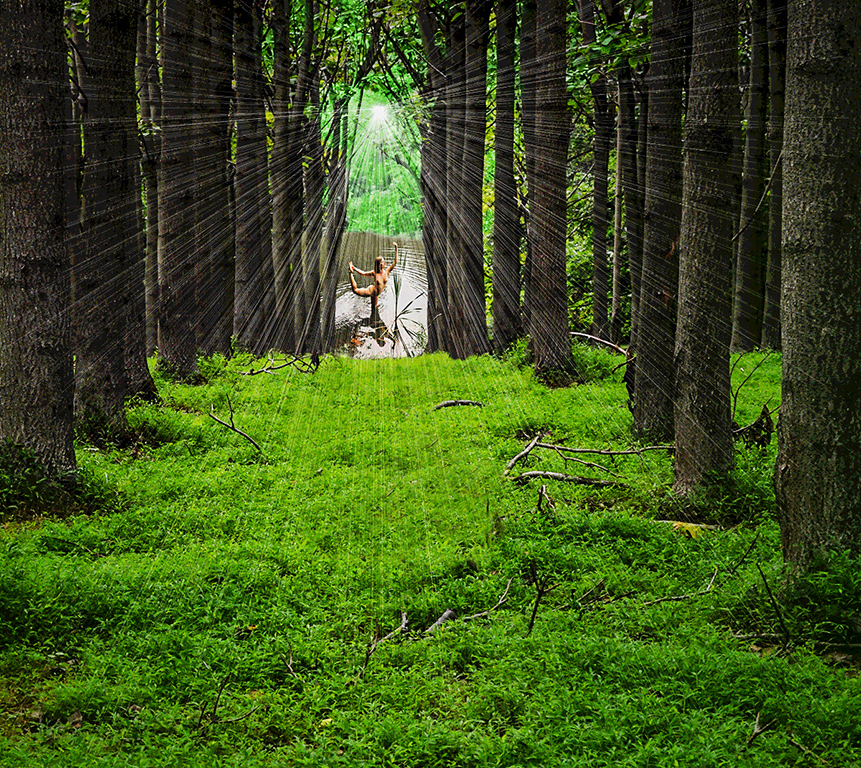
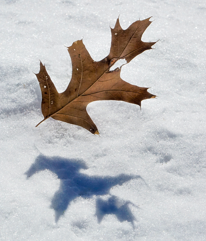
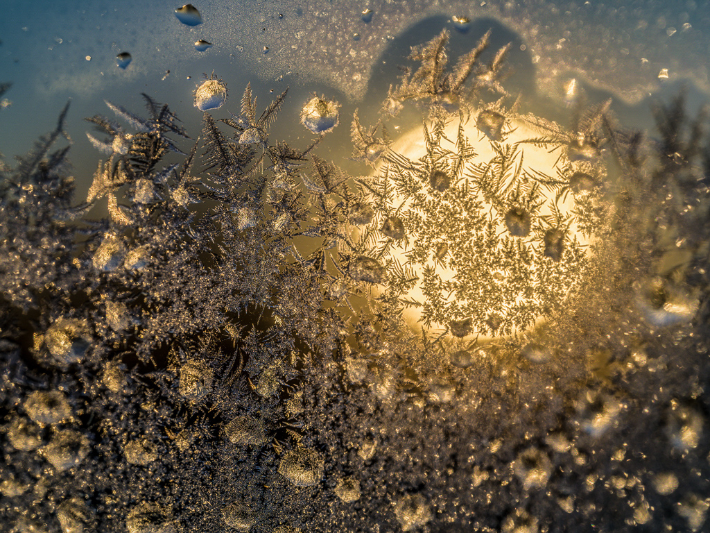
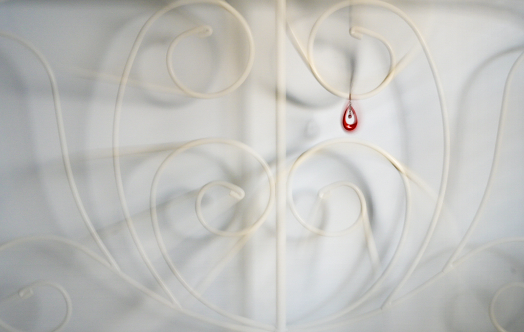
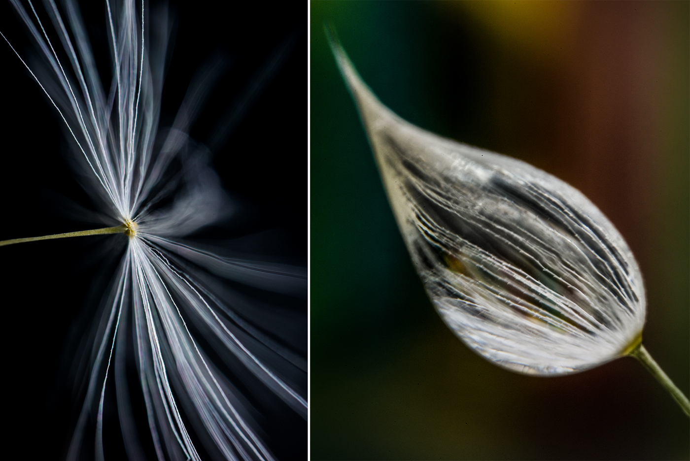
Hi Judith, I read an article recently that preferred "interval space" to "negative space" due to the connotation of the word "negative'. The shape of the dark area is somewhat ambiguous allowing artistic interpretation by the viewer. Is it a human face, an animal, a cliff, or a house? The bright grass seed head is the go-to subject and the dark area adds the ambiguous context to make it more interesting. I prefer the orientation you finally chose rather than the mirror image version. Karl
P.S. What were the camera settings? |
Mar 10th |
| 79 |
Mar 23 |
Reply |
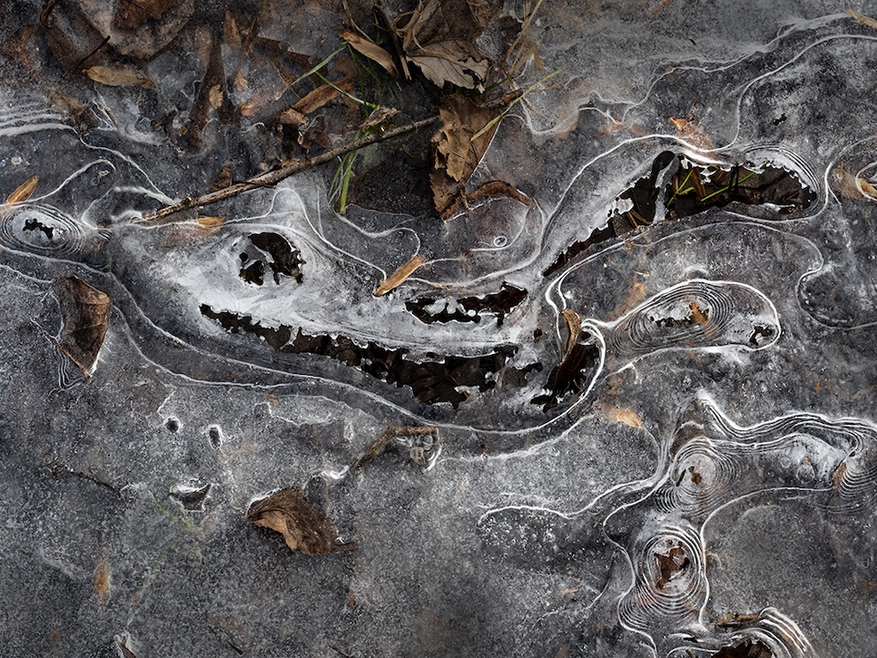
Hi Judith, The original is shown here. As you can see I only removed a small part of the stem. I then imagined the leaf to be suspended just above the ground. The shadow is real. The image was made with a Sony a6000 mirrorless camera with 16-70mm f/4 lens at 51mm. Exposure was ISO 400, 1/250 second at f/16. I believe the scene was pretty quiet so there was only a visual aria. Karl |
Mar 10th |
 |
5 comments - 1 reply for Group 79
|
5 comments - 1 reply Total
|