|
| Group |
Round |
C/R |
Comment |
Date |
Image |
| 79 |
Jan 23 |
Reply |
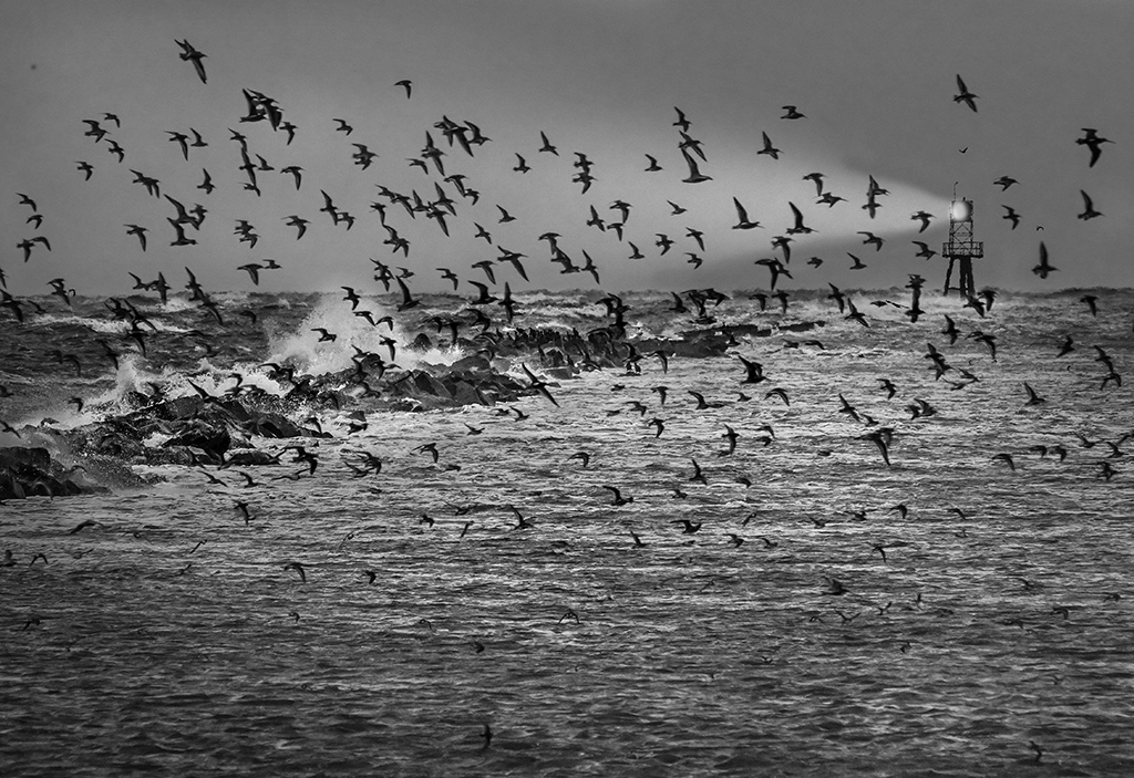
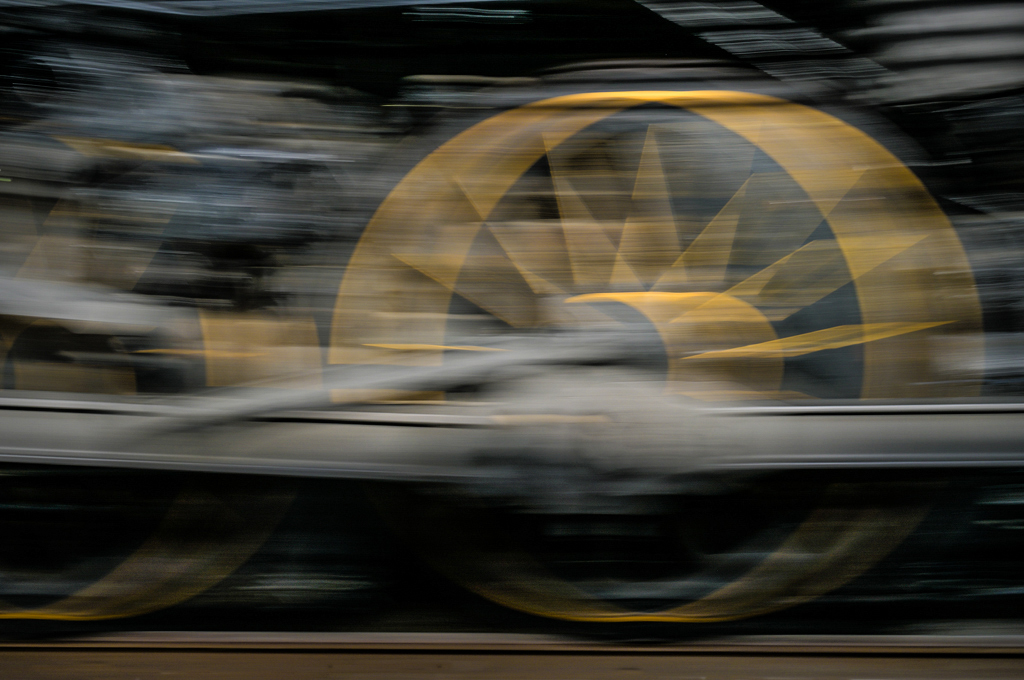
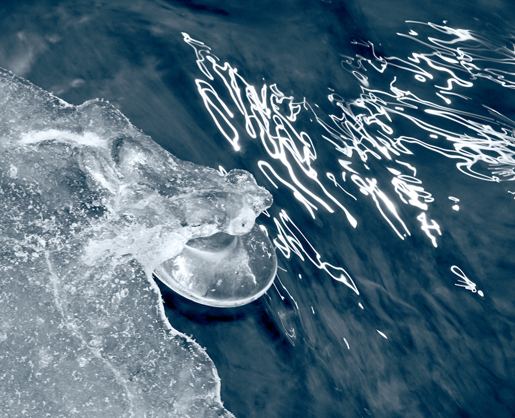
Hi Freddie, ICM is a relatively new term and as you say, probably more accurate in this situation. My use of the term 'panning' was simply based on the fact that I was physically moving the camera horizontally as I would to get a sharp image of a race car against a streaked background. In this case there was no subject to be rendered sharply, only streaked background.
I tried a variable neutral density (VND) filter and got many wierd effects, particularly on wide angle lenses, that I now just use single density filters. Anybody need a 77mm Tiffen VND in excellent condition? Karl |
Jan 22nd |
| 79 |
Jan 23 |
Reply |
Hi Gerard, The original capture is a 36 MP image with a very sharp lens. After your suggestion, I went back and tried the Blur/Motion filter in Photoshop Elements and got a mushy result, even after applying a lot of Clarity to the original. Let's think of panning as a scan where each incremental horizontal element gets the same exposure and sharpness as others. Using Blur/Motion in post really just smears each incremental element into its neighbors resulting in a mushy rendering. Karl |
Jan 19th |
| 79 |
Jan 23 |
Reply |
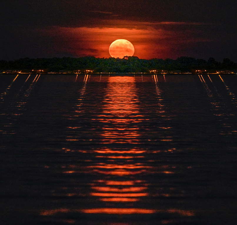
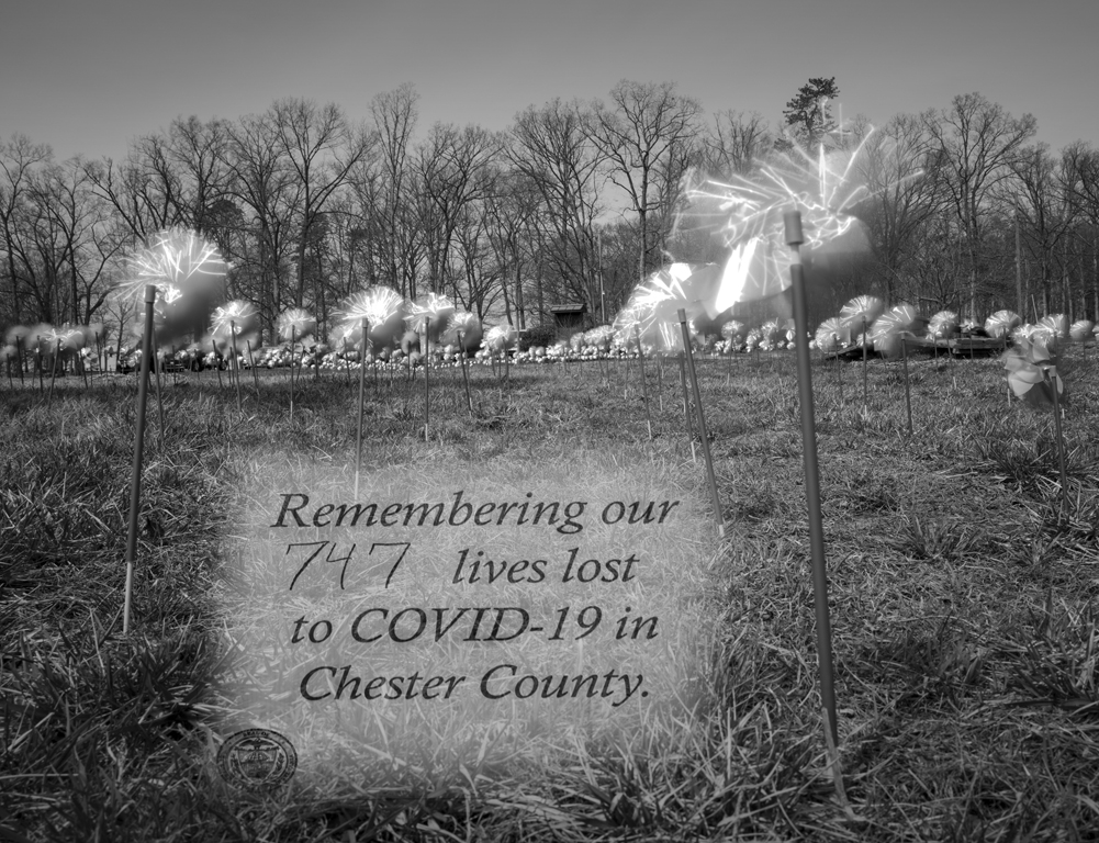
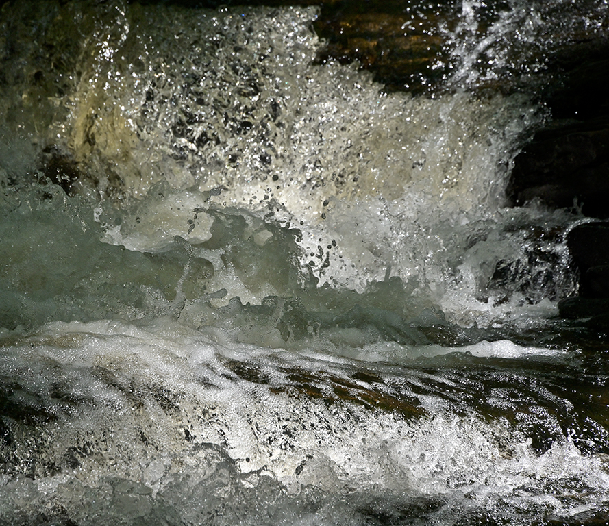
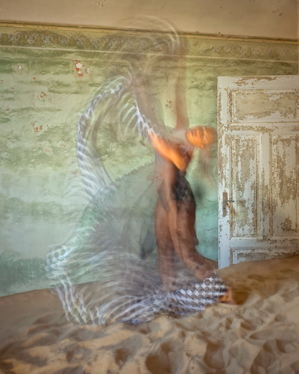
Judith, The image was made with a Nikon Z7 II and Nikkor Z 50 mm, f/1.2 S lens. It's an incredibly sharp lens throughout its aperture range. Exposure was ISO 64, 1/4 second, f/16. I quickly panned horizontally. If I had a neutral density filter with me, I could have made the exposure even slower. Karl |
Jan 18th |
| 79 |
Jan 23 |
Comment |
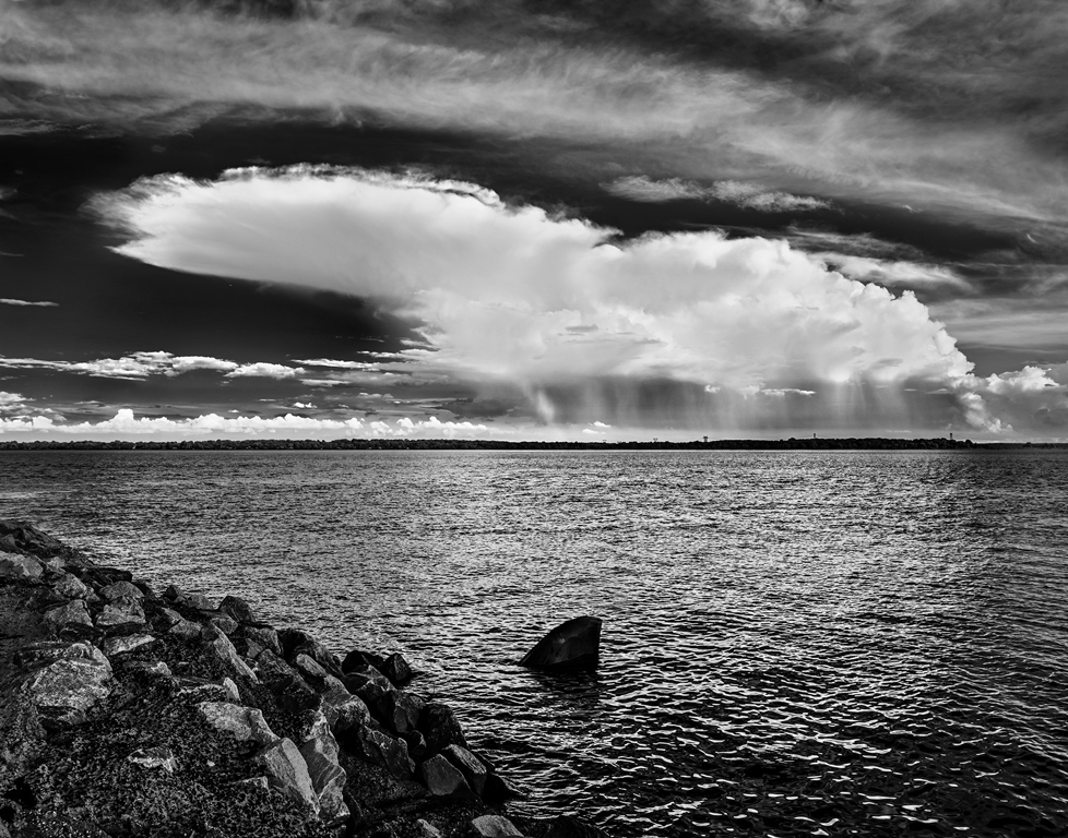
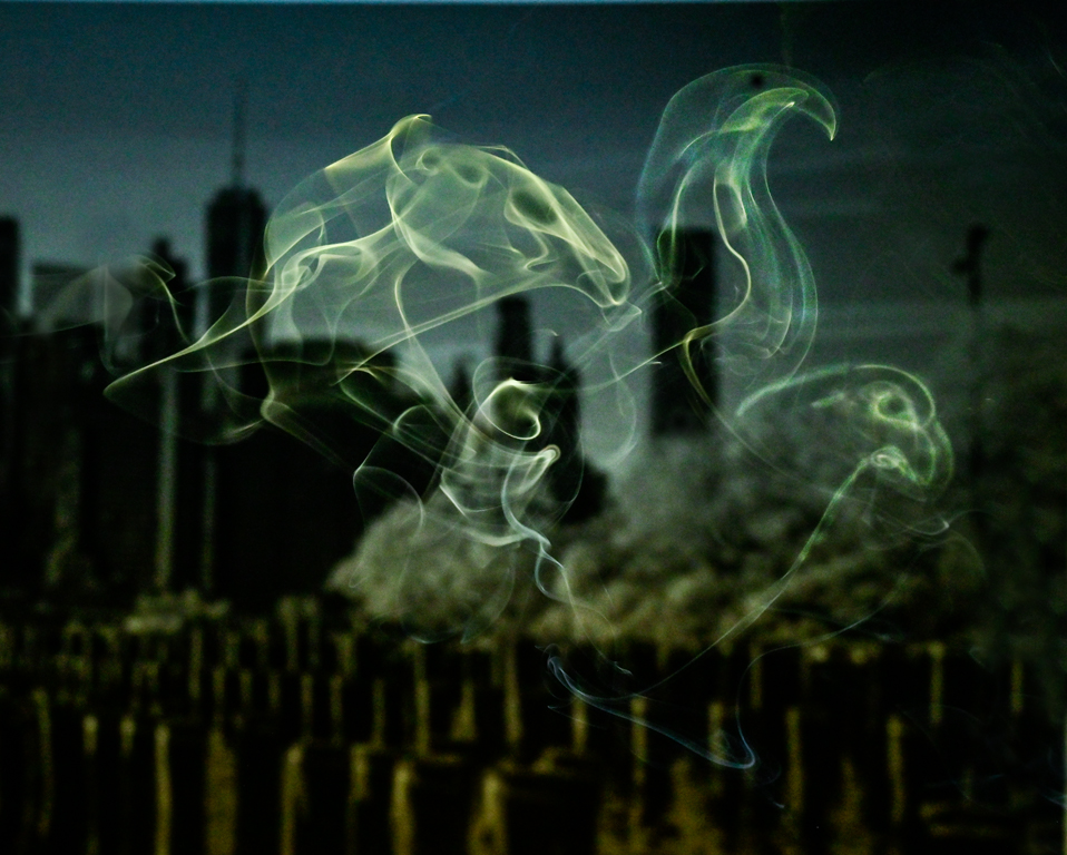
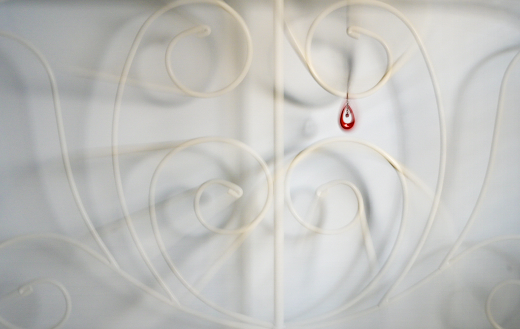
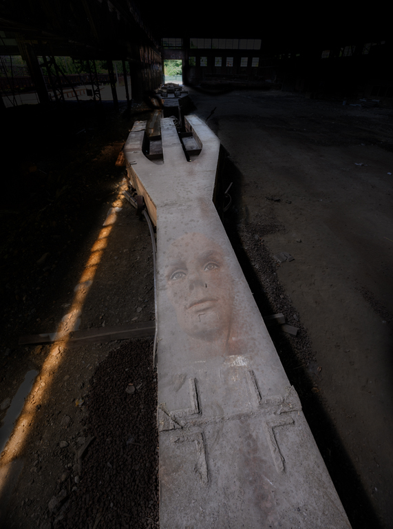
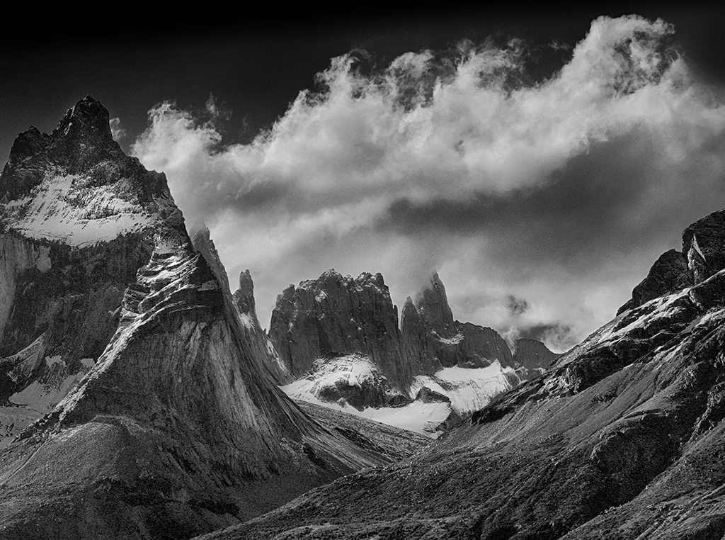
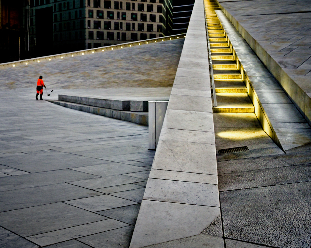
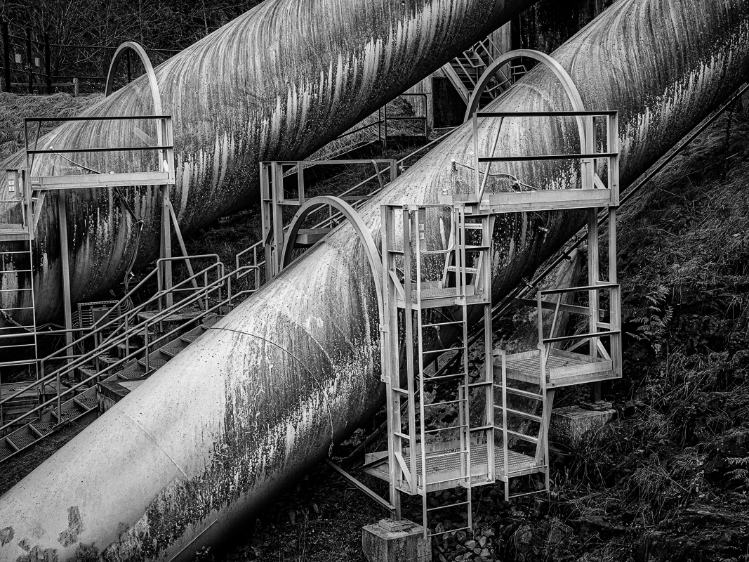
Hi Lauren, Great industrial image that works very well in black/white. The tonality is really good due to the cloudy light. There is a lot going on here and plenty of things to key on when looking for the subject in the image. My interpretation would be the two large pipes as the primary subject. To bring these out, I created a Levels layer, cut the white output to 200, and reduced midtones to 60. Then I masked out just the two pipes which maintain their original tonality while everything else gets darker. You have a good image with many opportunities for emphasis. Karl |
Jan 13th |
 |
| 79 |
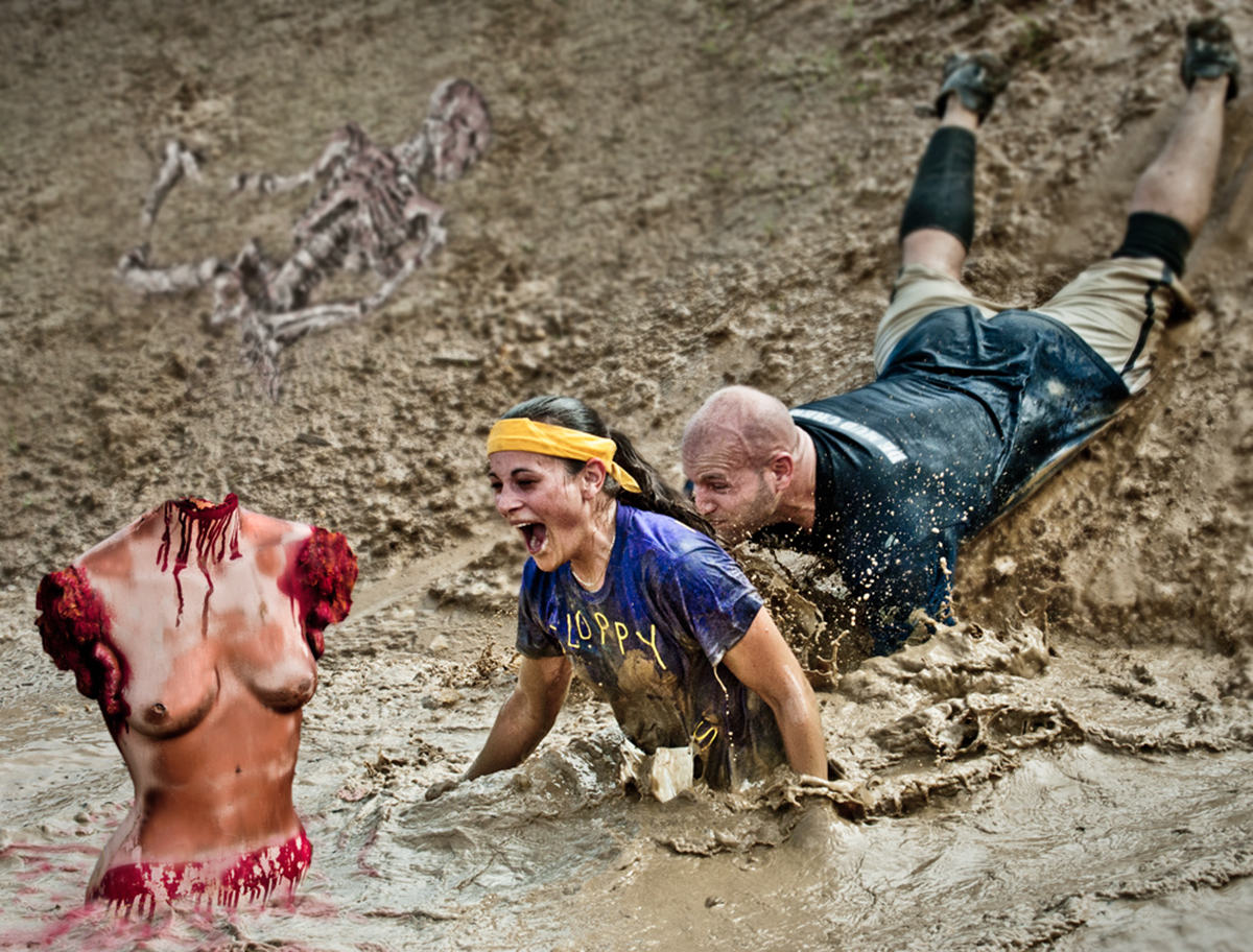
Jan 23 |
Comment |
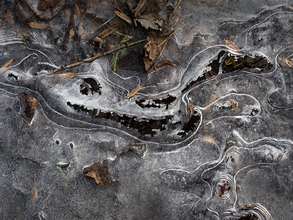
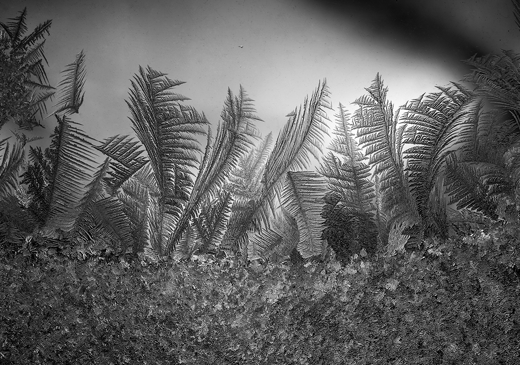
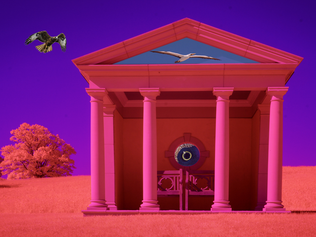
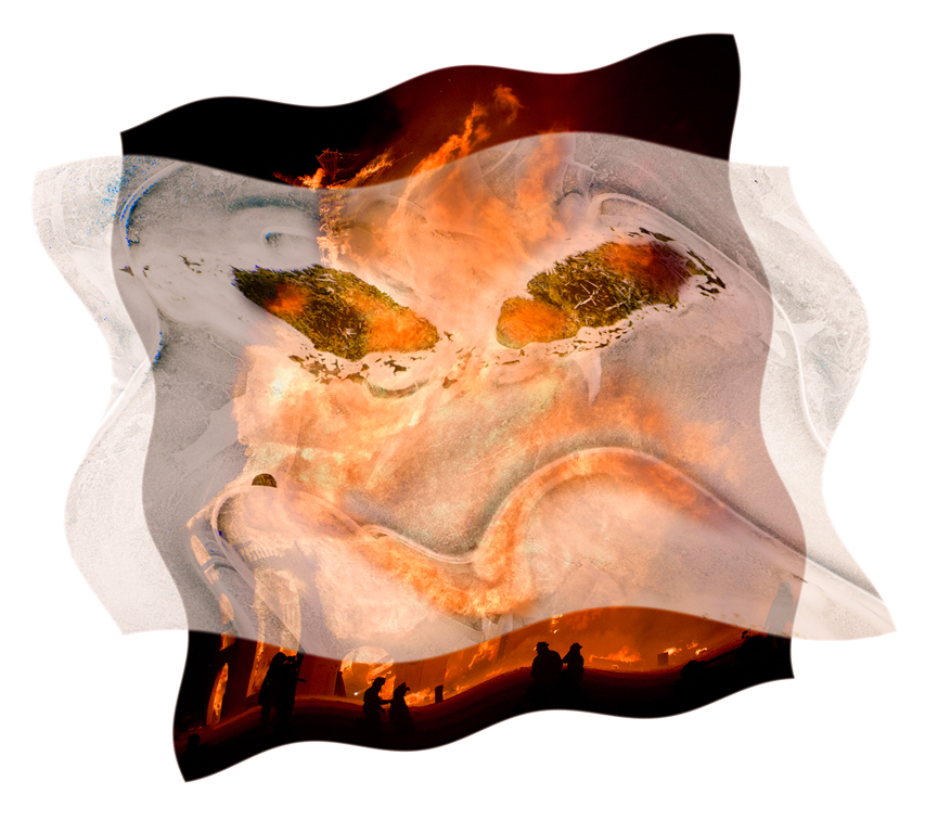
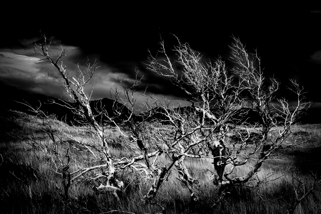
Hi Freddie, Windswept Patagonia is a great place for 'skeletons'. The red color takes the image out of reality and loses most of the grass detail. Red does provide a contrast to the dark blue sky. Darkening the sky and increasing contrast in the original could make it spooky without the sci-fi red color. Alternatively, switching to monochrome via a gradient map layer yields a very stark tangle. I tried different color gradients but settled on black/white although any could be used. Some color combinations make it look like a false color thermal imaging picture. Karl |
Jan 13th |
 |
| 79 |
Jan 23 |
Comment |
Hi Lynne, Excellent job of extracting an orchid blossom out of the 'jungle' into an airy, softer, artistic format. Composition is good and the blossom is clearly the star of the image. Well done. I wouldn't change anything. Karl |
Jan 13th |
| 79 |
Jan 23 |
Comment |
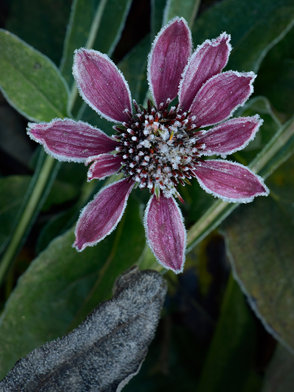
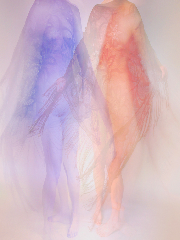
Hi Gerard, There is a radical difference between flowers. Also, the unmodified flower doesn't have a shadow like the charcoal flower so it looks pasted in. The technique could become the subject if you showed an evolution through 3 or 4 stages where the flower started as a darker original, then evolved and lightened to the final modified image. I once saw a salon Best-In-Show image that was simply a row of four different interpretations of the same flower image. Since they were all based on the same original, they were related but each looked different. Keep interpreting! Karl |
Jan 13th |
| 79 |
Jan 23 |
Comment |
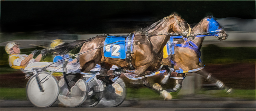
Hi Peter, Congratulations on winning at the track. The original image has lots of possible interpretations. I played with the image for a few minutes in Photoshop Elements. I made a duplicate layer and applied a filter effect and masked out the background. Then a Levels layer greatly darkening the image and masking out the horses and sulkies. It gives a more night effect to the image. Any filter/effect could be used. Endless fun in post processing. Karl |
Jan 13th |
 |
| 79 |
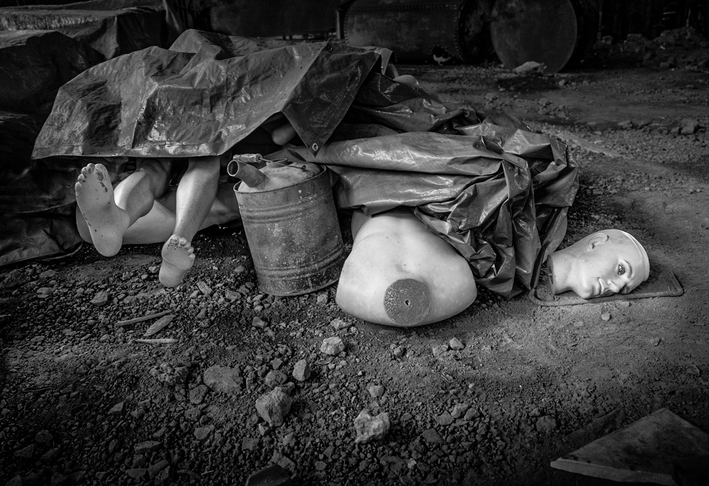
Jan 23 |
Comment |
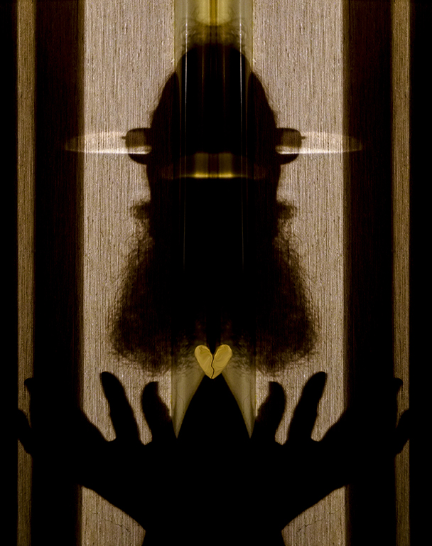
Hi Judith, Veerry Interesting. The film noir effect adds a lot of drama. Are there 2 or 4 legs in the picture? The slight ambiguity and lock step of the 2 obvious legs adds purpose and maybe suspense. How about the fuzzy falling figure (FFF) at the right edge looking back. Good idea and execution.
Karl |
Jan 10th |
6 comments - 3 replies for Group 79
|
6 comments - 3 replies Total
|