|
| Group |
Round |
C/R |
Comment |
Date |
Image |
| 79 |
Oct 22 |
Reply |
Each dancer is a separate image resulting from a sequence of three drops from one nozzle. The collisions in this column of drops causes the liquid spread that we interpret here as dresses, vines, hats, etc. The three images were carefully composited to appear as if they were on the same 'stage'. The possibilities are fascinating. The next challenge will be the interaction of simultaneous side-by-side drop columns. It could be a disaster or entirely new forms. Karl |
Oct 26th |
| 79 |
Oct 22 |
Comment |
Hi Freddie, The raw material in this interpretive image is fabulous. The reddish interpretation isn't just "lying down", it's pawing and screaming in the fire of hell. The original could be done as a vertical pano so that the long blur acts as a spotlight onto the moving dancers. Vertical and horizontal interpretations give entirely different feelings. Altering the hue also can make any interpretation from fire to ice. So many possibilities! Karl |
Oct 7th |
| 79 |
Oct 22 |
Comment |
Hi Gerard, The rippled water makes an abstract painting that could be a background or layer in a composite. I might crop out the brighter strip on the left. The abstract as an aluminum print would fit nicely into modern decor. Karl |
Oct 7th |
| 79 |
Oct 22 |
Comment |
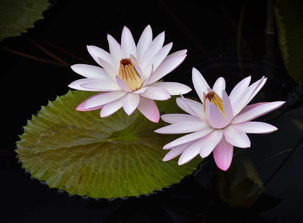
Hi Peter, The late Erik Kissa and I spent many hours in the water garden at Longwood Gardens. I live three miles away.
We both favored using a polarizer which can darken the water to whatever degree one wishes. The saturated colors of the lilies pop better against a darker background and require less enhancing in post. Since I also do photojournalism, I favor darker edges rather than lighter to better contain the viewing area. My image was taken at the same place as yours with a Nikon D810 and 80-400mm lens set at 135mm with partial polarization. Rather than cloning out the leaves at top edges, I darkened them substantially to leave some environment but still concentrating on the subjects. From this point the image could artistically go anywhere with post processing filters or effects. Karl |
Oct 7th |
 |
| 79 |
Oct 22 |
Comment |
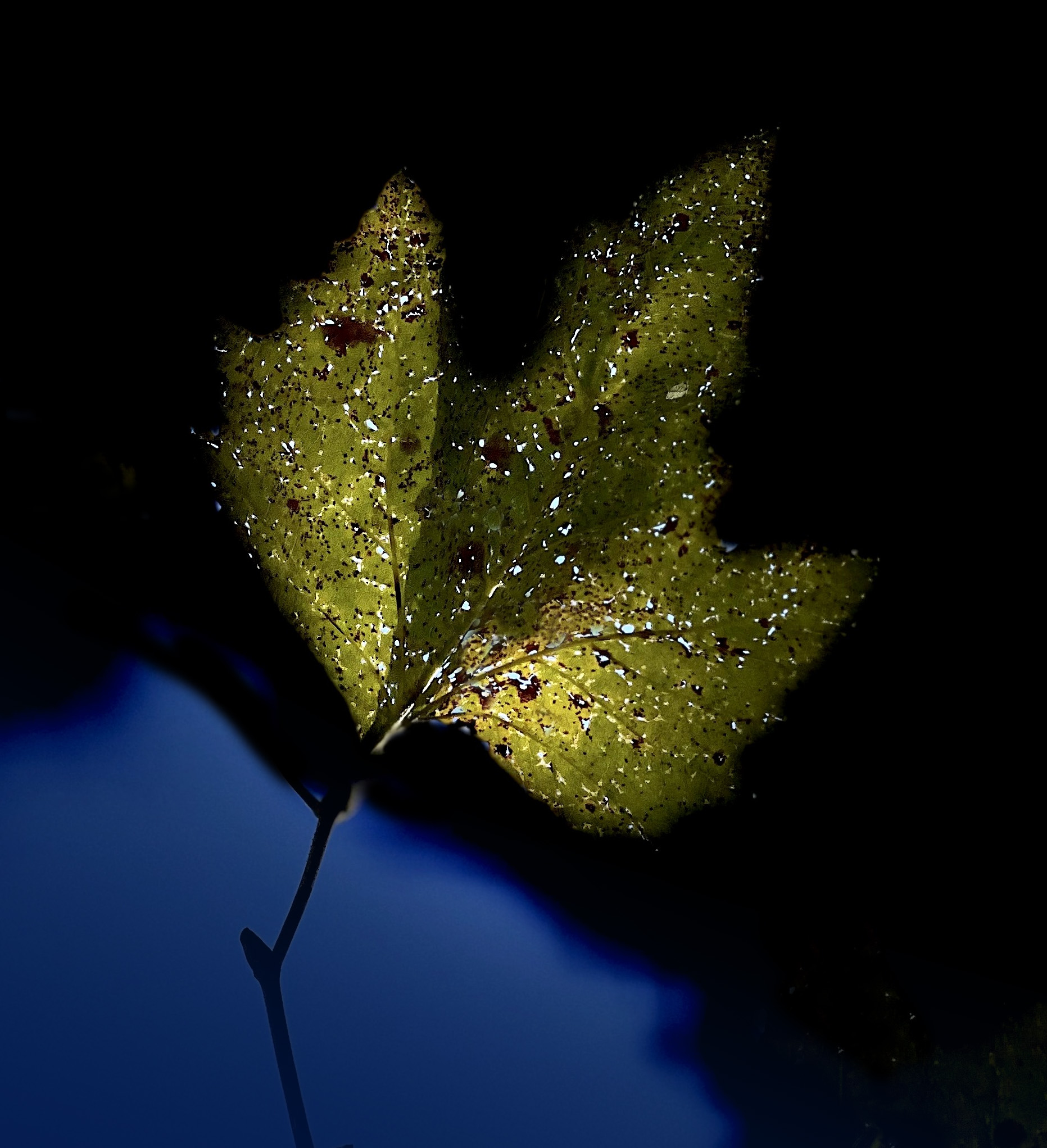
Hi Judith, Like Gerard, I favor the blue section although I decreased its opacity and moved it closer to the leaf. Then I made the leaf highlights more uniform. The large bright spots were fingernails on the chalkboard for me. I also cleaned up some of the other spots. In our instantaneous world we sometimes forget how much time was spent dodging, burning, bleaching, and retouching in analog printing. Making a clean image makes it easier to appreciate. Karl |
Oct 7th |
 |
| 79 |
Oct 22 |
Comment |
Hi Gerard, The interesting thinking about images like this is how our individual minds interpret line and form. The original may be busty or have a bustle while the revision is a slender sheath. It's all in our minds. Karl |
Oct 7th |
5 comments - 1 reply for Group 79
|
5 comments - 1 reply Total
|