|
| Group |
Round |
C/R |
Comment |
Date |
Image |
| 79 |
Jul 22 |
Reply |
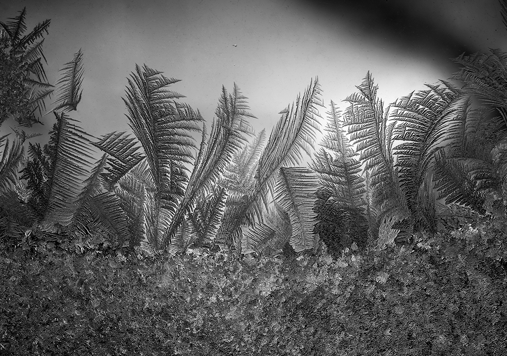
Yes, the cave paintings add meaning and more interesting subject matter. Karl |
Jul 18th |
| 79 |
Jul 22 |
Comment |
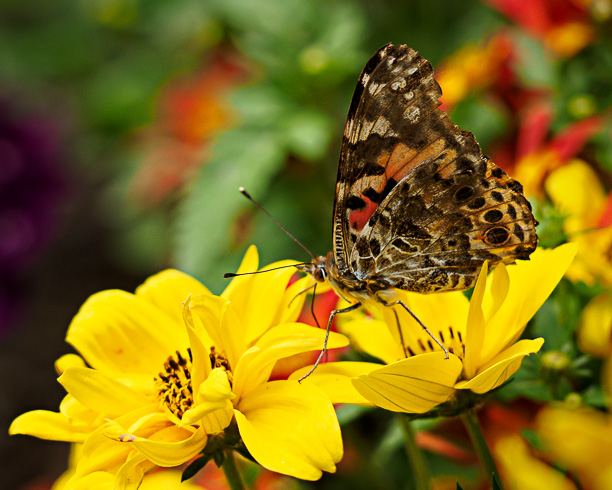
Hi Lauren, I'll chime in again with a horizontal 10x8 crop. This view keeps only the sharp yellow flowers and eliminates the bright top flowers. Like Stuart, I darkened the top and lower right corners slightly with the Gradient tool. I think that natural world images don't need the high level of adjustment that Peter showed. Karl |
Jul 18th |
 |
| 79 |
Jul 22 |
Comment |
Hi Gerard, I agree that a vertical pano of the original works well and is more natural. I might do that in making a large print.
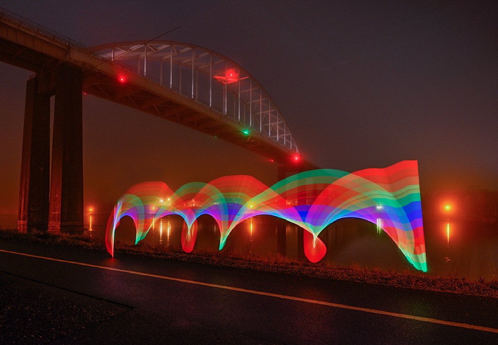
For PSA projected image exhibitions I would go with the altered version and maybe crop some of the bottom where the reflection is unsharp. Judges these days hate unsharpness. Plus the fact that most projected exhibitions still favor horizontal images (e.g. 1024x768 pixels). An entry can contain much more information if it is more horizontal and less vertical. Karl |
Jul 14th |
| 79 |
Jul 22 |
Reply |
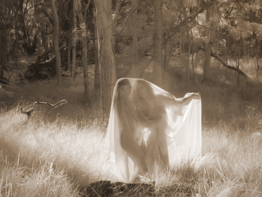
Hi Peter, Thanks for the itch relief tip. For competition I would put a thin white or strawberry line around the image. For 'fine art' I rather like the edges going out to infinity. Yes, the image also works well as a panorama. Great comments. Karl |
Jul 11th |
| 79 |
Jul 22 |
Comment |
Hi Lauren, What a colorful butterfly image! Your cropping is good but I might crop the top even more. Crop to remove the red flowers at top center so that the border comes 2/3 of the way down to the butterfly. This removes a distraction and gives a more asymmetric composition with the butterfly raised up. That results in a feeling of both more importance for the butterfly and a more intimate look at him on the same level. Beautiful color and sharply focused. Karl |
Jul 8th |
| 79 |
Jul 22 |
Comment |
Hi Lynne, The 'developed' image has much more impact. Darker, more saturated images seem to have more striking power. Normally I like to see some ambiance in an image, but here the ambiance detracted so you did well to remove it. Excellent processing work to make a portfolio worthy flower image. Karl |
Jul 8th |
| 79 |
Jul 22 |
Comment |
Hi Gerard, I like the idea of a rainbow wall. The color adds an interesting factor to a wall that is aching for a feature to take it out of the ordinary. I agree with Bev that a Sean Scully exhibit would not be an art destination for me. The color blocks, however, in muted form helped this image. With the rock wall I would also try a figure at about 25% opacity. Karl Leck |
Jul 6th |
| 79 |
Jul 22 |
Comment |
Hi Judith, The brown toning and clarity to emphasize the wood grain create an image depicting years of use, decay, and now off-limits as shown by the tape. My old school side might like to see the entire shed with some ambiance to convey both age and loneliness. As it stands, it is a great interpretation that communicates well. Karl |
Jul 6th |
6 comments - 2 replies for Group 79
|
6 comments - 2 replies Total
|