|
| Group |
Round |
C/R |
Comment |
Date |
Image |
| 20 |
Oct 21 |
Comment |
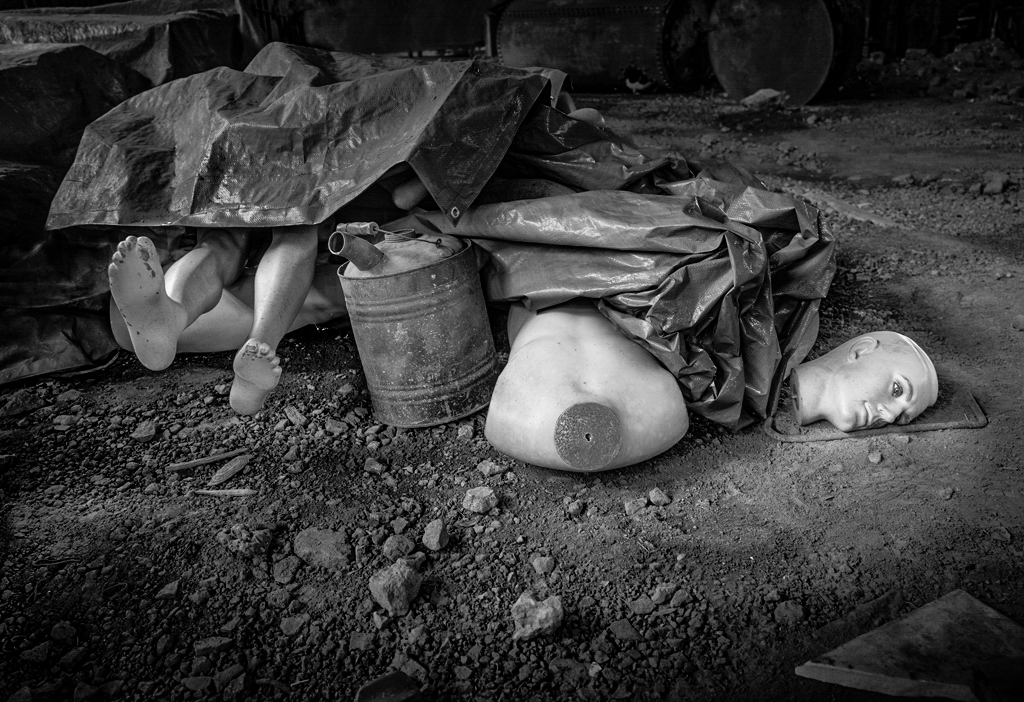
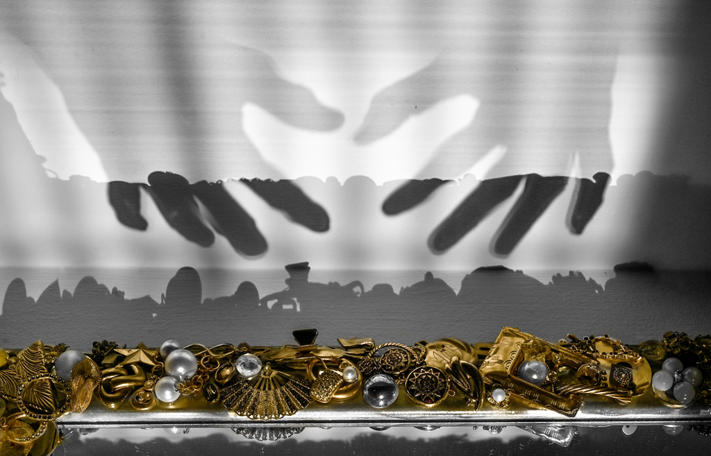
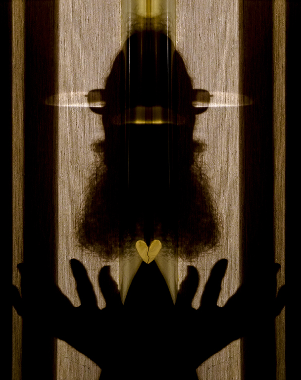
Hi Fred, I love the concept. How much weight can you lose? The image might be remade with lighting to emphasize the books and perhaps the small skull. The bottom shelf could be bare and decorative pieces that don't correspond to the theme, eliminated. Light the skeleton but not the right side. The small bright spot at lower right is distracting. Simplify to the theme. Another possibility might be the skeleton reaching to the books but head turned to make 'eye' contact with the viewer. Great idea! Keep at it. Karl Leck, Group 79 |
Oct 11th |
1 comment - 0 replies for Group 20
|
| 79 |
Oct 21 |
Reply |
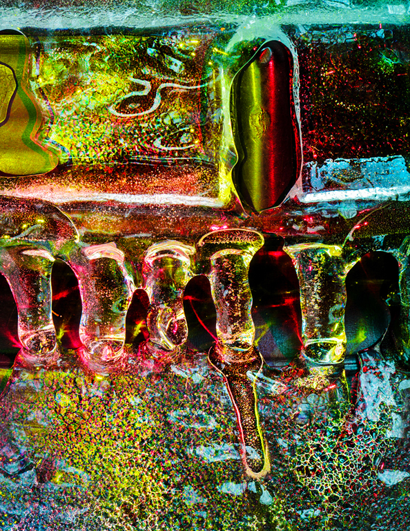
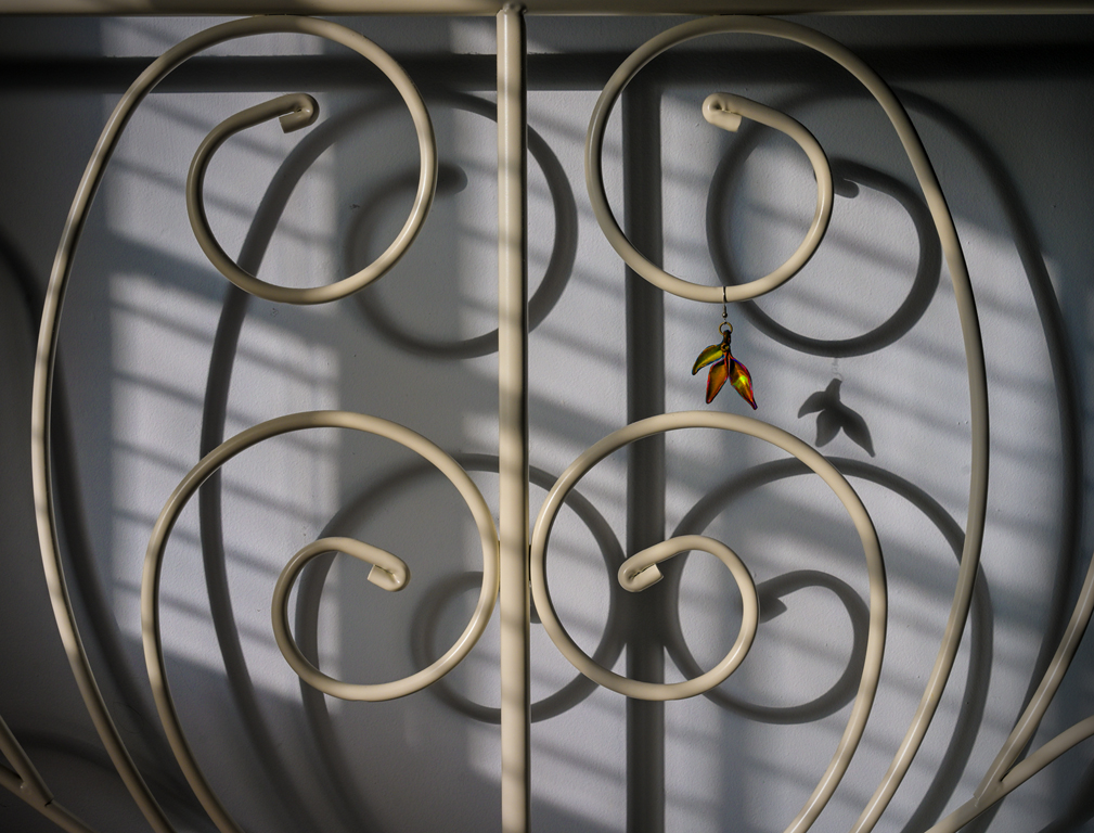
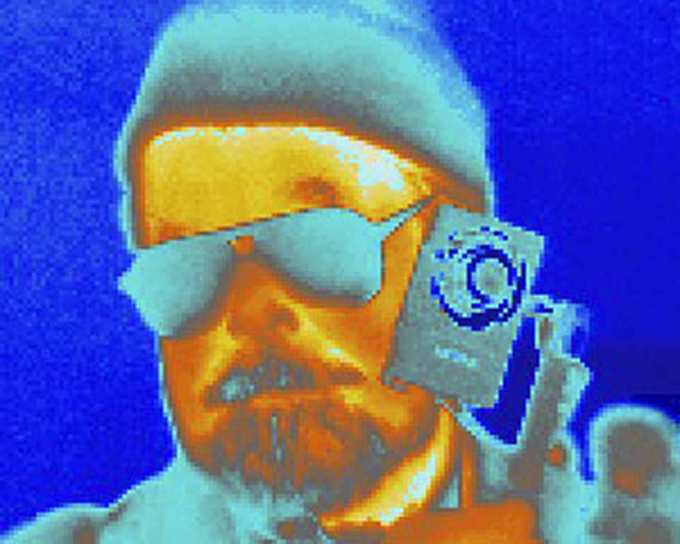
Well, actually the picture was made with a Nikon, not a Canon, but I guess canon sounds better than nikon in your phrasing. The music was in my head but I sometimes beat it out on various parts of this singing bed headboard. Karl |
Oct 20th |
| 79 |
Oct 21 |
Comment |
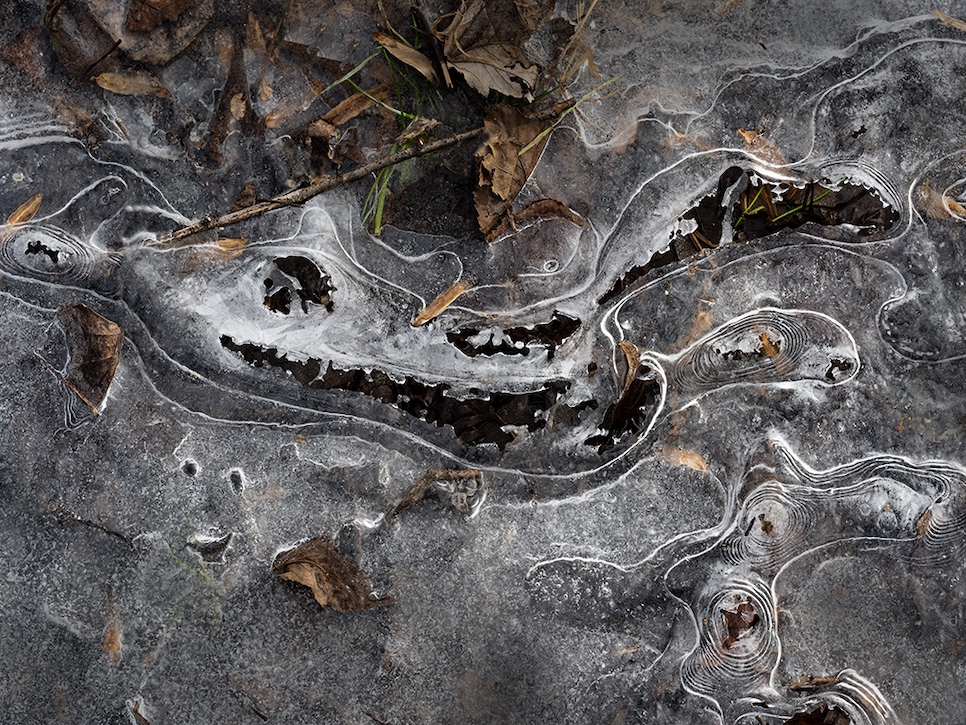
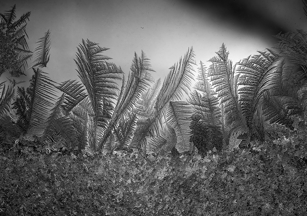
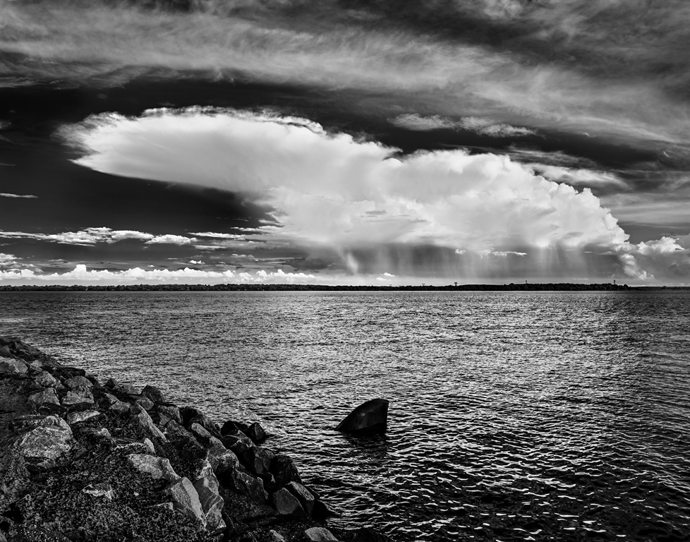
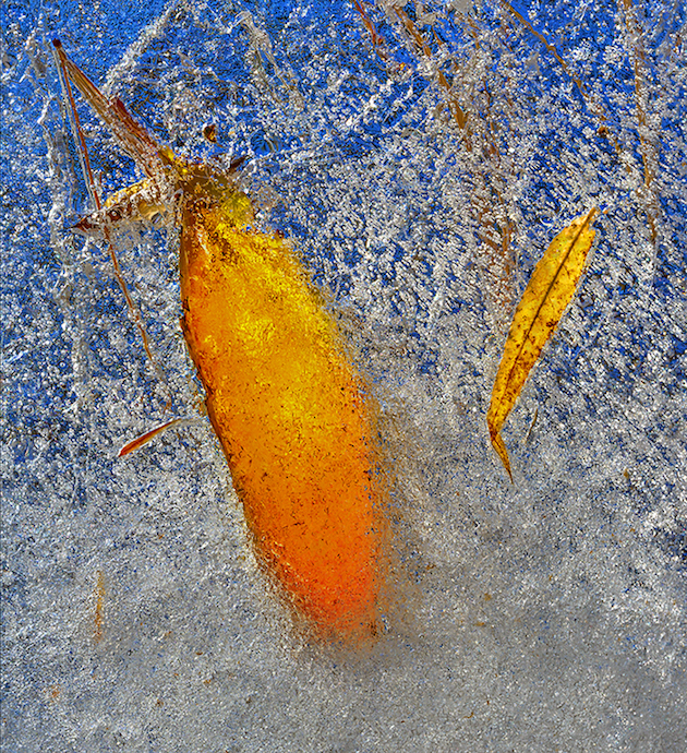
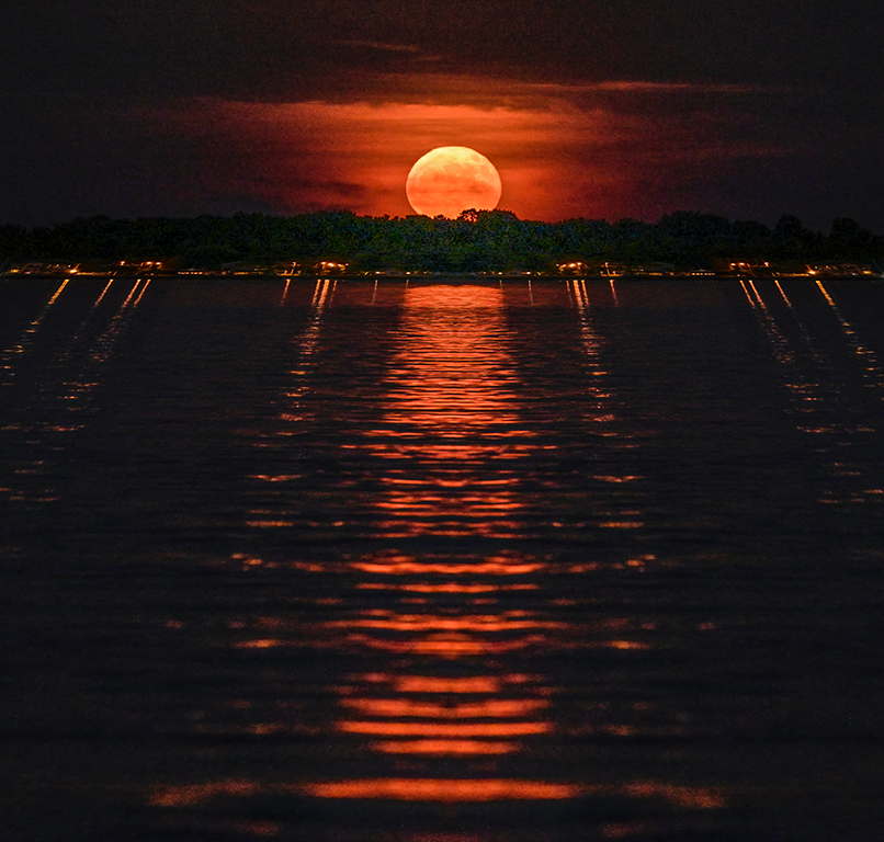
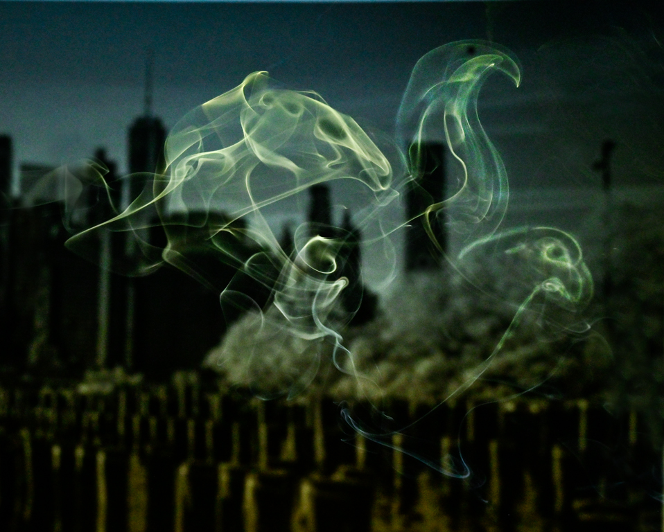
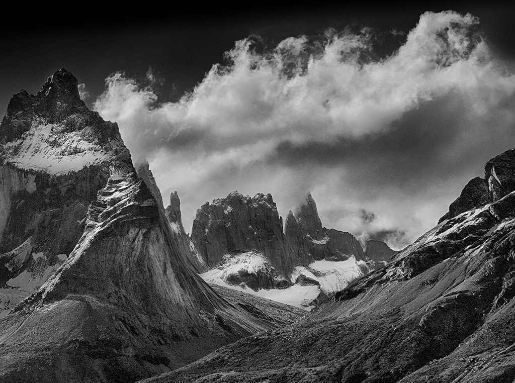
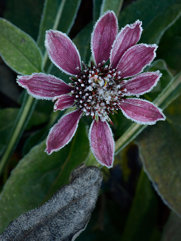
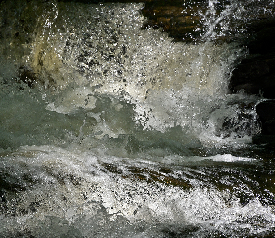
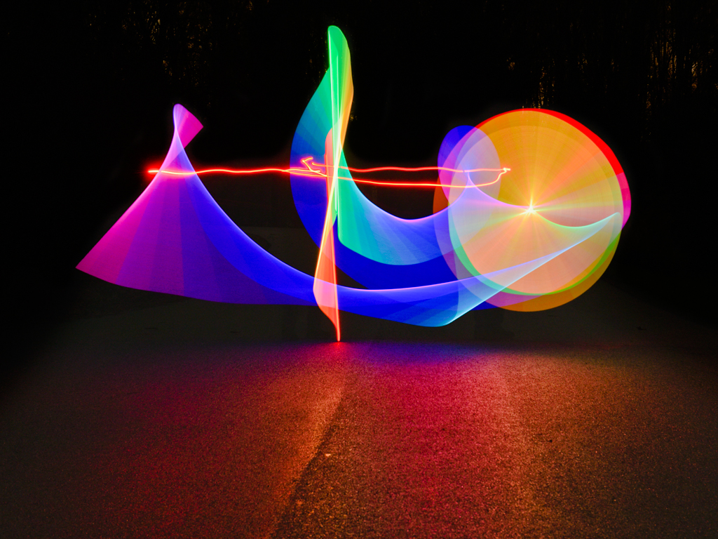
Hi Lauren, I like the repeating conical forms in the top half and round forms in the bottom.
The color contrast between deciduous and evergreen trees makes the image better than just the bright warm colors we see in the East now. The High Resolution function is similar to in-camera High Dynamic Range in that 2 or more captures are overlayed. Items in the image that don't move look perfectly still. Items that move between exposures become blurs or ghosts like the water here. It's a beautiful seasonal image. Karl |
Oct 11th |
| 79 |
Oct 21 |
Comment |
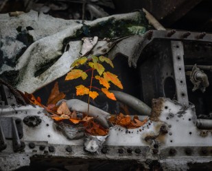
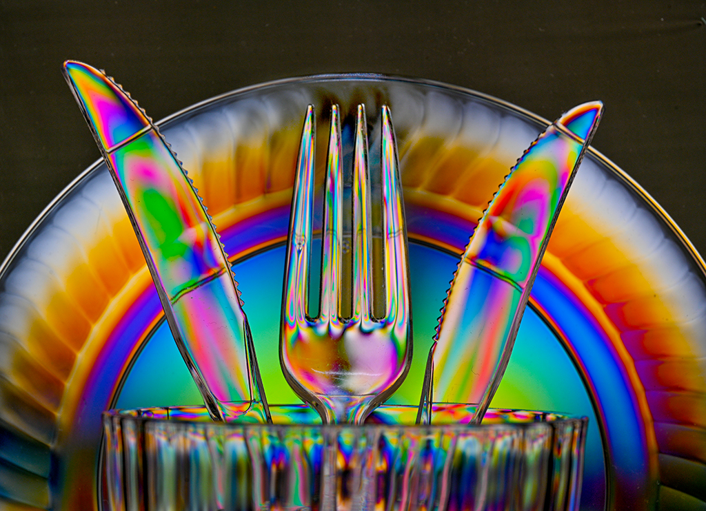
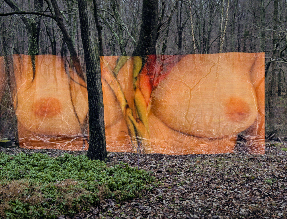
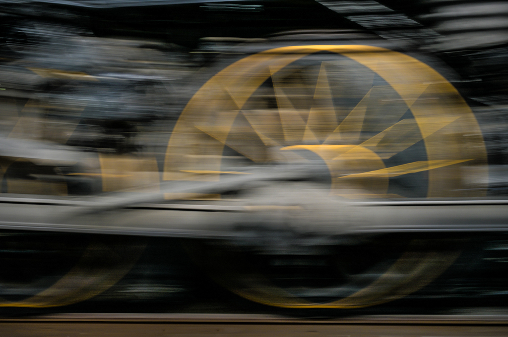
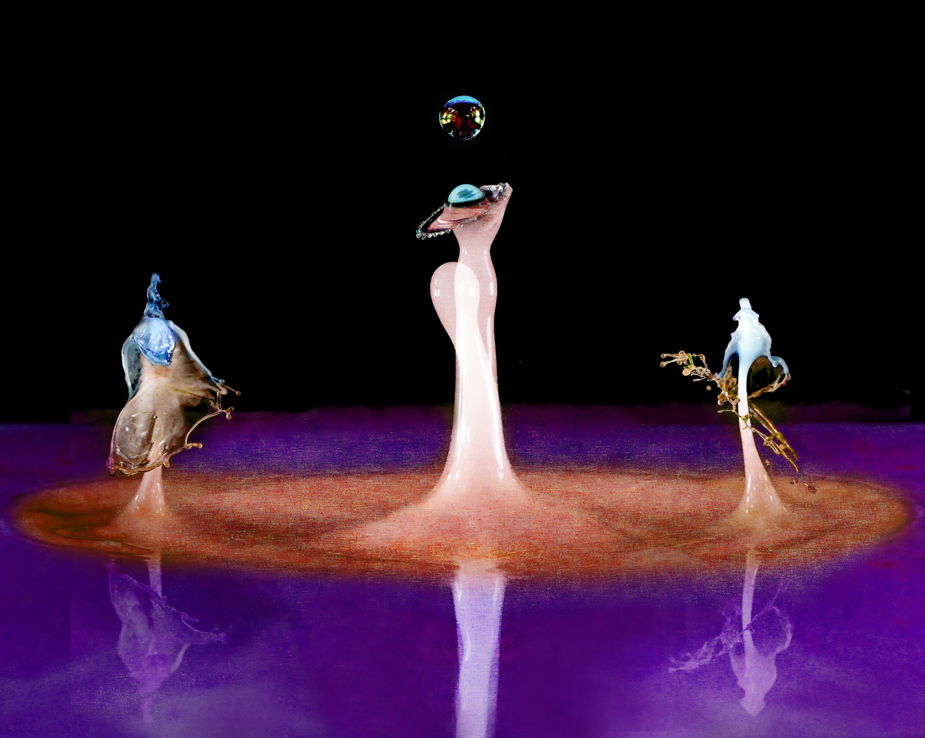
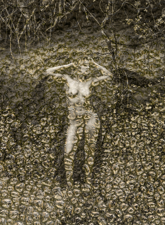
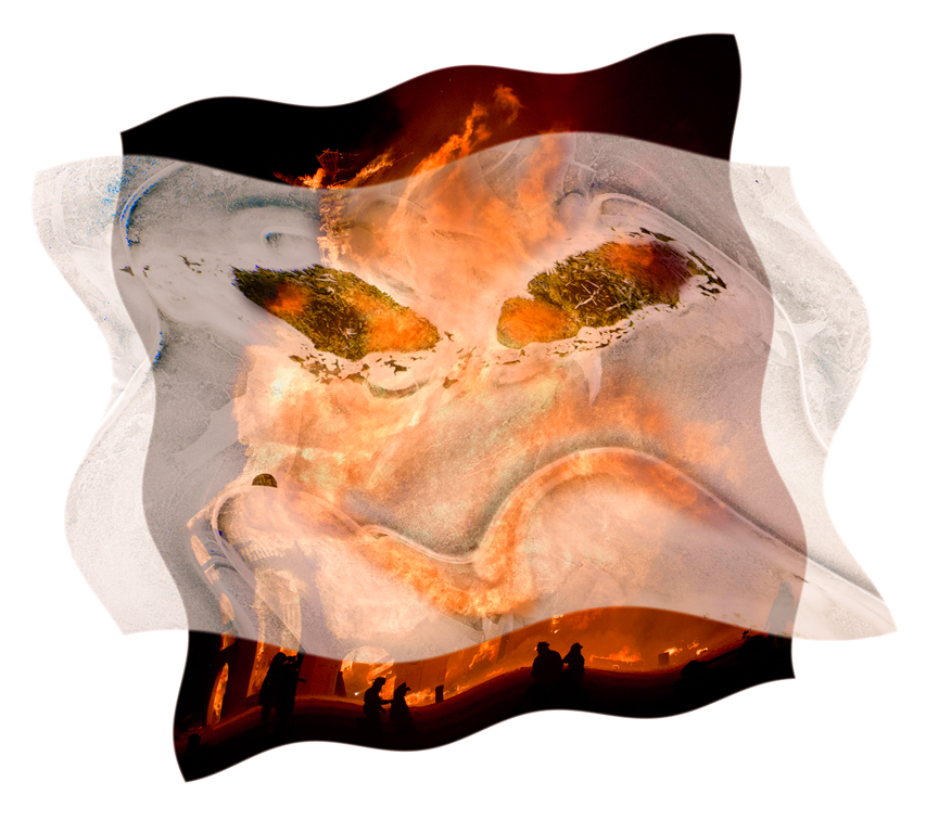
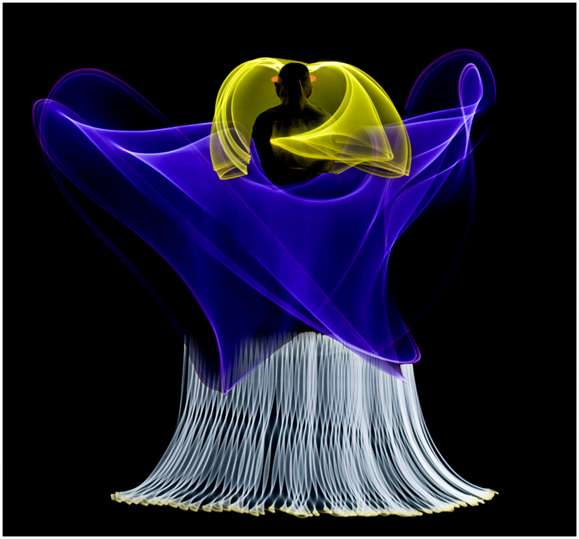
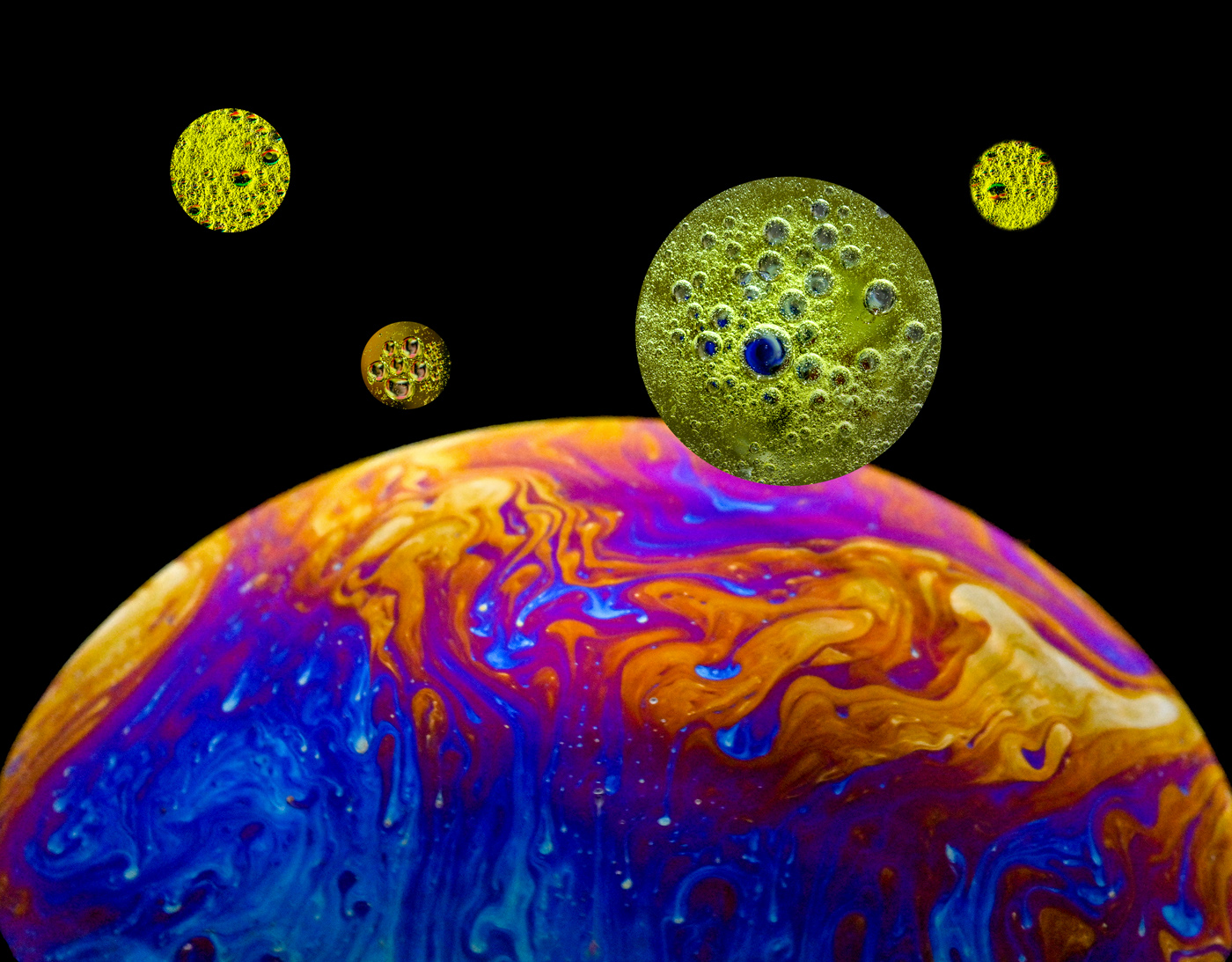
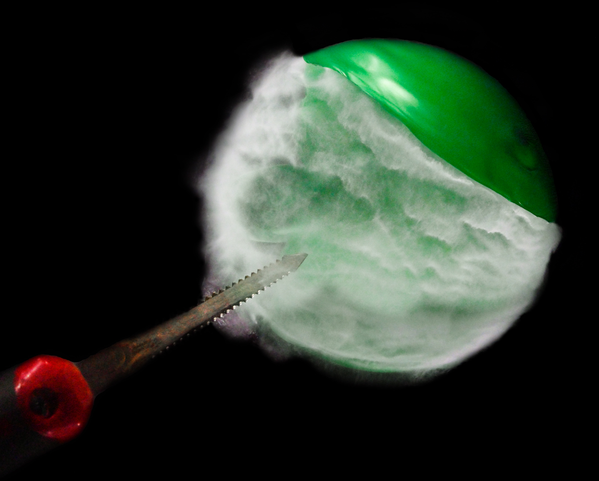
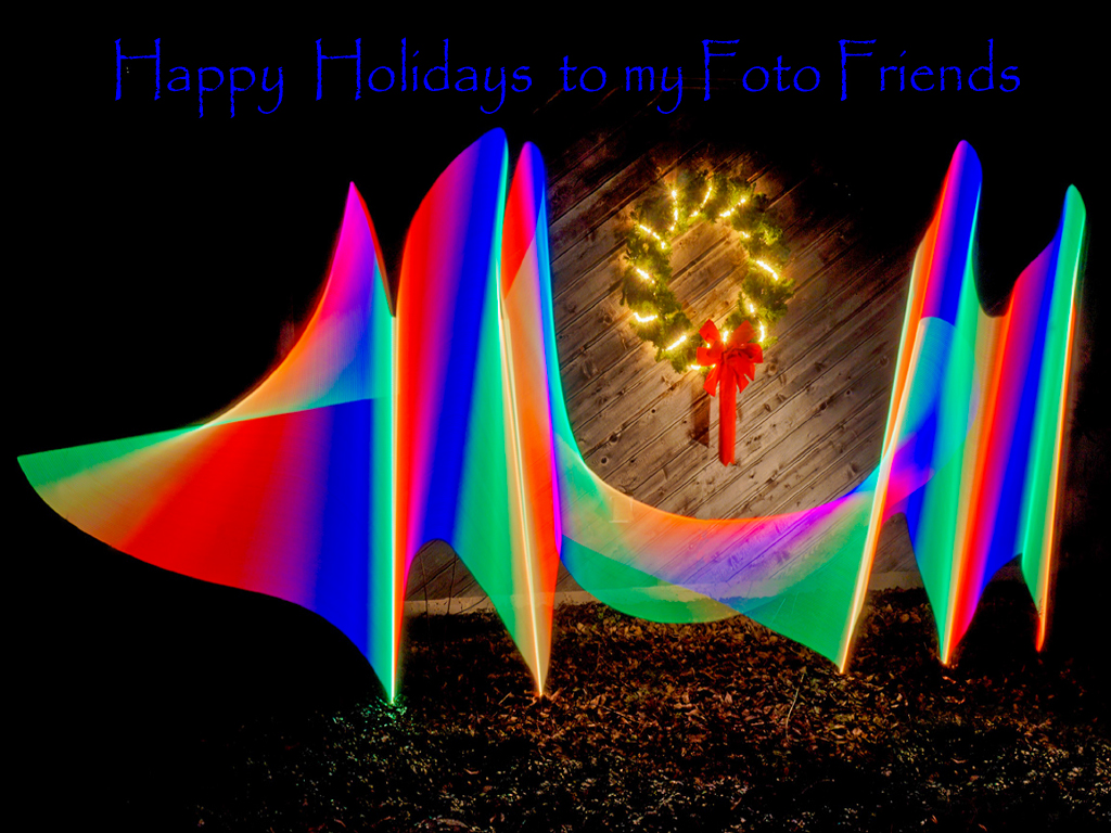
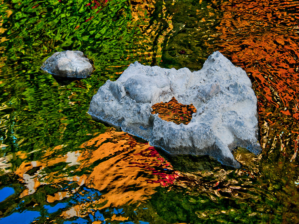
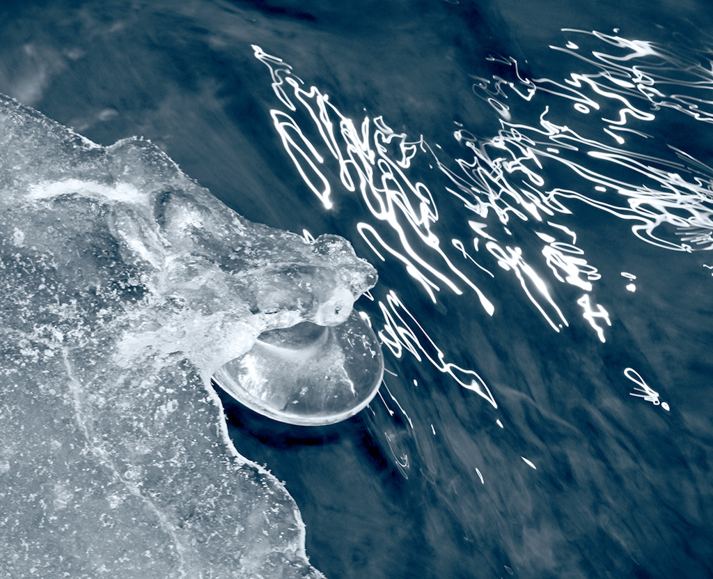
Hi Freddie, Some of my friends say, "If you can't quite tell what it is, then it's art." I suspect that the subject is manmade, not nature, since the color gamut is so broad and saturated. Skeins of yarn? The items have been nicely abstracted by dragging (slowing) the shutter resulting in some fascinating, flowing forms. Karl |
Oct 11th |
| 79 |
Oct 21 |
Comment |
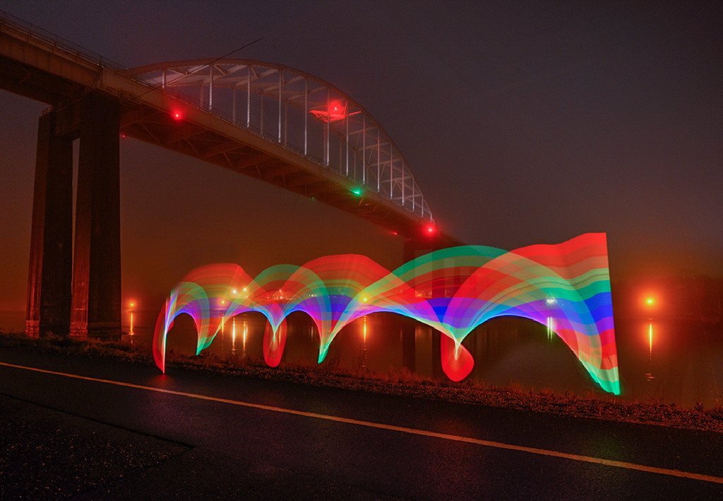
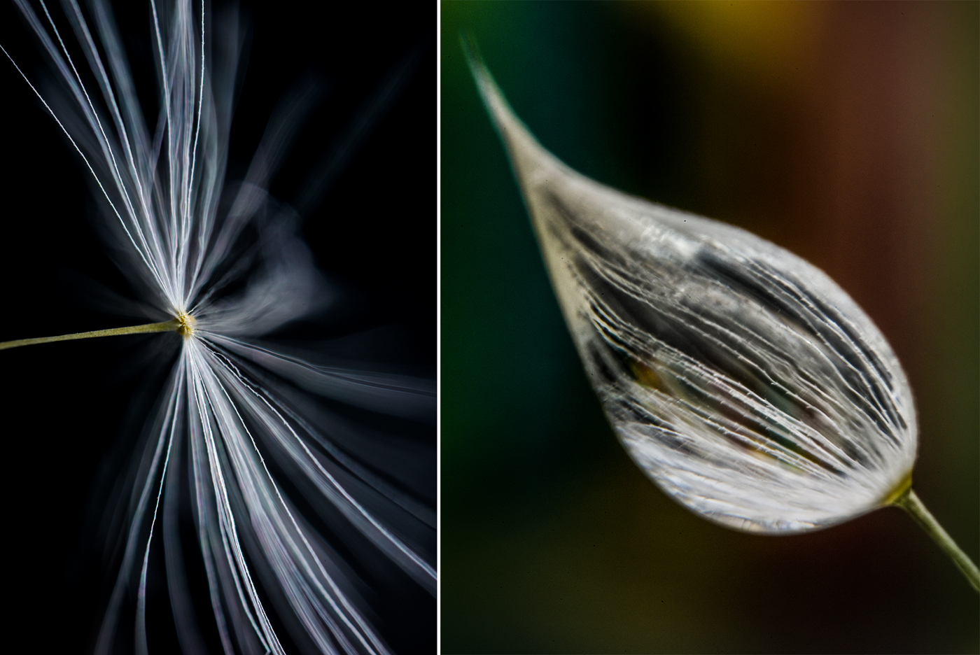
Hi Peter, Nice interpretation of form. The little bit of color adds a lot of interest and helps make the image 'artistic'. If this wasn't a photography forum, I would have said this was calligraphy with brush and ink. Karl |
Oct 9th |
| 79 |
Oct 21 |
Comment |
Hi Peter, Nice interpretation of form. The little bit of color adds a lot of interest and helps make the image 'artistic'. If this wasn't a photography forum, I would have said this was calligraphy with brush and ink. Karl |
Oct 9th |
| 79 |
Oct 21 |
Comment |
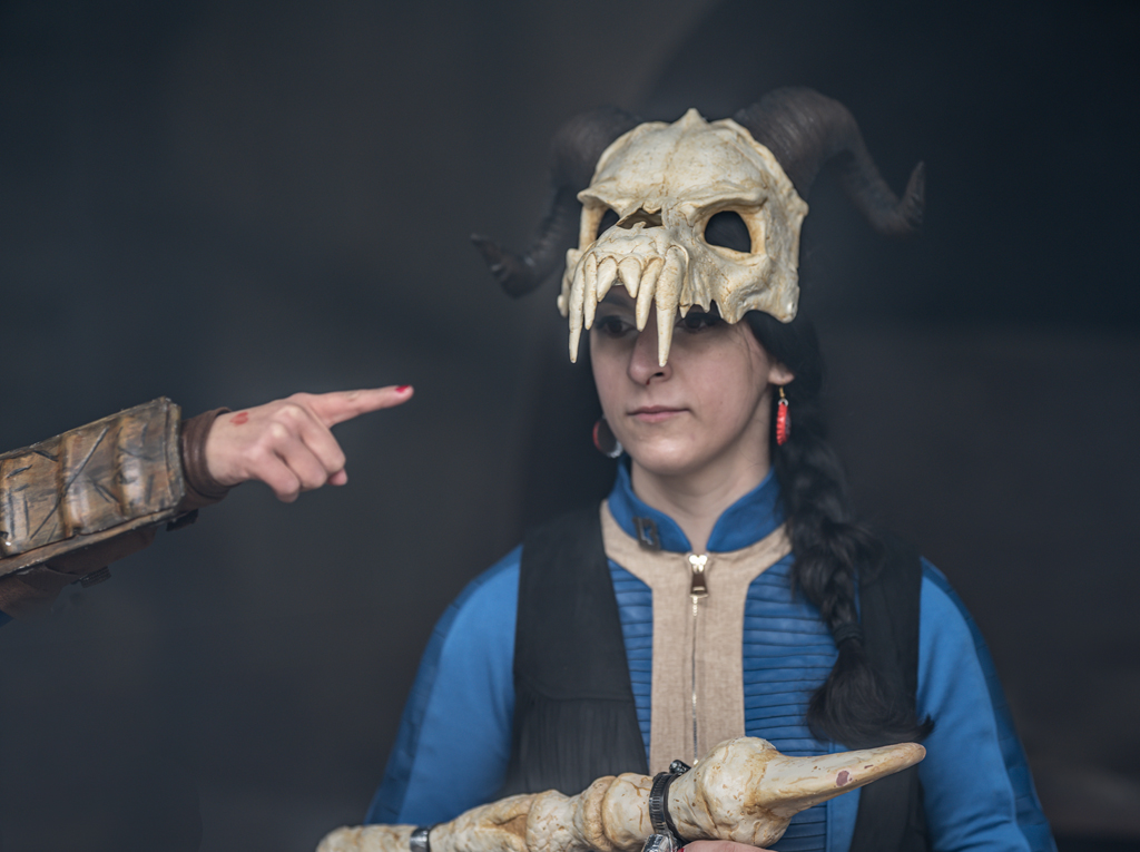
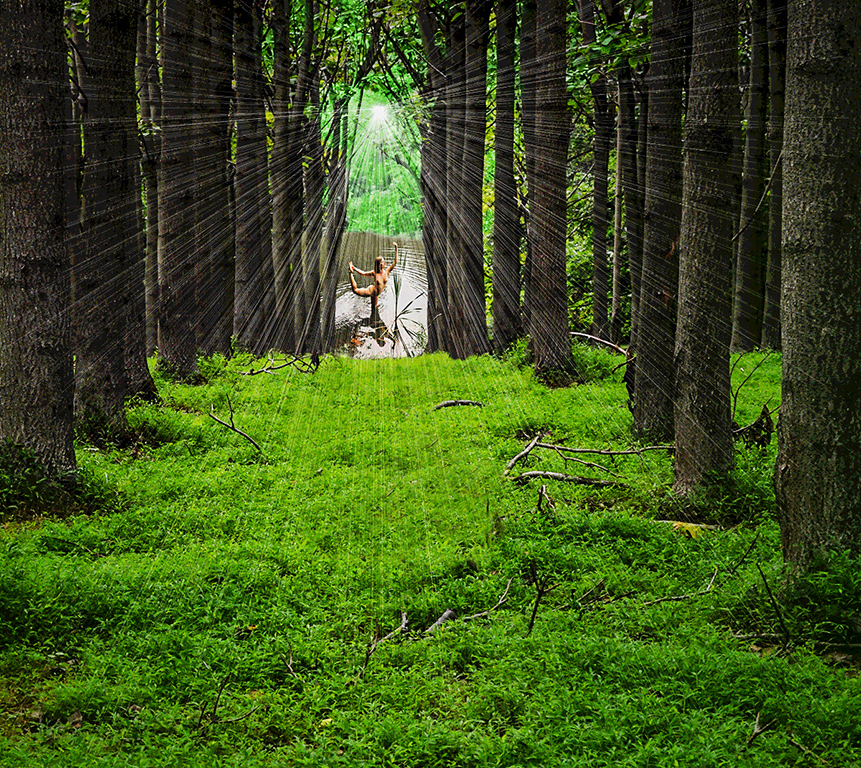
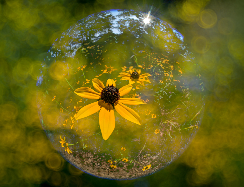
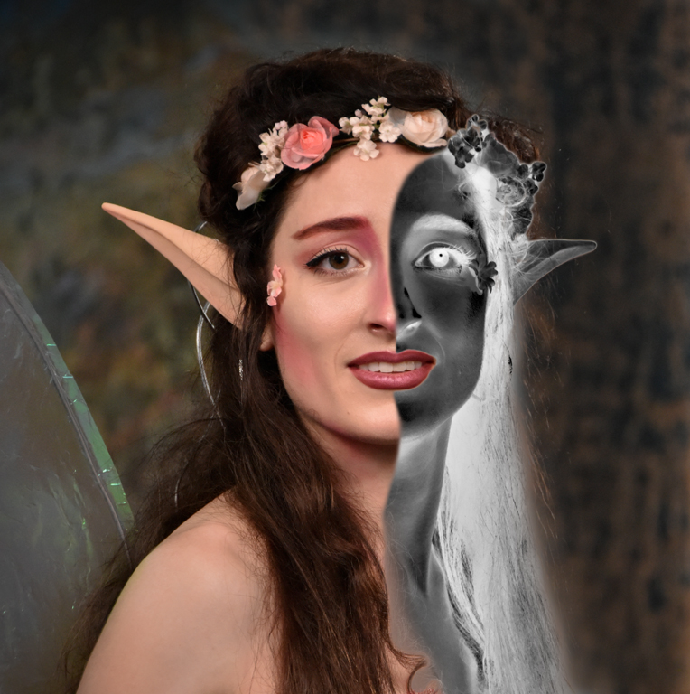
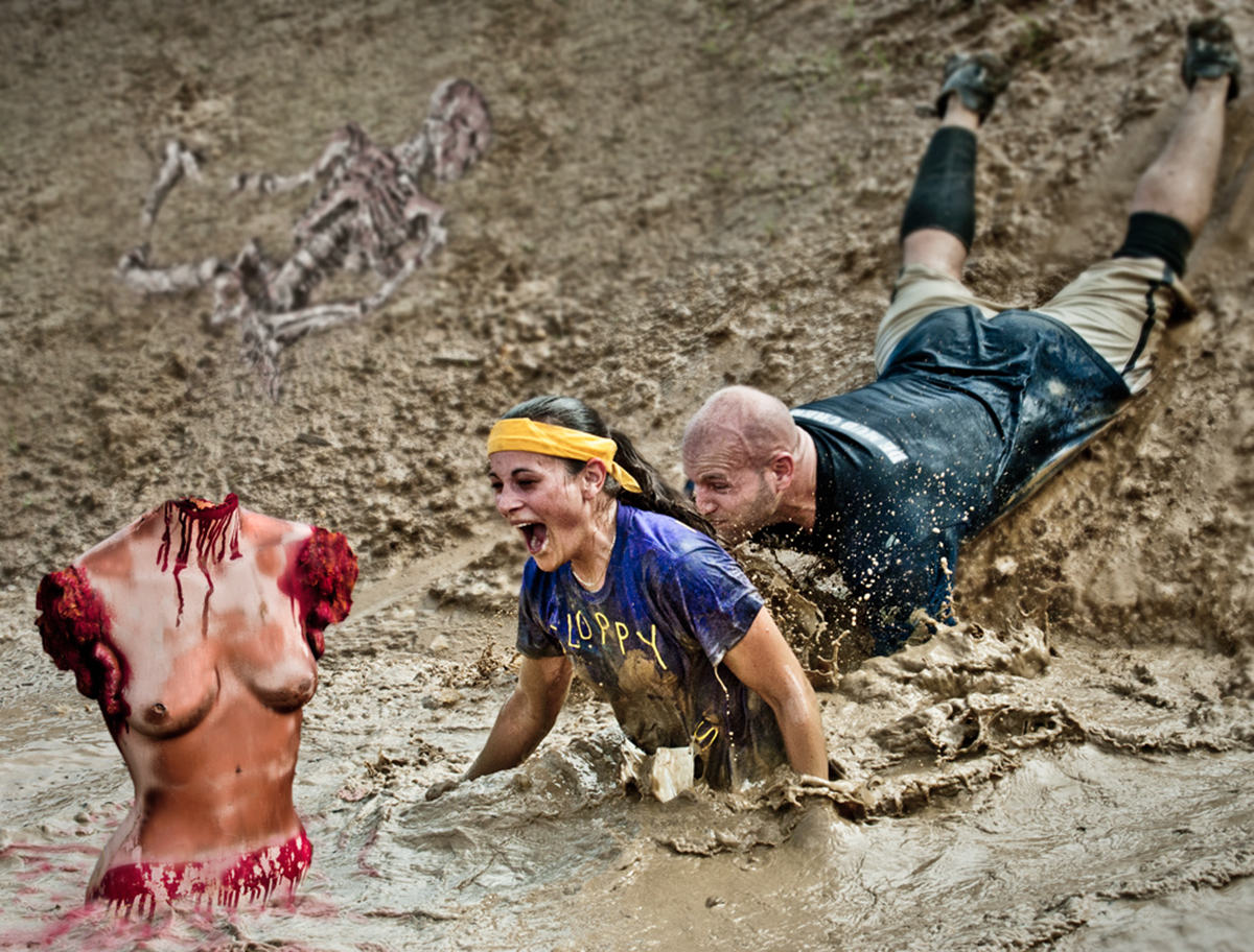
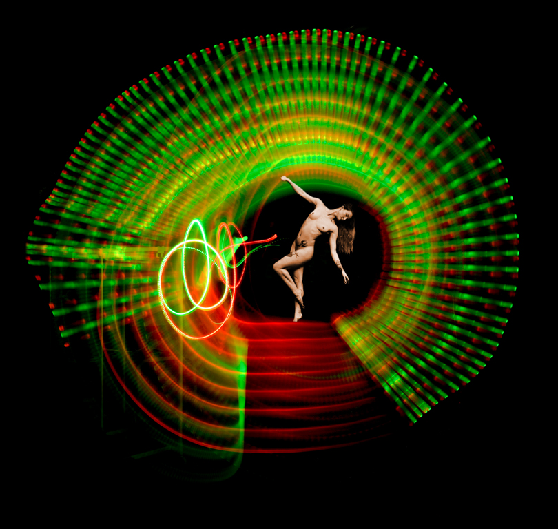
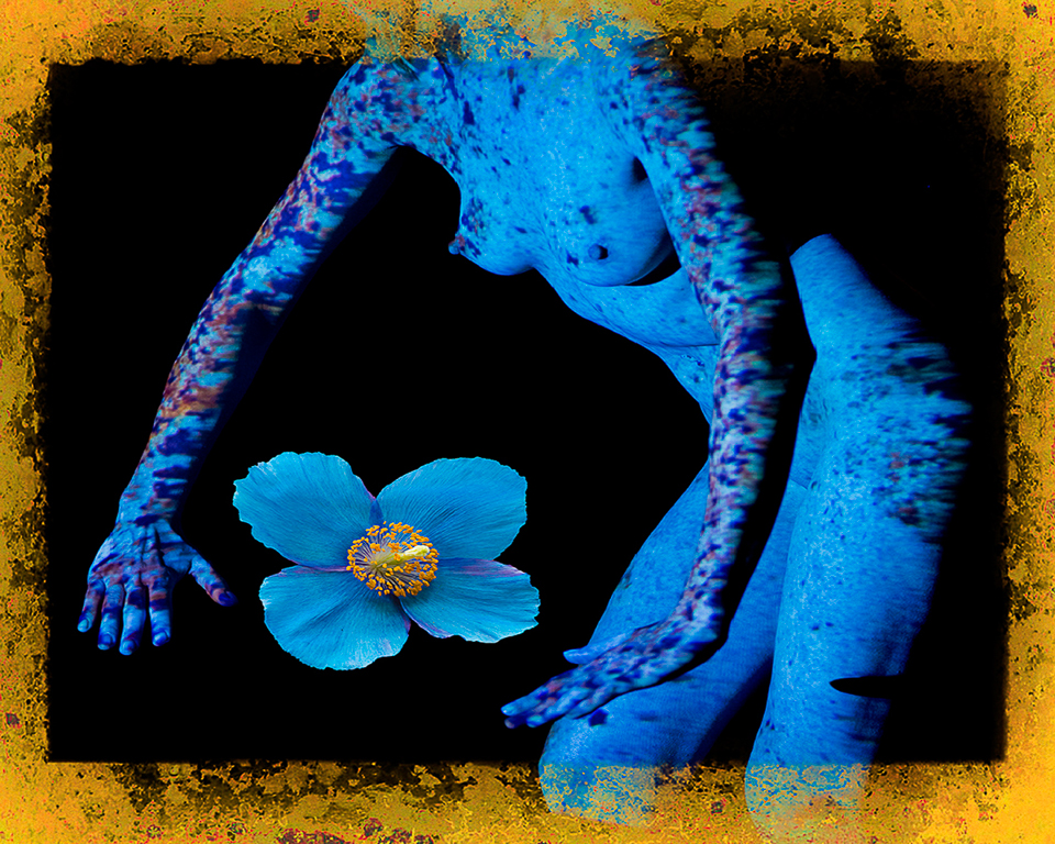
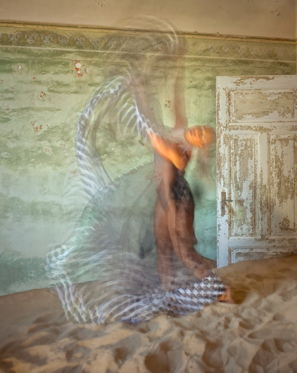
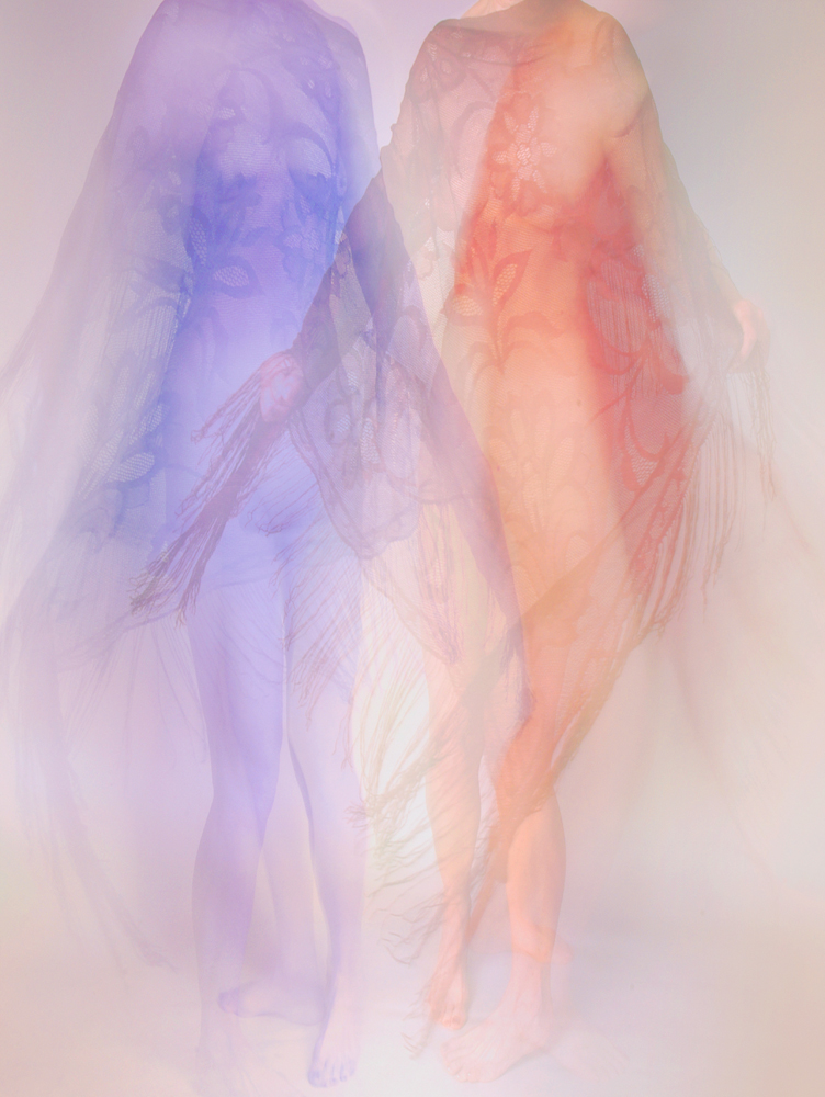
Hi Judith, I liked the idea of entrapment. The overlapping of web on the figure is a good beginning. I think the spaceman needs to stand out a bit more. I'm not sure b&w is the best way to go for this combination. If spaceman were colored blue or orange, etc. he would stand out better. can get complicated. It would be more realistic if parts of spaceman had a shadow on the web (Photoshop Drop Shadow tool or artistic burning). You have given yourself a real challenge. This is one of those images where it is hard to tell when it is finished. Karl |
Oct 9th |
5 comments - 1 reply for Group 79
|
| 83 |
Oct 21 |
Comment |
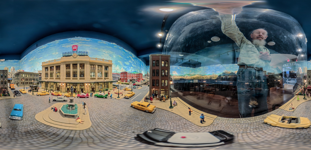
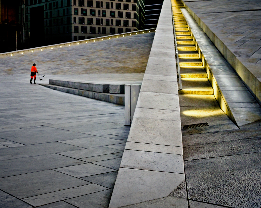
Hello Dirk, I applaud your interpretation of a nice town scene into a geometric composition. Starting with the apartment building and going past nature's tree out to infinity. Three elements with very different shapes and lines without the interference of color.
I love images that are different from the millions I've seen in 75 years. This definitely stands out and is a tribute to your vision. It's the best post I've seen this month.
Karl Leck, USA, Group 79 |
Oct 11th |
1 comment - 0 replies for Group 83
|
7 comments - 1 reply Total
|