|
| Group |
Round |
C/R |
Comment |
Date |
Image |
| 79 |
Sep 21 |
Reply |
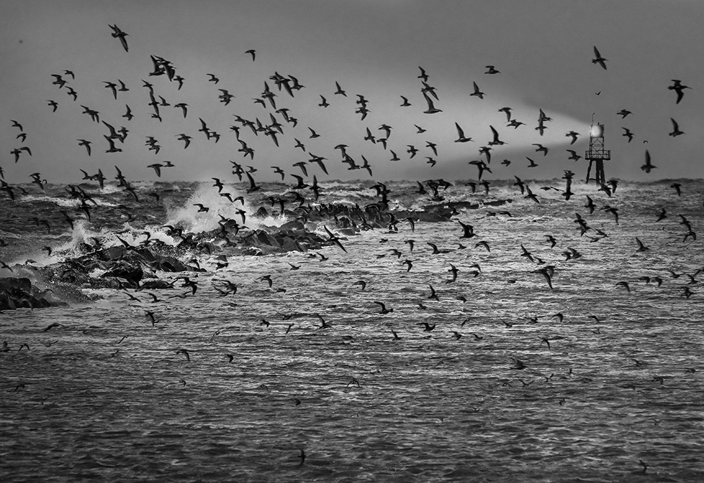
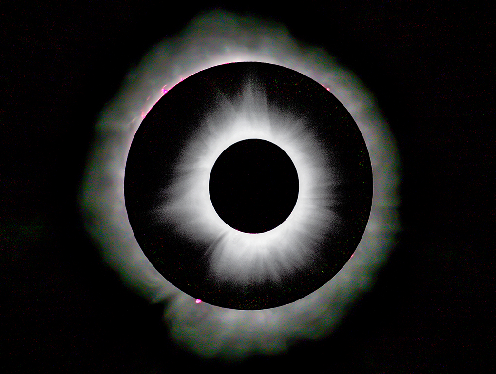
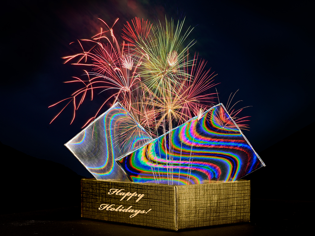
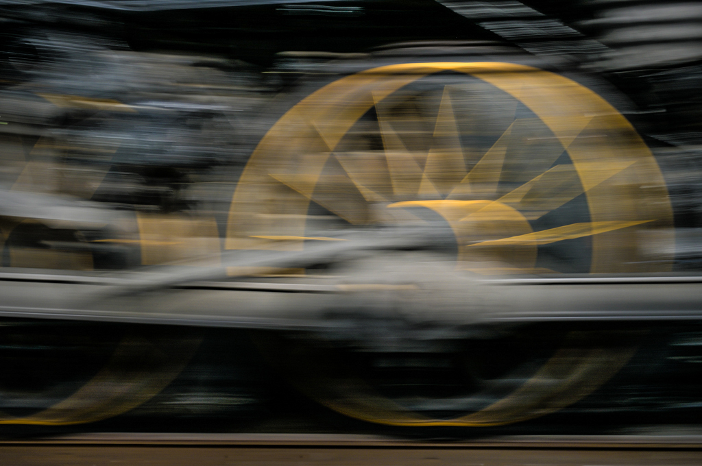
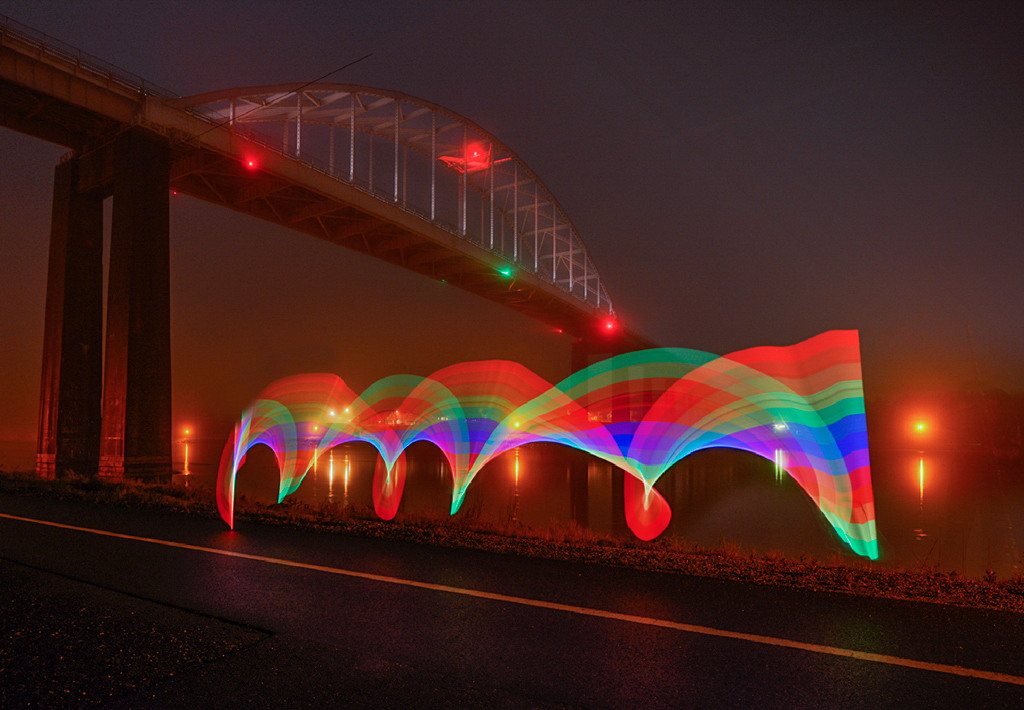
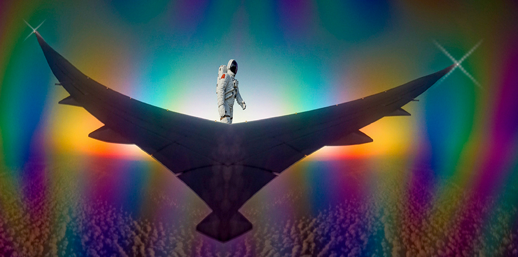
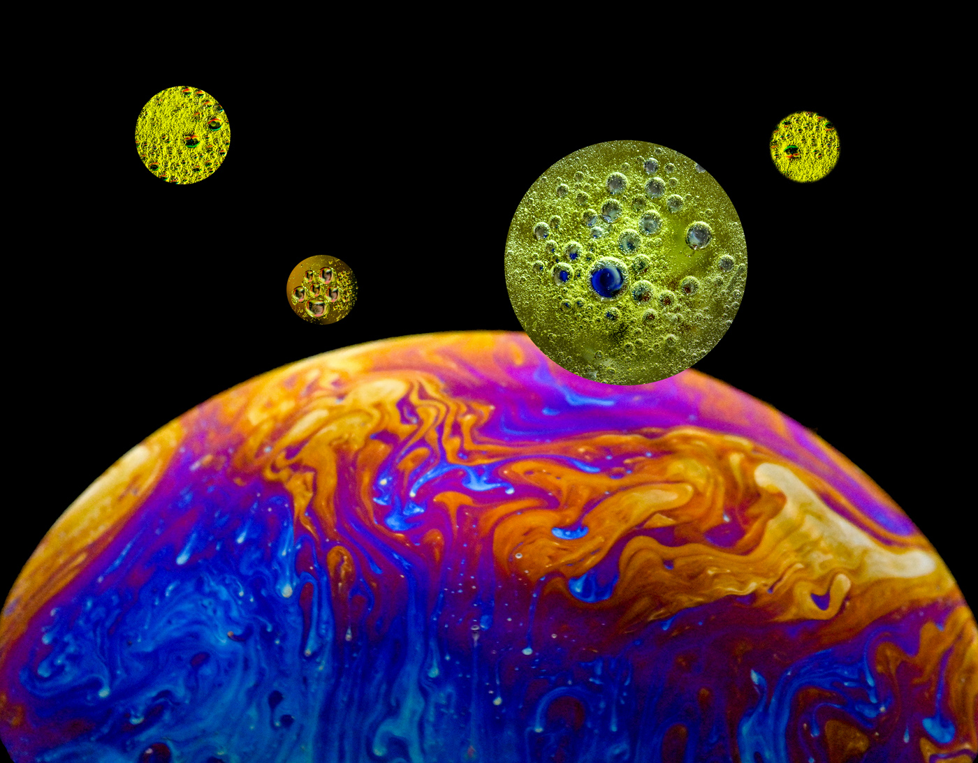
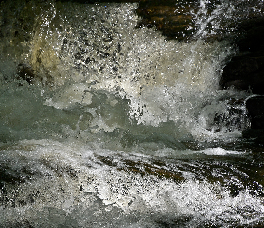
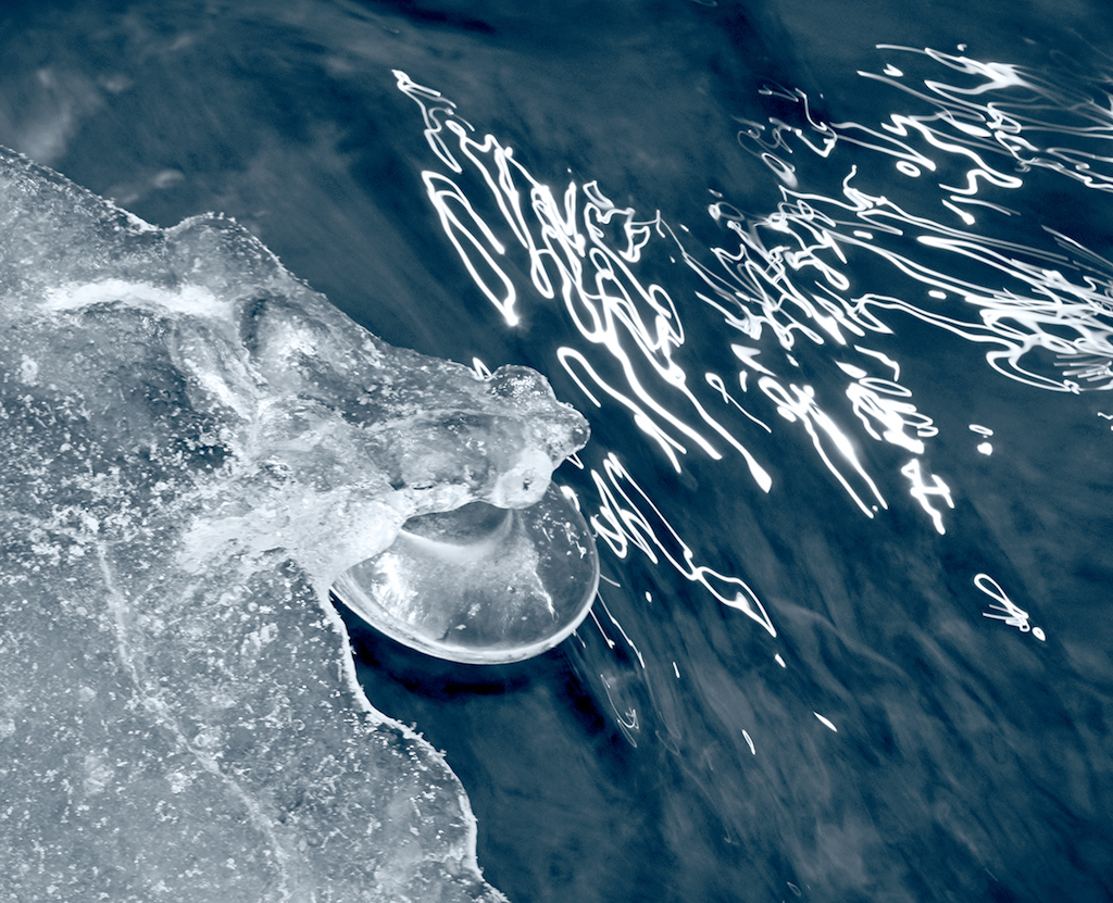
A polarizing filter helped with saturated color and protection of the lens front surface from salt spray. The faint refraction curves may be caused by reflections in the filter since the 14-30 mm S lens has Nikon's best coatings. Karl |
Sep 17th |
| 79 |
Sep 21 |
Comment |
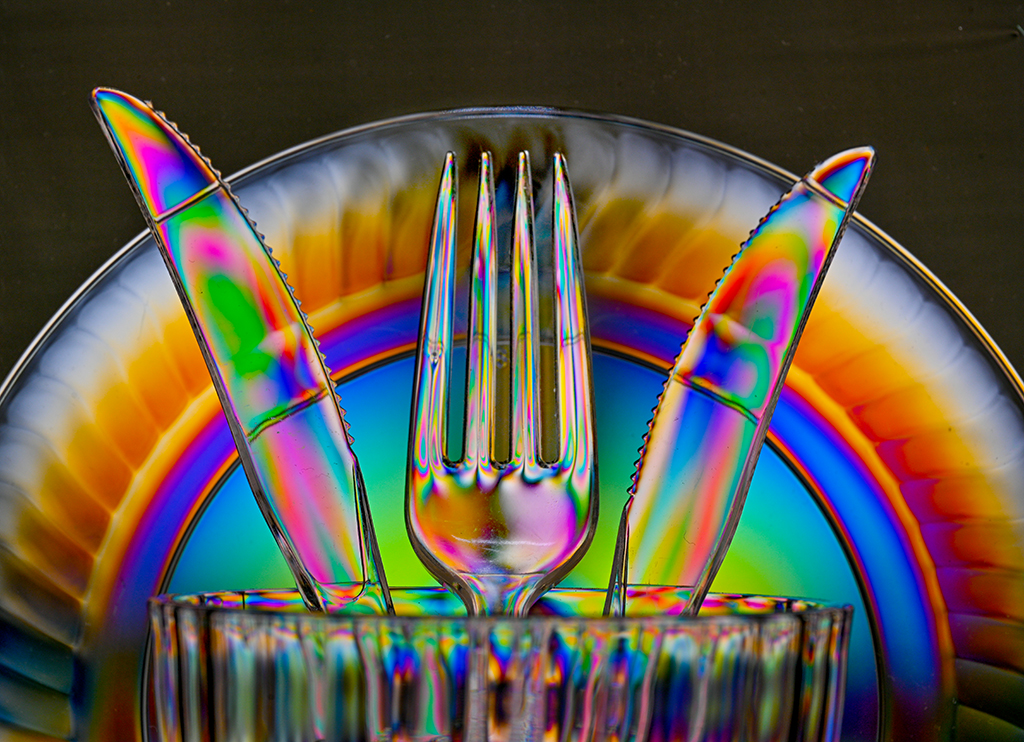
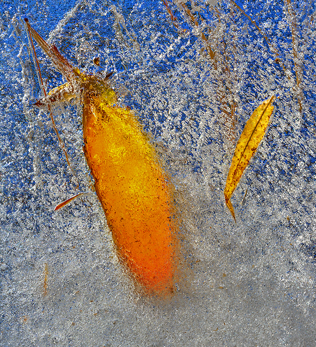
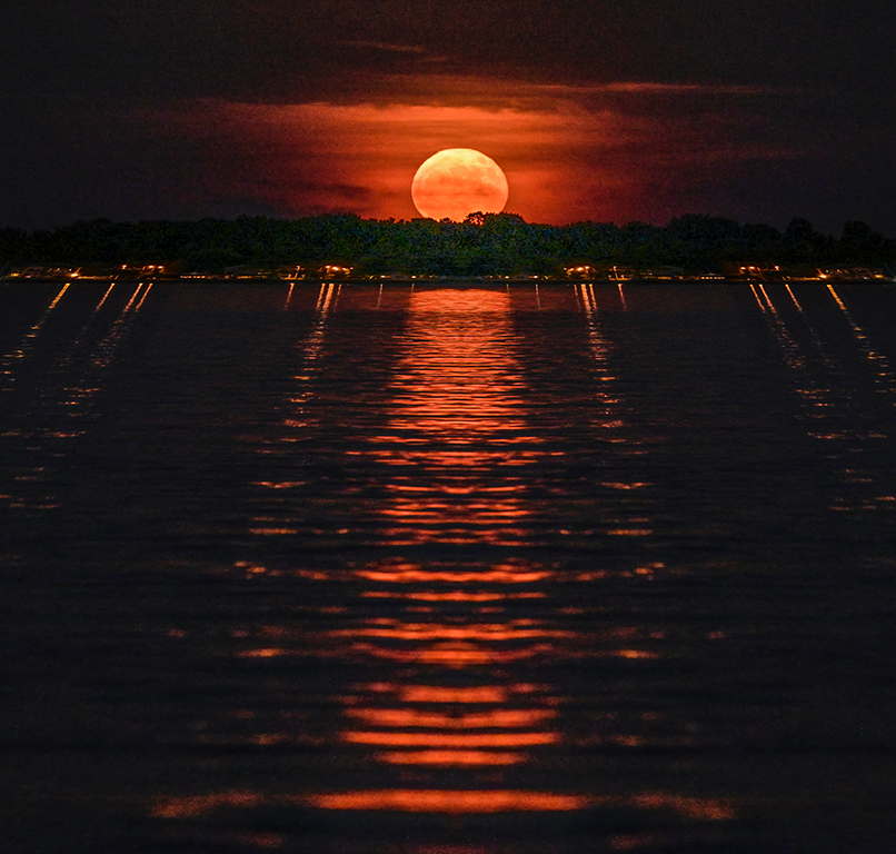
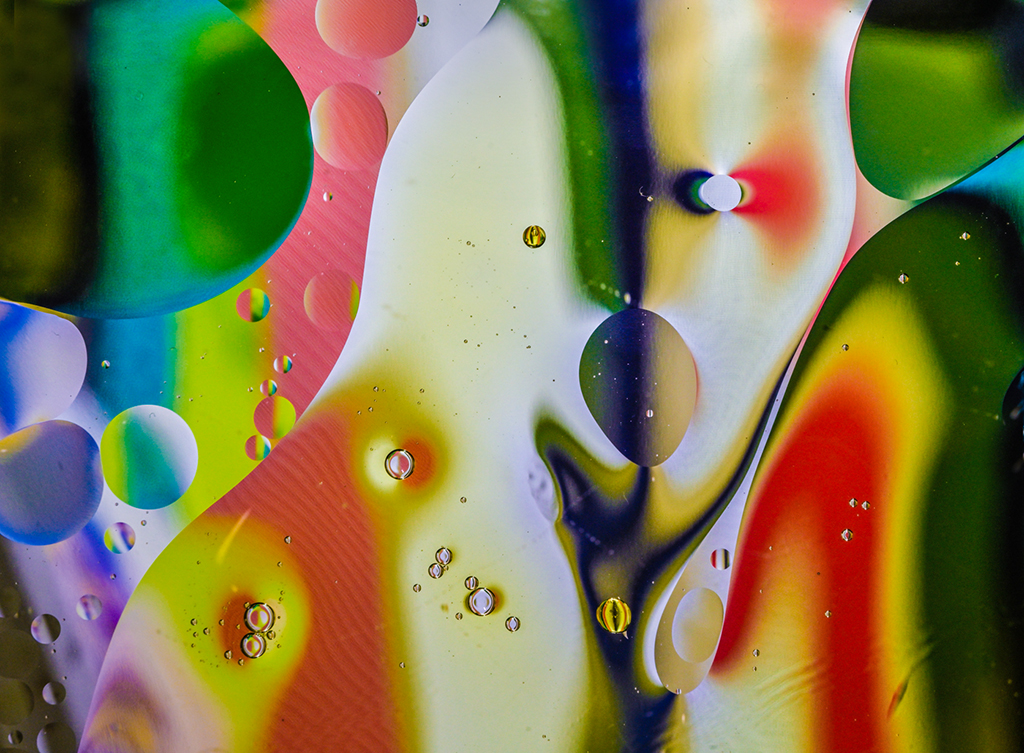
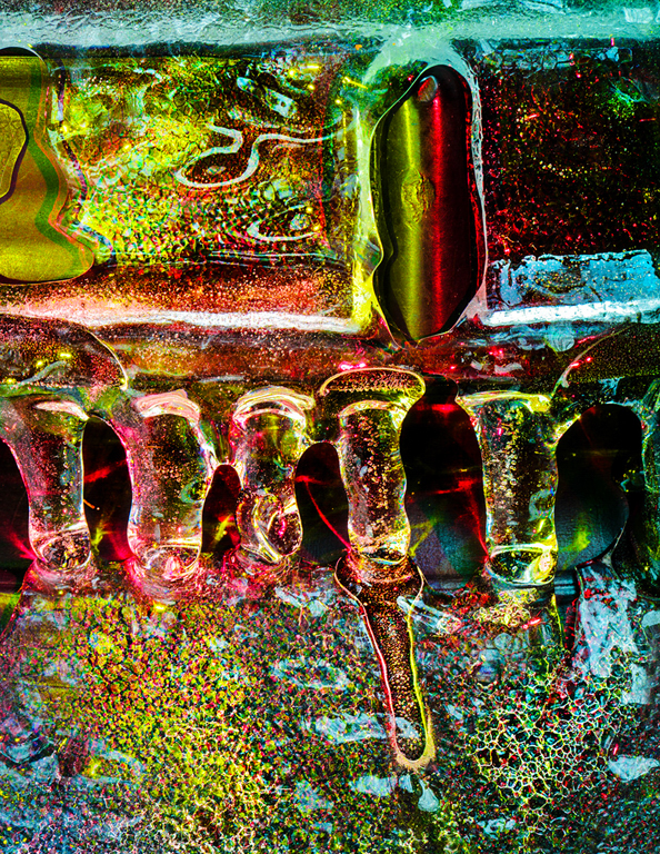
Hi Lauren, What a luscious array of color! They are beautiful. A bit more depth of field might help. That would require a higher ISO but the latest noise reduction softwares do miraculous work. Perhaps cropping 15% off the bottom could help bring the viewer's eye to the sharper, more colorful top area. Color saturation can be increased by a 0.5 to 1.0 stop underexposure. The color balance is nicely done. Karl |
Sep 10th |
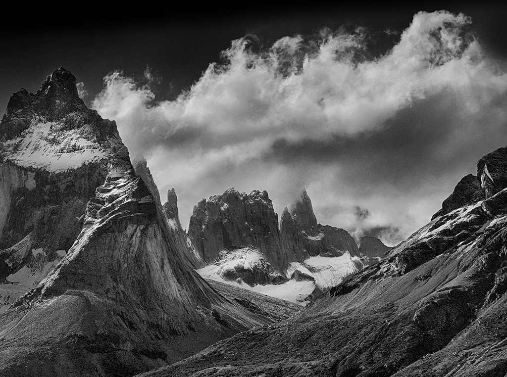
| 79 |
Sep 21 |
Comment |
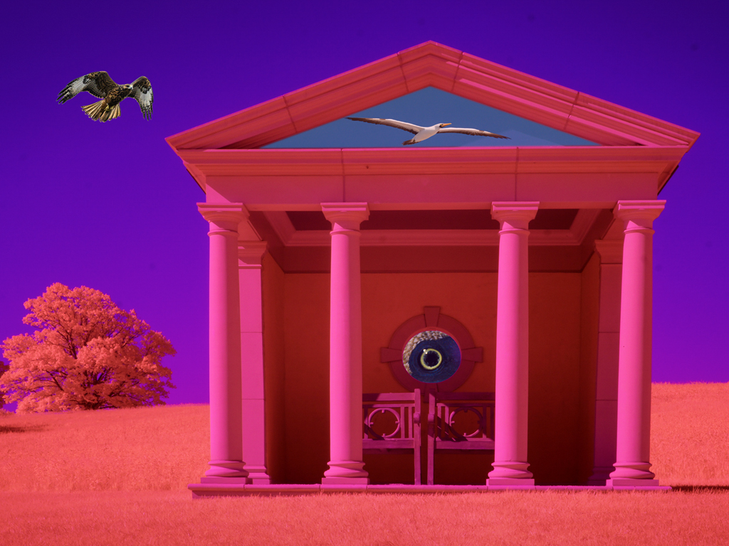
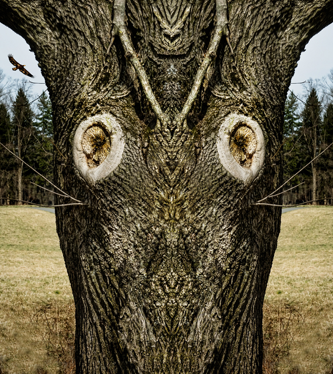
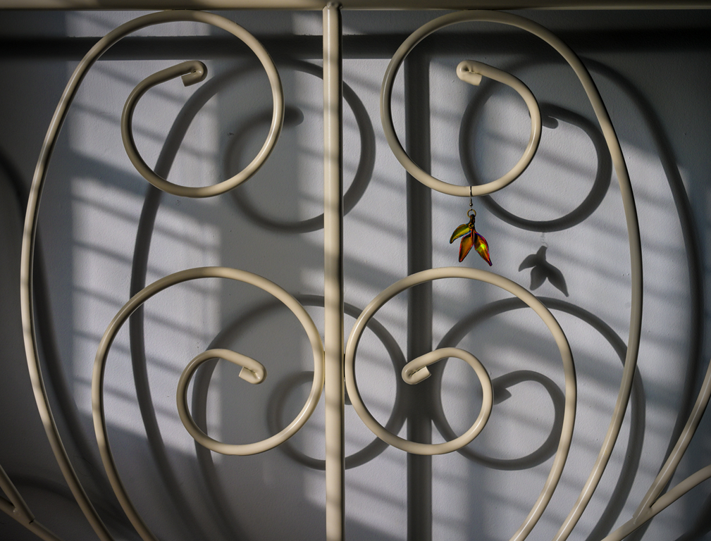
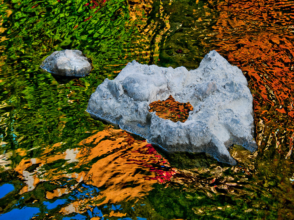
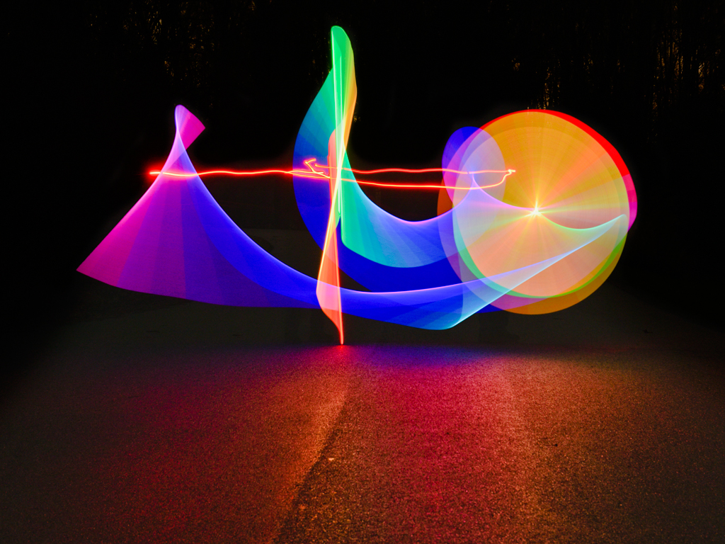
Hi Freddie, I agree with Peter that an alternative format could be a rotation 90 degrees counterclockwise to form what I see as a charging bull. Either way, it's a great exercise in pareidolia, seeing subject matter in abstract lines and tones. Perhaps converting the purplish tones to more yellowish tones can provide a blue/yellow contrast to emphasize the shapes. Karl |
Sep 10th |
| 79 |
Sep 21 |
Comment |
Hi Freddie, I agree with Peter that an alternative format could be a rotation 90 degrees counterclockwise to form what I see as a charging bull. Either way, it's a great exercise in pareidolia, seeing subject matter in abstract lines and tones. Perhaps converting the purplish tones to more yellowish tones can provide a blue/yellow contrast to emphasize the shapes. Karl |
Sep 10th |
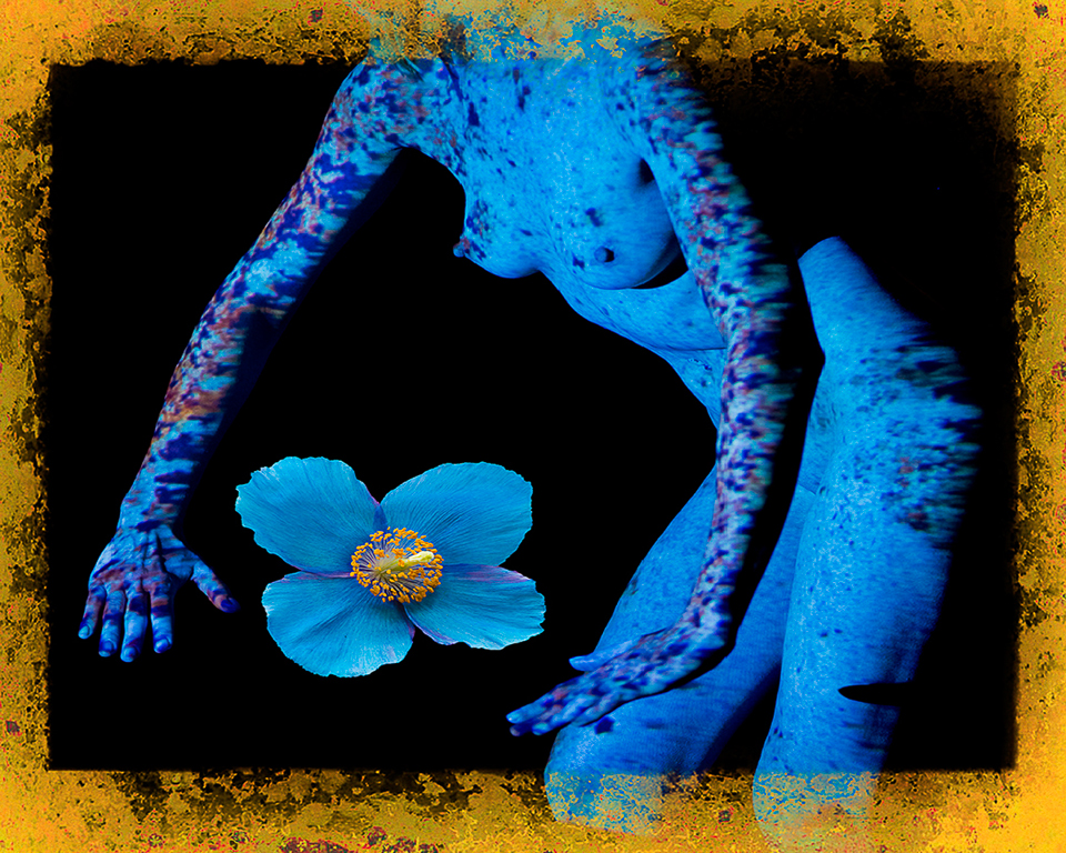
| 79 |
Sep 21 |
Comment |
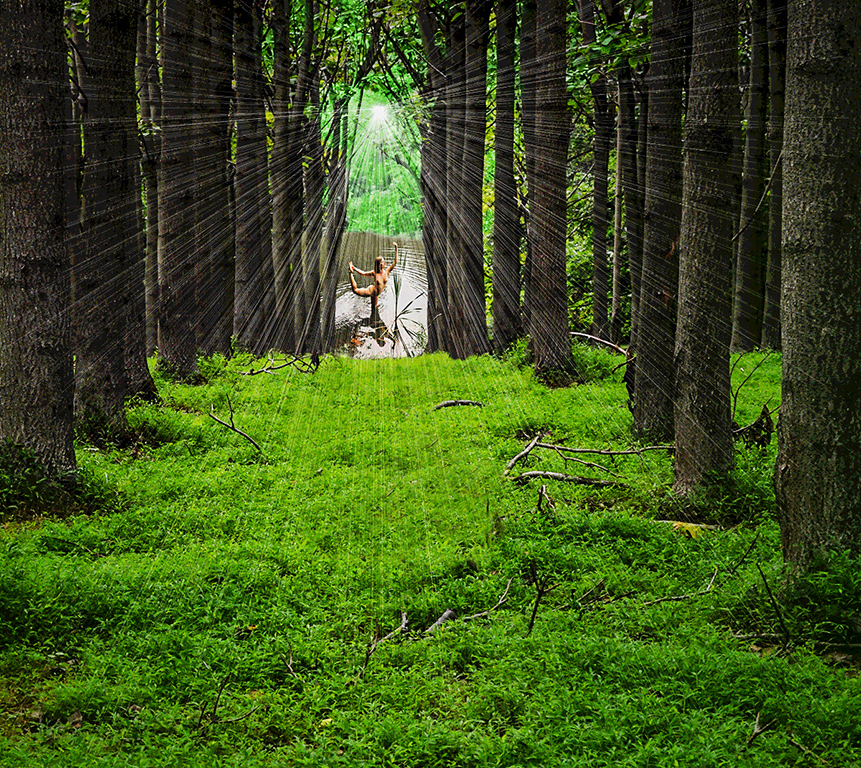
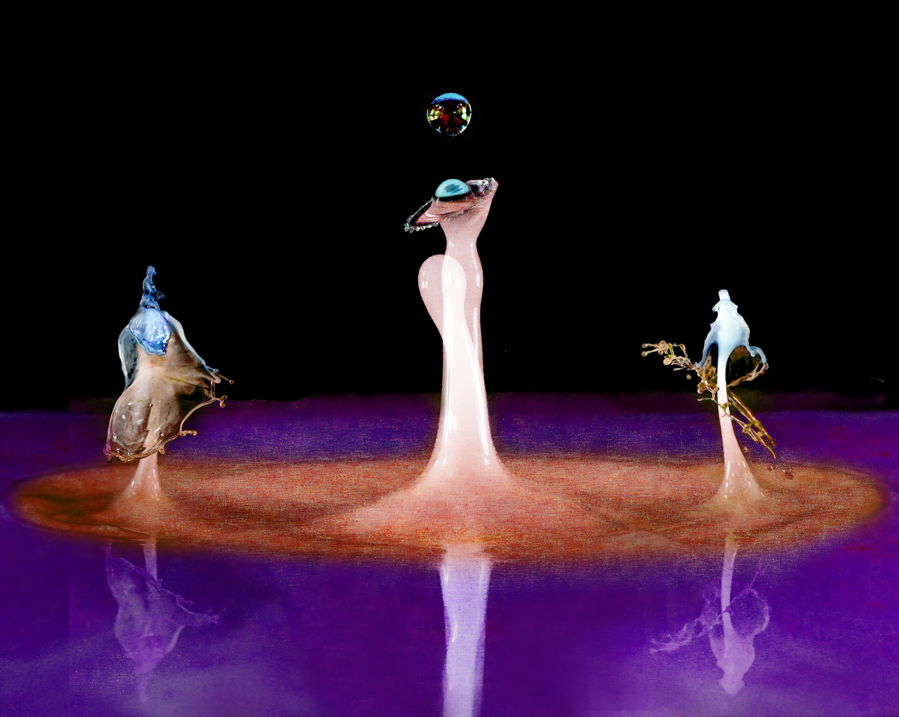
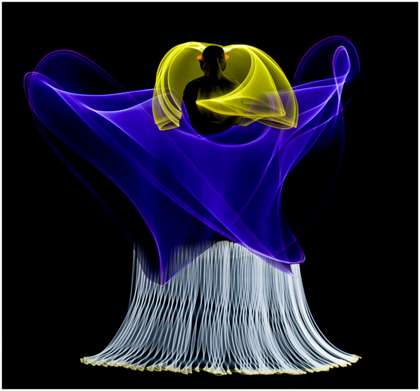
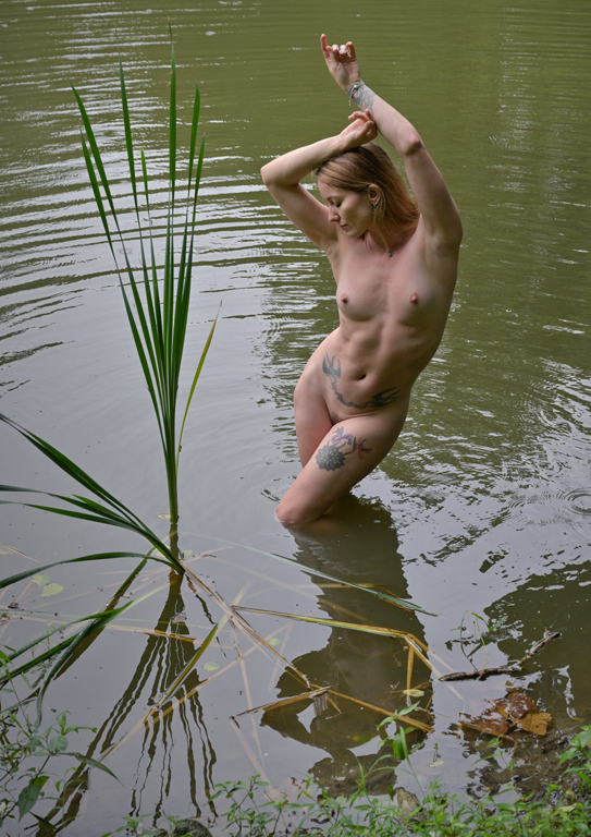
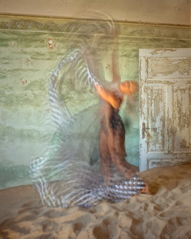
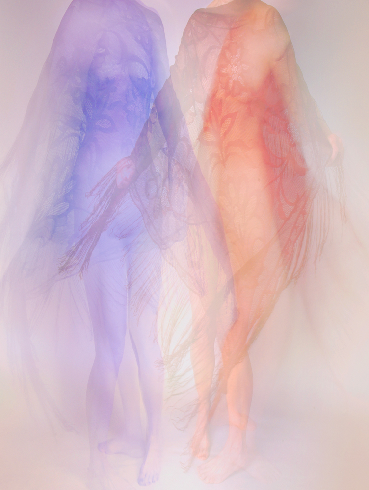
Hi Peter, I love the motion in the overlayed flower versions. This is a beautiful work from a nice but routine flower image to a kinetic impression. I see the flower parts as rising from the water or wavelike motion. The blue color also helps trigger thoughts of water. The light emanating from the junction of waves and rising forms (flower) nicely keeps our eye in the image for more inspection of the movement. The texture contrast between waves and flower forms adds interest. Well conceived and developed. Karl |
Sep 10th |
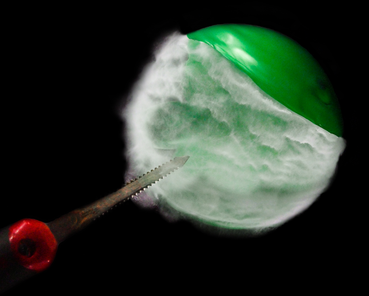
| 79 |
Sep 21 |
Comment |
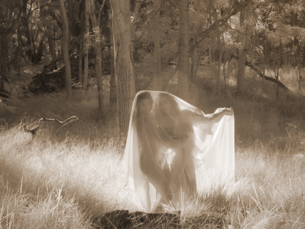
Hi Judith, It's interesting to observe how the relation between photography and painting has changed in nearly 200 years. As soon as manipulative techniques were invented, photographers have worked to not just record a scene but emulate art techniques. You can turn an image capture into art by printing it and covering it with thick brushed varnish. A texture screen can be applied in printing from a negative to impart canvas, etching, grass, etc texture to the print. Finally in the digital world we have myriad algorithms to make painting easier.
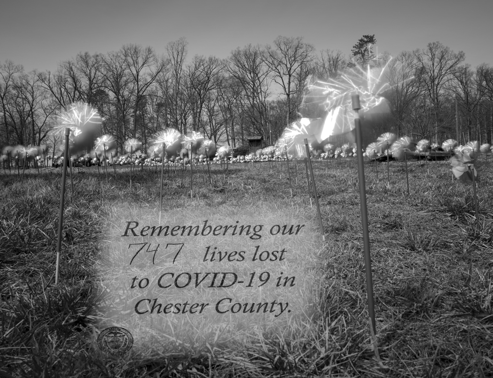
Fog/mist is inherently low contrast because it disperses light. That can easily be amplified be raising shadow luminosity and lowering highlight luminosity in RAW conversion or Curves. The deer pose is wonderful. The lower contrast takes the mood from literal to impressionistic. I would like it just as well without the brush strokes but as an exercise in learning the use of tools in Post Processing, you have done very well. Karl |
Sep 10th |
5 comments - 1 reply for Group 79
|
5 comments - 1 reply Total
|