|
| Group |
Round |
C/R |
Comment |
Date |
Image |
| 79 |
Aug 21 |
Reply |
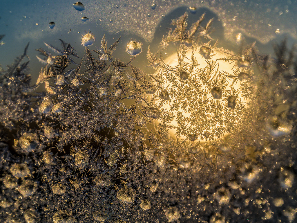
Hi Peter, The revision has more impact and creates a clearer message. The Picard aspect didn't jump out to me from the small image. Since the picture is more abstract than the original capture, we can now find things we 'think' are there. Well done! Karl |
Aug 10th |
| 79 |
Aug 21 |
Comment |
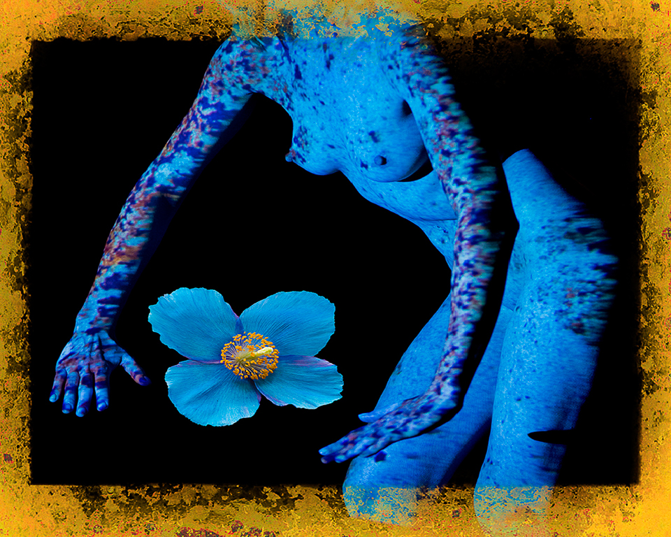
Hi Lauren, I agree with Peter about "too much". I understand having other blossoms in the picture, but they and the foliage should be subservant to the big lily. Cropping is one approach. Another would be a levels layer with the lily masked out where the white point was reduced to 200 and gray point also reduced to 70 or 80. The over sharpening aspect shown by white lines around subject matter is problematic. Sharpening enhances the texture of the petals but should not be done to the petal edges of an already sharp image made with a very nice lens. Beware of sharpening that may be done by a camera setting. Any sharpening should be done as the last step of processing and often only to select parts of the image which are masked from the rest via layers.
See my image this month for dramatic tone changes by using masking on Levels layers. Karl |
Aug 9th |
| 79 |
Aug 21 |
Comment |
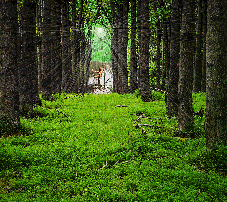
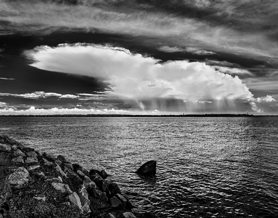
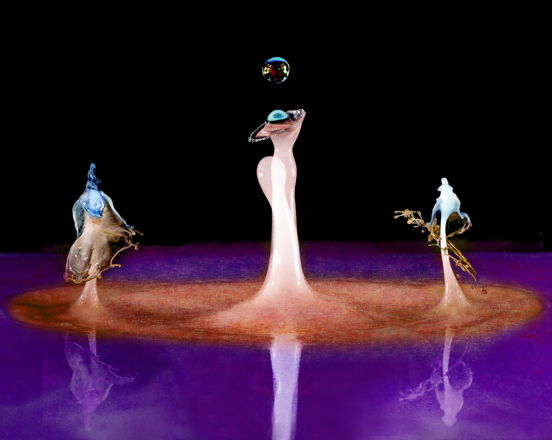
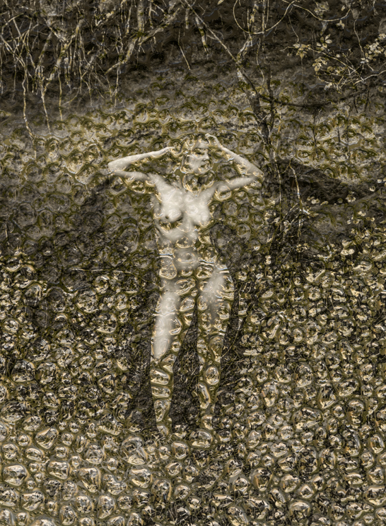
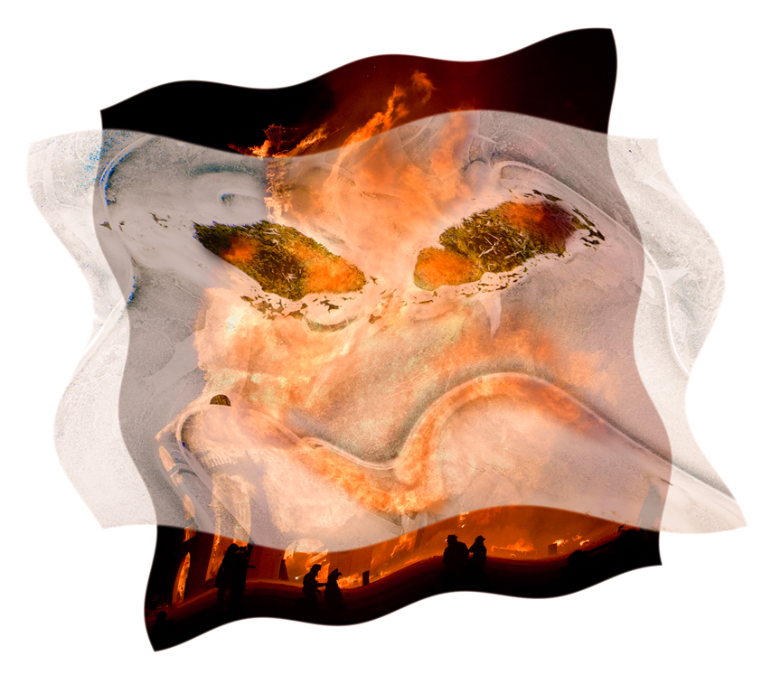
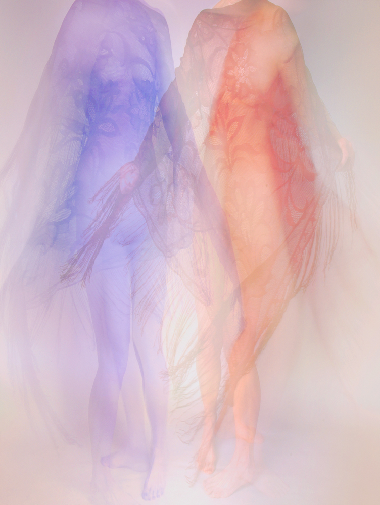
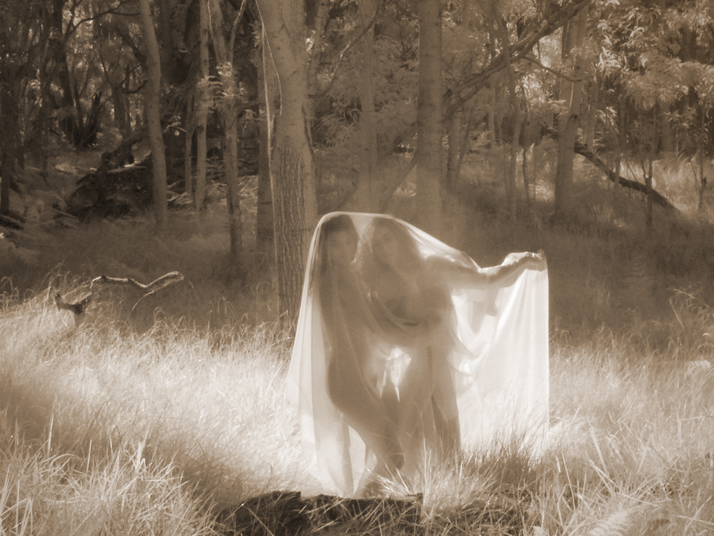
Hi Freddie, The result is indeed quite ethereal. I like the original tonality, too. I'm not sure about the crop which gives two more interesting areas separated by a bland area around the middle. Perhaps cropping to just the left of center figure and bringing in some warm tonality would create another impression. Or go darker with the current tones for a night mood. Lots of possibilities for a image that has no reason for concern over sharpness or color balance. It's more about composition and feeling. Karl |
Aug 9th |
| 79 |
Aug 21 |
Comment |
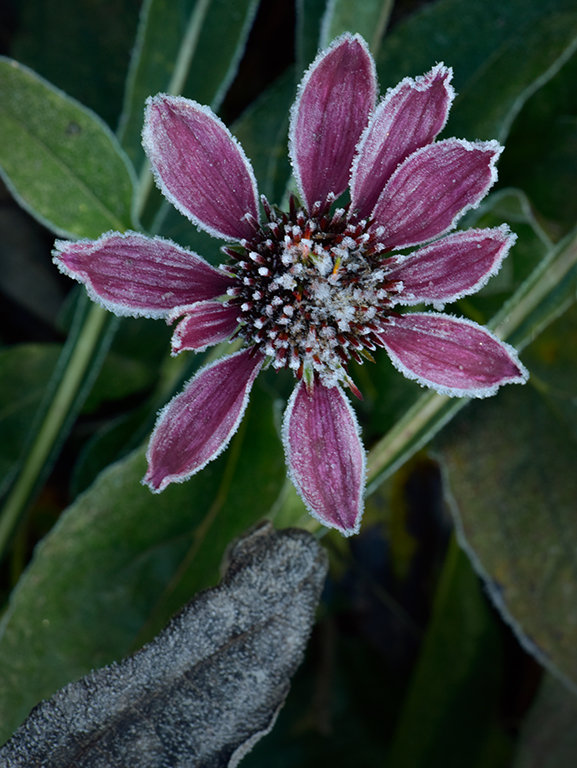
Hi Sandra, Gorgeous roses like I've never seen! Perhaps some cropping at top and right side would make the flowers a bit stronger. Your handling of the tonality is excellent. There is great detail in the petals. The polarizing filter has eliminated reflections allowing for the detail to show. I puzzled a bit about the dark center line between the two trios of blossoms. In the end I like it the way you captured it because the split adds another dimension to take the image out of the ordinary. Nice job! Karl |
Aug 9th |
| 79 |
Aug 21 |
Comment |
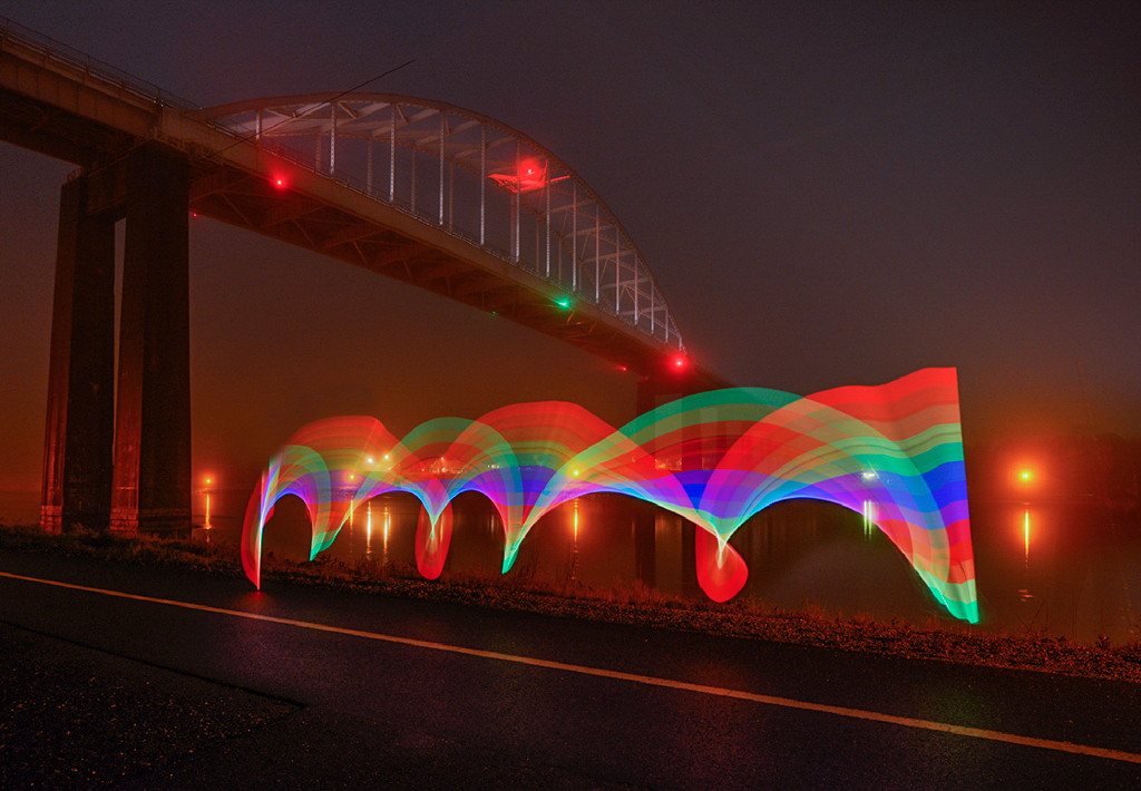
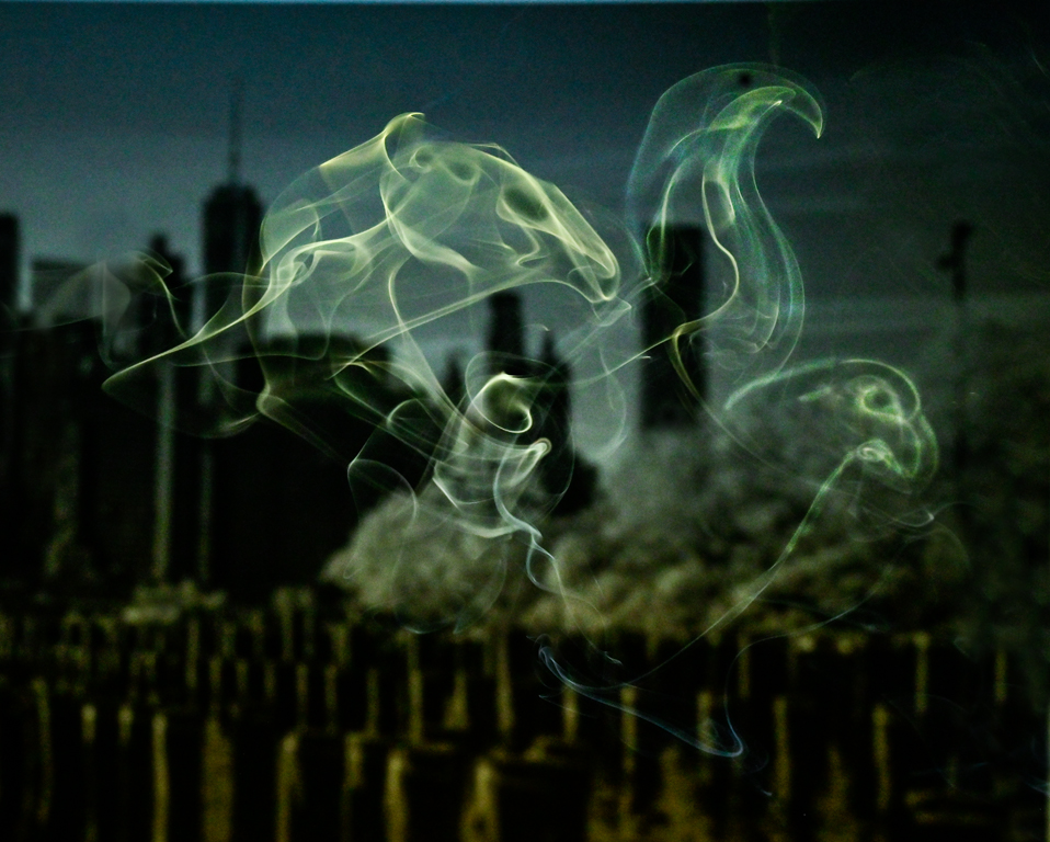
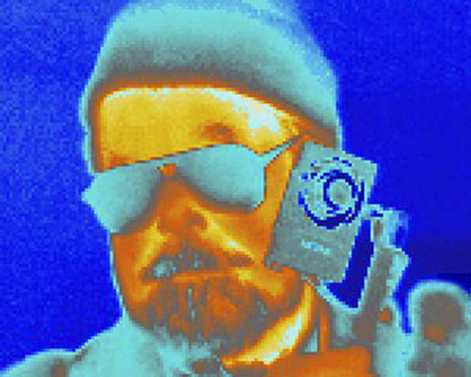
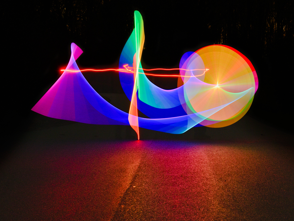
Hi Peter, You have made a nice starry, starry night interpretation of an aquarium scene. Perhaps making the fish head a little more distinct but still impressionistic could be done by cloning out the wide line(s) above its head. Could this be a print for the office wall? Karl |
Aug 9th |
| 79 |
Aug 21 |
Comment |
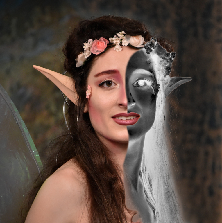
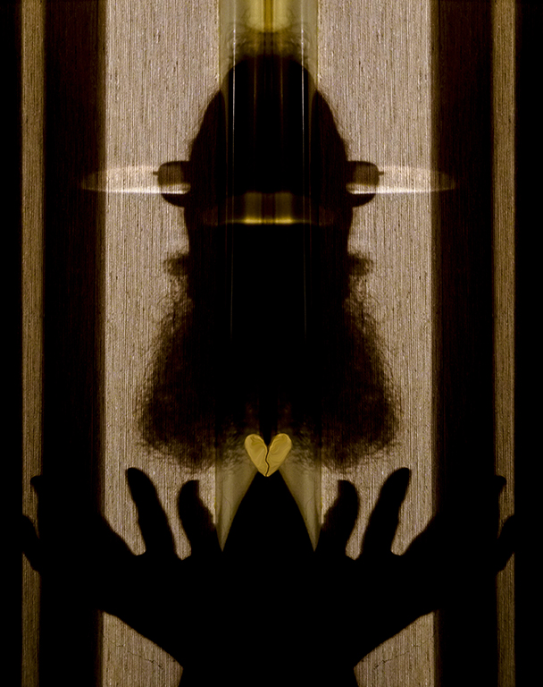
Hi Judith, Wow! You must be taking the fancy Photoshop classes. I'm back in PS 101 in 2000 which would do compositing in far fewer steps. First, be sure that the two images are compatible in luminosity, lighting direction and SHARPNESS. The luminosity (brightness) and light direction are OK but the gnome is very soft. The edges of the gnome stand out as if cut with scissors. It's a soft, out-of-focus subject with hard edges. Finger nails on a chalkboard! The edges need to be blended with a soft mask brush into the background. Alternatively, use the Select/Refine Edge tool on the selection. Perhaps the inside of the barn could be darker to reduce the cut edge look. Over 15 years ago an education night speaker at DCC told us to feather the edges of selections by 1-3 pixels to avoid the cut edge look. In today's higher pixel count cameras, perhaps 2-6 pixels would be better. It may sound counter intuitive but things do look more natural that way. Karl |
Aug 9th |
5 comments - 1 reply for Group 79
|
5 comments - 1 reply Total
|