|
| Group |
Round |
C/R |
Comment |
Date |
Image |
| 79 |
May 21 |
Comment |
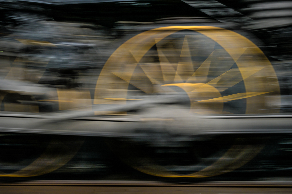
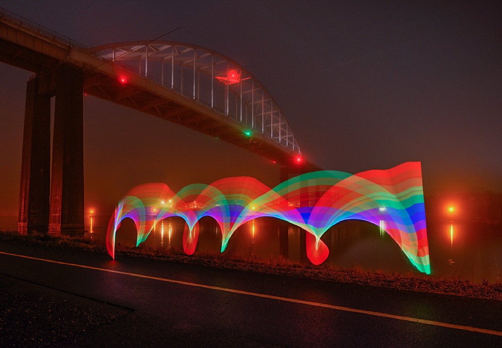
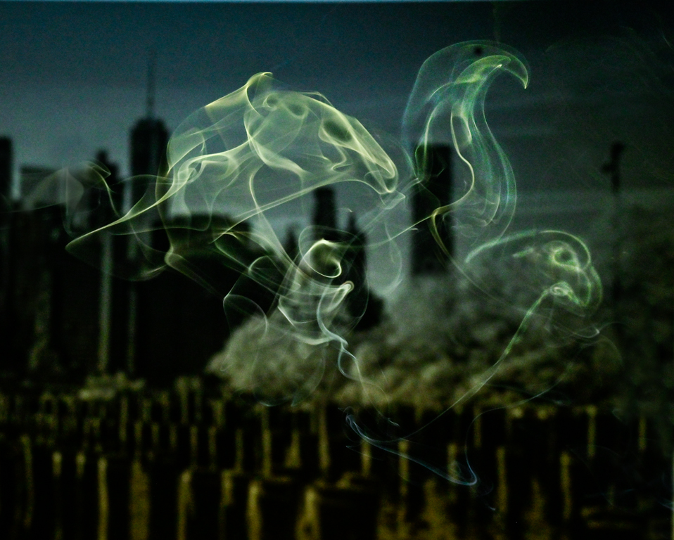
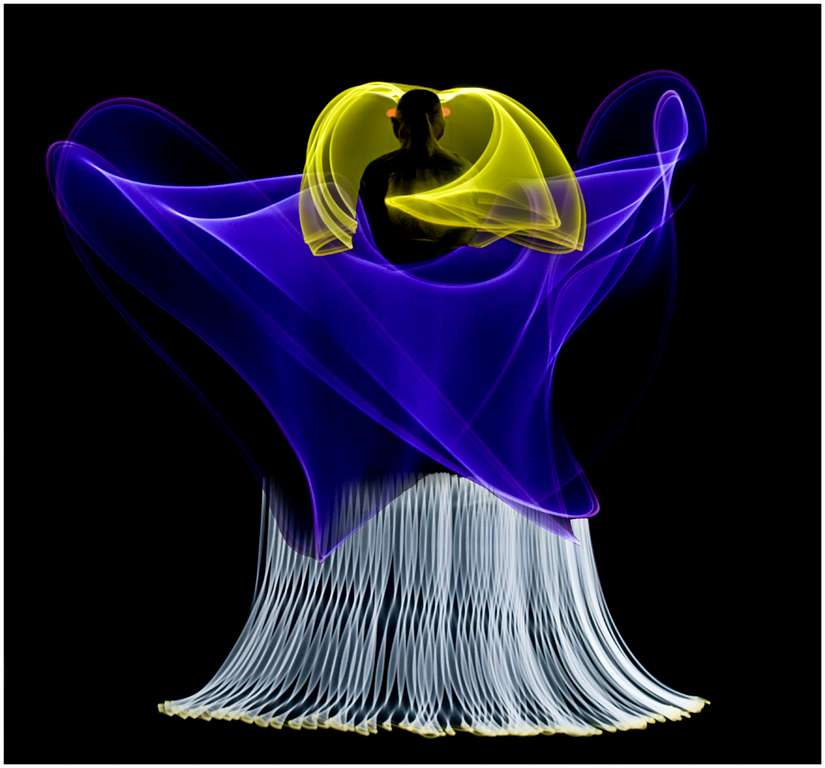
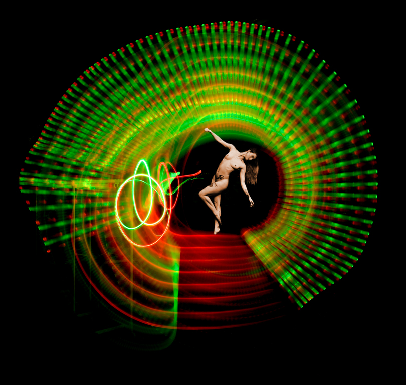
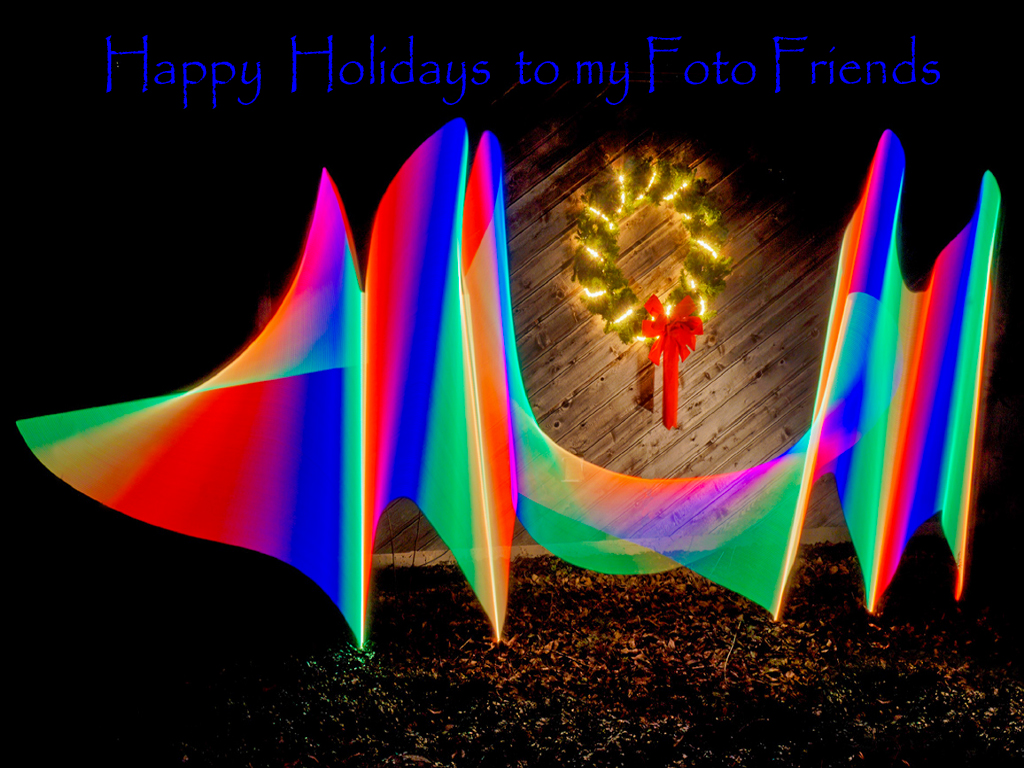
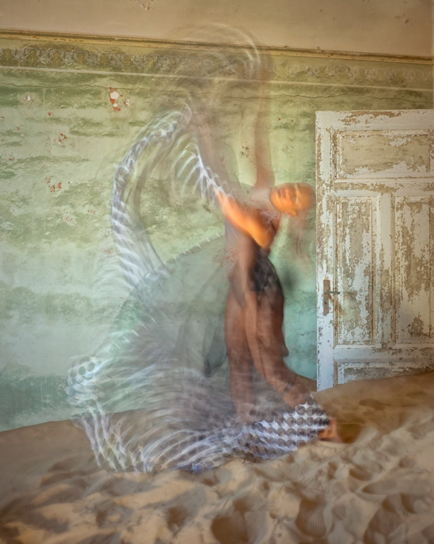
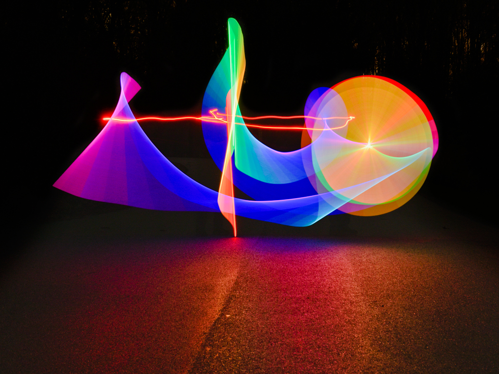
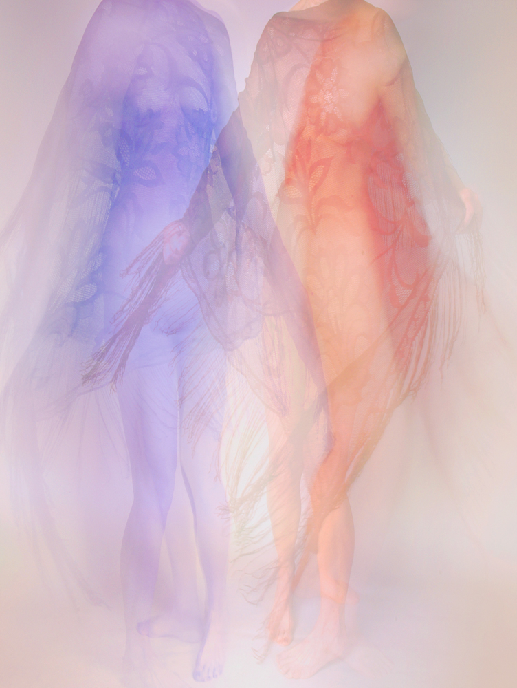
Hi Freddie, Welcome1 I love dance photography and envy your access to these performers. I agree with Peter's suggestions about long exposures and multiple exposures. The possibilities can be endless.
This image has a wonderful motion feel. It reminds me of a soft, pastel light drawing with beautiful colors. Beautifully done. Karl |
May 16th |
| 79 |
May 21 |
Comment |
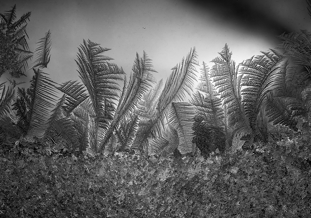
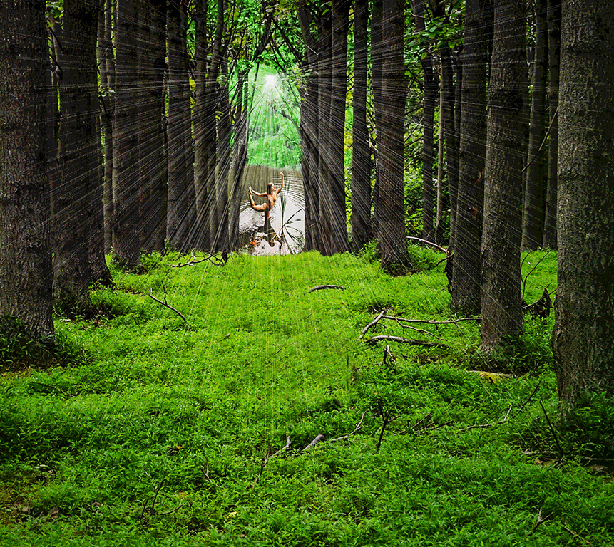
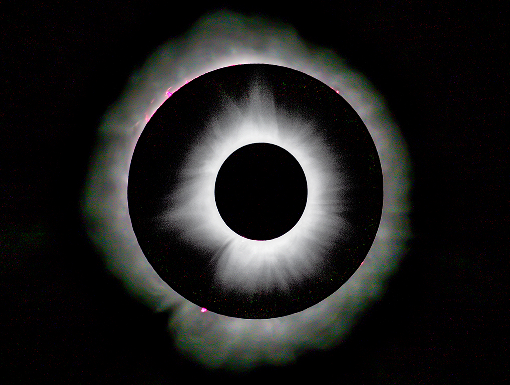
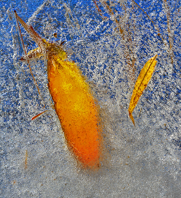
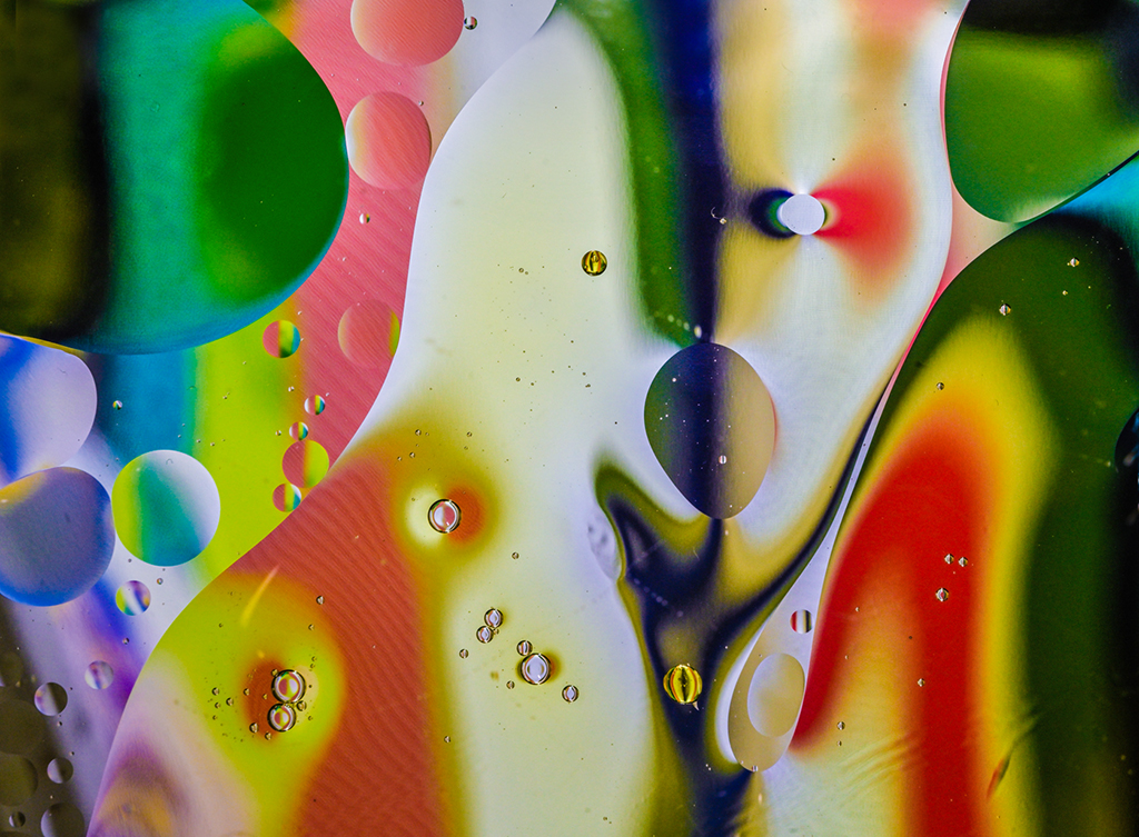
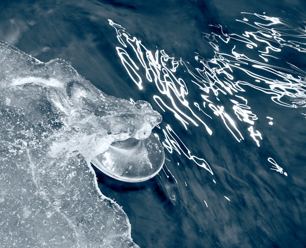
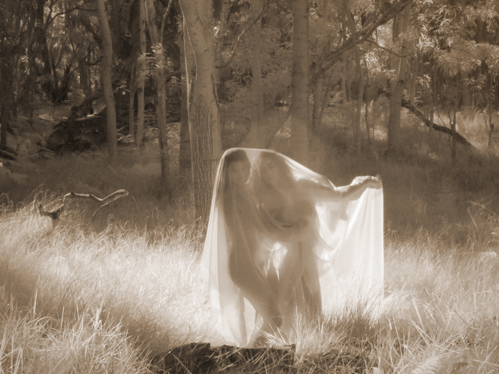
Hi Lauren, The 590 nm "Super Color Infrared" conversion by LifePixel includes about half of the visible spectrum along with near infrared. If the camera was pure IR (720 nm and higher), there would be only black & white with the bright leaves that Judy was expecting. True infrared devotees will go for the black & white version at high wavelengths. Photographers interested in false color artistic interpretations will use various filtering that includes part of the visible spectrum. Some of us remember the false color Ektachrome Infrared films used in science studies years ago, but that effect is not possible in digital. People interested in trying several alternative effects will have all filtering removed from the camera and then use filters on the lens to vary the wavelengths recorded by the sensor. I had all filtering removed from a Sony NEX-7 mirrorless camera and use LifePixel's Super Color and Super Blue filters as well as a Hoya 720 nm a or B+W 092 filter for black & white only. Red/blue channel swapping seems to bring out better color renditions with LifePixel's Super Color filter.
The composition of your image is good. The viewer's eye goes to the areas of brightness or contrast which is mostly in the periphery of the image. Watch where these areas are placed so that duller regions don't appear more centrally which tends to break the image apart.
Infrared is great fun, particularly with puffy cloud skies, patterns in landscapes, backlit models in filmy gowns, and lawns so white they look like snow. Enjoy! Karl |
May 16th |
| 79 |
May 21 |
Comment |
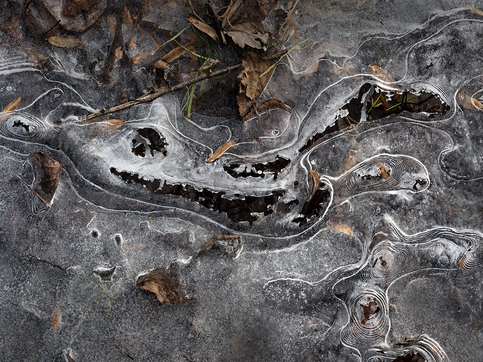
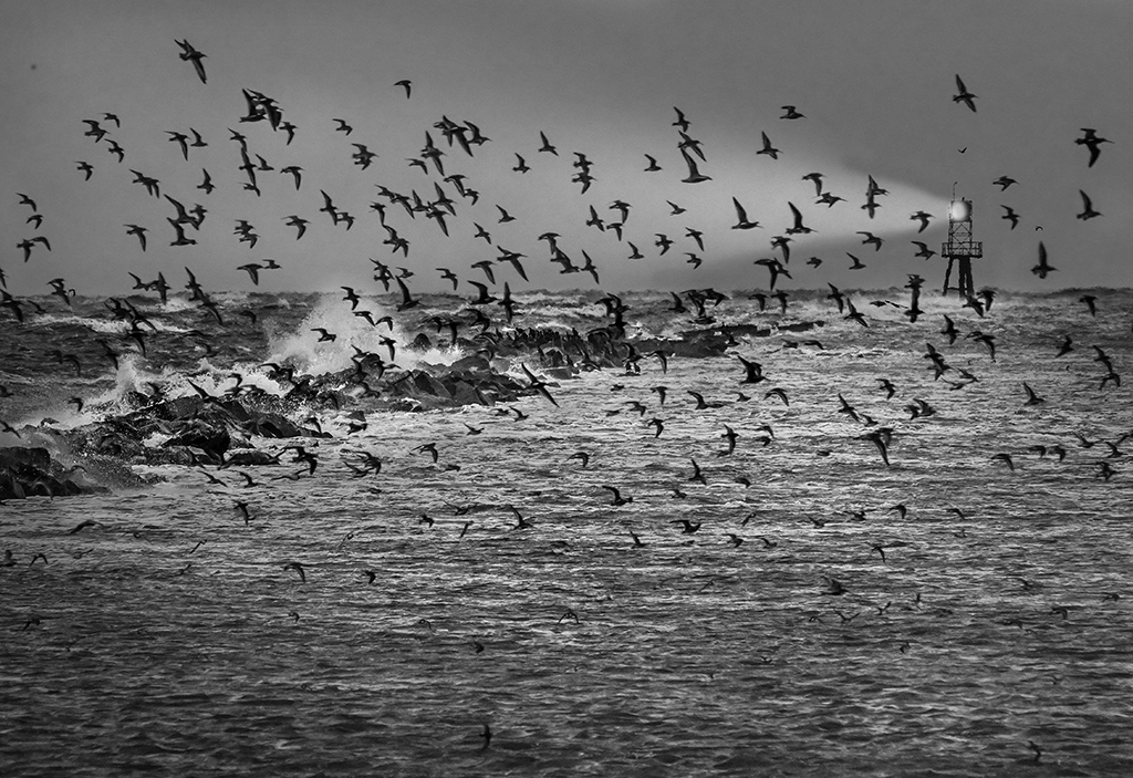
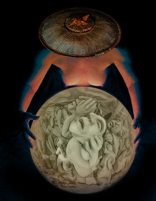
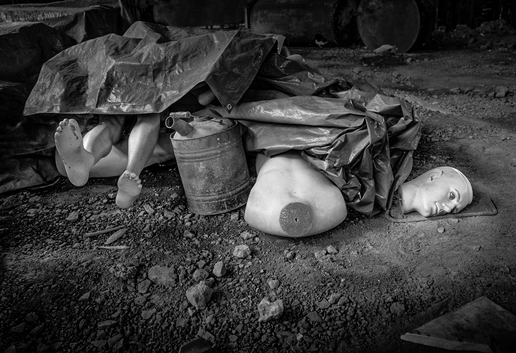
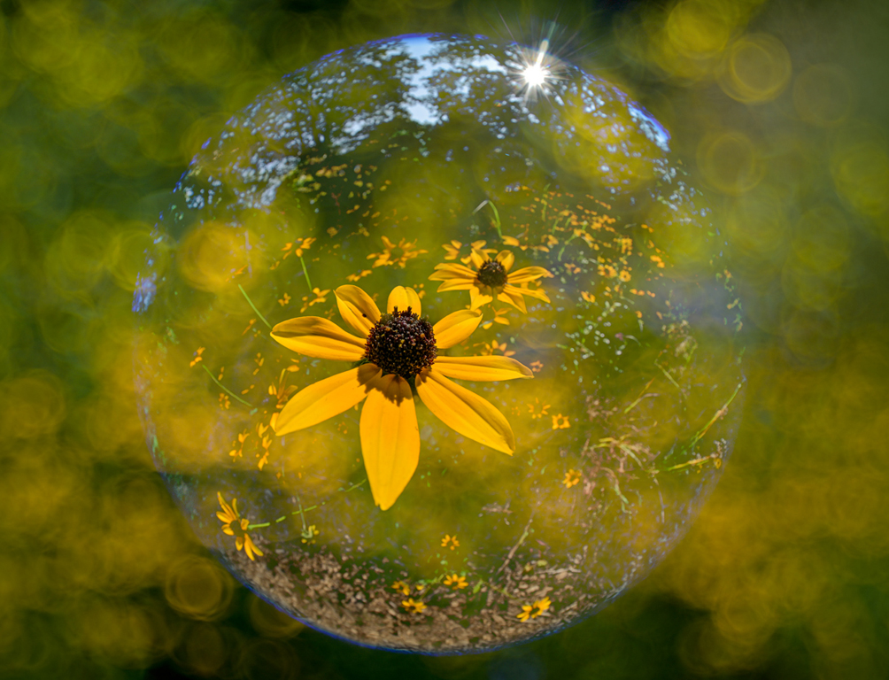
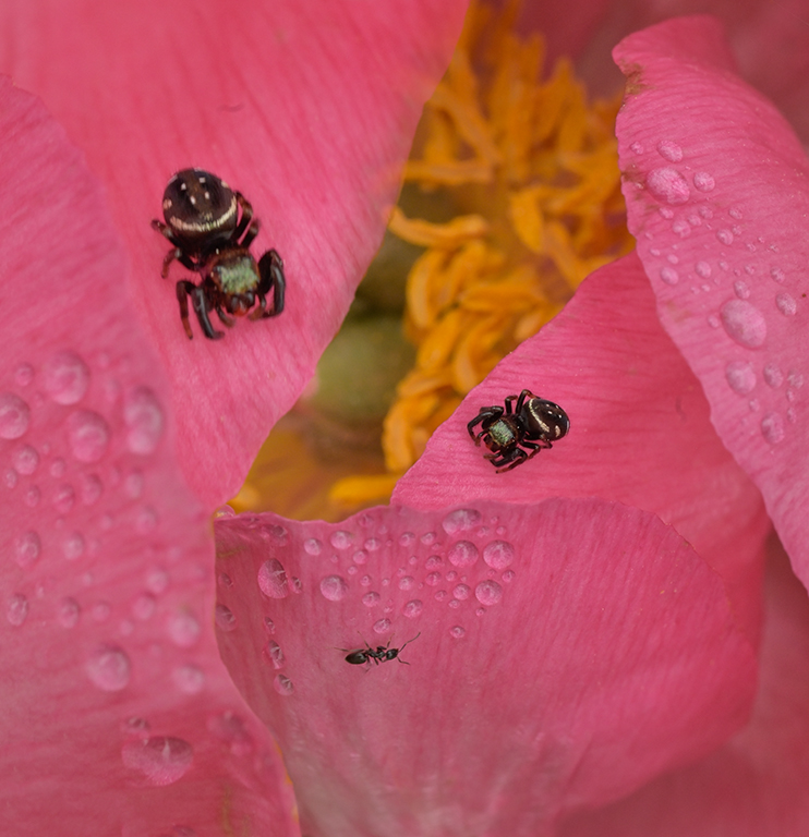
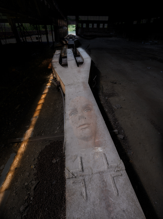
Hi Peter, I would like to see the whole reflection. That would make the image a top 1/3 peppers and bottom 2/3 reflections even if they fade out or into blur. I also like monochrome but feel the sharpening artifacts (black pencil lines) make the image look somewhat fake. Try some images where you are at the pepper's level rather than looking down from the 'God' view. As Weston knew, peppers are can be very interesting. They are cheaper models than humans and take directions better! Karl |
May 12th |
| 79 |
May 21 |
Comment |
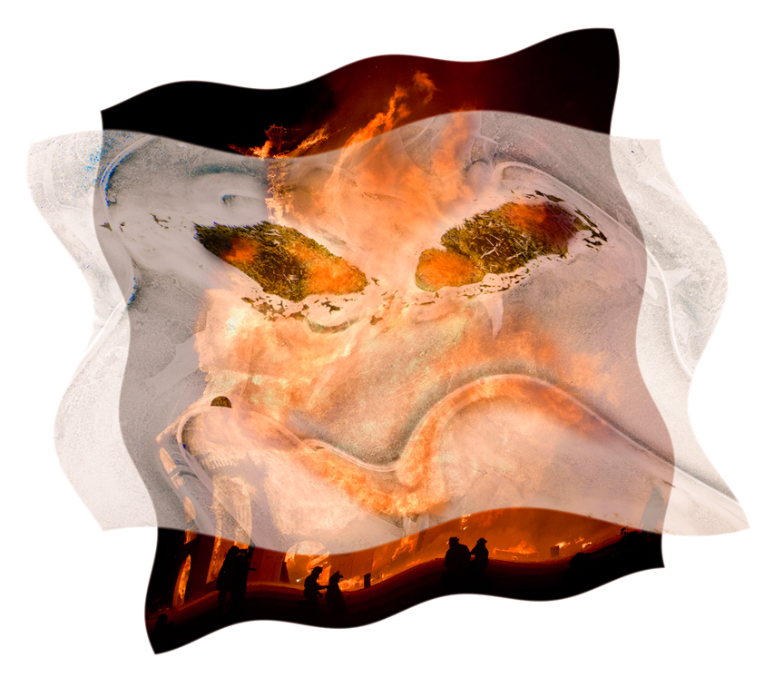
Hi Judith, The splashes of color add vibrancy to the somewhat monochrome scene. The descending fog adds mood. I agree with Peter that having the vibrant color just at the bottom is somewhat awkward in that it brings the eye to the bottom where it stays as we try to make sense of all the detail there. I also agree with Lauren's comment about the bright area of the house. I think more precise masking to make the house all one darker tone and the bottom brighter/colorful could add a more dimensional quality to the image. Such great fun to play in the Photoshop sandbox. In my experience I generally eschew some overall changes and lean towards very local adjustments to make my vision clearer. Karl |
May 12th |
| 79 |
May 21 |
Reply |
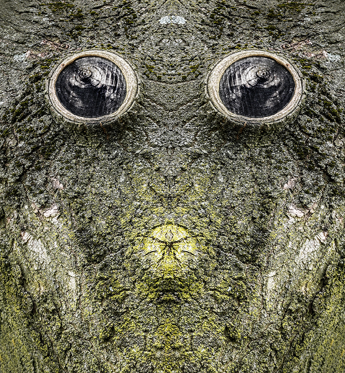
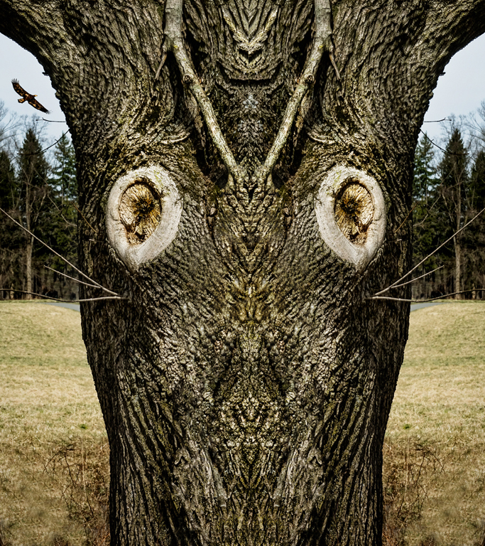
Hi Lauren, The 'images' in the tree bark were there. I did some local dodging/burning and contrast enhancement to bring out shapes and textures. It's just playing and evolving the image. Karl |
May 11th |
4 comments - 1 reply for Group 79
|
4 comments - 1 reply Total
|