|
| Group |
Round |
C/R |
Comment |
Date |
Image |
| 79 |
Sep 20 |
Reply |
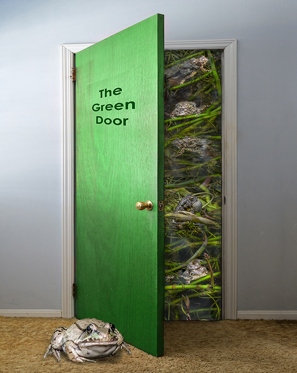
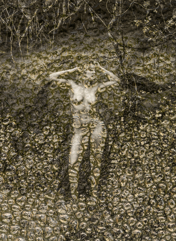
Thank you, Judy. I was looking for reactions. Your comments are very timely. The image was made on a lark before the current administration and polarization. I'm pleased to hear everyone's comments. Photography isn't just to make pretty, pleasing, escapist images all the time, but to show the world, real and imaginary, that exists. Karl |
Sep 21st |
| 79 |
Sep 20 |
Reply |
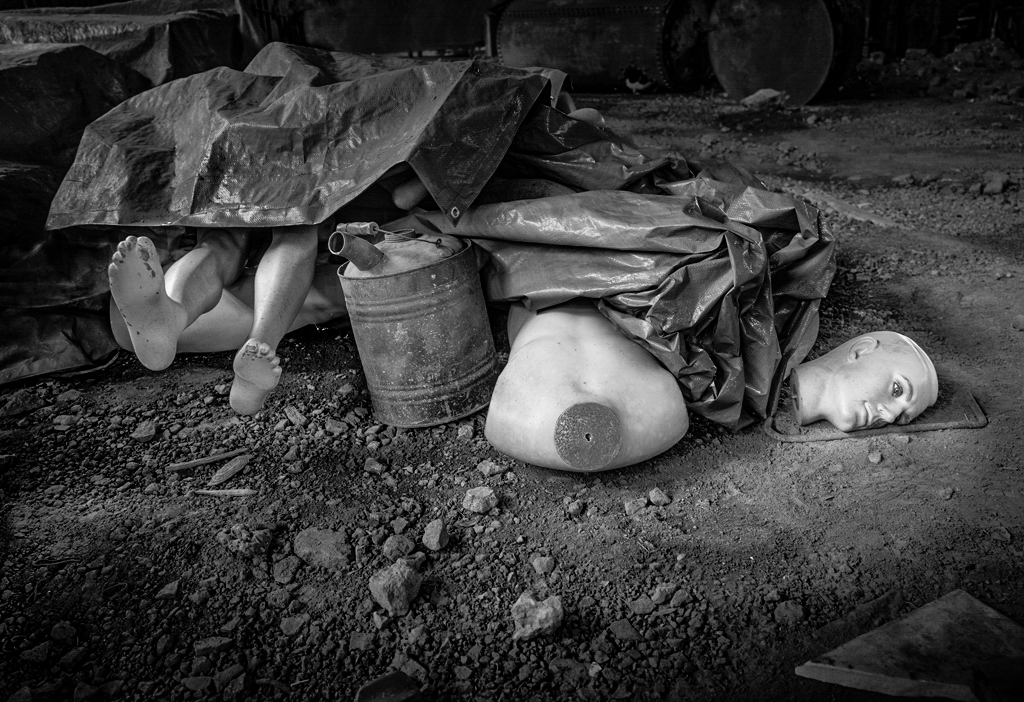
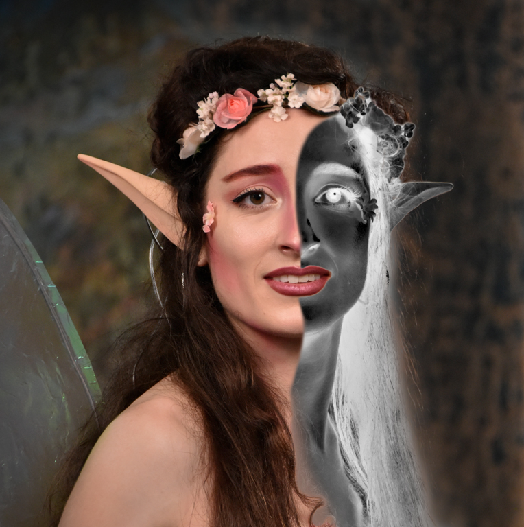
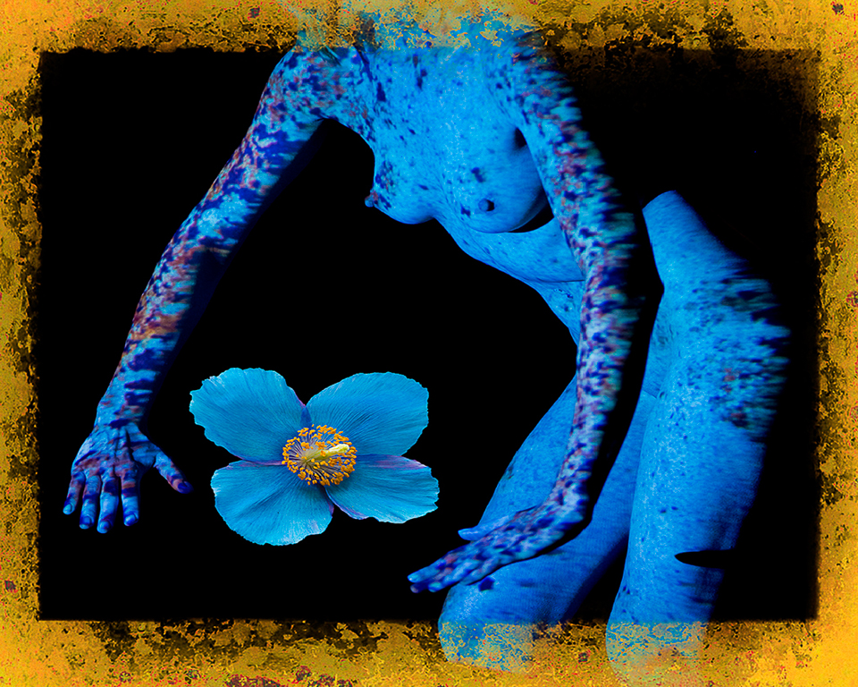
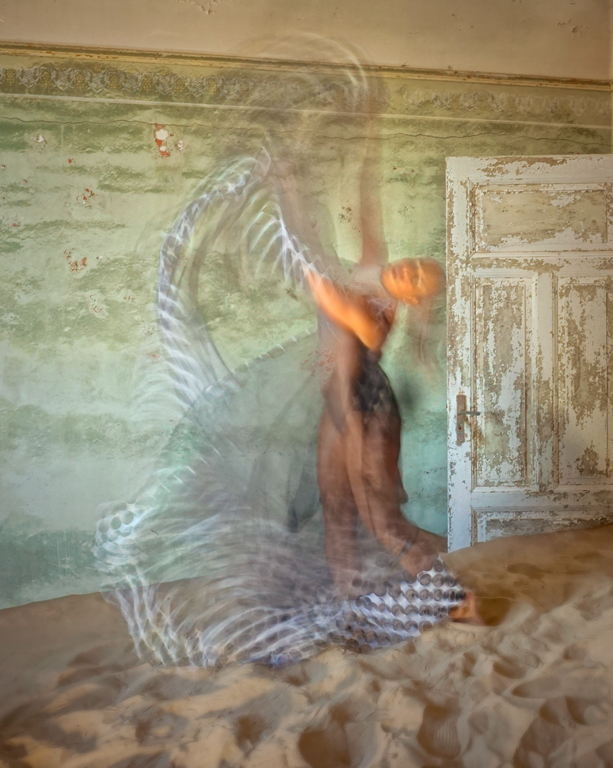
Thank you for pointing out the color tone differences between the mannequin and the people. As often happens, we see this image differently. As the maker of the composite, I see a connection between the girl and mannequin. A new viewer like yourself doesn't see it. That's why we have this dialogue find out if the communication between artist and viewer is clear. Karl |
Sep 19th |
| 79 |
Sep 20 |
Comment |
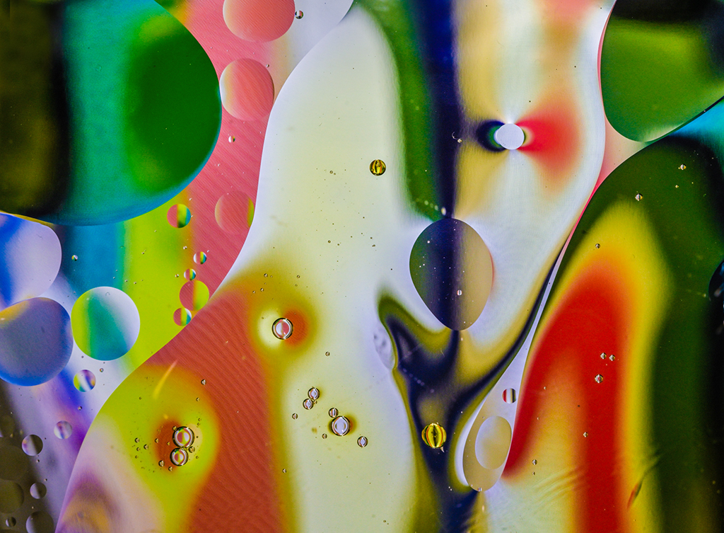
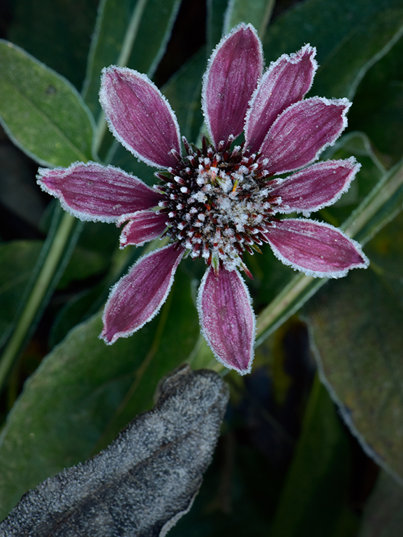
Hi Lauren, The image is quite painterly and would look great printed on canvas or watercolor paper. The focus stacking worked well. The warm color against the muted cooler background adds dimensional quality. A trilogy of blossoms plus a bud in an asymmetric composition adds to the artistic effect. Nicely done. Karl |
Sep 18th |
| 79 |
Sep 20 |
Comment |
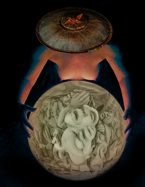
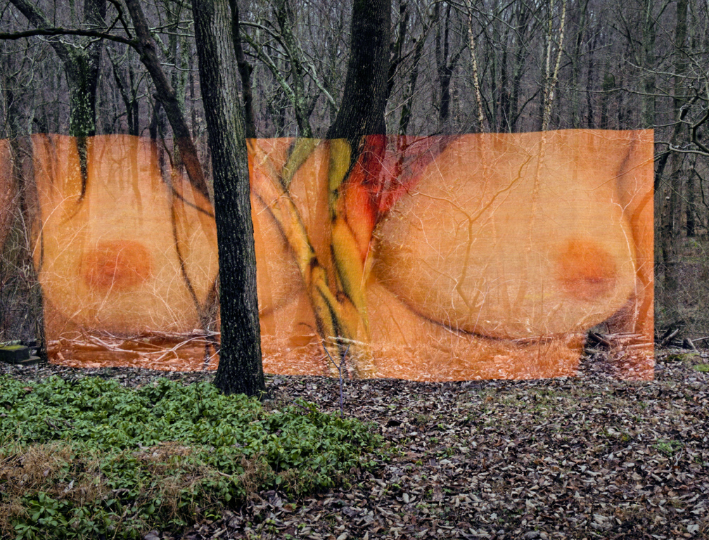
Hi Marie, You have mastered compositing. I like the interlacing of the flowers and wall text. It brings the images together in a meaningful way. Your description helps me more fully understand the image although it is a powerful statement visually. We need more images like this to reflect America's myriad problems and plunge out of the status of first world countries. Karl |
Sep 18th |
| 79 |
Sep 20 |
Comment |
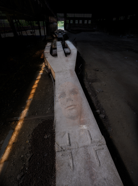
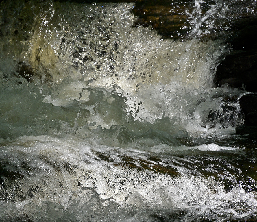
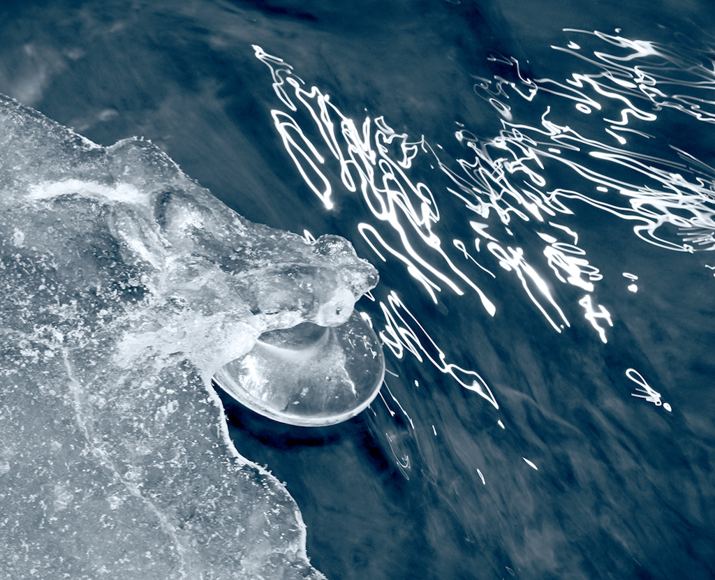
Hi Sandra, Stephen makes some excellent points. You started by bringing out a lot of shadow detail which makes a more robust image. I'm OK with the original format if the blue was darkened in the monochrome conversion to add a bit of noir. The cropped version tells less of a story to me but is a terrific industrial abstract. Karl |
Sep 18th |
| 79 |
Sep 20 |
Comment |
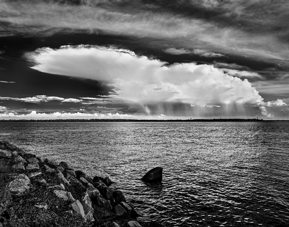
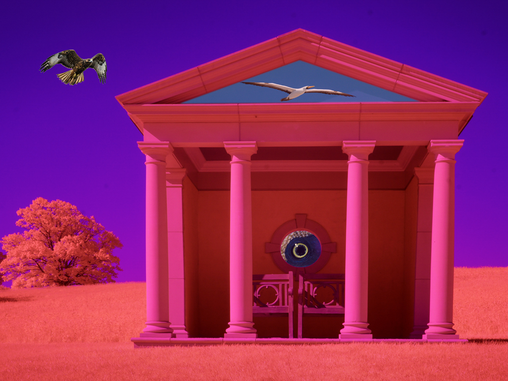
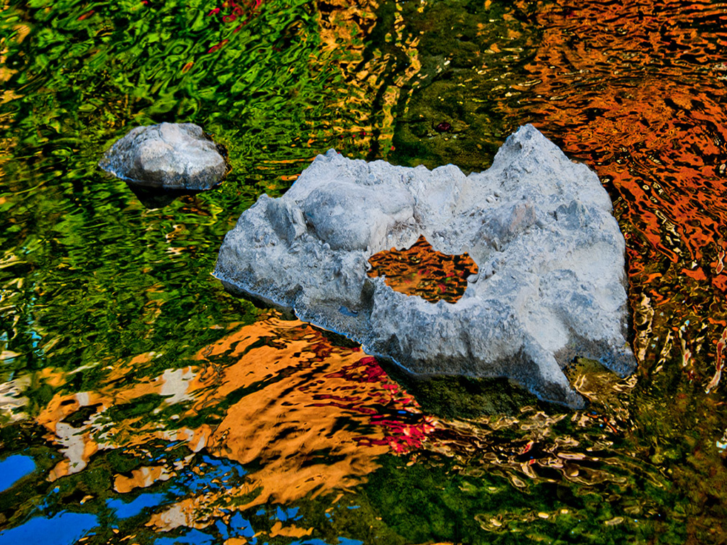
Hi Valerie, I love NZ. There are so many wonderful landscapes. In this case I prefer the Before image which could be brought up with some local contrast adjustments and conversion to black & white. The parts of the sandwich image I find problematic are the washed out lake (The Mt Cook reflection is gone.) and the 'halo' over the mountain area. I've made a lot of sandwiches in my life starting with putting two slides together years ago. It's great fun but doesn't always work. I've attached a color slide sandwich in which the horse is on a separate slide taken in the snow which was nearly clear film. For your image i would try to optimize Mt Cook as a b&w or try other blending modes and layer opacity. It's a great scene. Wish I was there. Karl |
Sep 18th |
 |
| 79 |
Sep 20 |
Comment |
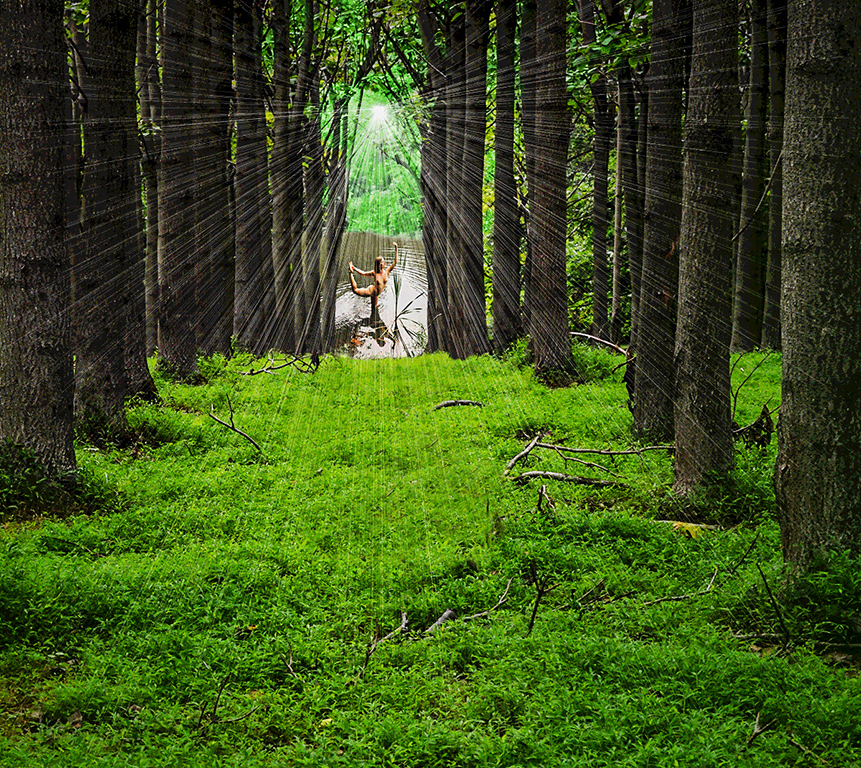
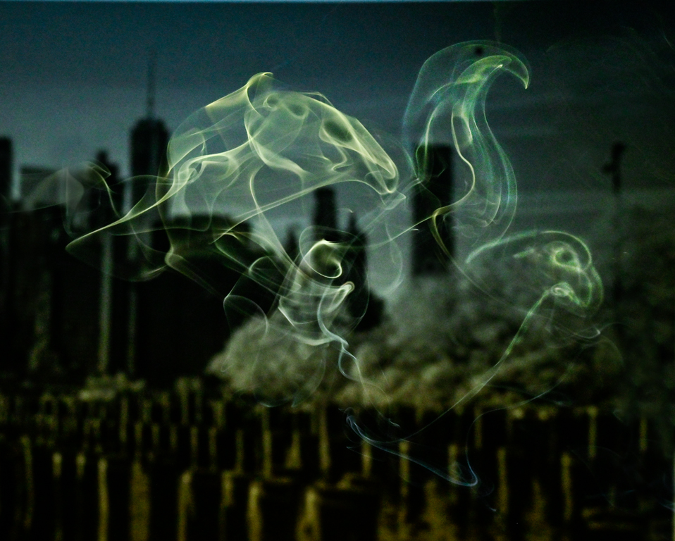
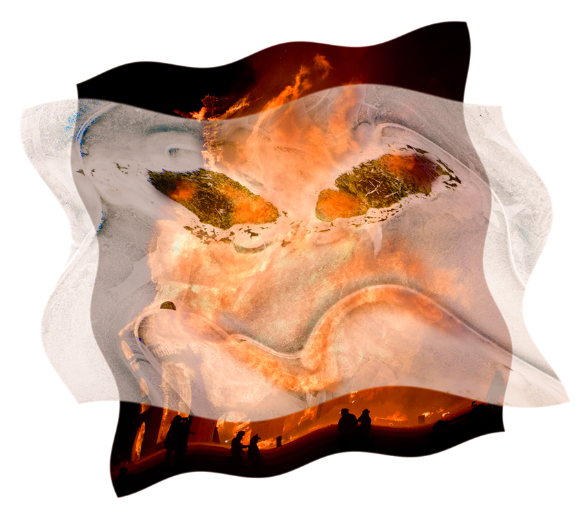
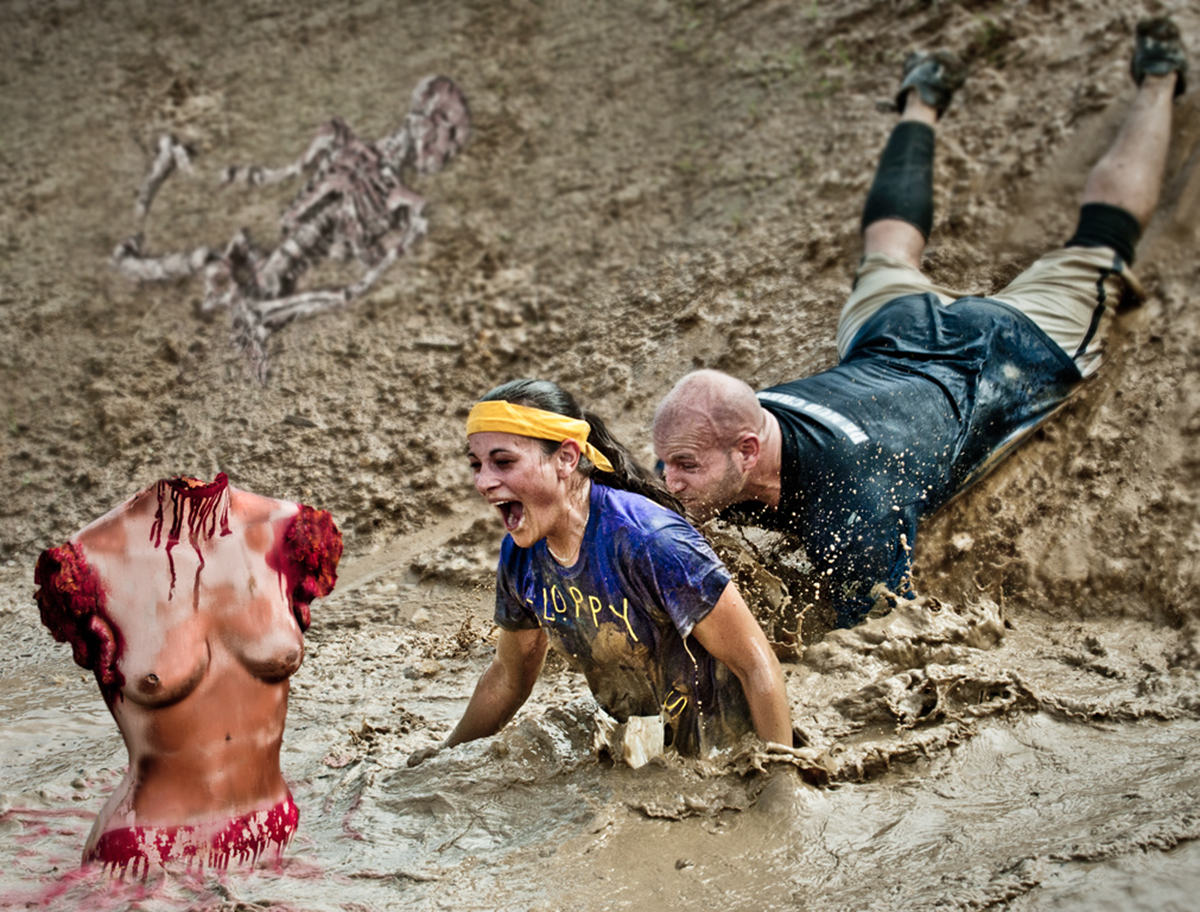
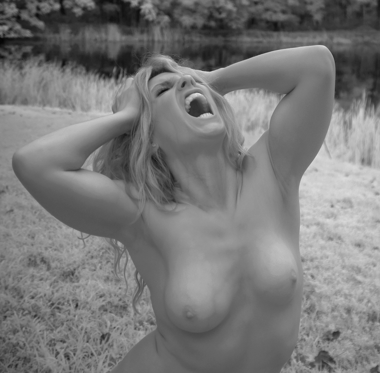
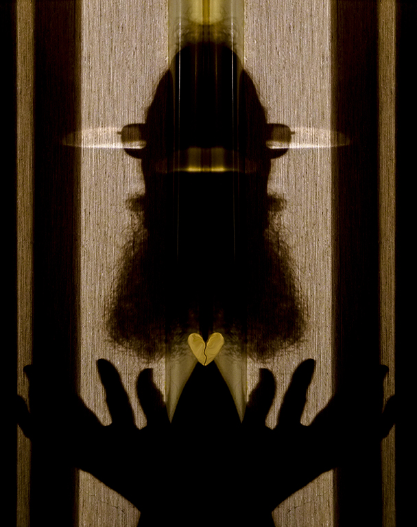
Hi May, Your images provoke multiple thoughts and reactions. This one gives the impression of a person screaming in a large void because of all the blank area on the sides. If those side areas were cropped out, it would be a more intimate/personal scream. Another interpretation would be to have the foreground tree in focus and the poster out of focus but visible giving the feeling of screaming in the distance. Your pictures are like a discussion prompt in a therapy session. Karl |
Sep 16th |
| 79 |
Sep 20 |
Comment |
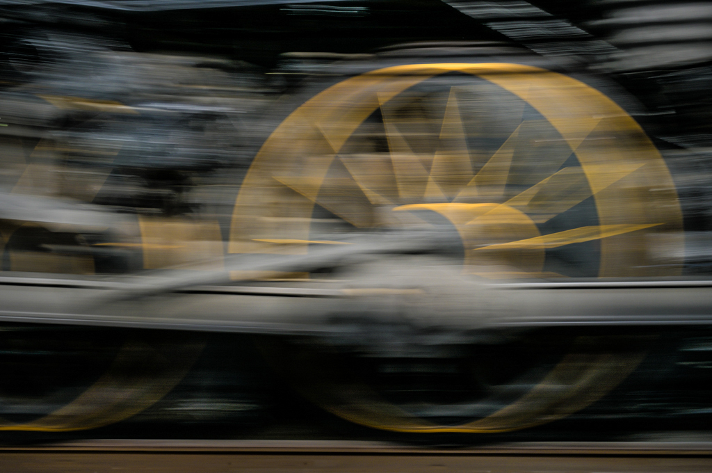
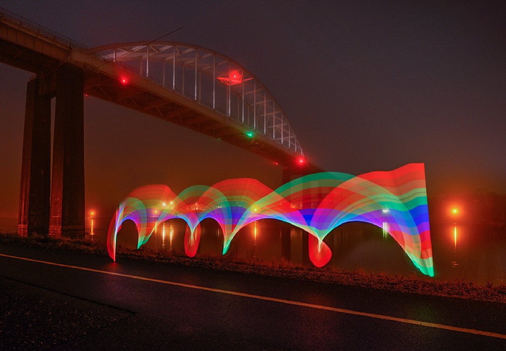
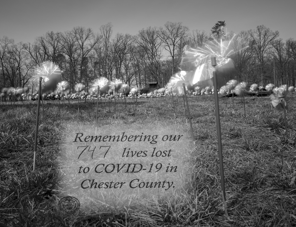
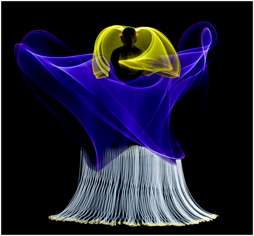
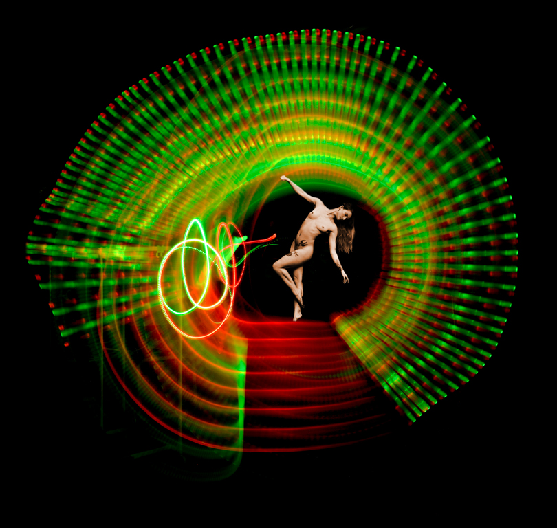
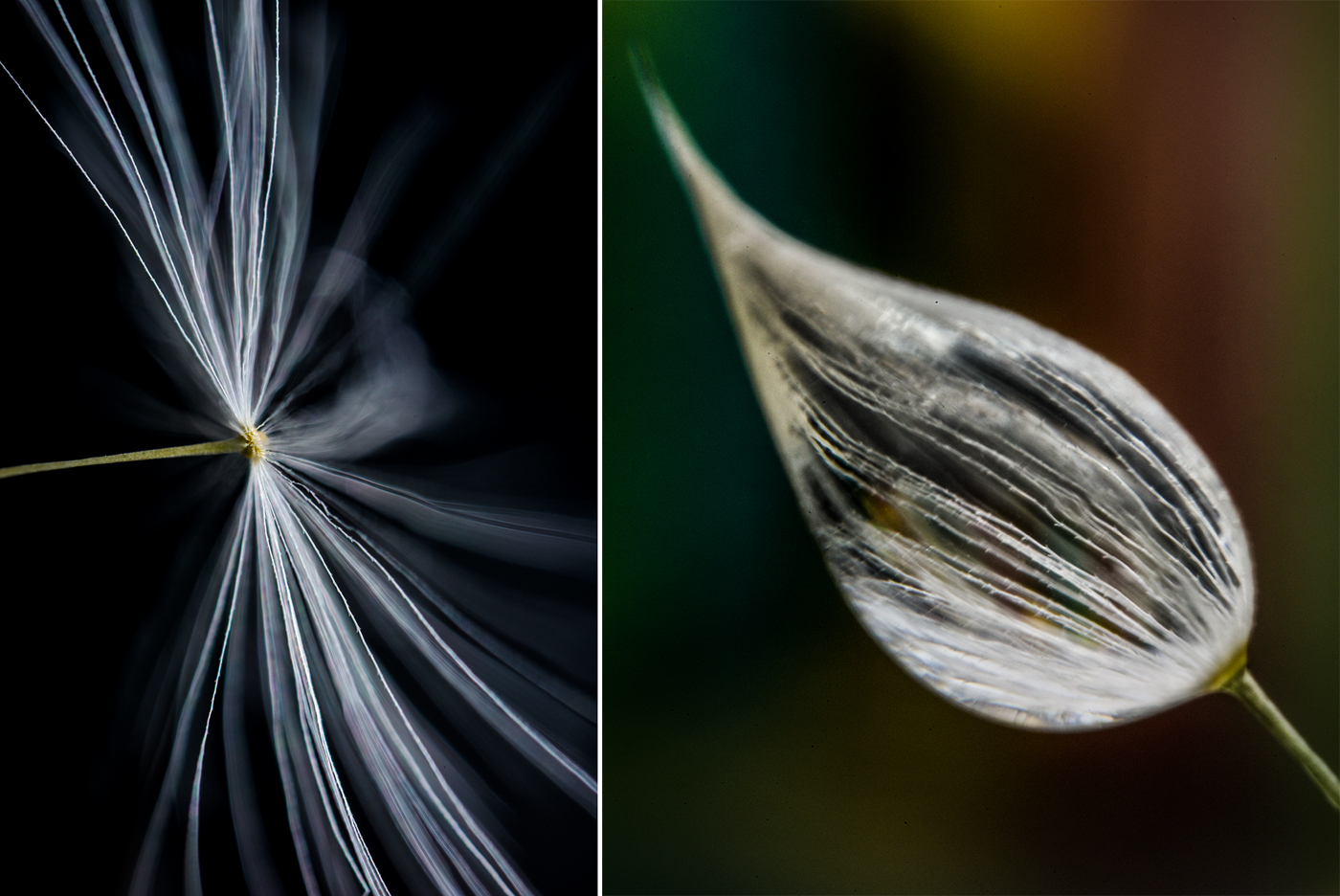
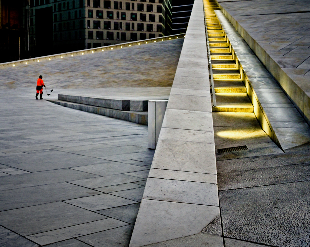
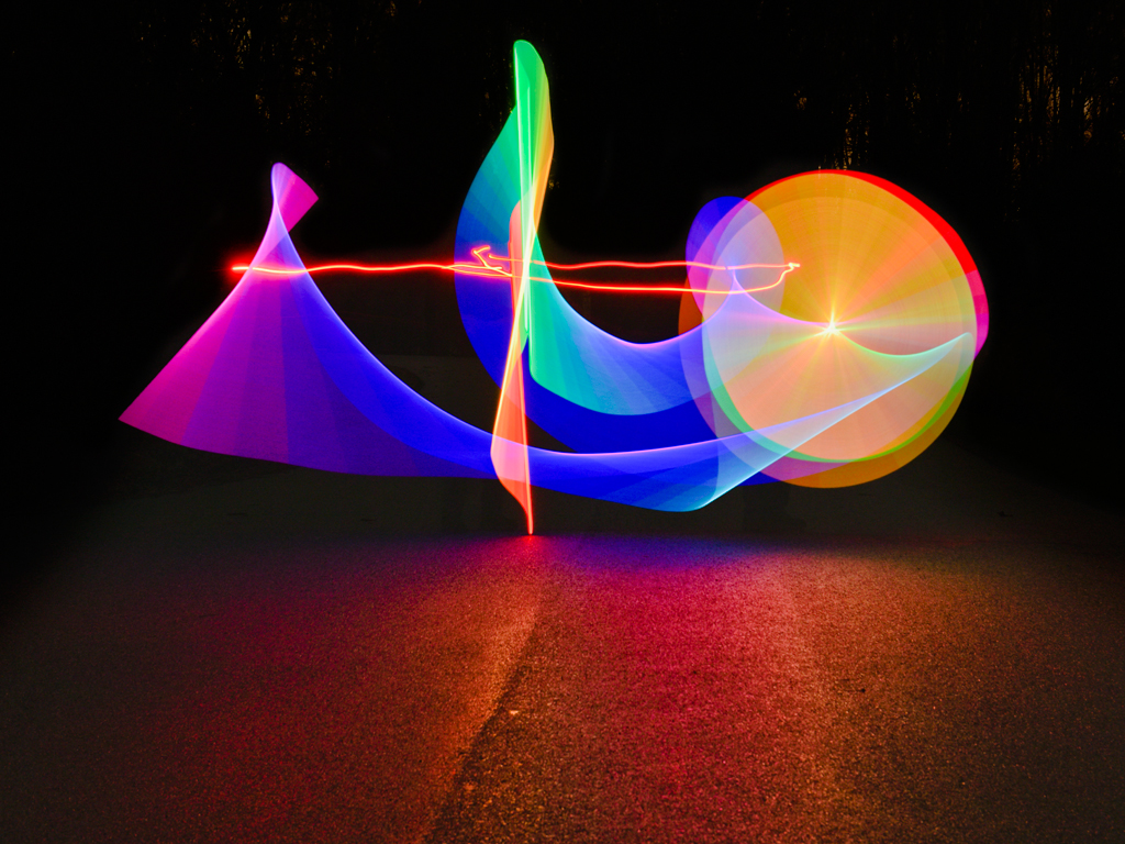
Hi Judith, You continue to master zoom and blur. This image has a pleasing amount of sharpness to make the subject clearly identifiable as well as zoom-blur to give the image a kinetic quality. Good exposure and color. Karl |
Sep 16th |
6 comments - 2 replies for Group 79
|
6 comments - 2 replies Total
|