|
| Group |
Round |
C/R |
Comment |
Date |
Image |
| 79 |
May 19 |
Comment |
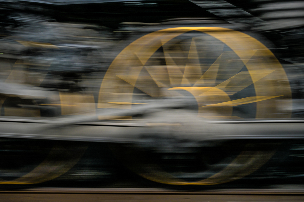
Hi Valerie, As a photographer of international equestrian sports for 25 years, I can appreciate the visualization and effort that went into this image. It's well done. I agree with our cohort that the missing reins are a visual problem. On the one hand we know there should be a connection between the rider's hand and the bridle so our mind can supply that link. On the other hand, if we crop out the rider at the base of the horse's neck, we still see some rein and the bridle which strongly suggest that there is a rider. I would choose the cropped version. The subject of the image is the horse since we see so little detail of the rider. The motion blur is very nice and strongly interprets the movement. Without the rider I can appreciate both color and mono versions. Color for a horse magazine and mono for a fine art print?
Karl |
May 15th |
| 79 |
May 19 |
Comment |
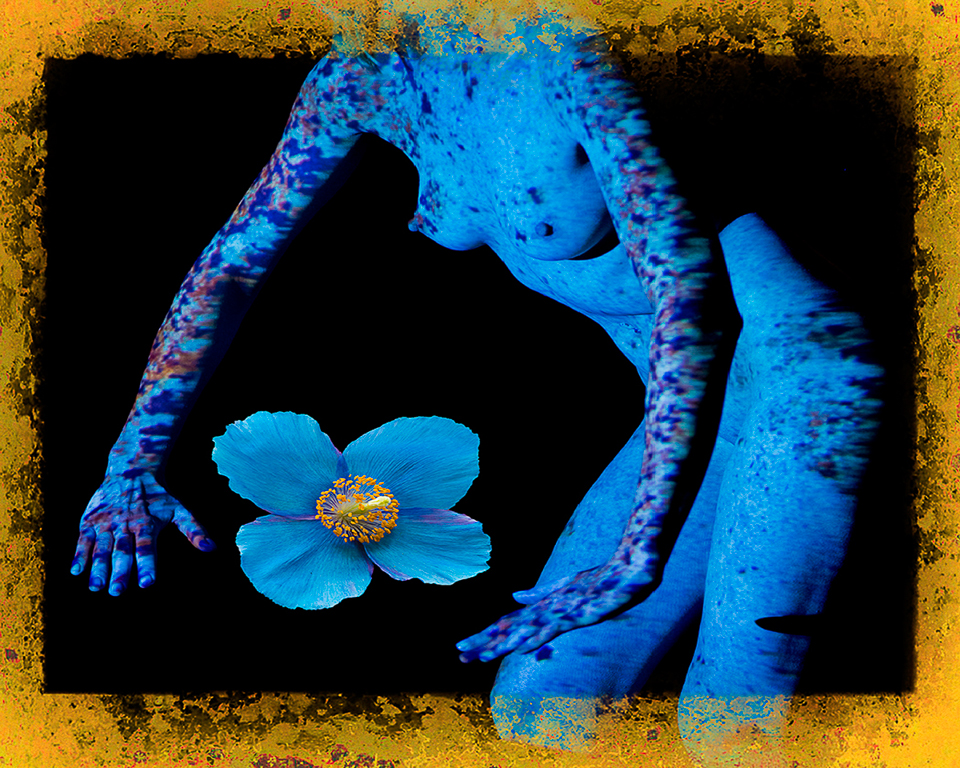
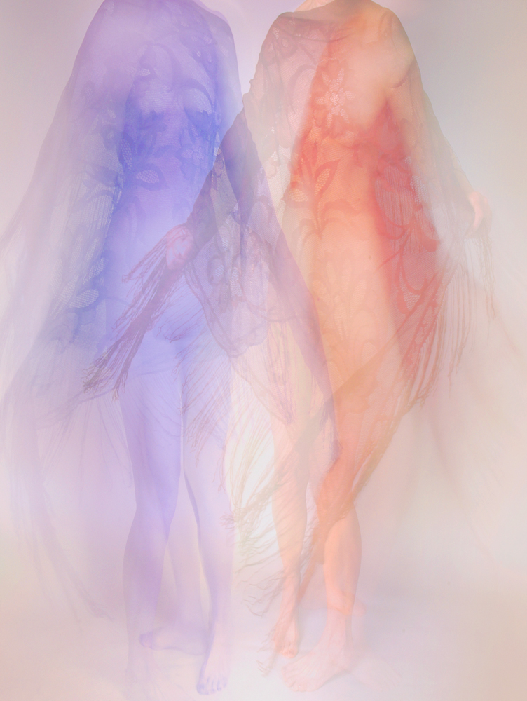
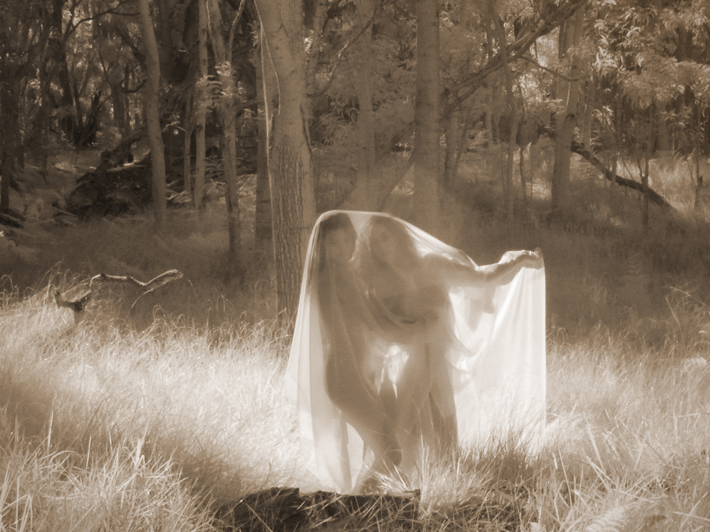
Hi Marie, This tranquil image of two women grows on me with each viewing. I'm not bothered by the 'missing' arm of the lip dress woman. I might have posed the redhead's left arm to wrap around her midsection rather than point off to the left. That would provide a more contained relationship between the women that is emphasized by their heads tilted towards each other. It's a very nice relationship image. The contrast between the busy print dress and the simpler lips dress in visual texture and color is wonderful. The hair difference adds to the effect. Is it a metaphor for disparate people being able to relate?
I also liked the reddish hair against the cement background but still the same color as the brick wall in most of the image.
Overall a great image to put on the wall and study over time. There's a lot in this picture that will take time to fully appreciate. I love it!
Karl |
May 15th |
| 79 |
May 19 |
Comment |
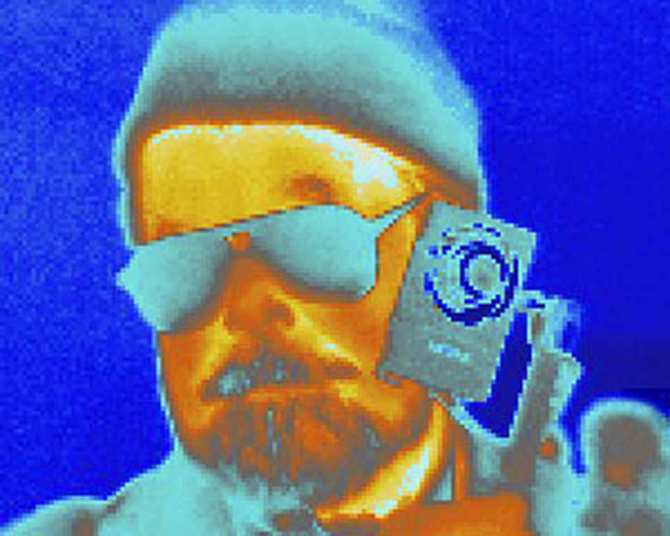
Hi Susan, Using digital filters on images is a new interpretation in the nearly 200 year history of photography. I think that more recent photographers grasp and enjoy the interpretations more than older folks. For me the image goes obviously to the illustration/cartoonish end of the spectrum. That said, I do grasp the serious and unposed expression of our judge. It is an open ended story in that we are not aware of the situation from the image itself. We can inject our own reasons for the expression. As a photo illustration, it is very well done. The art is in the ambiguity of interpreting the gentleman's facial expression and body language.
Karl |
May 15th |
| 79 |
May 19 |
Comment |
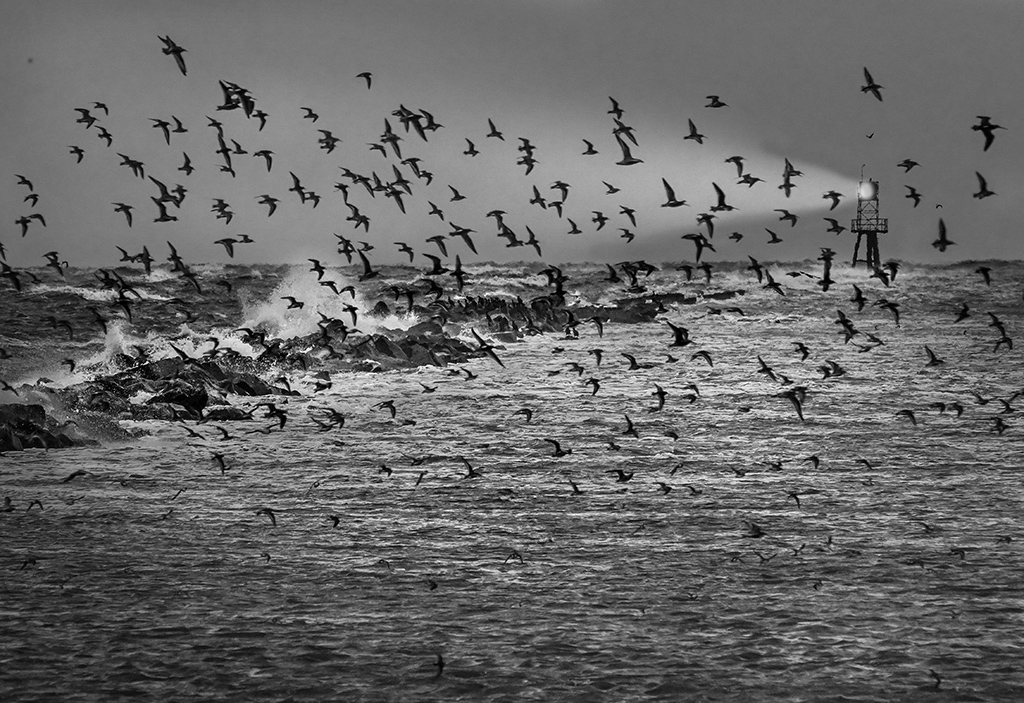
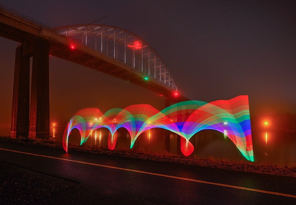
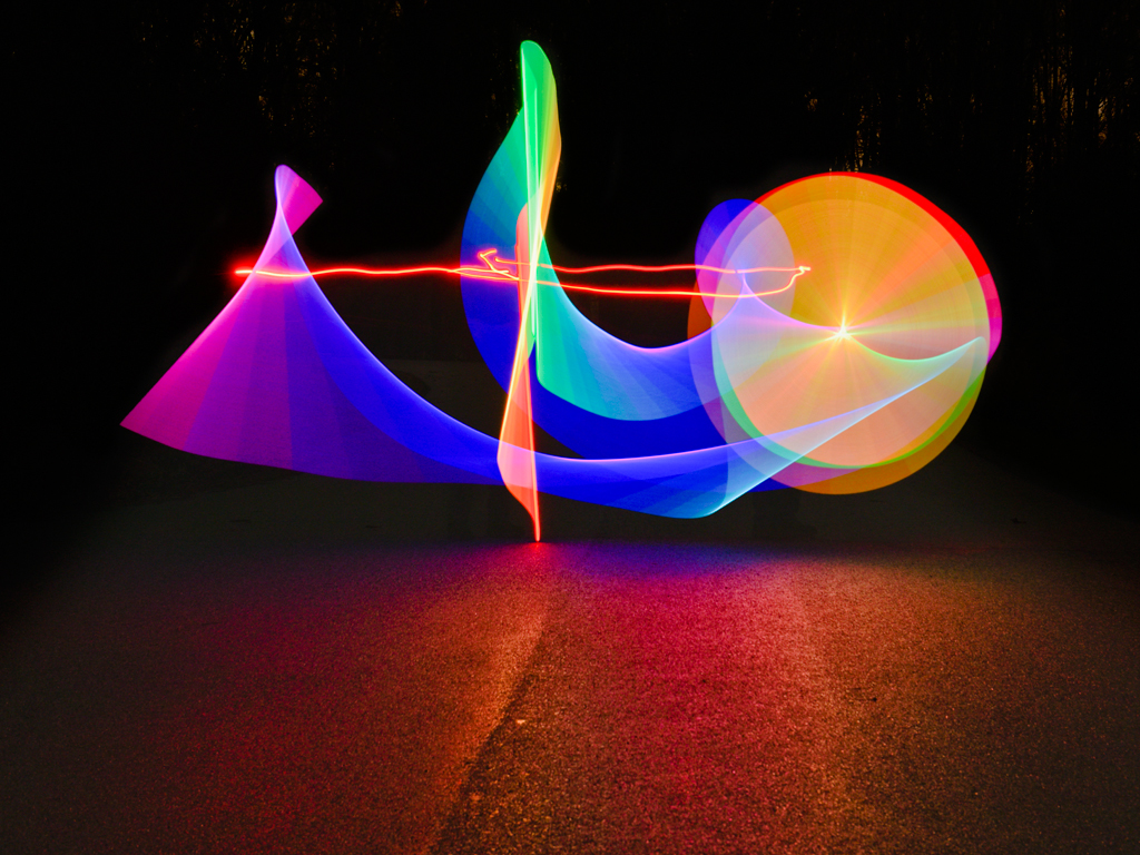
Hi Valerie, The image has the feeling of the rainy night venue. Thank you for showing the 'before' image. The cropping and tone handling are well done. I might desaturate the reds in the area to the right just a little more to decrease visual competition with the umbrella. I love motion images. This one successfully shows the motion. The figure crossing the street at the intersection of the street lines and vertical building lines makes an excellent composition.
I sympathize with the loss of camera gear. I had most of my gear stolen at the 1992 Barcelona Olympics and survived the last few days of the event using borrowed gear from fellow photographers. Now I'm particularly diligent in Spanish, Portuguese and Italian speaking countries.
Karl |
May 15th |
| 79 |
May 19 |
Comment |
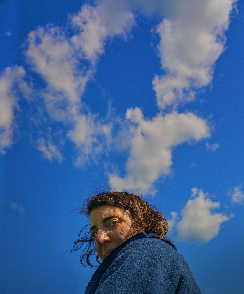
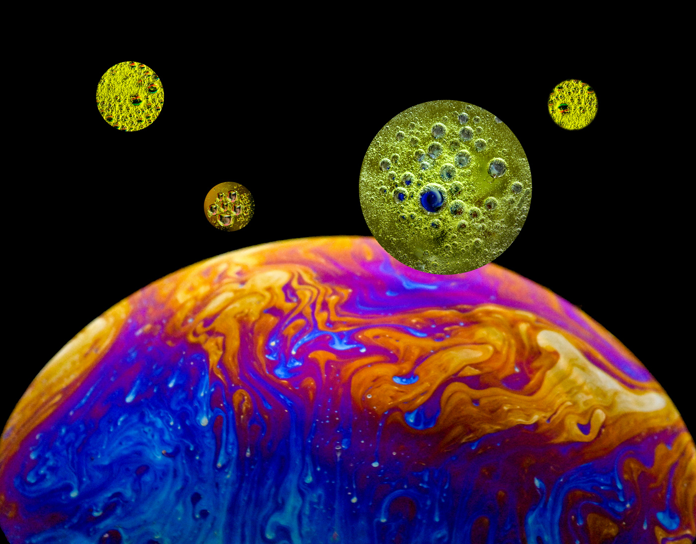
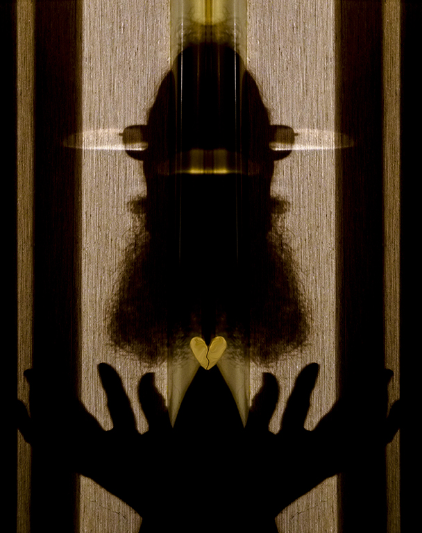
Hi Judith, The leaning way back composition gives me the feel of lying down to rest in the cosmos. I would try it without the 'peak' from your glasses on the nose so that there would be a cleaner face silhouette. That would negate the 'Ben' effect. It's a lovely, dynamic background that contrasts nicely with the restfull, reclining figure. The originality aspects here are why we call it fine art photography, not pictorial photography.
Karl |
May 15th |
5 comments - 0 replies for Group 79
|
5 comments - 0 replies Total
|