|
| Group |
Round |
C/R |
Comment |
Date |
Image |
| 79 |
Mar 19 |
Comment |
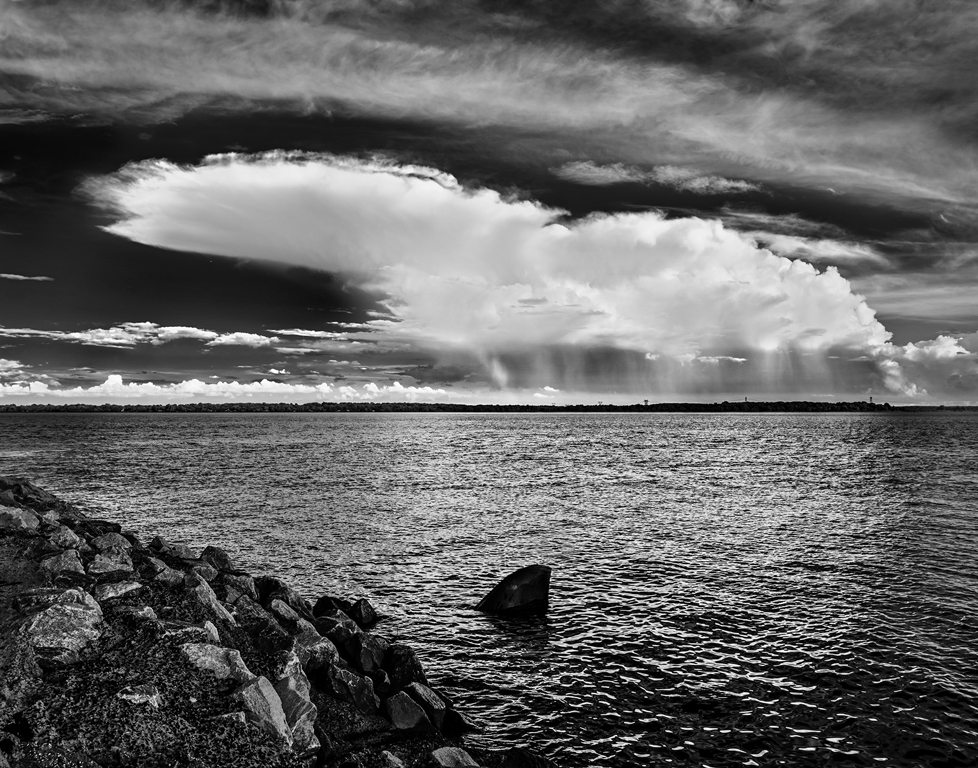
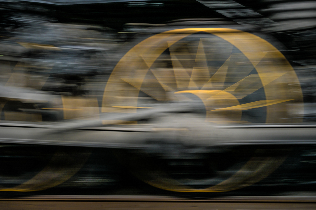
Hi Susan, The color is dramatic. I'd like to see the image at higher resolution which I know is not possible on this site. I'm looking for smooth gradients between colors rather than the sharper divisions showing at low res. I love the zigzag composition formed by the clouds, toll booth, and yellow posts. It's definitely a scene made by strong color, reflections, and the lights at dusk. You deserve credit for getting the image in this busy traffic situation, too. Keep a hand on the wheel1
|
Mar 27th |
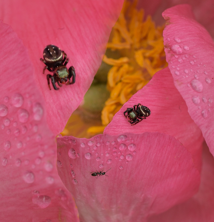
| 79 |
Mar 19 |
Comment |
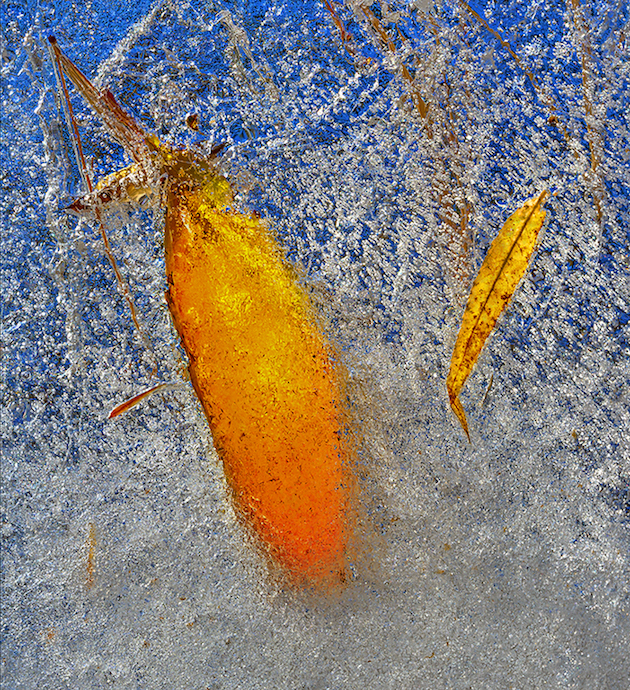
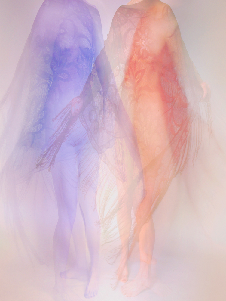
Hi Susan, If you aren't in the greeting card business yet, you should at least use images like this for cards to send to friends. While we all take lots of butterfly and flower pictures (subject matter that doesn't talk back!), it's the interpretation that produces feeling. This image makes me feel soft and content. I like the sharpness just around the butterfly's head. It makes the butterfly more accessible, like we are relating to each other. I would try different frames around the image, something soft and ragged or flowing? |
Mar 11th |
| 79 |
Mar 19 |
Comment |
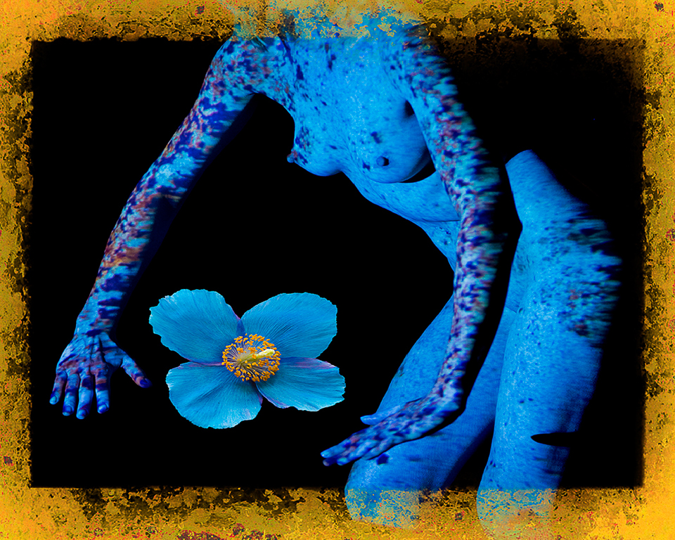
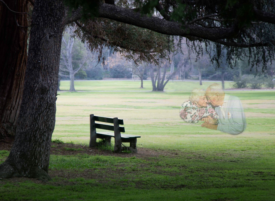
Hi Sandra, The bench image has been strengthened by contrast and color (green) emphasis. It's a very good interpretation into which we can read parts of our own lives. I agree that more space to the left and removing all the baby carts, cones, etc. from the background would make it simpler and more timeless. I would also flip it left to right to see how you like that interpretation.
Whenever I see a stark image like this, I'm tempted to layer on some of my own interpretation. I flipped your original image, cloned out the little distractions in the background and added in at 50% opacity an old couple from an image made by a friend. I also tend to appreciate shadow detail so I left visible detail in the trees framing the scene. As you get more familiar with Photoshop and compositing, the fun increases. |
Mar 11th |
 |
| 79 |
Mar 19 |
Comment |
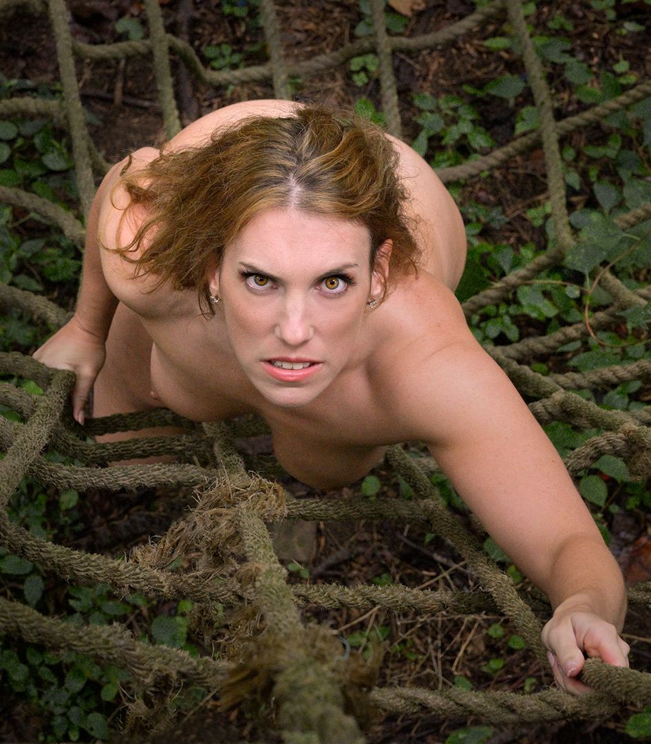
Hi Mary, I continue to envy your tattooed models. You have done well in post processing. Portrait format is stronger here and darkening the tattooed arm just enough to shift emphasis to arms, hands, and face. My eye keeps bouncing from the nose-fingers area to the forest of hair on the model's arm. I'm settling into the idea that the brighter areas should be taken as a whole (the noun) supported by the eyebrows, nose, fingers, hair (the adjectives) and to lesser extent, the tattoo. That makes it a true fine art image in my mind where continuing study brings more thoughts. I also like the tattoo at the shoulder that acts like the all seeing eye in the background. The image is a thoughtful eye full. |
Mar 11th |
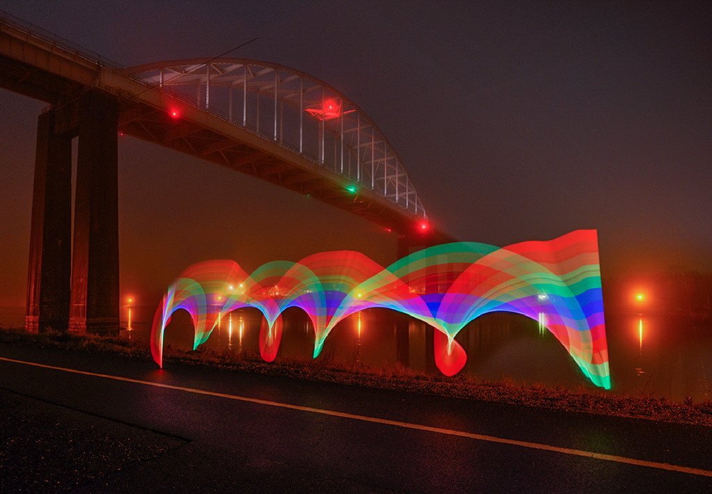
| 79 |
Mar 19 |
Comment |
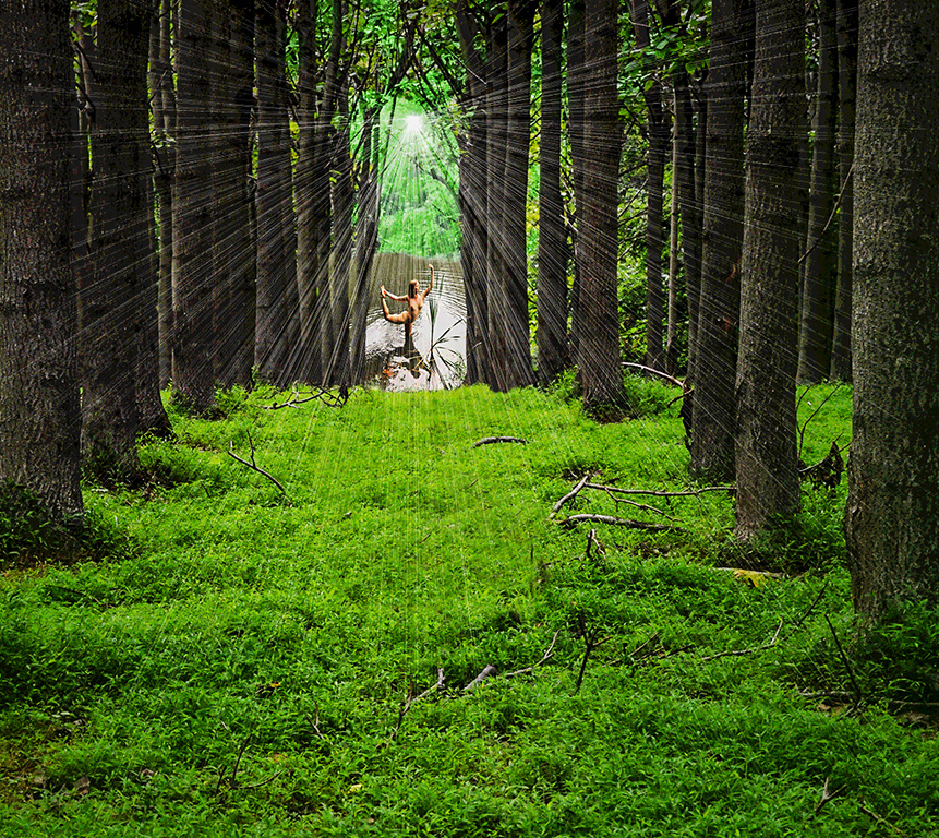
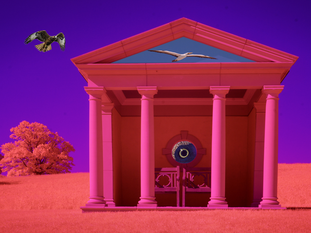
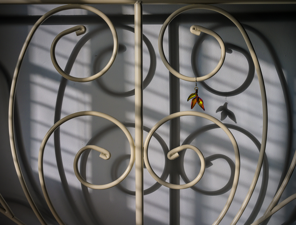
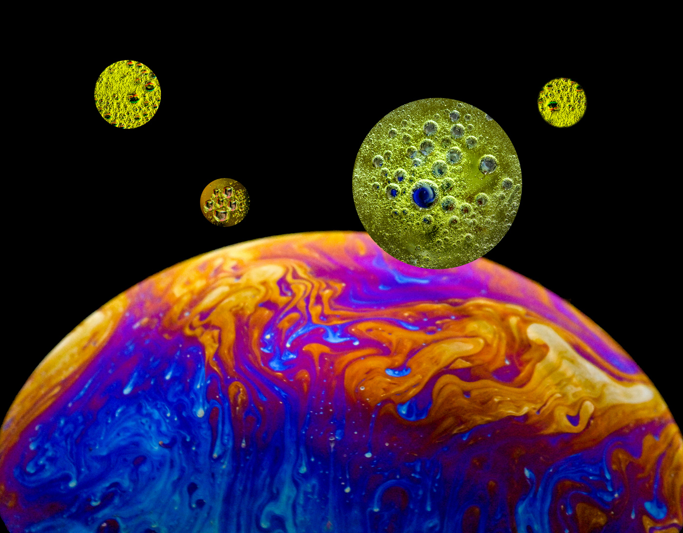
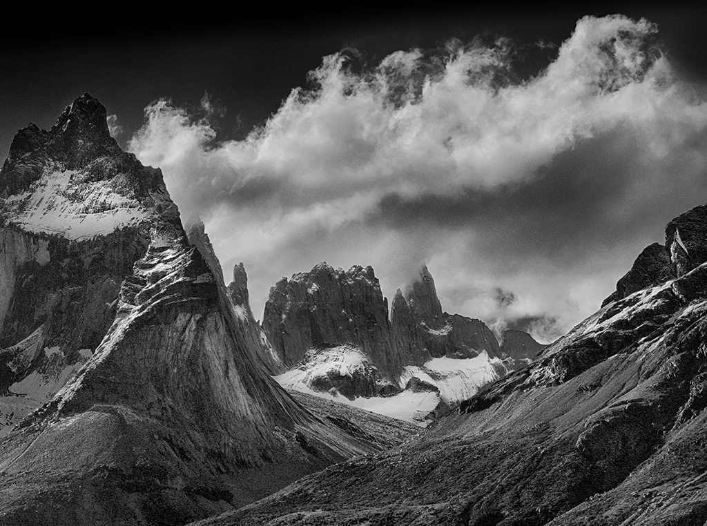
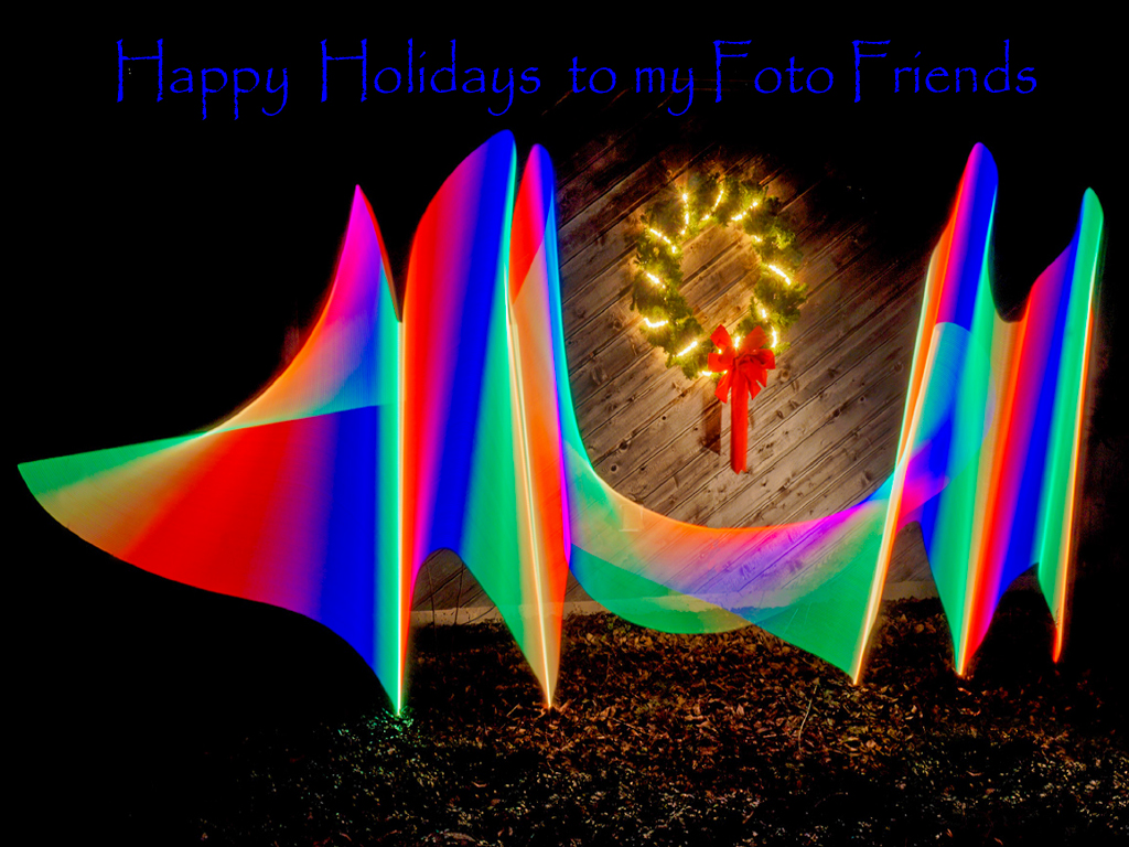
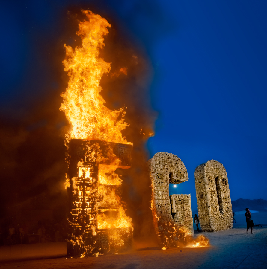
Hi Judith, It's like a science fiction trailer. I have never tried the stepped zoom technique on a geometric subject (only on flowers/trees). It works great! The depth is impressive. The stepping interrupts the smooth flow and actually gives a different vibration to the image. Very good use of technique. Also well composed with the lighter arched section on the left supported in feeling by the long rows on the right. I like this as one of your best Group 79 works. |
Mar 11th |
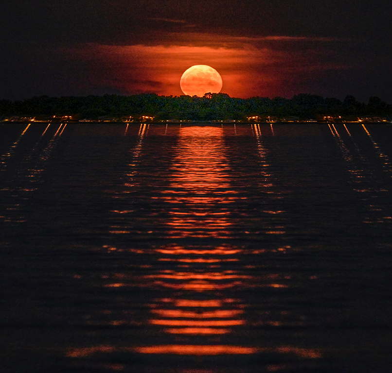
| 79 |
Mar 19 |
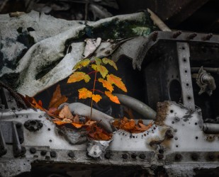
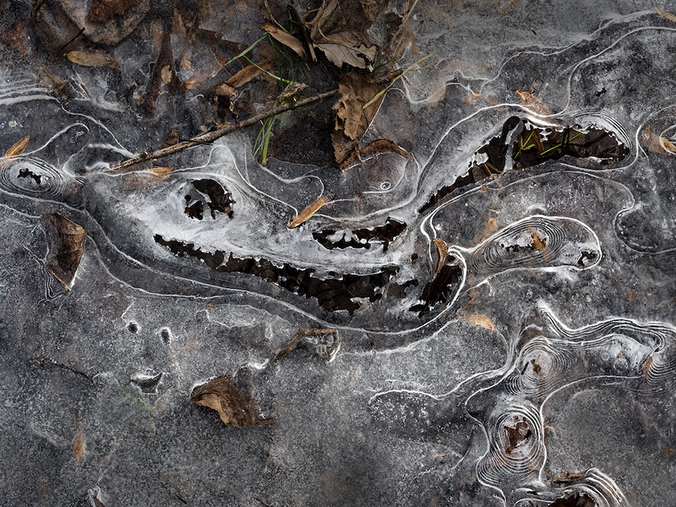
Comment |
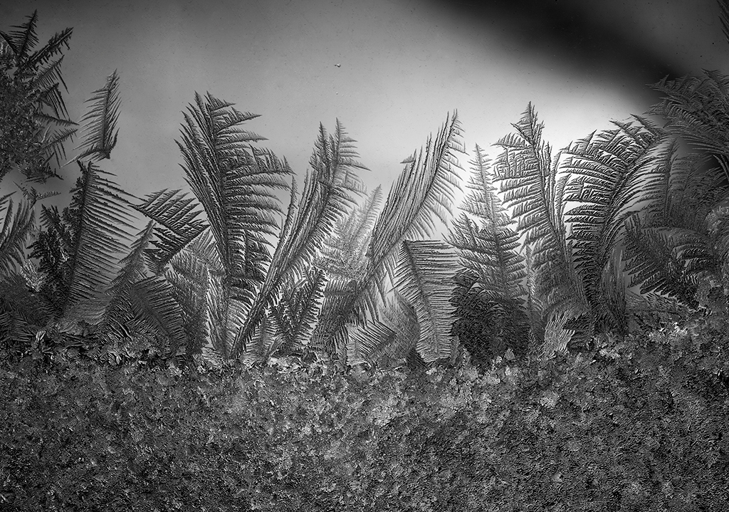
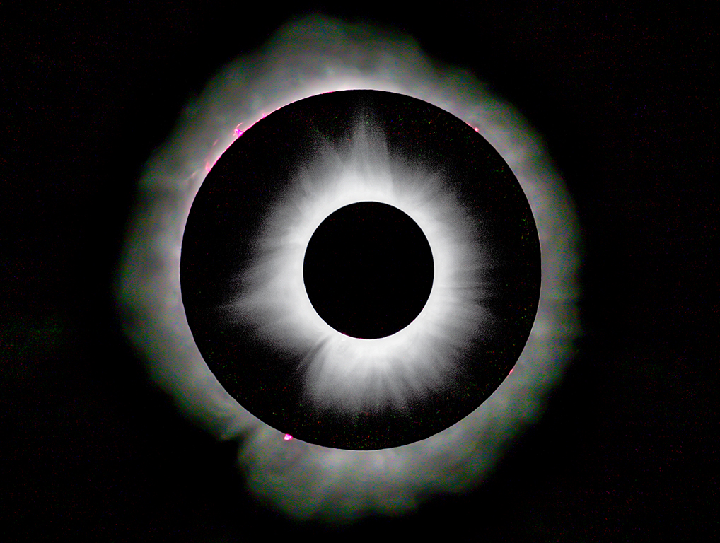
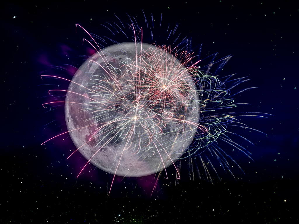
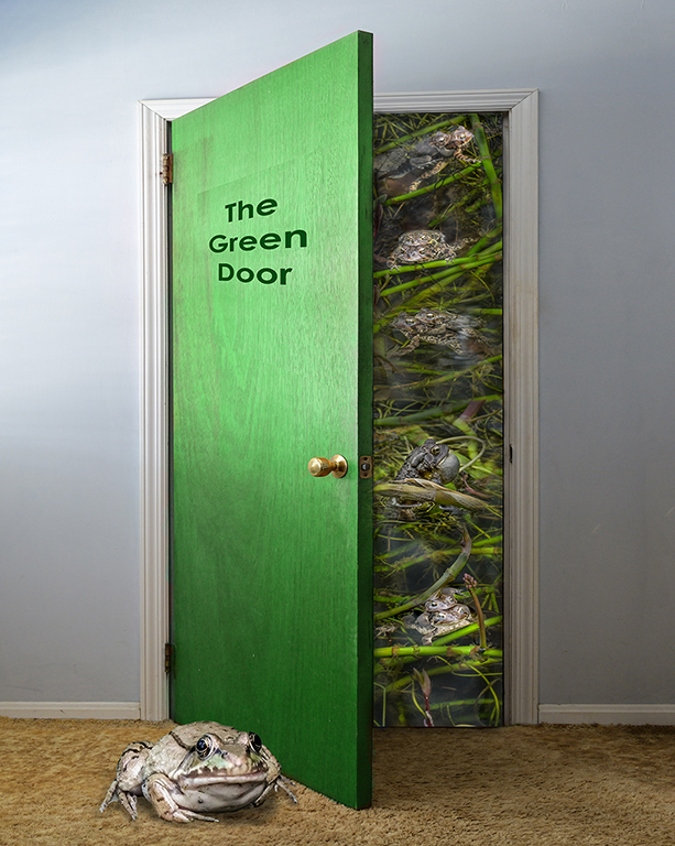
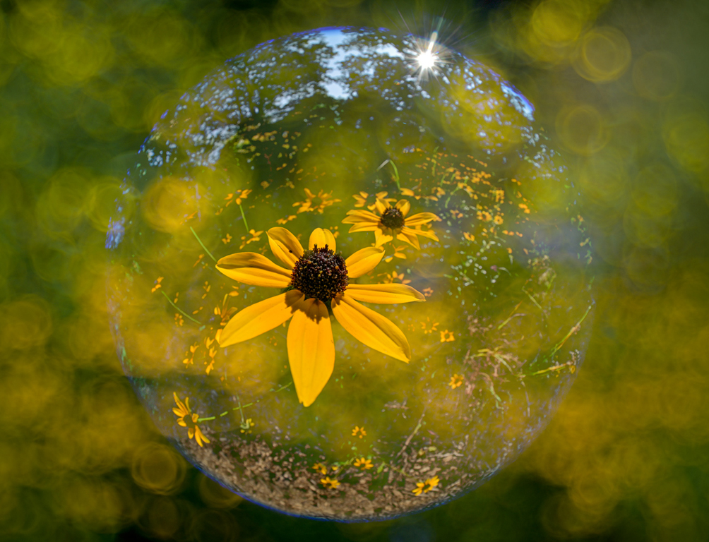
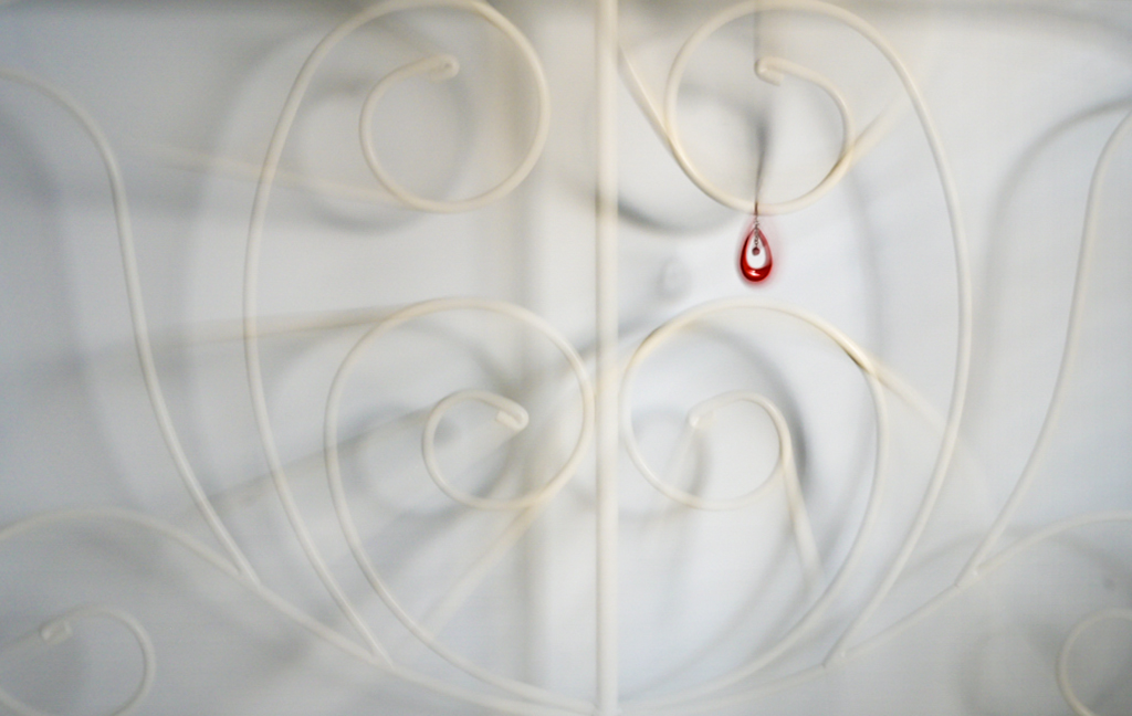
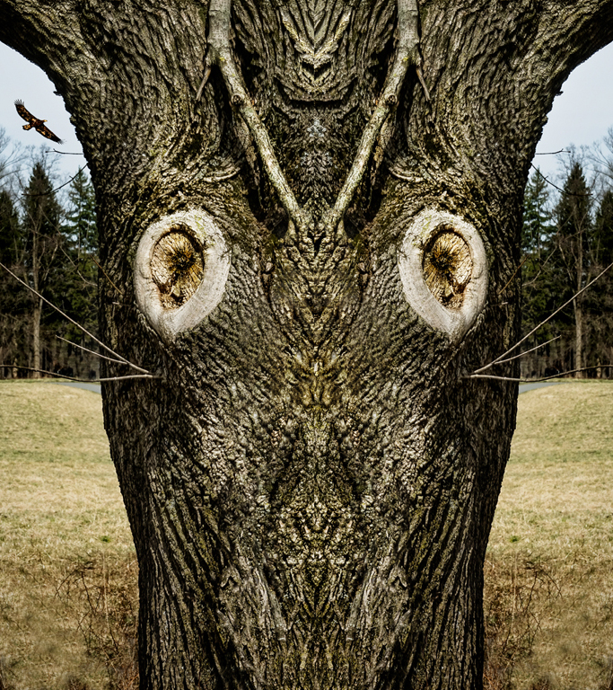
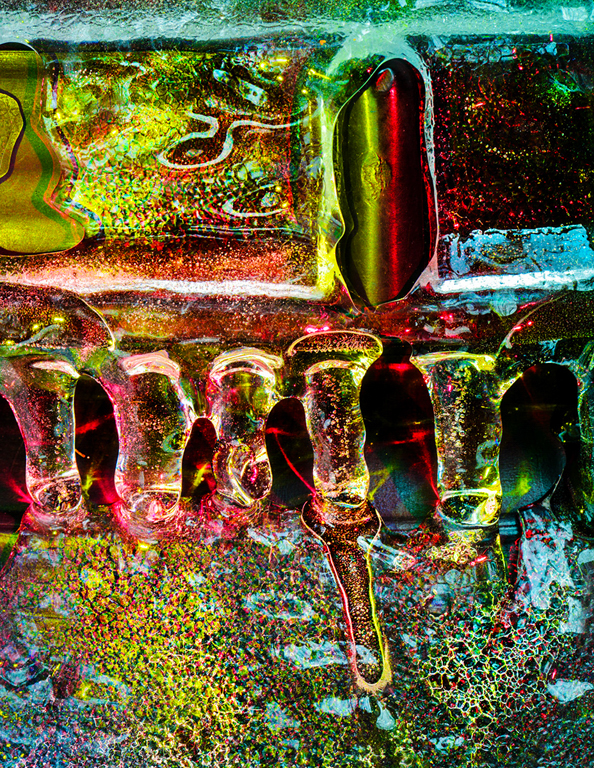
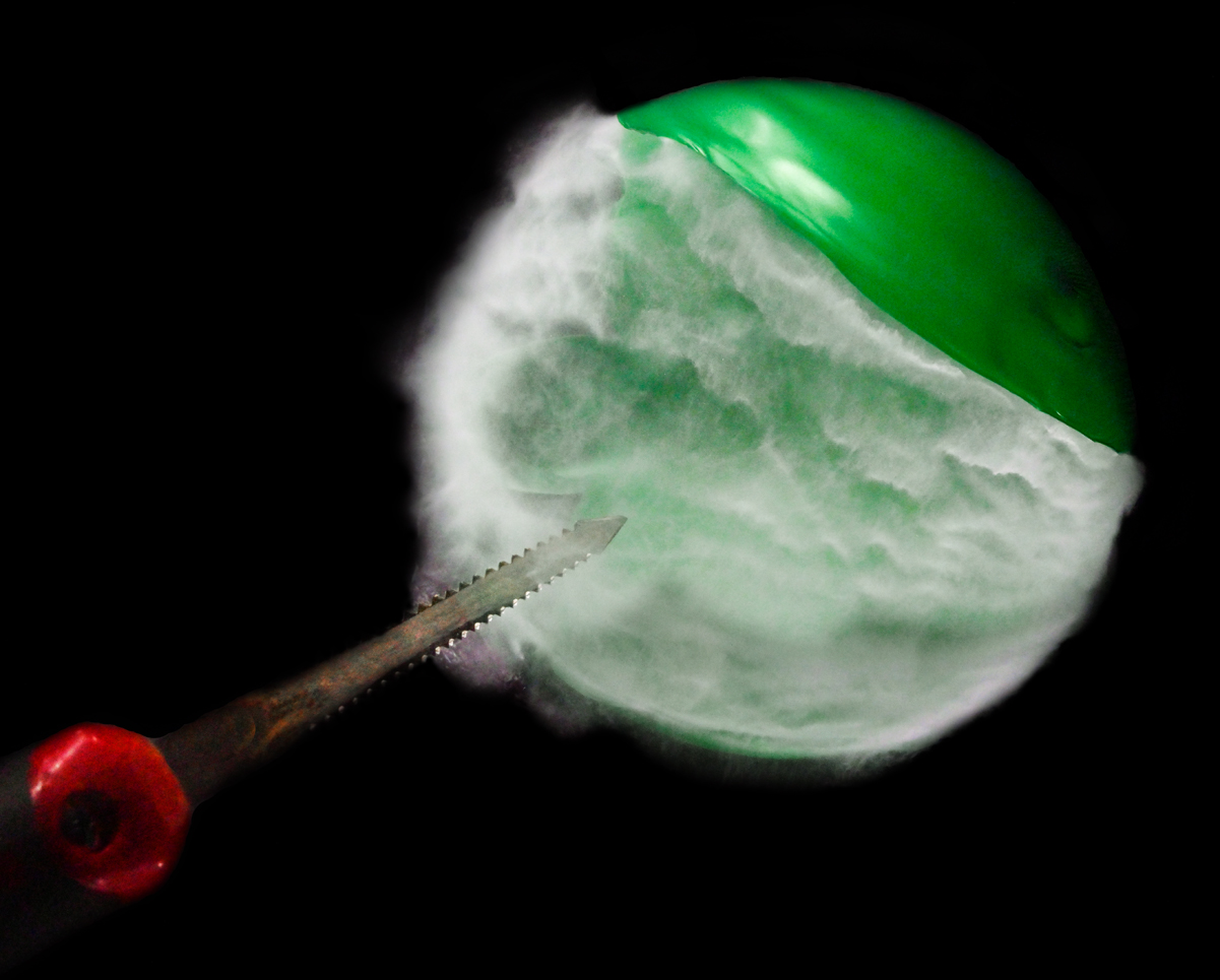
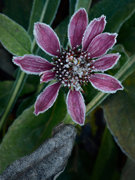
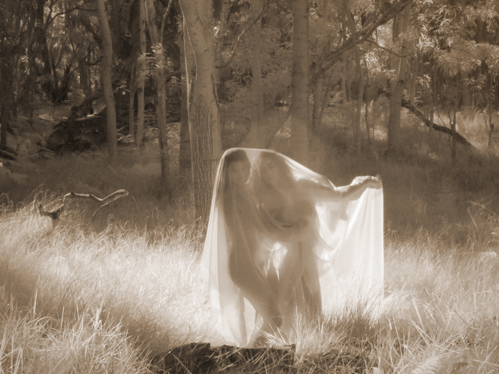
Susan saw a frogspawn that I didn't see before she mentioned it. That's why I love doing images like this. Their interpretation relates to our mental images of familiar things. The word for that is pareidolia - seeing seemingly familiar things in what is actually random information. Welcome to the 'Man in the Moon' club! |
Mar 11th |
6 comments - 0 replies for Group 79
|
6 comments - 0 replies Total
|