|
| Group |
Round |
C/R |
Comment |
Date |
Image |
| 79 |
Dec 18 |
Comment |
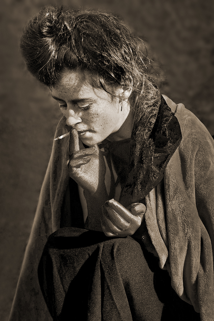
Hi Mary, while waiting for Christmas dinner, I tried some changes to The Next Morning in Photoshop 5. The result is attached. I cloned out the bag. Dodged (lightened) the glove fingers, cigarette, hair highlights, and eyes. Burned (darkened) facial highlights. Applied 30% gradient to darken left & right edges. Used clone tool at 60% to soften background. Converted to B&W with these settings: R=27, Y=-44, G=106, C=180, B=-121, and M=-80 which helped preserve garment detail. Used hue/Saturation to colorize at Hue=33, Saturation=17.
Merry Christmas, Karl |
Dec 25th |
 |
| 79 |
Dec 18 |
Comment |
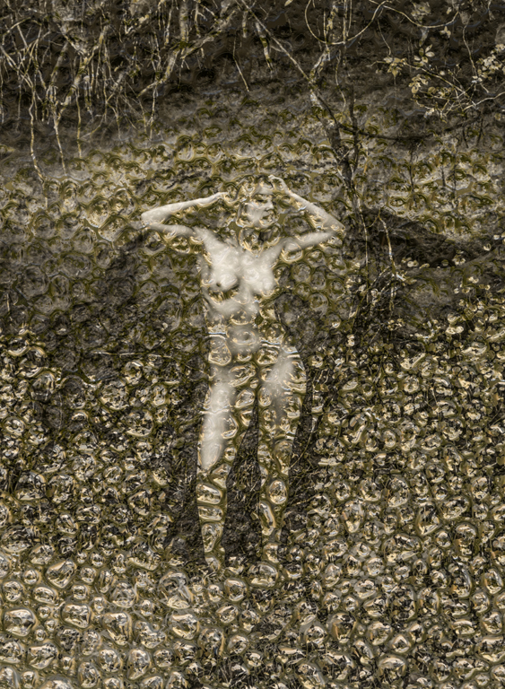
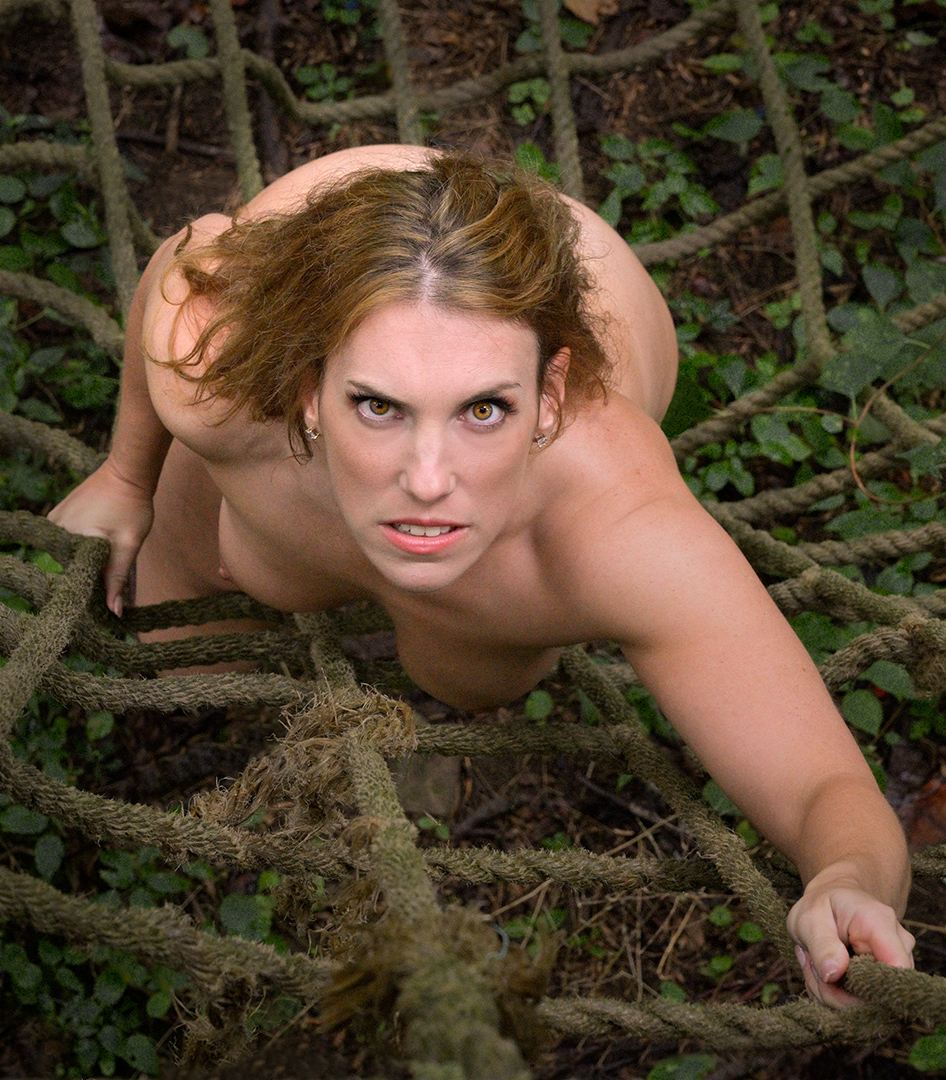
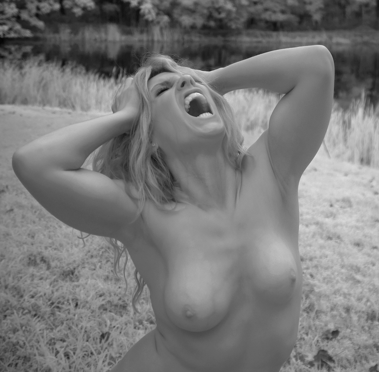
Hi Mary, I love the people being their real selves aspect of 'street photography'. You clearly caught such a moment. i agree with removing the bag in the background. Then I might try selecting the background and reducing the histogram highlights to the 180-200 range and maybe raise the midtones to 110-125. You can create some visual separation by doing this to make the background contrast flatter since the person has good contrast. The masking needs to be done carefully to avoid the halo effect on the left side of the figure. The area in most need of foreground-background separation is the top of the woman's hairdo. The fact that the background is in soft focus helps the separation. Going to monochrome gives the image more of a photojournalistic look that I like. Keeping the red gloves is an artistic alternative, but would negate the primal feeling of monochrome.
Karl |
Dec 24th |
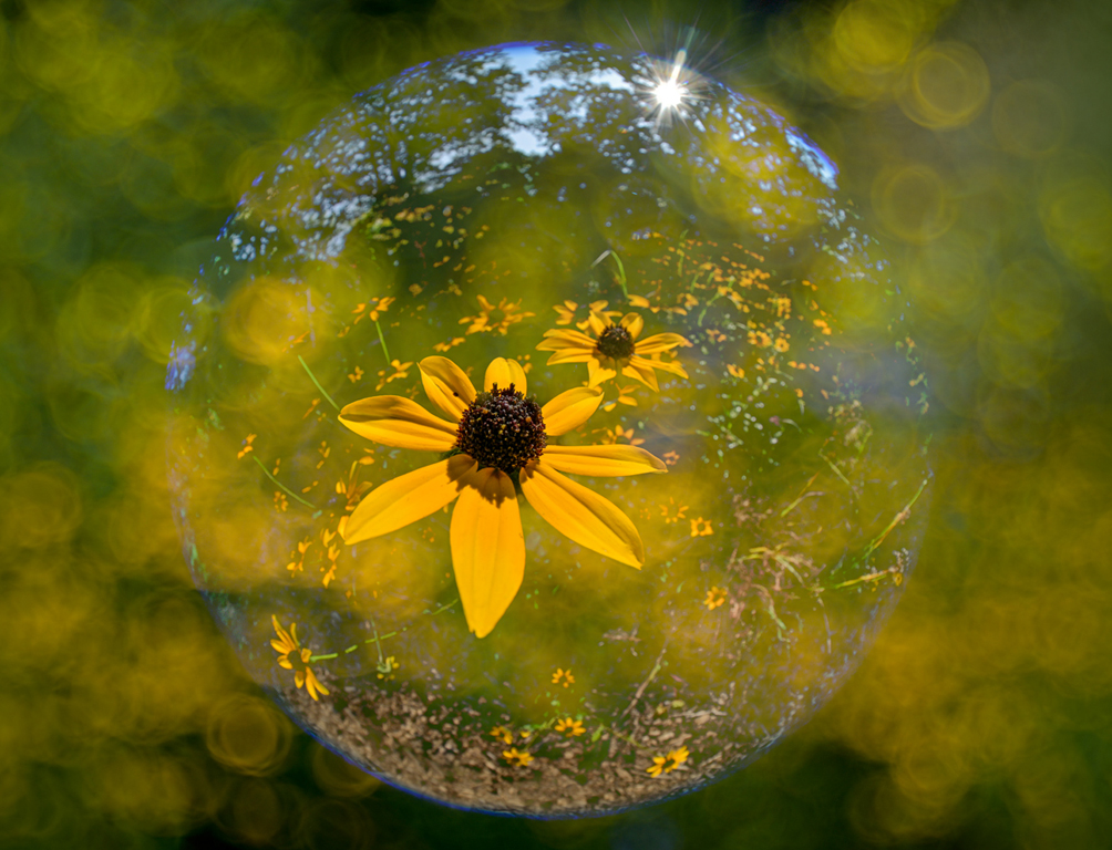
| 79 |
Dec 18 |
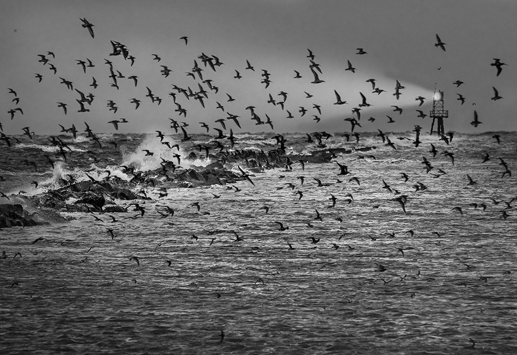
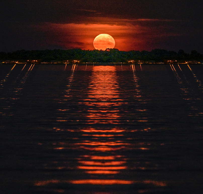
Comment |
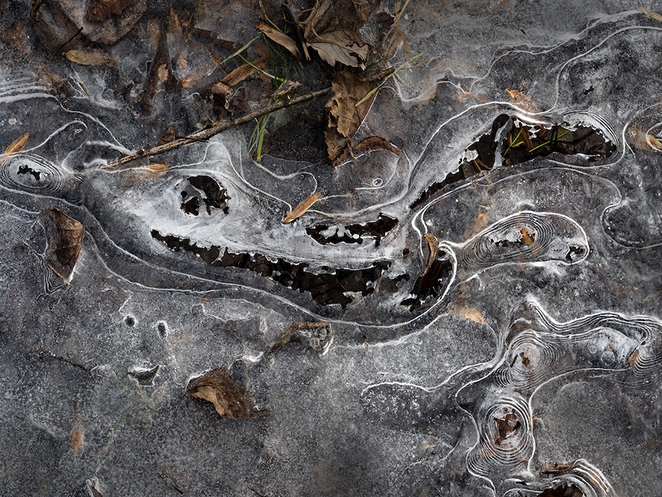
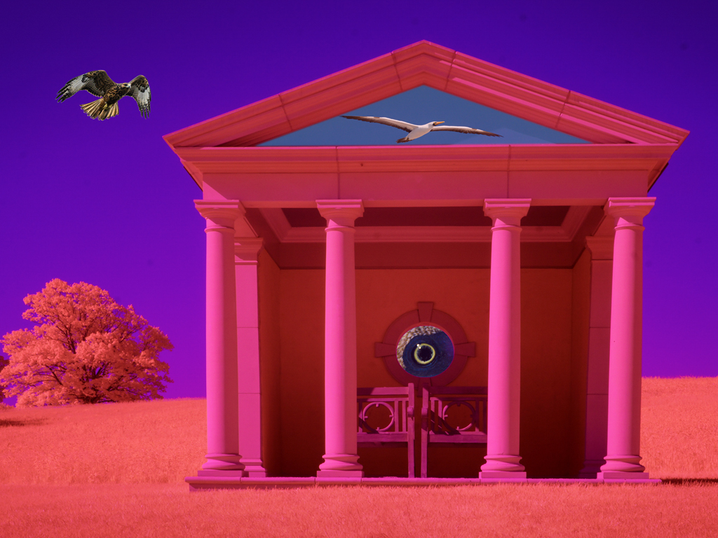
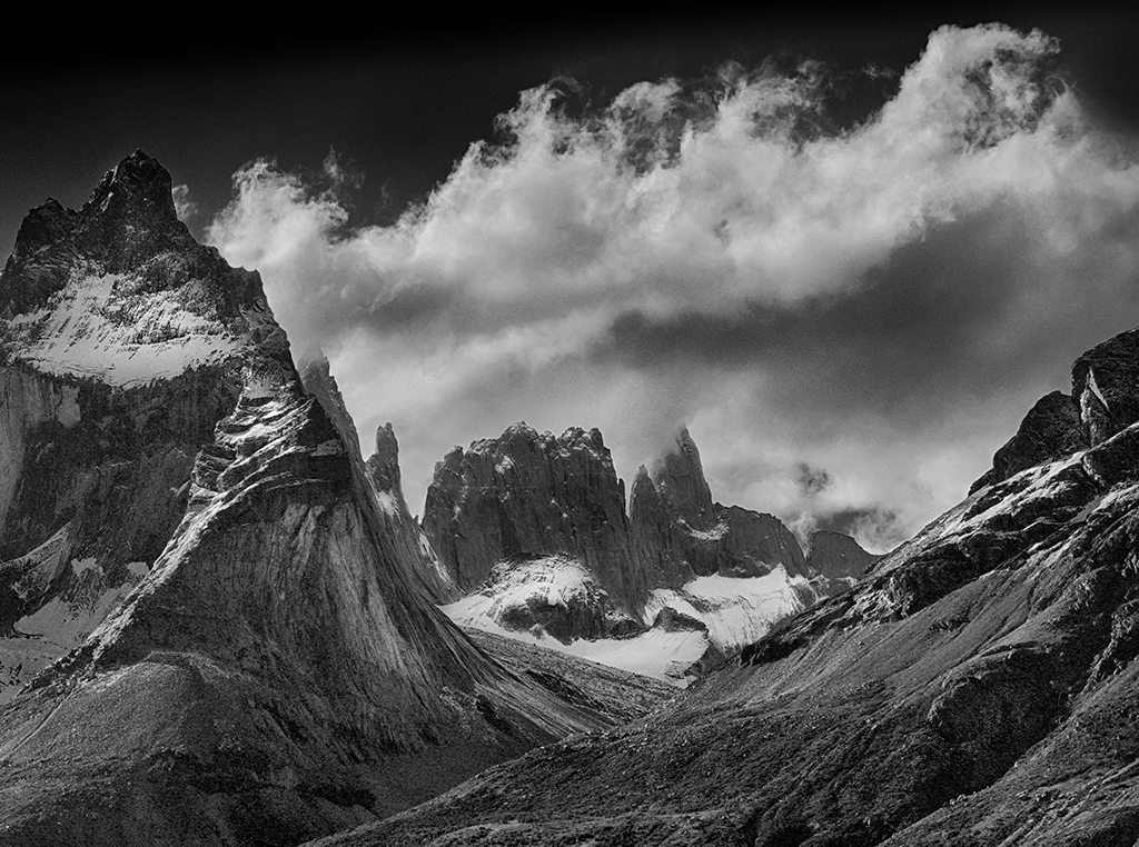
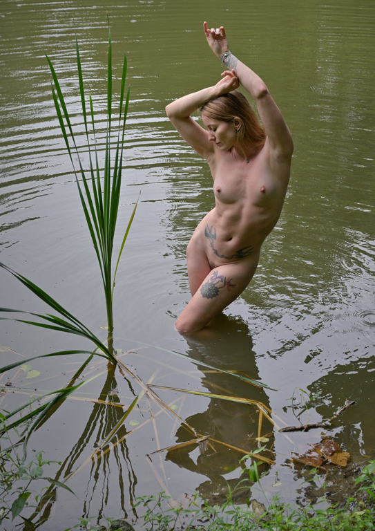
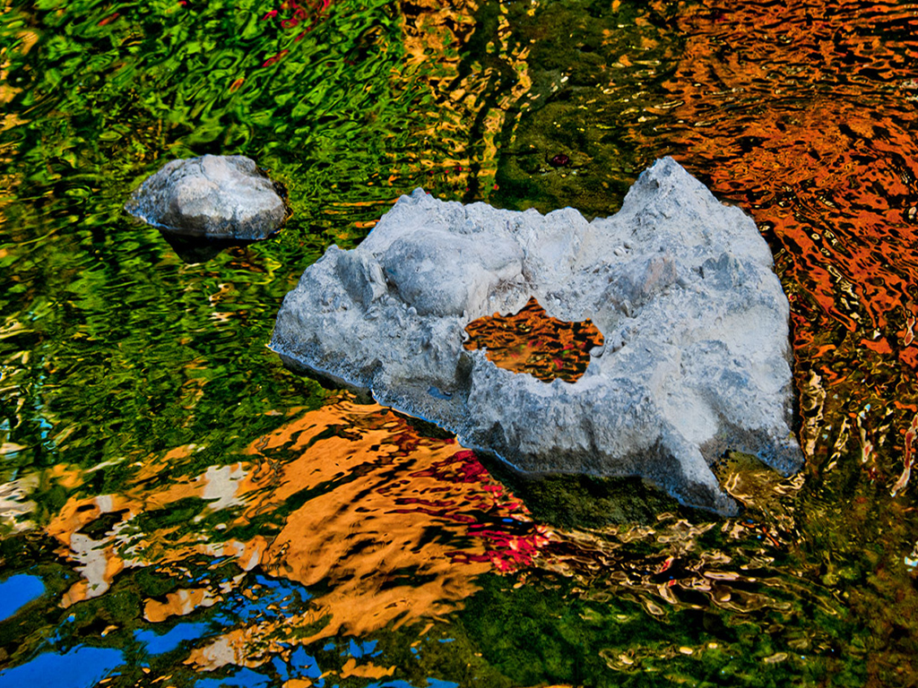
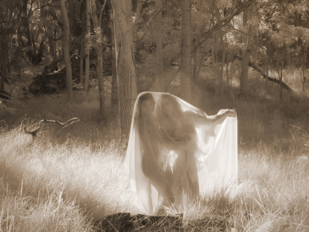
Hi Anurada, Beautiful composition! I was hiking in a local marsh yesterday looking for images of this type but nothing came together to my eye. I compliment you for seeing this elegantly simple composition and photographing it well. I like the fact that the reflection isn't perfect due to slight surface undulation. It makes the picture 'real'. The image is easy to grasp, yet complex enough to require study of the relationships of lines. I particularly liked the levitating 'C' shaped twig toward the left side. It's one of those nuances that a viewer finds after looking at the image awhile.
This stark image stands out this month when some of the others submitted are so colorful. They are all good and show the range of 'fine art photography'.
Karl |
Dec 24th |
| 79 |
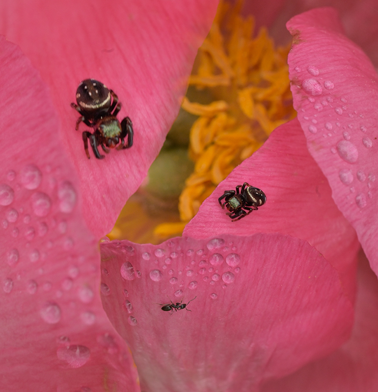
Dec 18 |
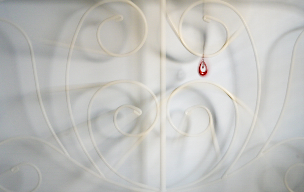
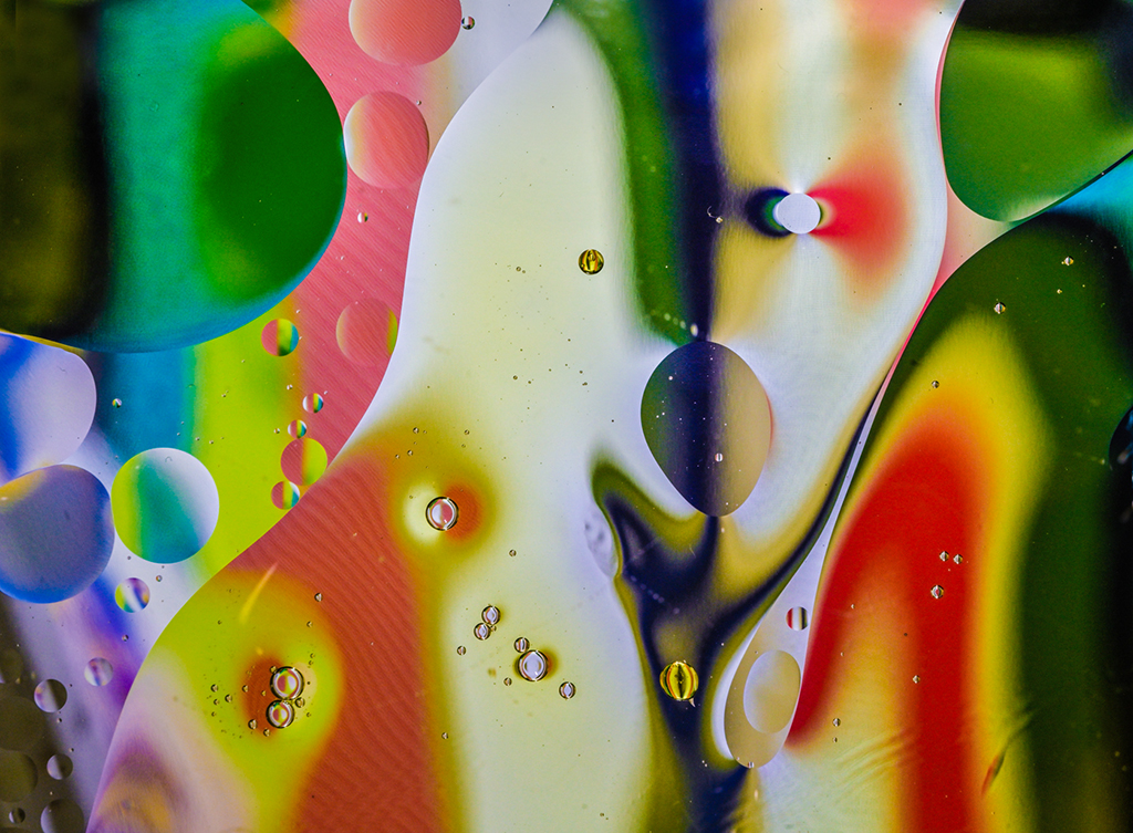
Comment |
Hi Susan, So often we tend not to photograph when the atmosphere is funky. Your reflections in window water drops shows a lot about your upbeat personality. You saw the minute beauty in the drops and photographed them perfectly. It's a nice asymmetric composition with contrasting forms: irregular water drops, circular M&M's, and the shadowy grid lines. i get the mystery aspect that Judith mentioned. Nicely done.
Karl |
Dec 24th |
| 79 |
Dec 18 |
Comment |
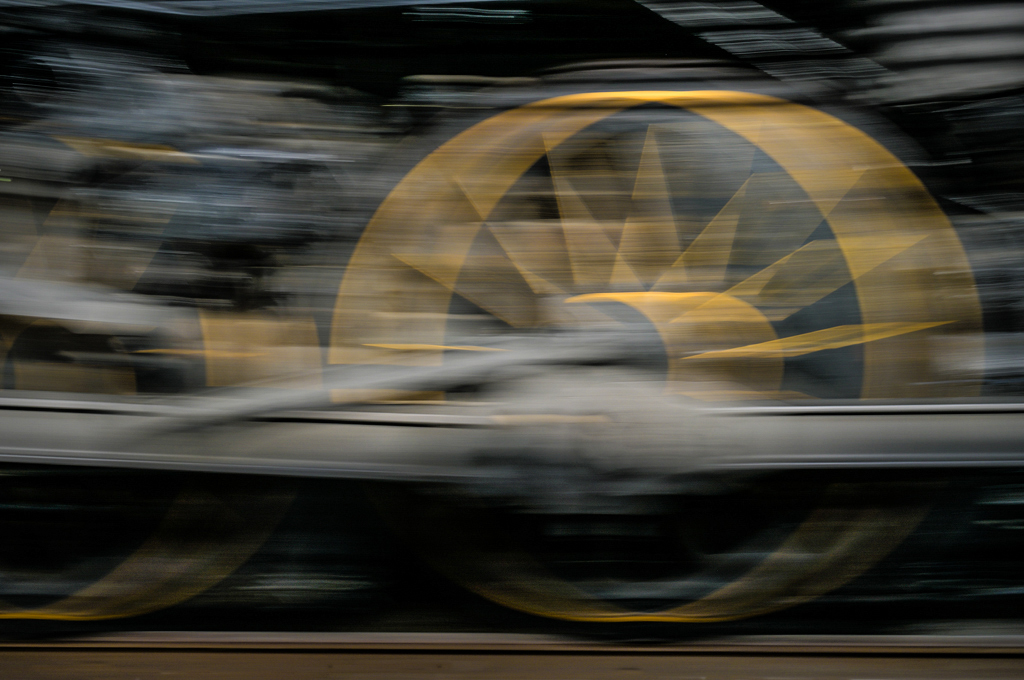
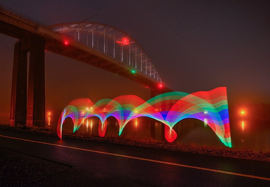
I tried to upload the original file without reducing it. Here's a reduced copy that should load better.
Karl |
Dec 11th |
 |
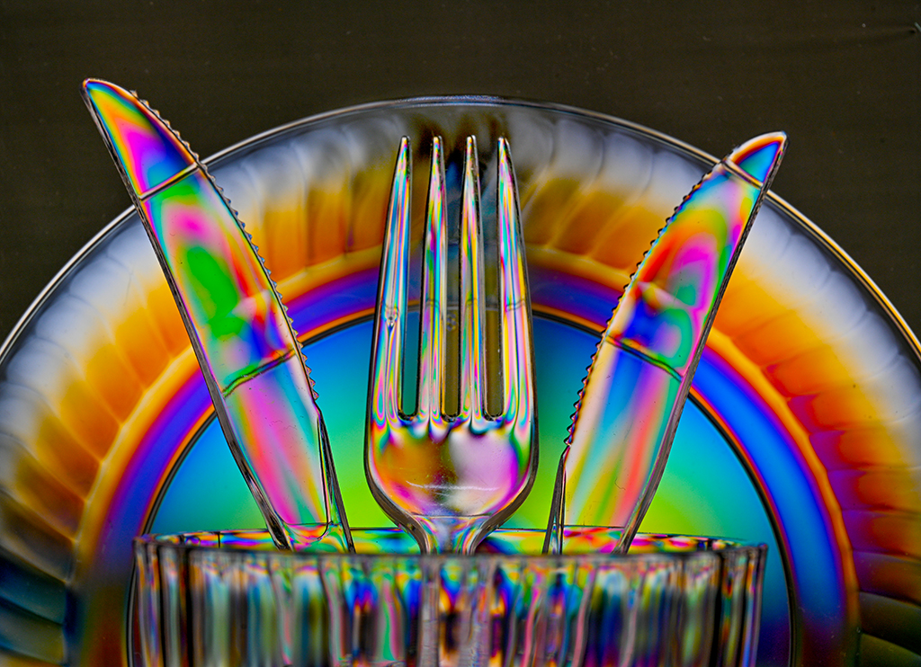
| 79 |
Dec 18 |
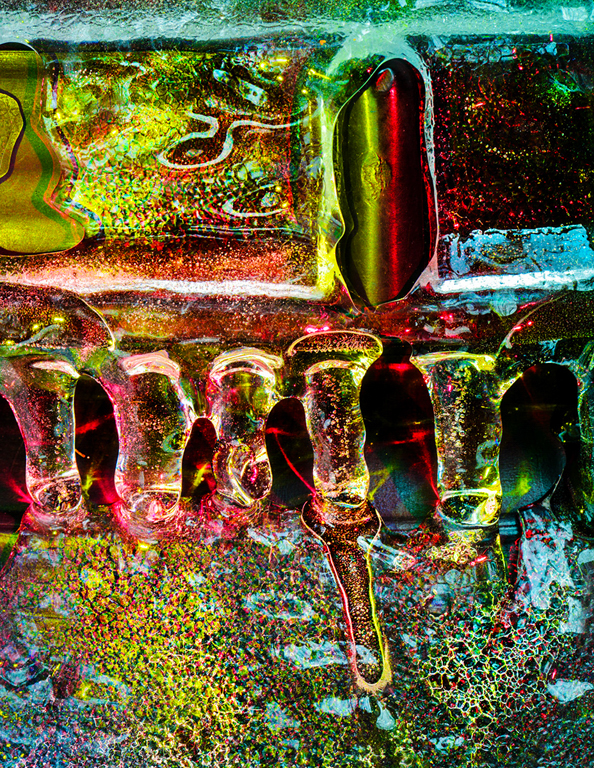
Comment |
Hi Susan, I love this original take on common garden items. Unlike painters who can interpret scenes in whatever colors they conjure onto blank canvas, we photographers start with a scene in its natural state and then use our tools to interpret it. Too often we stick fairly close to reality. Deviating too far can be risky and make the scene cartoony or visual noise. The image here is successful because the conversion uses a wonderful, pleasing color palette and nice effect, the 'felted wool' that Mary noticed. The common objects become abstract and the scene becomes art.
Karl |
Dec 11th |
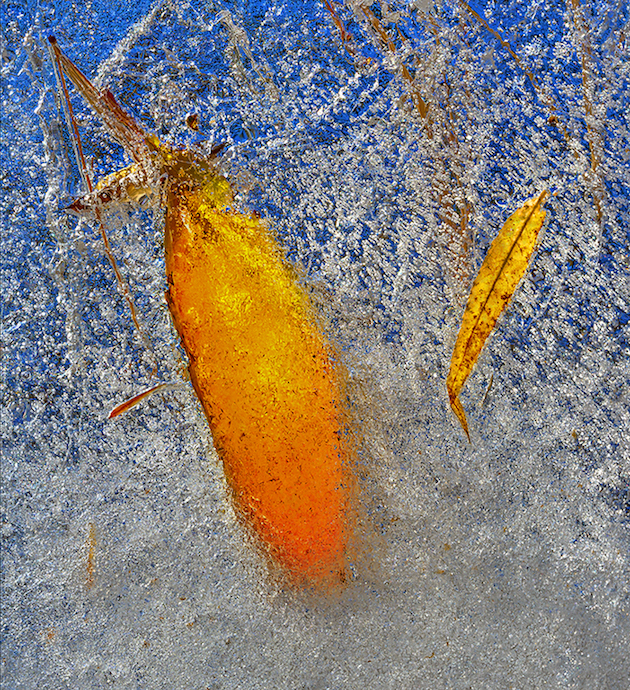
| 79 |
Dec 18 |
Comment |
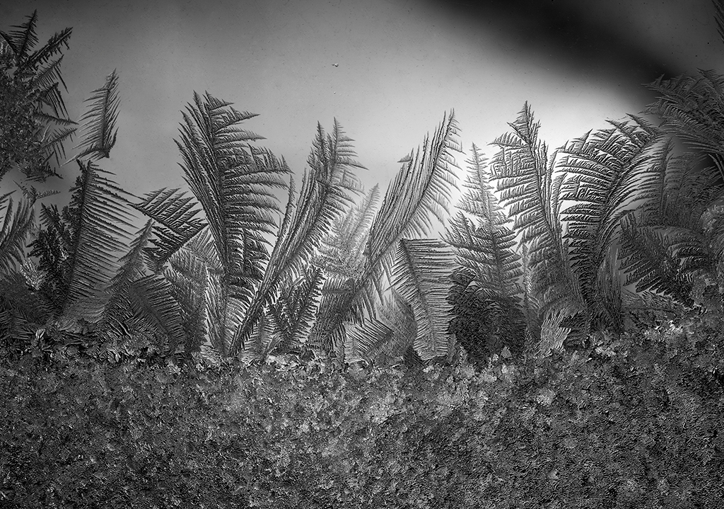
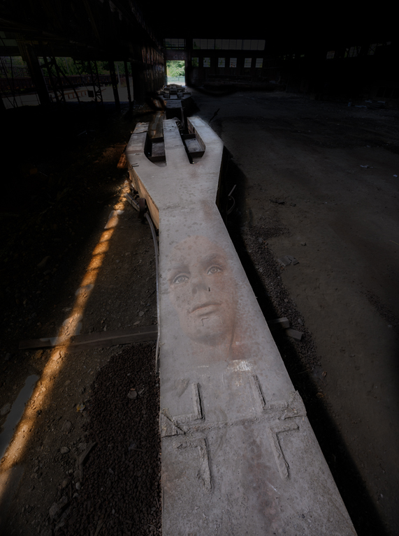
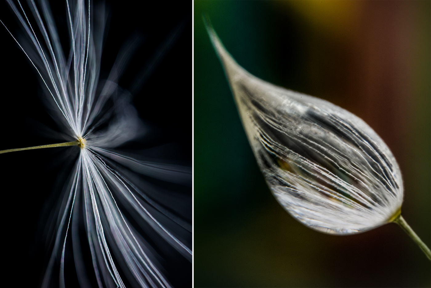
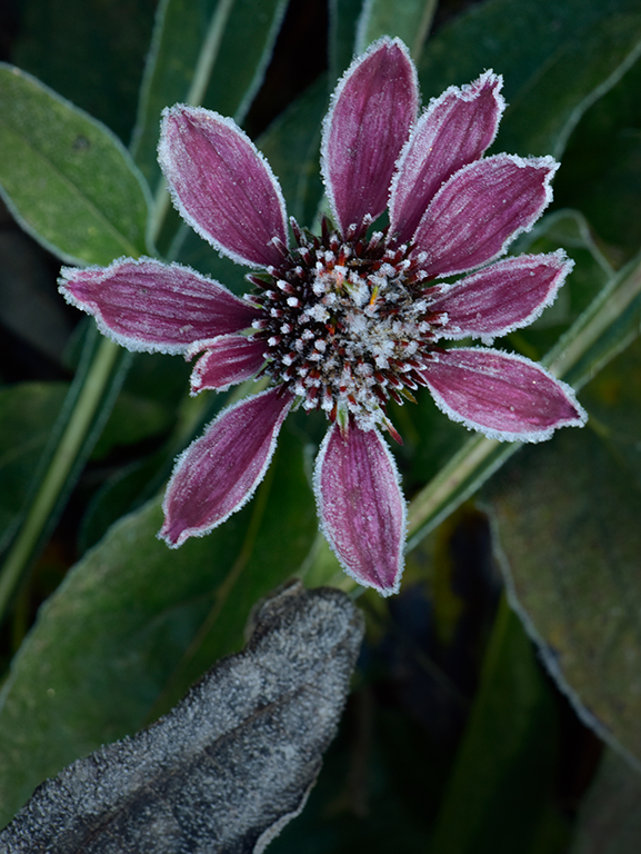
Hi Judith, This is an elegant, yet simple leaf. Elegant in its detail and intricacy. Simple in the clean background which allows the viewer to closely examine the skeletal structure. I like the composition with its heavier base, smaller bumped head and long dangling stem (or proboscis). The mind conjures up an insect. Shooting at f/22 helps keep all parts sharp. The leaf could also be imaged on a flatbed scanner for even sharper detail which isn't necessary for a lo-res venue like this but would make a nice large print.
Karl |
Dec 11th |
| 79 |
Dec 18 |
Comment |
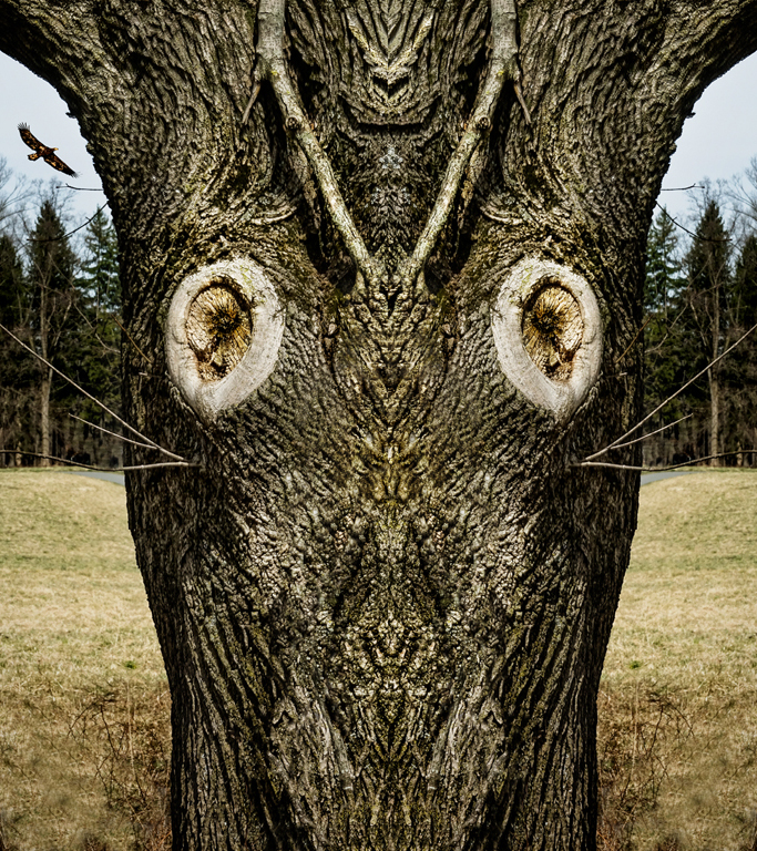
For comparison I am putting up the original capture of which I used the left half and flipped/copied it to the right half before doing touch up work. It was open minded play. I agree with Mary that the bright sides can distract.
For me the best places to photograph are close to home and far away in places I never saw before. The ice season is arriving here so I'll be in my back property on my kneeling pad with the a macro rig. Mother Nature is always changing. |
Dec 11th |
| 79 |
Dec 18 |
Comment |
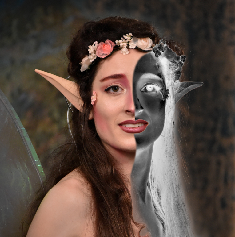
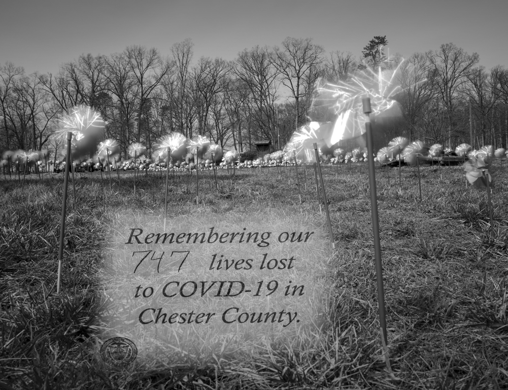
Hi Valerie, The triptych has the look of a 30's postcard. It has an aged feel without the edge foxing and acid stains. I think you are on to something in making the separation to three images to elicit three thoughts that relate. Technically well done with feeling, too. Upon further inspection, I found the difference in ground lines a bit disjointed from switching the side images. Perhaps making the ground line the same throughout would make the relationship of individuals to the whole clearer.
Karl |
Dec 6th |
9 comments - 0 replies for Group 79
|
9 comments - 0 replies Total
|